
Plot like a Pro: Matplotlib 101

Welcome to a full comprehensive guide that will guide you from no knowledge about matplotlib to a prodigy which will allow you to plot like a pro.
Now before we start learning matplotlib we should know what it actually is.
What is Matplotlib?
Matplotlib is one of the most widely used data visualization libraries in Python. It’s powerful, flexible, and easy to use, making it an essential tool for anyone working with data. In this blog, we will take a journey from the basics to advanced functionalities of Matplotlib. Whether you are a beginner or looking to polish your skills, this guide has something for everyone.
Before using matplotlib it is important to have it installed in your system. You can do it by typing the following command in your command prompt.
pip install matplotlib
To get started, you need to import the library. The standard way to import Matplotlib is:
import matplotlib.pyplot as plt
import numpy as np
Here plt is the alias that we have given so that it is easy to call the library when we need to use it.
We are also importing numpy here which is another python library that is used to work with arrays. You can read more about it here.
Matplotlib allows us to plot various types of plots. We will go through them one by one.
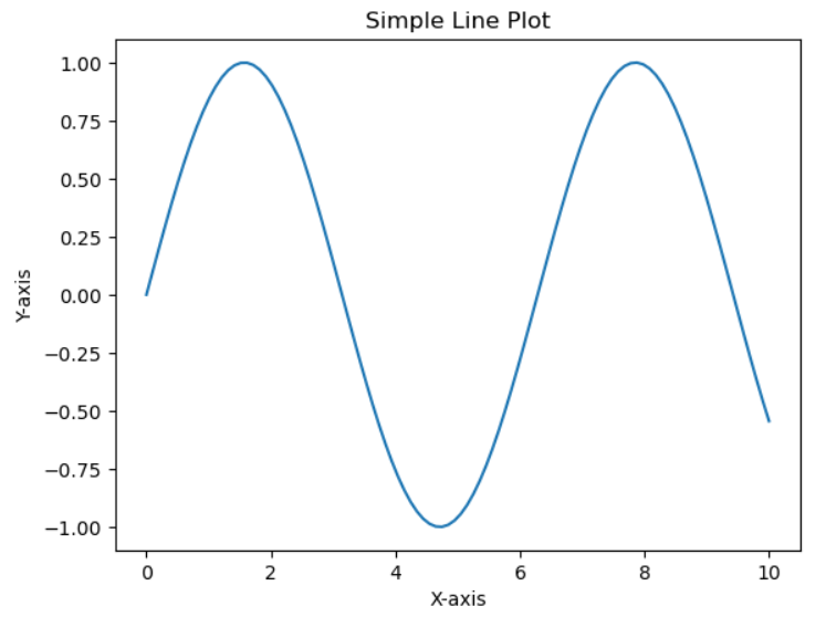
Line plot
- Description: Creates a line plot.
- Example:
plt.plot(x, y)plots the values ofyagainstxas a continuous line.
import matplotlib.pyplot as plt # Importing matplotlib
import numpy as np # Importing numpy

# Creating sample data
x = np.linspace(0, 10, 100) # Generating 100 evenly distributed values between 0 and 10
y = np.sin(x) # Calculating the sin of values of x

plt.plot(x, y) # Plotting y against x
plt.title("Simple Line Plot") # Gives the plot title
plt.xlabel("X-axis") # Labels the x axis of the plot
plt.ylabel("Y-axis") # Labels the y axis of the plot
plt.show() # Displays the final plot
Output
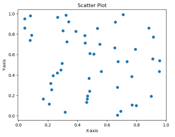
Scatter Plot
- Description: Creates a scatter plot.
- Example:
plt.scatter(x, y)plots the values ofyagainstxas individual points.
import matplotlib.pyplot as plt
import numpy as np

# Generating random data
x = np.random.rand(50)
y = np.random.rand(50)

plt.scatter(x, y) # Plotting scatter plot as individual points
plt.title("Scatter Plot")
plt.xlabel("X-axis")
plt.ylabel("Y-axis")
plt.show()
Output
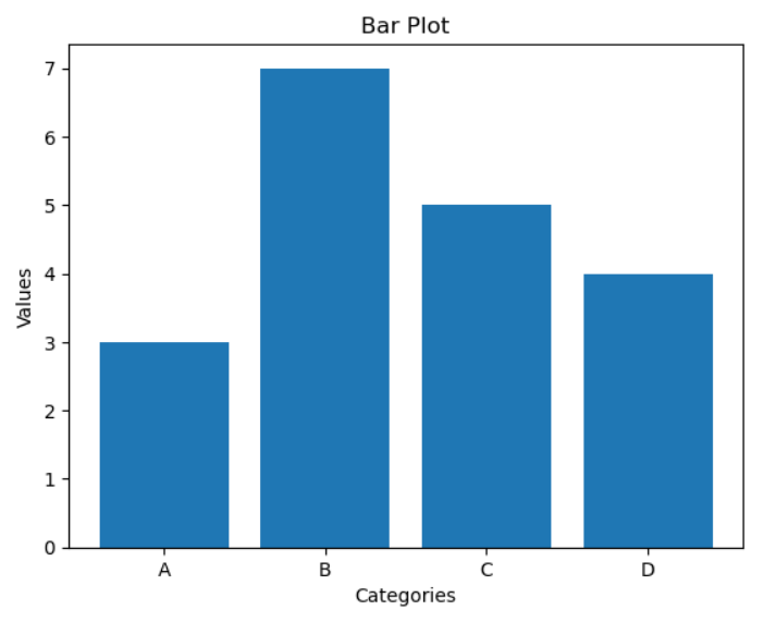
Bar Plot
- Description: Creates a bar plot.
- Example:
plt.bar(categories, values)plots bars for each category with the corresponding values.
import matplotlib.pyplot as plt
import numpy as np

# Generating the data
categories = ['A', 'B', 'C', 'D'] # Specifying the categories
values = [3, 7, 5, 4] # Specifying the values of each category

plt.bar(categories, values) # Plotting bar plot for each category with corresponding values
plt.title("Bar Plot")
plt.xlabel("Categories")
plt.ylabel("Values")
plt.show()
Output
Basic Plot Customization
You may feel like these plots look very basic and dull, well you are right but matplotlib allows various customization options as well to make our graphs come to life.
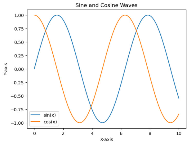
Legend()
Places a legend on the axis
x = np.linspace(0, 10, 100)
y1 = np.sin(x)
y2 = np.cos(x)

plt.plot(x, y1, label='sin(x)') # label specifies what we want the name on the legend
plt.plot(x, y2, label='cos(x)')
plt.title("Sine and Cosine Waves")
plt.xlabel("X-axis")
plt.ylabel("Y-axis")
plt.legend() # Places a legend on the axis
plt.show()
Output
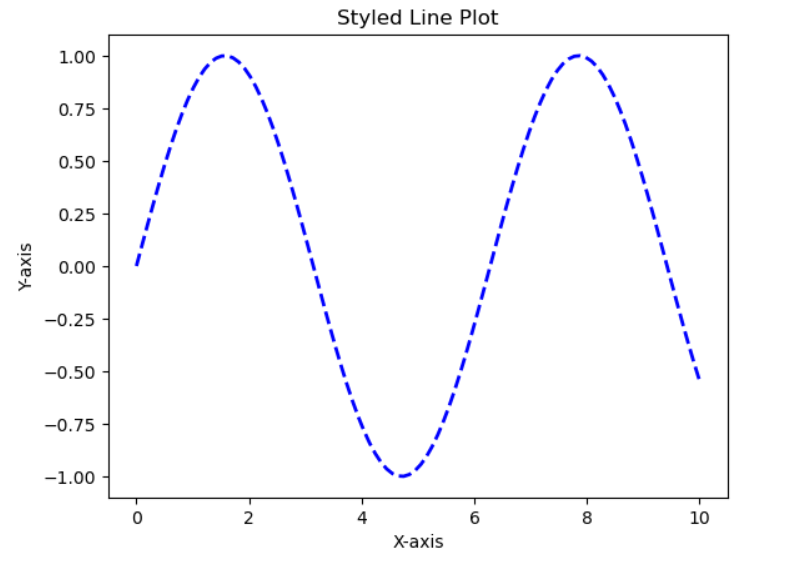
Line Styles and Colors
color: Sets the line colorlinestyle: Sets the line stylelinewidth: Sets the line width
x = np.linspace(0, 10, 100)
y = np.sin(x)

# color sets the color
# The style and width of the line can also be changed
plt.plot(x, y, color='blue', linestyle='--', linewidth=2)
plt.title("Styled Line Plot")
plt.xlabel("X-axis")
plt.ylabel("Y-axis")
plt.show()
Output
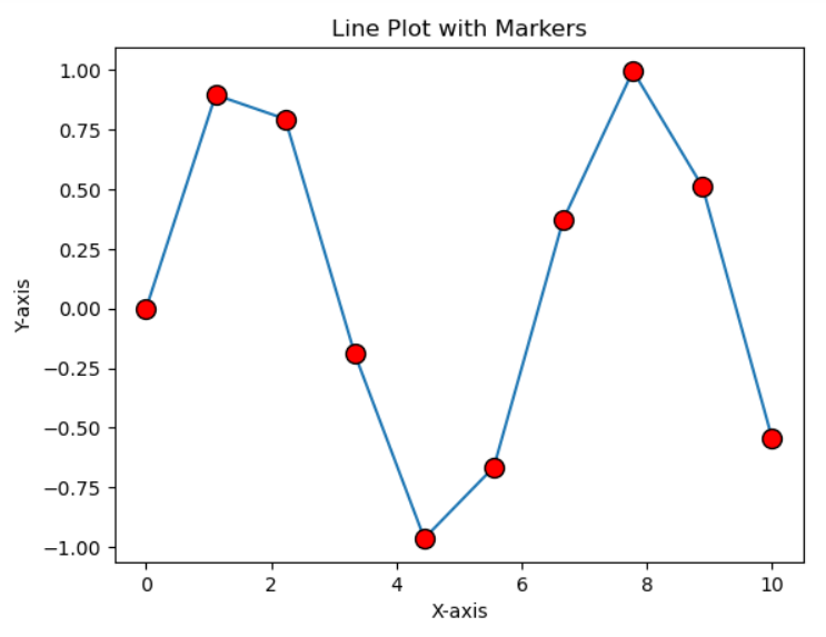
Markers
We can also add markers to our plots
marker: Sets the marker stylemarkersize: Sets the marker sizemarkerfacecolor: Sets the marker face colormarkeredgecolor: Sets the marker edge color
x = np.linspace(0, 10, 10)
y = np.sin(x)

plt.plot(x, y, marker='o', markersize=10, markerfacecolor='red', markeredgecolor='black')
plt.title("Line Plot with Markers")
plt.xlabel("X-axis")
plt.ylabel("Y-axis")
plt.show()
Output
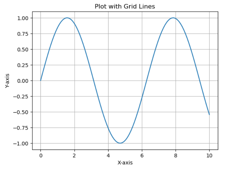
Grid
plt.grid(): Adds grid lines to the plot
x = np.linspace(0, 10, 100)
y = np.sin(x)

plt.plot(x, y)
plt.title("Plot with Grid Lines")
plt.xlabel("X-axis")
plt.ylabel("Y-axis")
plt.grid(True)
plt.show()
Output
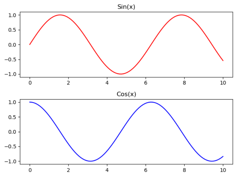
Subplots
plt.subplots(): Creates multiple plots in a single figure
x = np.linspace(0, 10, 100)
y1 = np.sin(x)
y2 = np.cos(x)

# Create a figure and an array of subplots with 2 rows and 1 column
fig, axs = plt.subplots(2,1)
axs[0].plot(x, y1, 'r')
axs[0].set_title('Sin(x)')
axs[1].plot(x, y2, 'b')
axs[1].set_title('Cos(x)')

# Adjust the layout to prevent overlap
plt.tight_layout()
plt.show()
Output
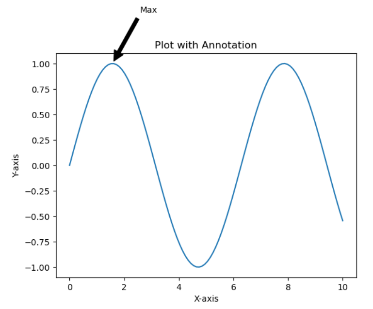
Annotations
plt.annotate(): Adds annotations to the plot
x = np.linspace(0, 10, 100)
y = np.sin(x)

plt.plot(x, y)
plt.title("Plot with Annotation")
plt.xlabel("X-axis")
plt.ylabel("Y-axis")
plt.annotate('Max', xy=(np.pi/2, 1), xytext=(np.pi/2 + 1, 1.5),
             arrowprops=dict(facecolor='black', shrink=0.05))
plt.show()
Output
Logarithmic Scale
Using matplotlib we can set our scale to logarithmic scale
plt.yscale(): Sets the y-axis to a logarithmic scaleplt.xscale(): Sets the x-axis to a logarithmic scale
x = np.linspace(1, 10, 100)
y = np.exp(x)

plt.plot(x, y)
plt.title("Logarithmic Scale")
plt.xlabel("X-axis")
plt.ylabel("Y-axis")
plt.yscale('log')
plt.show()
Output
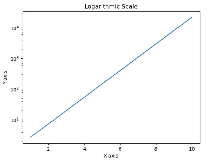
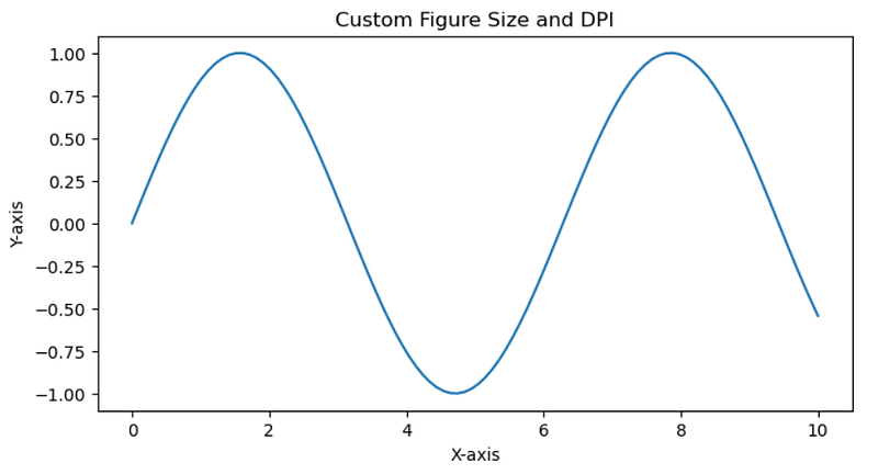
Figure Size and Resolution
We can specify figure size and resolution of our plots
plt.figure(figsize=(width, height), dpi=dpi): Customizes the size and resolution of the plot
x = np.linspace(0, 10, 100)
y = np.sin(x)

plt.figure(figsize=(8, 4), dpi=100) # This helps us specify the figure size and resolution
plt.plot(x, y)
plt.title("Custom Figure Size and DPI")
plt.xlabel("X-axis")
plt.ylabel("Y-axis")
plt.show()
Output
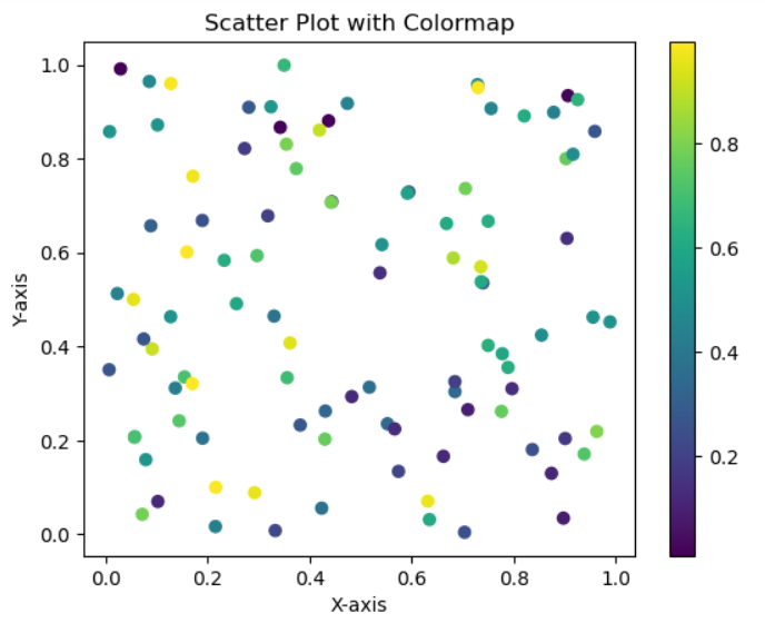
Color Maps
We can also add some colour to our graphs
cmap: Applies a colormap to the plot
x = np.random.rand(100)
y = np.random.rand(100)
colors = np.random.rand(100)

plt.scatter(x, y, c=colors, cmap='viridis')
plt.colorbar()  # Shows color scale
plt.title("Scatter Plot with Colormap")
plt.xlabel("X-axis")
plt.ylabel("Y-axis")
plt.show()
Output
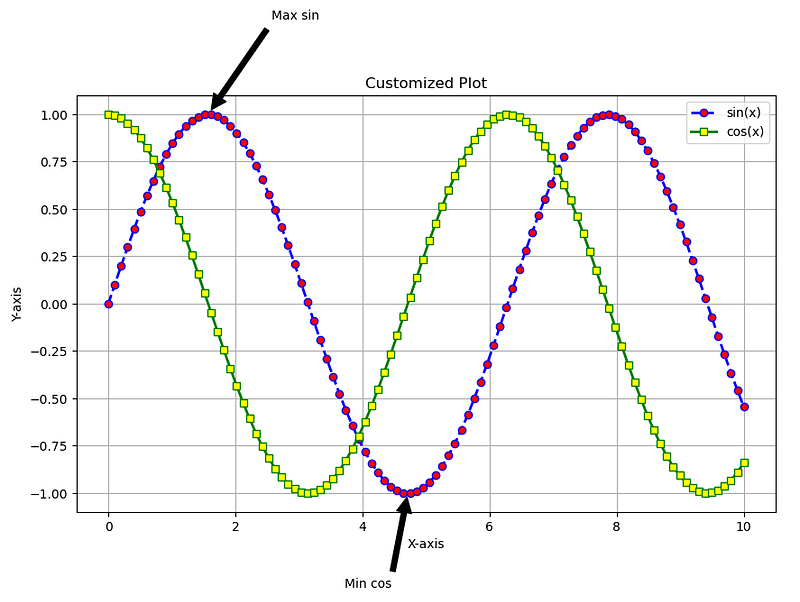
Customized Plot
Now I will display a plot using all the customizations that we used. It might look like a huge code at first but when you focus and try to understand you will see that we have covered all the topics and you can generate a similar graph yourself.
# All customizations
import matplotlib.pyplot as plt
import numpy as np

x = np.linspace(0, 10, 100)
y1 = np.sin(x)
y2 = np.cos(x)

plt.figure(figsize=(10, 6), dpi=100) # Setting our fig size and resolution

# Setting plot line color, linestyle, linewidth, adding a marker and a label
plt.plot(x, y1, color='blue', linestyle='--', linewidth=2, marker='o', markersize=6, markerfacecolor='red', label='sin(x)')
plt.plot(x, y2, color='green', linestyle='-', linewidth=2, marker='s', markersize=6, markerfacecolor='yellow', label='cos(x)')


plt.title("Customized Plot") # Giving title to plot
plt.xlabel("X-axis") # Labelling x axis
plt.ylabel("Y-axis") # Labelling y axis
plt.legend() # Displaying the legend
plt.grid(True) # Displaying the grid

# Setting up some annotations
plt.annotate('Max sin', xy=(np.pi/2, 1), xytext=(np.pi/2 + 1, 1.5), arrowprops=dict(facecolor='black', shrink=0.05))
plt.annotate('Min cos', xy=(3*np.pi/2, -1), xytext=(3*np.pi/2 - 1, -1.5), arrowprops=dict(facecolor='black', shrink=0.05))

plt.show()
Output
Now that you know all the different types of customizations you can explore each one and tinker with the graphs yourself and have some fun.
Now let’s continue on our journey to understand more different types of graphs that we can plot using matplotlib
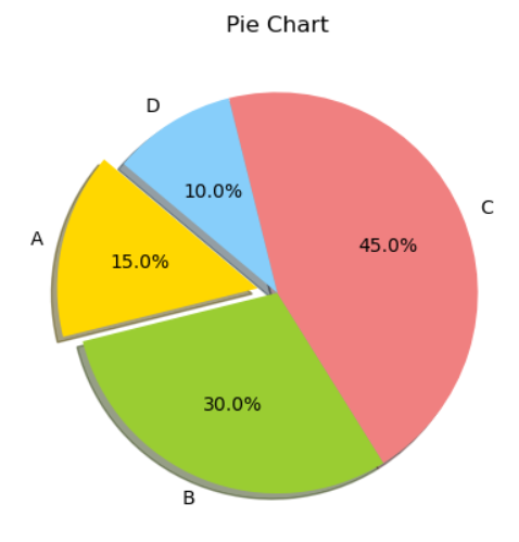
Pie Chart
Pie charts are a circular statistical graphic, which is divided into slices to illustrate numerical proportions
# Pie Charts
import matplotlib.pyplot as plt

# Data to plot
labels = 'A', 'B', 'C', 'D' # Labels for each slice of the pie chart
sizes = [15, 30, 45, 10] # The data or the size of the pie charts
colors = ['gold', 'yellowgreen', 'lightcoral', 'lightskyblue'] # Colors for the different slices of pie chart
explode = (0.1, 0, 0, 0)  # Exploding the 1st slice

# Create a pie chart
plt.pie(sizes, explode=explode, labels=labels, colors=colors, autopct='%1.1f%%', shadow=True, startangle=140)
# Specifying the sizes, explode, labels and colors
# %1.1f%%' displays the percentage value with one decimal place and a percent sign
# Shadow = True turns on the shadow
# This argument rotates the pie chart so that the first slice ('A') starts at 140 degrees counterclockwise from the positive x-axis
plt.title("Pie Chart")
plt.show()
Output
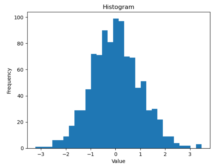
Histogram
We can use plt.hist() function to plot a histogram
import matplotlib.pyplot as plt
import numpy as np

# Creating a NumPy array named data containing 1000 random numbers
data = np.random.randn(1000)

# Data is the data we need to plot
# Bins is the number of bars we want or the number of divisions we want in our data
plt.hist(data, bins=30)
plt.title("Histogram")
plt.xlabel("Value")
plt.ylabel("Frequency")
plt.show()
Output
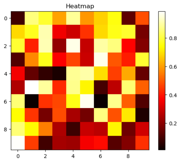
Heatmap
We can use plt.imshow() to plot a heatmap. Heatmap is an extremely useful plot that is widely used in EDA which I will cover in a future blog. Right now just focus on learning how a heatmap can be plotted.
import matplotlib.pyplot as plt
import numpy as np

data = np.random.rand(10, 10)

# cmap specifies the colormap
# interpolation method used to determine the color for pixels that don't fall exactly on a data point in the array
plt.imshow(data, cmap='hot', interpolation='nearest')
plt.colorbar()
plt.title("Heatmap")
plt.show()
Output
Box Plots
Box plots are a great way to visualize the distribution of data and identify outliers. They display the median, quartiles, and potential outliers in your dataset.
We can use plt.boxplot() to plot a boxplot.
import matplotlib.pyplot as plt
import numpy as np

# Generate some random data
np.random.seed(10) # This line sets a seed for the random number generator in NumPy. This ensures that the code will generate the same random data every time you run it
data = [np.random.normal(0, std, 100) for std in range(1, 4)]
# np.random.normal(0, std, 100): Inside the loop, this function generates 100 random numbers from a normal distribution with a mean of 0 and a standard deviation of std (which takes the value of 1, 2, and 3 in each iteration). This creates three datasets with different levels of spread.

# Create a box plot
plt.boxplot(data, vert=True, patch_artist=True, labels=['Group 1', 'Group 2', 'Group 3'])
# vert = True sets the boxplot to vertical
# patch_artist = Truue allows you to customize the colors of the boxplot
plt.title("Box Plot")
plt.xlabel("Groups")
plt.ylabel("Values")
plt.show()
Output
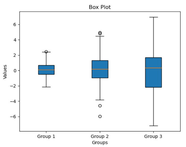
Note that the center value of a boxplot represents the median, box size indicates how spread out the data is, bottom edge represents the first quartile, the top edge represents the third quartile and the lines extending out are called the whiskers. The small circles represent any outliers that may lie in the data.
Saving Plots
Lastly after generating all your plots you should be aware how to save the generated graphs.
import matplotlib.pyplot as plt
import numpy as np

x = np.linspace(0, 10, 100)
y = np.sin(x)

plt.plot(x, y)
plt.title("Saving Plots")
plt.xlabel("X-axis")
plt.ylabel("Y-axis")
plt.savefig('plot.png') # This saves the graph
plt.show()
Output
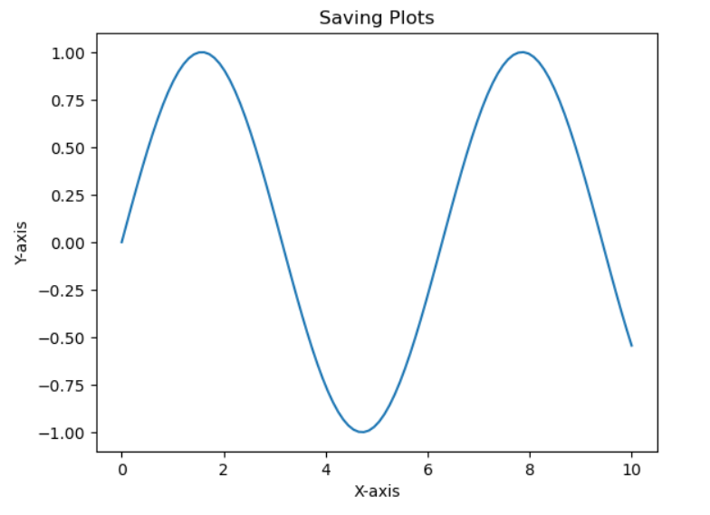
The generated image gets saved
You may have noticed us using the plt.show() command every time to display every graph, but there is a hack around it.
You can use the following command
%matplotlib inline
This magic command is specific to Jupyter notebooks. It tells the notebook to display Matplotlib plots inline, directly below the code cells that produce them.
If you run this command once then you dont have to use plt.show() command every time.
Congrats! You’ve mastered Matplotlib, and learned how to turn data into clear, beautiful visuals. Keep experimenting, and you’ll keep improving. Thanks for joining me in this journey and I hope you learned something today.


