
HOW TO DRAW
Odds are Better than Evens
when working out how to make your pictures more pleasing
This session applies equally to drawing as to painting so the examples will be in colour.
There are any number of ‘rules’ on this subject — I’m just going to stick with the idea that odds are better than evens. That is, that it’s better to think in thirds than halves; better to think of 1, 3, 5 than 2, 4 etc.
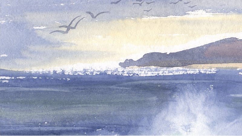
This painting (above) is pleasant enough but it’s nothing special. It’s too even. The horizon line is halfway down the page. The sticky-outy bit of land sticks out to halfway along the page — there is, therefore, an equal amount of sea and sky, and an equal amount of promontory and no-promontory.
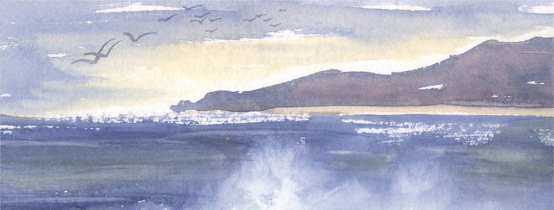
Increase the amount of land so that it takes up roughly two-thirds to the right, leaving a third of no-promontory to the left, and the picture is immediately more interesting.
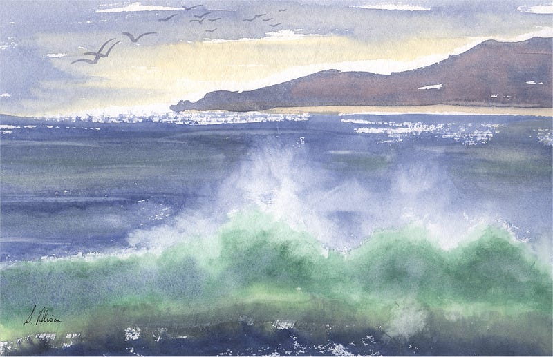
Increase the amount of sea so that there is two-thirds sea and one-third sky and, again, the whole composition becomes more of a picture that tells a story than merely a fairly bland landscape painting.
That is, ‘Odds are Better than Evens’, particularly for natural subjects.
It would have worked equally as well if the sky had been increased to two-thirds and the sea stayed at one-third.
Try to avoid an equal amount of space, an equal number of things, an equal emphasis of everything.
Take flying ducks:

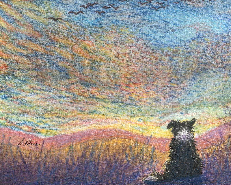
In this painting (above) that I prepared earlier, you can see that the sky is about a third (ish) of the space, the sea about two-thirds. The dog staring out to sea is not in the middle of the picture in any direction. It works as a harmonious picture.
However, add in some ducks:
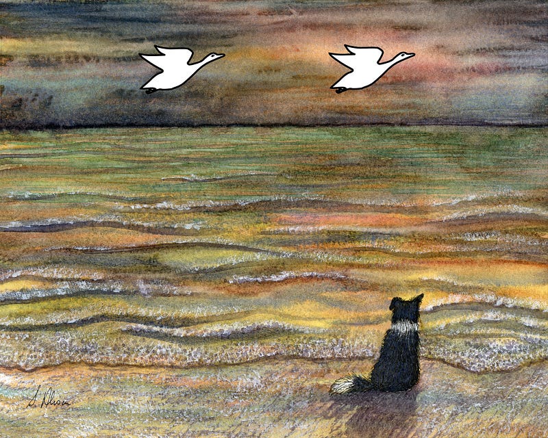
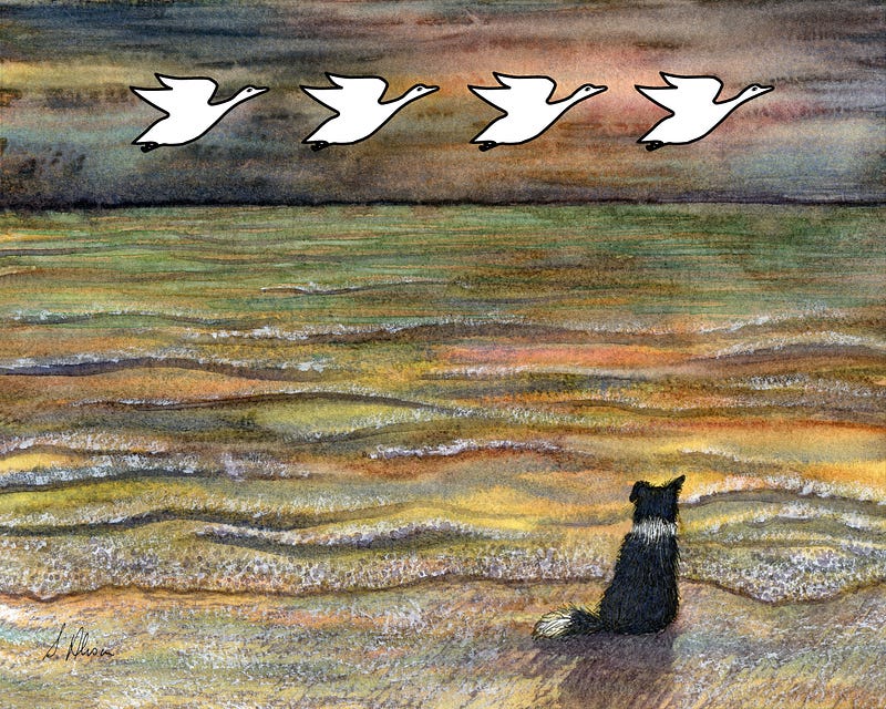
And you just know that Doggo is thinking: “Wot? Wot’s going on here, then?” Two ducks smack, bang in the middle of the sky. (pic 1) Oh, and four ducks looking as if they’re doing a line dance. (pic 2)
They’re all the same size; all the same distance from each other; the same colour; the same emphasis. It just looks unnatural. (Which is fine if that’s what you want, but not so great if it’s not what you want.) The ducks might as well be plastic figures flying across a wall.
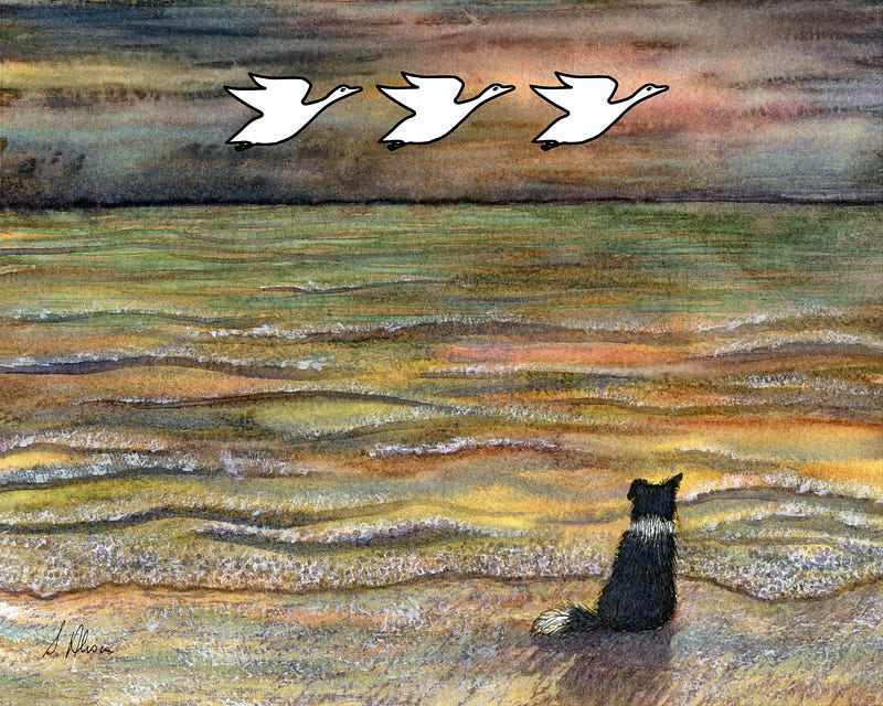
However, as soon as you take away (or add) a duck, and have an odd number as in pic 3, it does look a little better because it doesn’t look quite so ‘square’.
(If I were to paint ducks into this picture, they wouldn’t be stark white like these three, but I need them to be this bright so you can see clearly what’s going on.)
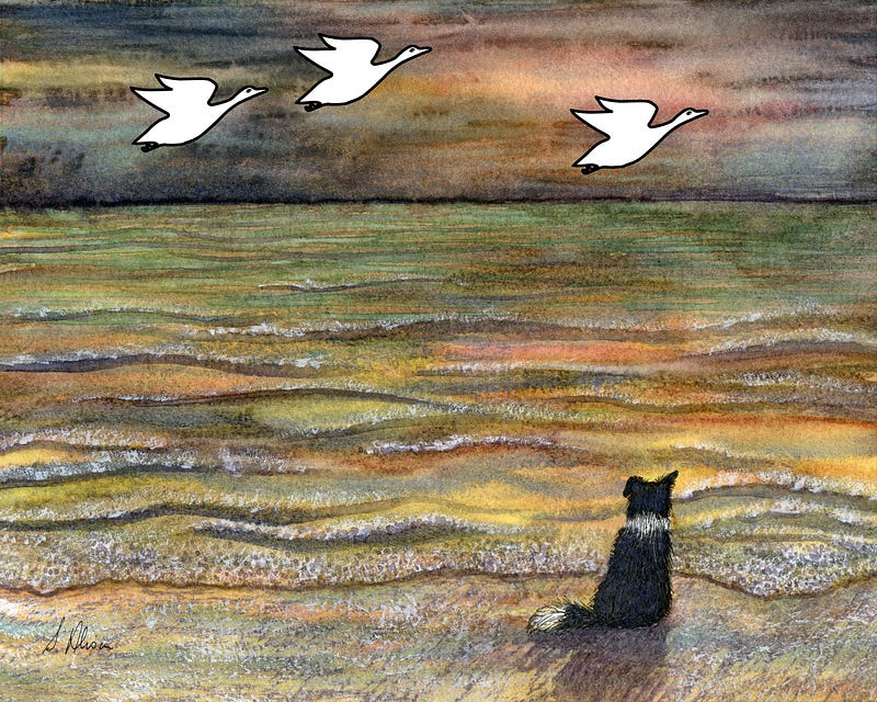
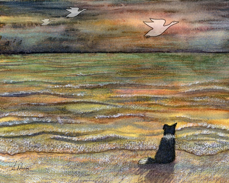
- As soon as the space between the ducks is made different, they look more natural (pic 1) — this also includes the space between the left-hand duck and the edge of the pic being smaller than the space between the right-hand duck and that edge of the pic.
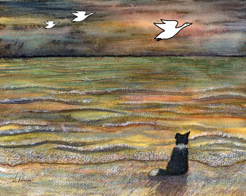
- Change the size of the ducks. This also makes them look as if they’re not all the same distance away from the viewer.
- Change the colour and emphasis of the ducks so the furthest one is the palest one.
And, although the ducks are not particularly natural from the off, you can see that keeping everything odd, rather than even, is an instant way of making your composition more harmonious.
(There are always exceptions, of course, but we’re not covering them in this session.)
A quick exercise with trees will show the same idea that odds are better than evens.

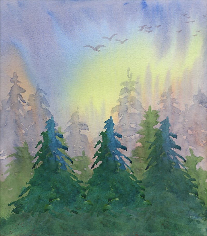
The front-most trees — two of them in pic 1 — are equally spaced out and it makes the picture look a bit static. Also the tops of those trees come halfway up/down the pic making the ‘square’ effect more pronounced. In pic 2 I’ve added in another tree to stop the ‘evens’ effect. But it’s still regimented — three trees but the same distance from each other and the same height as each other.
Symmetry isn’t something to aim for when drawing and/or painting the natural world. In fact, symmetry is best offset.
Pic 3 — I’ve added some foreground so the sky is about a third (roughly) and the earth and trees are about two-thirds of the picture. Or the sky is a third, the trees are a third and the foreground is a third.
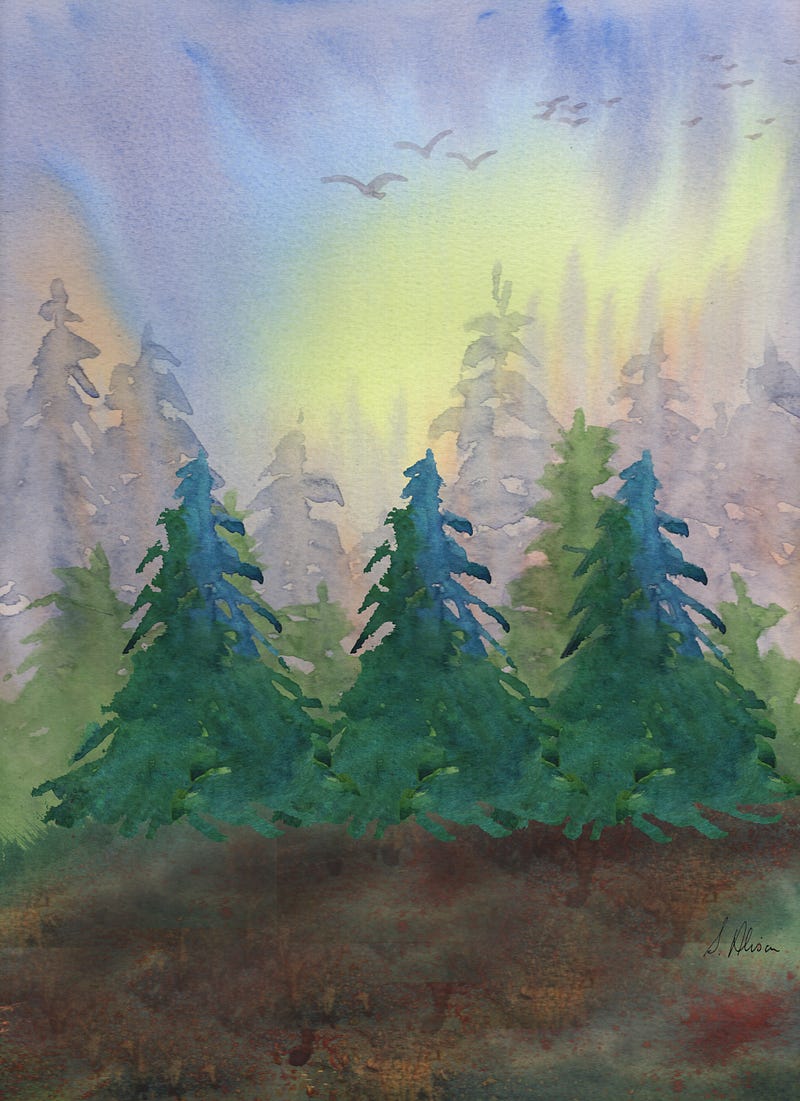
Pic 4 — I’ve moved the left-hand tree forward and to the left a bit, and the middle one forward and overlapping the right-most tree. Regimentation has finally left the picture.
However, those trees are still the same size, and the same colour, and they all have equal ‘importance’ in the picture because their density of colour is the same.
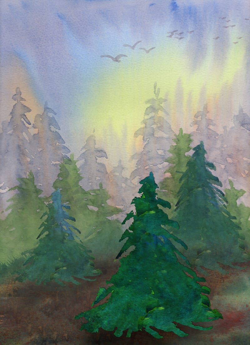
Pic 5 — I’ve changed the size of the trees — the furthest back being the smallest of the three, and the furthest forward the largest. Also the front-most one now has the brightest colouring fading through the trees as they go into the background.
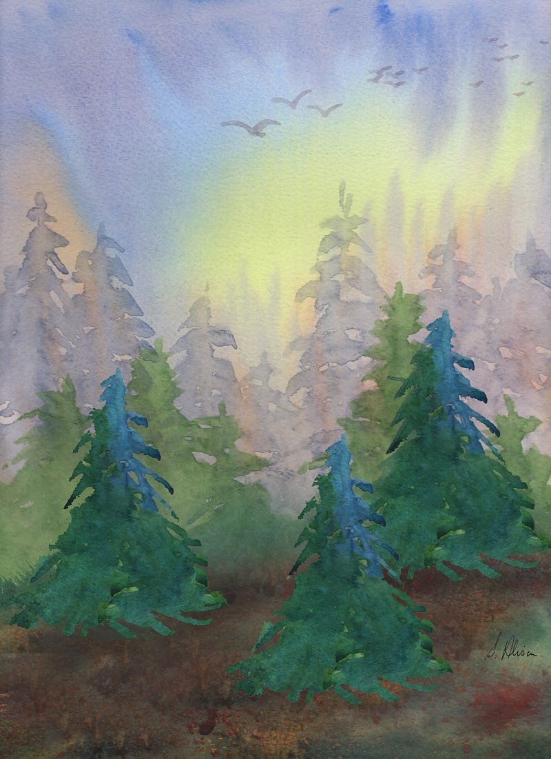
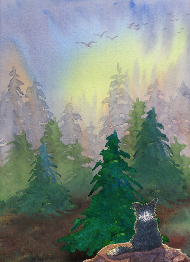
Pic 6 — The picture didn’t need a dog on a rock right in the foreground but I’ve put him in there anyway — not in the middle, because symmetry can divide a picture in half when you want it whole.
You can see how he pushes everything else further into the distance, too. Because he isn’t in the middle he shows the way to look; and because everything is in an ‘odd’ space rather than an ‘even’ space there is a natural path through the picture to the sun gleaming into the sky in the background — all this looking and seeing would normally be unconscious.
All of this might seem a bit burdensome to start with, but as you go along it will become second nature, and you will, without consciously thinking about it, see where things need to go. You’ll probably find yourself moving things around on your mantelpiece or sideboard, too, into more harmonious formations.
This session has been about thinking odds rather than evens when composing a picture, especially of a natural subject. Two more pics above show the odds idea.
There will be another session soon on the ‘Magic of Three’.
All paintings and drawings are by the author.
The session on distance is useful to have in mind through all this, too:


