
Disabled Controls
Never, ever disable buttons — Requirements for an accessible solution

In a previous article, I discussed the problems with disabling buttons. Namely, that disabled buttons:
- Are inaccessible for assistive technology (AT) users
- Do not communicate why the button is disabled
- Incorrectly assume the user understands that the button is disabled and why
- Do not sufficiently communicate to the user what they must do to enable the button
When I started writing this article, it included possible alternatives along with what you’ll read below, but it became too long. So, I’ll have to save the actual alternatives for a future submission (my sincere apologies — I’m wordy; it’s a problem).
Hopefully, once we go over the requirements, you’ll likely be able to infer an alternative yourself. The clues are all there.
Contents
The reason behind a disabled button
We’ll go over why a developer would want to disable a button in the first place. This will give us our first requirement.
If the user can’t perform the action the button would perform, what should we communicate to the user? We’ll discuss how disabled buttons fail to communicate and act out a conversation between the user and the web page. This will give us our next two requirements.
Providing the information in an accessible way
We’ll discuss what will work, generally speaking. This will give us our final requirement. Then, we’ll go over what won’t work, specifically bad implementations for communicating information to the user.
The reason behind a disabled button
Let’s dig into what a developer is attempting to accomplish by disabling a button. To state it simply, developers typically disable buttons to prevent user error, data corruption, or unauthorized access.
Is disabling a button the only way to do that? Of course not! But it’s easy and it’s been such a longstanding design pattern that many developers don’t want to give it up.
Regardless, we have our first requirement: Prevent the user from performing an action.
What the user needs to know
Of course, just preventing the action isn’t enough in most cases. If we’re unable to hide a button (more on that later), we need to communicate to the user why they can’t perform the action, what they can do, and provide that information in an accessible way.
What are you wanting to communicate to the user? This is the question you need to ask first.
Then follow up with: “How can I communicate that to the maximum number of users?”
Where disabled buttons fail in communication
If you’re disabling a button, you may be attempting to tell the user one or more of the following:
- You can’t perform this action now
- Before you can perform this action, you must first accomplish a task
- You can’t perform this action until a specific event occurs, such as a date or an action performed by another user
- You don’t have the rights/permissions to perform this action
When you disable a button, how much of this are you communicating to the user explicitly?
The answer: none.
Disabling a button implies the first point, but only to sighted users without color perception challenges. Anyone else may not know the button is disabled or may not know the button exists.
Conversations with a web page
Whether you specialize in accessibility, UX, requirements, etc., try to think of any user interaction as a conversation between the user and the web page. In this hypothetical conversation, the Save button is disabled:
User: Ok, there’s the Save button. [Click Save button]
Web Page: [no action]
User: Did it work? I clicked it. Why isn’t it working?
Web Page: [silence]
User: What did I do wrong? [Click][Click]
Web Page: [no action]
You might object and say a user would never do this because they can tell the button’s disabled and would never bother to click it. Putting aside that you’re making some pretty unwarranted assumptions about your users (namely, that they use the web the same way you do), let’s run with that:
User: Why is the Save button disabled?
Web Page: [silence]
User: I thought I did everything right. Why isn’t it working?
Web Page: [silence]
User: What did I do wrong? Is this a bug?
Web Page: [silence]

The outcome is essentially the same. You’ve disabled the button but haven’t told the user why or what needs to happen before it can be enabled.
So the user is left asking: When can I? Why can’t I? Who do I contact so I can? The web page’s answer: *shrug*
Let’s change the conversation to give more useful information. Make this conversation (or something like it) your goal:
User: Ok, there’s the Save button. [Click Save button]
Web Page: Enter a Location (hyperlinked) before saving.
User: Oh, that’s right! [Enters valid Location value] That should do it. [Click Save button]
Web Page: Saved successfully.
Notice in this hypothetical conversation, there are no questions. That’s because the web page answered them before they were asked.
Now we know one thing we want to communicate to the user:
“You cannot perform action X until action Y is performed.”
It’s important that we’re specific in what the user needs to do. Is there a field the user needs to correct? Include the field’s name in the text and say exactly what’s wrong with the entry.
Let’s say the user needs to enter a Delivery Date, but they enter yesterday’s date.
Bad example: “Enter a valid date.” Better example: “Enter a date for the Delivery Date on or after 11/15/2023.”
That gives us two more requirements:
- Inform the user that the action cannot be performed
- Inform the user what needs to happen before the action can be performed
Providing the information in an accessible way
In the follow-up article, we’ll discuss actual accessible alternatives to disabled buttons. Here, we’ll go over what generally works and what doesn’t.
What works
Our goal should be to provide sufficient information to the maximal number of users. This means that a typical sighted mouse/keyboard user can perceive it, as well as users that rely on assistive technology (AT). We want to provide the same (if possible) relevant and actionable information.
Hiding the button
Before we get too deep with this, there’s a solution that’s just as simple as disabling a button. However, you should be careful about when and how you employ it.
Answer the following question: Will the user be able to perform the action in their current session?
If the answer is no, hide the button. That’s it. Done.
There’s no point in showing functionality the user cannot perform. It only introduces confusion.
Some examples of this scenario include:
- The user doesn’t have permissions/rights necessary to perform the action. For example, hiding a “Delete user” button if the user doesn’t have rights to delete a user
- The action is not available, such as selecting a Pick-up location when only Delivery is available
- The action would cause data corruption, a security violation, or some exception
Hiding the button can be done in the code behind, or you can simply add the hidden attribute to the button. With CSS, you can use display: none. This will remove it visually and from assistive technology.
If removing the button messes with how the page is presented or aligned, use visibility: hidden. That will ensure nothing occupies the space the button took up.
When you can’t hide it
Perhaps you cannot hide the button as described above. For example, you have a form’s submit button. Assuming the purpose of the page is for the user to submit information, you shouldn’t hide the button... ever. Why? Because (presumably) you’ll want to show the button in that same session.
If you show a button that was previously hidden on a page, it’s typically not announced by AT. And even if it was, it doesn’t tell the user where it is or how to get there.
Now that we’ve determined the button should be present and enabled, what can we do to still communicate to the user what they need to know?
At the very least, we need to communicate the information to the user on the button click event. This must be done with text. We cannot assume the user will infer the information based off icons, images, or animations.
Remember, in the accessibility world, text is king.
The text should be visually present, perceivable by AT, understandable, and actionable. What does that mean?
- Visually present: It can be seen in context on a web page by sighted users
- Perceivable by AT: Assistive technology will communicate the text to the user. That is, it won’t be skipped
- Understandable: No jargon, ambiguous terms, or complicated wording
- Actionable: Tell the user exactly what they must do and with what. For example, “Enter your Last Name” is better than “Enter valid information” and hyperlinking “Last Name” to that control is better than just the text
So, we now have all of our requirements and information about each:
Requirement 1: Prevent the user from performing an action The user should not be able to perform the default action of the button for the duration of their time on the page
Requirement 2: Inform the user that the action cannot be performed The user most know that the default action of the button cannot be performed. Otherwise, they may conclude that the page is broken.
Requirement 3: Inform the user what needs to happen before the action can be performed What good is telling the user they can’t do something without telling them how they can? Be explicit in the needed action and how it can be performed.
Requirement 4: Provide the information in an accessible way Ensure the information you give the user is visually present, perceivable by AT, understandable, and actionable… and use text to do it.
What doesn’t work
Now that we’ve laid out our requirements, there’s a principle that we must understand before we continue.
Someone else may have given this a better name, but I call it the fundamental vs. supplimental principle. Essentially, the fundamental is the necessary and the supplimental (while it can be helpful) is not neccessary.
As an example, think of a textbox. A fundamental (required) addition to a textbox is an associated label. You should never have a textbox without a label — it’s fundamental. I think we can all agree.
Where I’m sure to get some friction is the supplimental part. These fall under the supplimental:
- Anything that provides little value beyond the aesthetic
- Anything that is only perceivable to sighted users
- Anything that doesn’t substantially contribute to the accessibility of the page
Using the textbox example, a supplimental addition would be a placeholder, and associated icon, or a tooltip.
These things may add some value (except for placeholders— please just forget those exist), but they aren’t fundamental to the accessibility of the control or page.
With that out of the way, let dig into examples of what won’t work.
Visual Cues
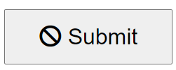
Is an icon inside a button sufficient to communicate that the default button behavior cannot be performed? No, of course not! Even if it did, it would still violate Requirements 3 and 4 (the user doesn’t know how it can be enabled and it’s not accessible).
The same is true for the cursor: not-allowed style given to the button on hover. It doesn’t communicate anything meaningful to the user (or anything at all to AT users).
Does that mean you shouldn’t do those? Not necessarily.
Feel free to use them, but remember, they are supplimental not fundamental. They are visual cues that reinforce the primary mode of communication — not the primary mode of communication themselves.
So, as long as there is a present, understandable, universally perceivable, textual, and actionable communication to the user, these supplimental additions are just seasoning.
Non-textual, visual cues should never be used as a primary means of communicating to the user. Here are some examples of those cues:
- Icons/Images
- Cursor changes
- Color changes
Tooltips
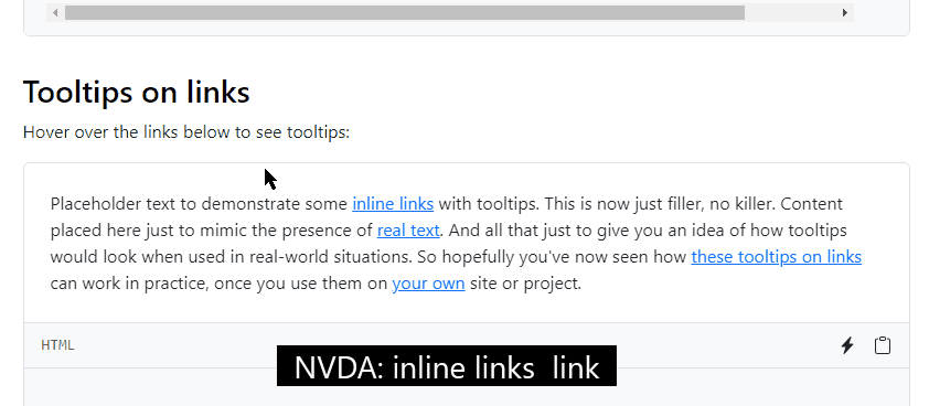
Tooltips are also supplimental; therefore, you should not rely on them to communicate fundamental information to the user.
By “tooltip”, I’m talking about both the default web browser behavior when a mouse cursor hovers over an element with a title attribute and a JavaScript creation that extends that behavior further.
Tooltips are often not perceived by AT and require a mouse-only event, both of which violate Requirement 4.
Even in Bootstrap’s implementation of tooltips (v5.3 as of the writing of this article), none of the text is read by a screen reader:
There are other issues with tooltips that Adam Silver address well in his article “The problem with tooltips and what to do instead”.
Unassociated text
Placing text near where the button is may seem like a good solution, but keeping some text near the relevant control doesn’t ensure AT can perceive it.
Take a look at this example:
<input id="btnSave" type="button" value="Save" />
<div id="saveWarning">
You cannot save until you have entered a Location.
</div>
Which renders like this (yes, I added a little CSS):
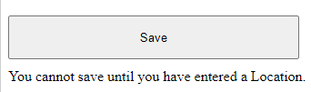
This meets the first three requirements, but not the fourth — that is, an AT user is not likely to perceive it.
If you object and say the AT user can press the down arrow key so that the text will be read, you’re right, they can — but why would they? The submit button has focus and they may have no reason to think anything’s wrong.
Any of these (visual cues, tooltips, or unassociated text) will not work from an accessibility perspective. However, they are still better than disabling a button. These options at least communicate something — just not enough and not to everyone. That’s why we need a different solution.
Conclusion
We now have our requirements for an accessible solution:
- Requirement 1: Prevent the user from performing an action
- Requirement 2: Inform the user that the action cannot be performed
- Requirement 3: Inform the user what needs to happen before the action can be performed
- Requirement 4: Provide the information in an accessible way
Several people had some objections to my last article. Some were reasonable — others, I could tell they didn’t read the whole thing. But that’s ok.
The most common objection had to do with disabling a submit button to prevent an accidental double-click. Instead of going into that, I’ll refer any interested readers to an excellent blog post by Chris Ferdinandi titled “Don’t disable buttons while submitting forms with ajax”.
My next article will include some accessible solutions, but if you read this article closely, I bet you were able to pick up where I’m going.
I understand many people won’t be convinced to quit disabling buttons. After all, there’s likely no specific litigation threat for disabling button because WCAG didn’t forbid it.
Even if I haven’t convinced you, I hope that I’ve helped you to think about your content in a different way — or, at least, reminded you to take into account all types of users and many types of interactive devices and tools used to consume web content.
Progress is progress.
Links
Further reading
- Designing for accessibility is not that hard by Pablo Stanley
- The problem with tooltips and what to do instead by Adam Silver
- Button labels: is “OK” ok? by Tiina Golub
- Front end devs really don’t understand accessibility by Chris Ferdinandi


