
Disabled Controls
Never, ever disable buttons — Do this instead
This is the third and final article on why you should not disable buttons and what to do instead.

Contents
We’ll review the previous articles and go over who I’m writing these articles for and why.
Yes, you can just hide the button. I’ll show you various ways to do that and how some render differently.
Solution 2: The validation method
Use your already-existing client-side validation to inform the user they cannot perform the button’s action and how they can address it.
Solution 3: The help text method
Inform the user with help text. It’s certainly not a flashy solution, but it can fit the bill. I include a variant that somewhat addresses the user’s tendency not to read important text.
Give the user the needed information in a modal. It’s not my favorite solution, but as I’ll show you, it can be extended to give the user a much better experience.
I’ll provide options that are more accessible than disabling buttons, but I’m not comfortable giving my full recommendation. Requirements are king — and sometimes the requirements call for disabled buttons. I’ll show a few solutions for such a case.
Introduction
Review
Below is a quick recap of the previous articles. Feel free to skip to the solutions.
In this entry, I laid out the case for never disabling buttons. It caused far more controversy than I anticipated, but debate is healthy.
Part 2: Requirement for an accessible solution
In this article, I gathered requirements so that we can determine if the solutions are viable. And here they are:
- Requirement 1: Prevent the user from performing an action
- Requirement 2: Inform the user that the action cannot be performed
- Requirement 3: Inform the user what needs to happen before the action can be performed
- Requirement 4: Provide the information in an accessible way
The requirement that I’m going to focus on in this article is Requirement 4. I will assume that you are preventing the user from performing the default functionality of the button. I addressed Requirements 2 and 3 in the previous article. For review, the text you provide should be:
- Visually present: It can be seen in context on a web page by sighted users
- Perceivable by AT: Assistive technology will communicate the text to the user. That is, it won’t be skipped
- Understandable: No jargon, ambiguous terms, or complicated wording
- Actionable: Tell the user exactly what they must do and how. For example, “Enter your Last Name” is better than “Enter valid information” and hyperlinking “Last Name” to that control is better than just the text
So, I’m mostly going to focus on Requirement 4 in this article (or the Perceivable by AT bullet, if you like).
Who’s this for, anyway?
I want to address some points brought up in previous articles (and the comments).
I am not stating (in this article or in the previous ones) that you must use these solutions. You can disable a button and still be compliant with WCAG.
But my goal isn’t to provide compliant solutions — it’s to provide accessible ones.
These articles are geared toward accessibility personnel, designers, developers, etc. that are looking for a more accessible solution than disabling buttons.
Enough of that; let’s get started.

Solution 1: Hide the button
This should be your go-to solution, if possible. This is the simplest, least invasive solution.
I acknowledge that the implementation here really only meets Requirement 1. I’m including it anyway because it is an accessible alternative to disabling buttons. If this isn’t an option for you, feel free to go to the next one.
As I said in Part 2 of this series, you can hide a button like this:
- Add the attribute
hiddento the button element - Give the button a style with
display: none; - Give the button a style with
visibility: hidden;
Use the visibility: hidden; option if removing the button causes unwanted shifts in how the rest of the page displays. All three of these will remove them visibly from the page and will keep assistive technology (AT) from reading them.
When should you use this solution
Hide the button when the user should not be able to perform the action for as long as they are on that page.
In other words, ask this question: Is there anything the user can do on the page that would enable the button? If the answer is no, you should probably hide it.
Here are some scenarios where hiding a button makes sense:
- The button performs an action that the user does not have permissions/rights to perform
- The button performs an action that you do not want available while the user is on the page
- The button performs an action that would cause an error or would be pointless to display (like pagination controls when only one page worth of data is available).
Example
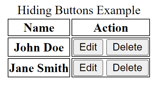
Let’s say you have a table of users. In the “Action” column, you have “Edit” and “Delete” buttons:
<table id="tblUsers">
<caption>Hiding Buttons Example</caption>
  <thead>
    <tr>
      <th scope="col">Name</th>
      <th scope="col">Action</th>
    </tr>
  </thead>
  <tbody>
    <tr>
      <th scope="row">John Doe</td>
      <td>
        <button id="btnEdit01" >Edit</button>
        <button id="btnDelete01" class="deleteBtn">Delete</button>
      </td>
    </tr>
    <tr>
      <th scope="row">Jane Smith</td>
      <td>
        <button id="btnEdit02">Edit</button>
        <button id="btnDelete02" class="deleteBtn">Delete</button>
      </td>
    </tr>
  </tbody>
</table>
As far as styles, I’ve only added a 1px black solid border around the td and th elements to show the behavior of display:none and visibility:hidden.
Here’s how it renders initially:
NOTE: This should go without saying, but you’d want more than styling or even JavaScript to prevent users from performing any action for which they don’t have permission. I’m using this only as an example.
Now, let’s say you don’t want the user to be able to delete. You can use the visibility: hidden style on the delete buttons if removing the button will mess up how your page looks. Notice the second column will not resize to fit its visible contents:
.deleteBtn
{
  visibility: hidden;
}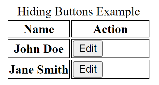
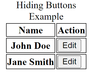
However, if you use display: none, it will resize:
.deleteBtn
{
  display: none;
}
Note: I am aware of visibility: collapse and how it should be used for elements inside a table. However, browsers act differently with this style — which is unfortunate. Check out the Mozilla Web Docs for reference.
If you didn’t want the user to delete or edit, just remove/hide the column altogether.
How visual users perceive it: They don’t How AT reads it: It doesn’t Meets Requirement 4: Not applicable
One last thing, if you’re going to hide the button, hide it for the duration of the user’s time on the page. Don’t hide and then show the button after the user performs an action. If you do, assistive technology (AT) won’t announce to the user that the button is now visible.
Pros
- Easily the simplest solution
- Offers the same experience to all users
- No JavaScript required
- No explanation required
Cons
- Doesn’t inform the user that the functionality exists (which may be a good thing)
- Not a solution for when the user can click the button after performing actions on that page
Solution 2: The validation method
You already have validation in place for invalid entries on form controls, why not just piggyback off that?
When you should use this solution
What if you can’t hide a button, but you already have accessible client-side validation in place? Then, you can use validation to communicate to the user what needs to happen before they can perform the default action of the button.
It’s probably a good solution for buttons that normally trigger validation on a page (like submit buttons) — but probably not a good solution for buttons that don’t, such as pagination or show/hide buttons.
Example
The example below reflects the rendered markup of the validation section. I’m not including the JavaScript for brevity:
<section role="alert" id="sxValidation" hidden
aria-labelledby="alrtHeading">
  <h2 id="alrtHeading">Validation heading</h2>
  <div id="errSummary" >
    <p>Please correct the following before submitting:</p>
    <ul id="lstErrors">
      <li><a href="#chkIAgree">Check the I agree checkbox</a></li>
    </ul>
  </div>
</section>
How visual users perceive it: A validation section that informs the user that they need to check the “I agree” checkbox.
How AT reads it: It reads the <section> element, including the link. It begins reading once it appears (thanks to the role="alert" attribute) :
NVDA:
Validation heading alert Please correct the following before submitting:
Check the I agree checkbox link
list with 1 item Check the I agree checkbox link
Note: This solution does not necessarily give the validation <section> focus. If you want to do that, give the <section> element a tabindex="-1" attribute and cause it to receive focus in JavaScript. A side effect of this is that AT will likely read the entire section twice. I sometimes use tabindex="-1" because I like to put internal links in validation messages to provide shortcuts to the relevant controls. Using tabindex and focusing on that <section> element ensures that the user can easily navigate the links in validation messages.
Meets Requirement 4: Yes. The text is read by AT, and (at least in this example) there is a hyperlink to the relevant control.
Pros
- You don’t have to create anything new (assuming you already have client-side validation in place)
- It provides easy access to the control that user needs to correct
Cons
- It requires JavaScript
- It requires more testing (accessibility, functional, and regression) than simply adding text
- It may not be the best solution for buttons that don’t otherwise trigger validation. For example, I wouldn’t suggest this solution for a “Next” pagination button when the last rows are visible.
Solution 3: The help text method
Let’s say, for whatever reason, you don’t want to hide the button and validation is impractical. How can we inform the user that the action cannot be performed and what they can do to perform it?
You can provide text that informs the user — we’ll call it “help text”.
When you should use this solution
You should use this option when you want to minimize/eliminate the need for JavaScript. This solution is also preferable if the text required to communicate with the user is relatively small. Otherwise, the text could take up some real estate — and I know how some of you feel about that.
Unlike the validation solution, this one works well for buttons, regardless of whether or not they trigger validation.
Example
<label for="txtFName">First Name (required)</label>
<input type="text" id="txtFName" required >

<label for="txtLName">Last Name (required)</label>
<input type="text" id="txtLName" required >

<input type="checkbox" id="chkAgree" required >
<label for="chkAgree"> (required) I agree</label>

<button id="btnSubmit" aria-describedby="descBtnSubmit">
    Submit
</button>

<p id="descBtnSubmit" class="help-text">
    You cannot submit until you have checked the
    <a href="#chkAgree">"I agree" checkbox</a>.
</p>
How visual users perceive it: The help text displays on the page near the button
How AT reads it: With aria-describedby implemented, the help text is typically read after the control and its relevant attributes are described:
NVDA/JAWS (when the button has focus):
Submit button You cannot submit until you have checked the “I agree” checkbox.
Meets Requirement 4: Yes, this is available for both sighted and AT users.
Pros
- A simple solution
- No JavaScript needed
- Consistent across most AT
Cons
- It’s a bit awkward to click an enabled button and nothing happen.
One drawback to this method is that many mouse/keyboard/sighted users will not initially read the text that’s right in front of them. But we can make a little change with a variant of this solution.
Solution 3 Varient: Help text displays on button focus
A few tweaks of the above solution might provide a more usable experience. Here are the tweaks:
- Make the help text invisible by default
- Show the help text (via CSS) when the button has focus
...
<style>
.helpText {
  visibility: hidden;
}

#btnSubmit:focus + .helpText{
  visibility: visible;
}
</style>
...
<button id="btnSubmit" aria-describedby="descBtnSubmit">Submit</button>
<span id="descBtnSubmit" class="helpText">You will not be able to submit this
information until January 1, 2024.</span>
Pros
- Displays help text when relevant (the button has focus), somewhat mitigating user’s tendency not to read ever-present text on a page
aria-describedbyattribute ensures text is read by AT- No JavaScript required
Cons
- Help text goes away once the button loses focus (you can prevent this with JavaScript, of course)
Solution 4: The modal method
Sometimes, you want more text to explain exactly how a user can get the button available again. Perhaps both a validation message and a help text don’t provide adequate real estate for the verbiage needed.
Side note: You should avoid such situations. For most cases, if the text is long, the page is too big (or the controls are too many). Try to keep the number of controls on a single page (or view) to a minimum, if possible.
But, if this is your situation (and I acknowledge that sometimes that’s out of your hands), I recommend a modal.
When you should use this solution
When you’ve exhausted the possibility of the first three solutions, you have a relatively large amount of text that needs to display, and the button is consequential (anything that would cause a database change), then consider using the modal method.
This “vanilla” solution can be tweaked a bit to provide a better experience, but I’ll bring that up after the example.
This method opens a modal on the button click event. It would presumably have the text necessary to inform the user that the action cannot be performed and what (if anything) they can do to perform it.
Example
For this example, I’ll spare you the JavaScript. Essentially, the showModal() function below would prevent the default behavior of the button, show the modal, and give it focus.
<button id="btnSubmit" type="submit" onclick="showModal('btnSubmit')">
  Submit
</button>

...

<section id="dlgBtnSubmit" role="dialog" aria-labelledby="dlgHeading"
  aria-modal="true" tabindex="-1">
  <h2 id="dlgHeading">Your Awesome Modal Heading</h2>
  <p class="modalText">Your even more awesome explanation as to why the
user cannot submit and what they can do to make it happen</p>
</section>
There are a lot of accessibility checks that must be addressed before implementing this method — these include ensuring the Esc key closes the modal, the modal receives focus once opened, and the only elements in the tab order while the modal is open are inside the modal. You can find more information about it on the ARIA Authoring Practices Guide for the Modal pattern.
Extending this solution
You can extend the modal to include input controls. This can be cleverly implemented to provide a bit of a shortcut for the user. Let’s say they needed to provide information in a textbox on a completely different page in order for the button to function.
You could provide those controls in the modal. That would require more work, but the user would be pleasantly surprised that they don’t have to search though the site to find the page or control they need.
In the below hastily thrown-together example, the user attempts to subscribe to a service, but there isn’t an email address associated with the user. Instead of telling the user they have to go back to their profile page, find the Email textbox, and enter a valid address, it’s given to them right here so they can proceed with what they want to do. How considerate of you!
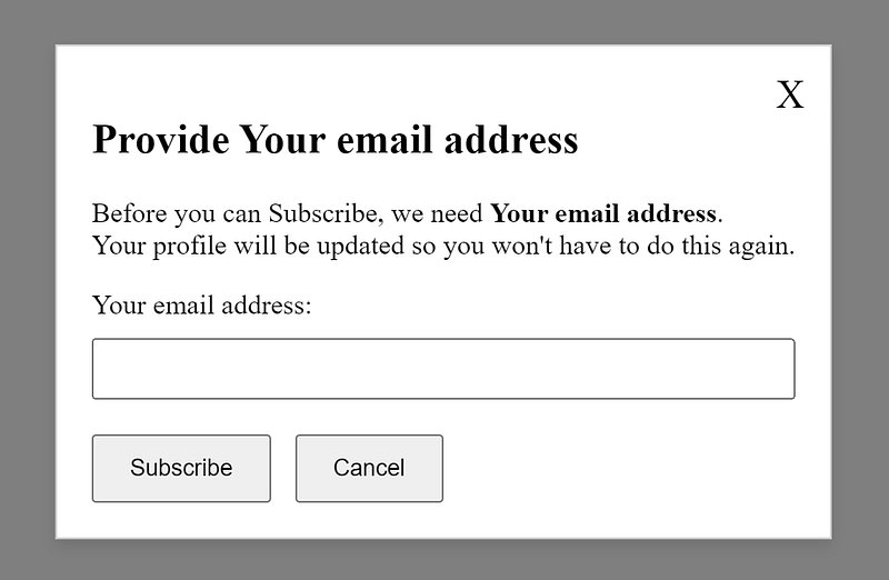
How visual users perceive it: A modal displays showing the relevant message. How AT reads it:
Provide Your email address
heading level 2 Provide Your email address
Close button
Before you can Subscribe, we need Your email address.
Your profile will be updated so you won't have to do this again.
Your email address:
edit required button Subscribe button Cancel
Meets Requirement 4: Yes. If the JavaScript displays the modal and gives it focus — and if the <section> element has the proper attributes as shown above, the text will be read by AT.
Pros
- Real estate is less of an issue than other solutions
- Allows longer explanations, if needed
- You can add controls such as textboxes, buttons, links, etc.
Cons
- Requires JavaScript
- Requires more testing than other solutions
- Not a great solution for all situations
- Unless you implement something similar to the extension example, the user will have to close the modal to correct the issue, which can be a problem for those with memory challenges
Lesser recommended solutions
There are some solutions that I don’t fully recommend as accessible alternatives. Now, any of these (or any combination of them) would still be more accessible than disabling buttons alone. So, if you didn’t like my recommendations so far, feel free to pick up one of these — and that’ll at least get you in the right direction.
Undercooked Solution#1: Tooltips
Tooltips have their own set of problems. Adam Silver lays out several of them in his article “The problem with tooltips and what to do instead”. Tooltips often rely on hover events, they disappear when anything else has focus/hover, and they obscure what’s behind them on the page.
Can you mitigate some of this? Yes, you can! And if you choose this method, you should. But this is just as much (or more) work than the solutions I’ve provided without having to worry about hover events and timing.
If you have to go this route, implement it along with this next “solution”.
Undercooked Solution#2: Parent with a tabindex
This is the solution I’d recommend if (for whatever reason) you absolutely cannot get away from a disabled button. We don’t always get a say in our requirements.
So, we have a disabled button. How can we provide some explanation as to why it’s disabled and what the user can do from here? We’ll utilize the help text method along with giving the parent element a tabindex of zero:
<div id="divSubmit" tabindex="0">
  <button id="btnSubmit" disabled aria-describedby="descBtnSubmit">
    Submit</button>
  <span id="descBtnSubmit" aria-hidden="true">This button will be disabled
    until your request is approved by your supervisor.</span>
</div>
You may be giving me the side-eye right now. Let me explain.
By giving the parent <div> element a tabindex="0" , I am forcing it to be in the tab order. When a AT encounters it, it will read the contents of the <div>. It’ll even read the disabled button (*gasp*)!
If you’re wondering about the aria-hidden="true", that’s a bit of a courtesy addition. You see, implementing this solution without the aria-hidden attribute will cause most AT to read the text of the <span> twice, once to account for the aria-describedby assignment and again for reading the text itself as a child of the <div>. The aria-hidden attribute in this case asks the AT to ignore the <span> — it won’t ignore the aria-describedby assignment.
“But you said never to disable buttons!” Yes, I did — and I stand by that. I also know that we don’t always get a choice in the matter. This solution is better than disabling buttons alone, but it’s certainly not perfect.
This still doesn’t address some of the other issues with disabled buttons like the color contrast or the confusion caused by a button that doesn’t do anything.
If you do choose to go forward with this option, please do the following:
- Remove the
tabindexattribute (or set it to -1) from the<div>element if the button ever becomes enabled - Add a visual cue that communicates that the button’s disabled, such as adding an icon on the button or (better yet) append the button text with “(disabled)”
- You can also give the button the following style:
cursor: not-allowedwhich will change the mouse pointer to a “no” or “ban” cursor when it hovers over the button - Give it a better color contrast than the default style. If you want it to be gray, fine — just don’t make the text gray, too. If you’re not sure, use WebAIM’s Contrast Checker
Undercooked Solution#3: Aria-disabled
There is never a need to use aria-disabled with a button (or with any element, for that matter). Giving a button the disabled attribute already communicates to AT that it’s “unavailable” or “dimmed”. The aria-disabled attribute does the same thing, but without actually disabling the button.
Why would you do that?
Why would you communicate to AT users that a button is disabled but keep it enabled for sighted users?
I honestly can’t think of a scenario where that makes sense. If you think of one, let me know.
Ok, that’s it. Whew!

Conclusion
Thank you all for staying with me on this long journey! I meant for all of this to be one article, not three. Yeesh!
I’ve learned a great deal — in no small part to those of you who reached out asking questions and even engaged in a civil debate. I welcome that.
Even if you’re unconvinced by my solutions/conclusions, I hope I’ve at least steered you in the right direction. If you still want/need to disable your buttons, please consider the tabindex “solution”.
As I stated earlier, my goal is to provide more accessible solutions — not just compliant ones. I’ve tried to provide those in this article and I hope you found something of value.
If you have a solution that I didn’t include, I’d love to know about it — and I know other readers would too.
Links
References
- MDN: CSS — visibility
- W3.org: Dialog (Modal) Pattern
- WebAIM Contrast Checker
- The problem with tooltips and what to do instead by Adam Silver
Further Reading
- Usability Pitfalls of Disabled Buttons, and How to Avoid Them by Vitaly Friedman
- Making Disabled Buttons More Inclusive by Sandrina Pereira
My related articles
- Part 1: Never, ever disable buttons — Why not?
- Part 2: Never, ever disable buttons — Requirements for an accessible solution
- Disabling text boxes: why it’s a bad idea and what to do instead
- Accessibility is misunderstood — let’s fix that
- Communicating accessibility as needs to be met and not rules to be followed


