
Navigating Challenges in Illustrating Rates and Indexes in Power BI Line or Area Charts
Mastering Time-Sensitive Data Visualization in Power BI: A Journey Through Rates and Indexes
PBIX file available for download at the end of this article.
Introduction
Rates and indexes can be very powerful in data analysis, helping us compare phenomena on a same scale. However, visualizing rates or indexes in Power BI line or area charts can be challenging, particularly when it involves freezing values at specific dates for accurate representation.
Rates or indexes often depend on historical values at specific points in time (e.g., stock/asset prices on the earliest date in your data). The main challenge is to ‘freeze’ these historical values in your calculations, despite changing date ranges in your visualizations.
This complexity is not limited to asset prices. In fact, whenever a numerator and denominator of a rate or index calculation are based on different time periods, this challenge often arises. For example, when calculating the employee attrition rate, the norm is to take all the departures over a period, divided by the average number of employees across this period.
The following article explain how you can address this complexity using DAX calculations through the following case study on comparing cryptocurrency price indexes.
Case Study: Comparing Cryptocurrencies’ Price Indexes
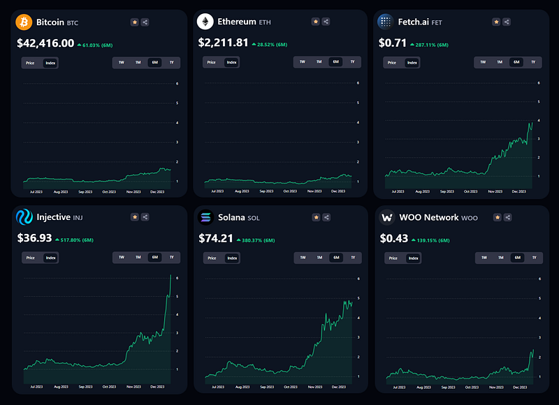
I built the following Power BI report to allow users to assess the performance of selected cryptocurrencies. This report provides a chart view of the price or price index, depending on the user’s selection. Additionally, the time horizon can be adjusted according to their selection (1W, 1M, 6M, 1Y).
Calculating the Price Index for Each Cryptocurrency
The price index offers a valuable perspective as it benchmarks the current value of a cryptocurrency against its initial value, facilitating comparisons across various coins on a uniform scale. This index is dynamic, adjusting according to the user-selected time frame.
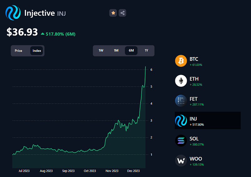
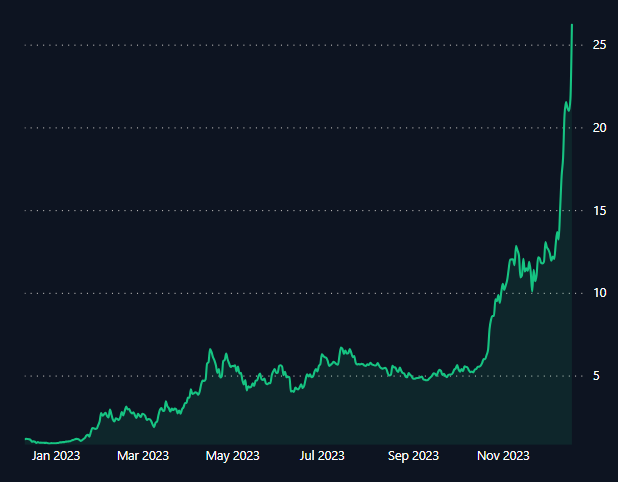
To calculate it, we divide the price of the cryptocurrency on any given day by its price on the earliest date within the selected period. For instance, let’s consider Injective’s price index over a 6-month period, as shown in the provided screenshot. Since this report was generated on December 18, 2023, the starting point (six months prior) is June 18, 2023. On this date, Injective’s price was $5.978 USD.
Initially, the index value is 1, because the starting price is divided by itself (5.978/5.978 = 1). Moving forward, the prices on subsequent dates are divided by this initial price of $5.978 USD to calculate the index. For example, on December 18, 2023, Injective’s price is $36.932 USD. Thus, the index on this date is computed as 36.932/5.978, resulting in an index value of approximately 6.18.
This method ensures a consistent basis for comparison across different cryptocurrencies and timeframes, illustrating how each coin’s value has evolved relative to its initial price.
In the following sections, I will cover how calculating the price index and displaying it on an area chart was achieved in Power BI
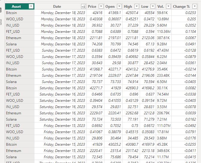
The Data
The data for this report was sourced from Investing.com. I loaded a CSV extract per cryptocurrency in Power BI and created the following table Asset Data.
You can view the CSV extracts as well as the Power Query transformations steps in the folder available for download at the end of this article.
Step 1: Calculating the Maximum and Minimum Dates
The first step was to calculate the maximum and minimum dates for the basis of the index calculations.
Calculating the maximum date was pretty straight forward: I took the most recent value in my dataset:
Maximum Date = MAX('Asset Data'[Date])As I was using a time period slicer, the Minimum Date depended on the user’s selection. Using the Maximum Date, the calculation involved subtracting time based on the selected period. In my case, here were the requirements:
1W: subtract 7 days from theMaximum Date1M: subtract 1 month from theMaximum Date6M: subtract 6 months from theMaximum Date1Y: subtract 1 year from theMaximum Date
I created the following DAX calculation to achieve this:
Minimum Date =
VAR _MaxDate = [Maximum Date]

VAR _SelectedPeriod = SELECTEDVALUE(Period[Period])

VAR _MinimumDate =
    SWITCH(
        TRUE(),
        _SelectedPeriod = "1W", _MaxDate-7,
        _SelectedPeriod = "1M", EDATE(_MaxDate,-1),
        _SelectedPeriod = "6M", EDATE(_MaxDate,-6),
        EDATE(_MaxDate,-12)
    )

RETURN _MinimumDate
For more details on how to create a time period slicer for your Power BI reports, you can read my following article Using Time Periods as Slicers to Enhance Power BI Line or Area Charts’ Range:
Step 2: Calculating the Current Price
The second step involved calculating the current price. To achieve this, I needed to select the price of the selected cryptocurrency at its maximum date.
Note that when referencing dates, we need to freeze the value in the DAX calculation. To do this, we need to store it within a variable and then reference that variation.
Here was the DAX calculation to achieve this:
Current Price =
VAR _MaxDate = [Maximum Date]

VAR _CurrentPrice =
    CALCULATE(
        SUM('Asset Data'[Price]),
        FILTER(
            'Asset Data',
            'Asset Data'[Date] = _MaxDate
        )
    )

RETURN _CurrentPrice
Step 3: Calculating the Price Index
Finally, the most critical step: Calculating the price index.
The most crucial aspect of this calculation is to ensure that the denominator (the price of the selected cryptocurrency at its earliest or minimum date) remains constant across each data point in the line or area chart.
Here is the DAX calculation:
Index =
VAR _MinDate =
    CALCULATE(
        [Minimum Date],
        ALL('Asset Data'[Date])
    )

VAR _MinValue =
CALCULATE(
    CALCULATE(
        SUM('Asset Data'[Price]),
        FILTER(
            'Asset Data',
            'Asset Data'[Date] = _MinDate
        )
    ),
    ALL('Asset Data'[Date])
)

VAR _Index =
    DIVIDE(
        [Current Price],
        _MinValue
    )

RETURN _Index
Let’s break down each part of the calculation for clarity:
1._MinDate Calculation:
VAR _MinDate = CALCULATE([Minimum Date], ALL('Asset Data'[Date]))- This variable calculates the minimum (earliest) date in the ‘Asset Data’ table. The
ALLfunction removes any filters from the 'Date' column, ensuring the calculation considers all dates in the dataset.
2. _MinValue Calculation:
VAR _MinValue = CALCULATE(CALCULATE(SUM('Asset Data'[Price]), FILTER('Asset Data', 'Asset Data'[Date] = _MinDate)), ALL('Asset Data'[Date]))- This variable calculates the total price of the asset on the minimum date. First,
FILTERis used to select rows from 'Asset Data' where the date is equal to_MinDate. Then,SUM('Asset Data'[Price])sums up the prices of the asset on this date. As there is only 1 value per date, it simply returns the selected value. The outerCALCULATE, combined withALL, ensures that the calculation ignores any filters on the 'Date' column.
3. _Index Calculation:
VAR _Index = DIVIDE([Current Price], _MinValue)- This variable calculates the index by dividing the current price of the asset (denoted by
[Current Price]) by the price of the asset on the minimum date (_MinValue). This division gives the index value at each point in time relative to its initial value.
4. Return _Index:
RETURN _Index- Finally, the calculated
_Indexis returned as the result of the entire DAX expression.
The critical aspect of this calculation is the way _MinValue is computed and used. By calculating and 'freezing' the asset price at the minimum date, this value remains constant across all data points in the visualization. This approach ensures that the index at each point in time is calculated relative to a fixed reference point, providing a consistent and meaningful comparison of the asset's price changes over time. This is essential for a line or area chart, where the goal is to visualize the relative change or growth of the asset's value.
Step 4: Creating the Line or Area Chart
The fourth step is the fun part: Creating the Chart!
In my case, I was using an area chart. I first selected this visualization and dragged the Index measure to the Y-axis and the Date column to the X-axis.
Occasionally, the visualization might initially present a date hierarchy view. If this occurs, it’s important to switch it simply to the Date.
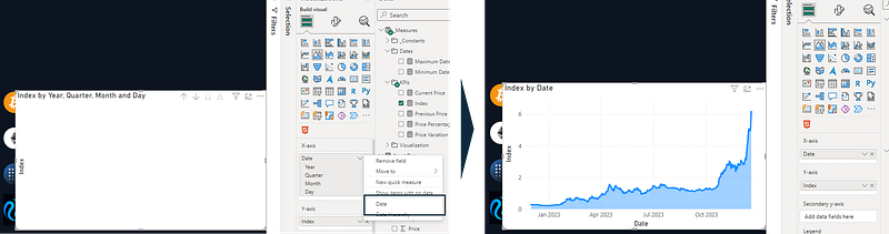
Since my design included a time period slicer, allowing users to choose their preferred analysis timeframe, it was crucial for the X-axis to be adaptable. I accomplished this by aligning the Minimum Date measure with the lower bound of the X-axis range.
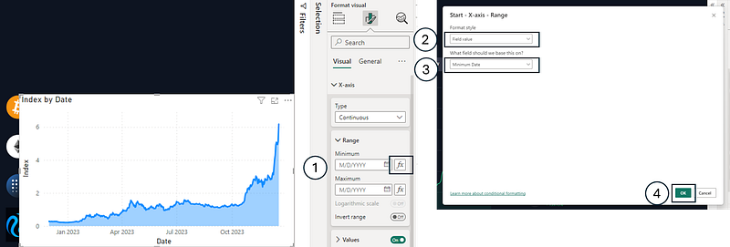
I then applied a few formatting steps to get the desired look and feel:
- Removed the chart’s
Titleas well as the titles of theX-axisandY-axis - Turned
offthe chart’sBackground - Changed the line’s stroke width from
3pxto2px - Changed the Line Type to
Smooth - Adjusted the
Shaded ideafrom60%to90% - Switched the Y-axis values position to have it on the right
Conclusion
Illustrating rates or indexes in Power BI line charts requires careful attention to DAX measures and visualization settings, particularly when dealing with the challenge of freezing values at specific dates. With precise calculations and thoughtful design, you can effectively convey complex financial trends and insights.
You can download my report with all visuals and formatting as displayed in the cover picture of this article here.
Your feedback fuels my content! Engage through comments, and if you find value in such insights, your claps encourage more of this content. Thank you for your readership!
Stay Tuned
Make sure to follow me on Medium to access all my articles on advanced techniques in Power BI visualization.
Connect or Follow Me Here:
Don’t forget to subscribe to
👉 Power BI Publication
👉 Power BI Newsletter
and join our Power BI community
👉 Power BI Masterclass