
Moving Averages And Time Series Data in Excel
Analyzing Time Series data is a common and often important task for Data Analysts. Anywhere you are asked to present historical trends, sales, revenue, demand and seasonality you will be working with Time Series data to build a picture. One great technique is to use Moving Averages to iron out fluctuations in your results.
Let’s take a look at an example problem below involving stock market prices:
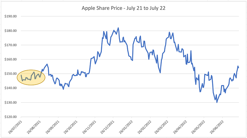
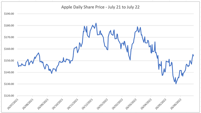
Here we have Apple’s daily stock price between July 2021 to July 2022 downloaded from Yahoo Finance. You can access the data file at the following link:
We can see the share price move up or down every day, but it is a difficult chart to read given the constant fluctuations in daily price, if we look at a small date period for example the 3 weeks highlighted in Yellow below, it’s almost impossible to determine the average price or any trend by looking at this daily chart.
But there is a solution to this!
What we need to do is smoothen the line graph and produce what is called a Moving Average, a helpful way of filtering out the “noise” in our data so we can identify trends and movements more easily. There is more than 1 type of Moving Average, for the purpose of this example we will focus on Simple Moving Averages (SMA)
How do we create a Moving Average?
A moving average is essentially the mean average of a time period over any given length of time, usually 1 week, 4 weeks, 1 month or even 3 months are common examples.
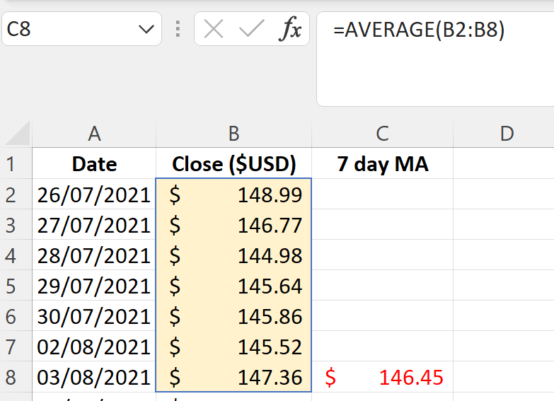
To create a moving average for say 1 week, in Excel all we need to do is use a formula that averages 7 days' worth of daily data starting from the 7th day. The AVERAGE formula below takes the 7 days from 26/07/21 to 03/08/21 inclusive and gives us a Mean Average.
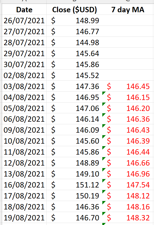
We now want to drag this average all the way down our data set.
With this new column in Red (our 7-day moving average) we can now plot a new series which looks like this:
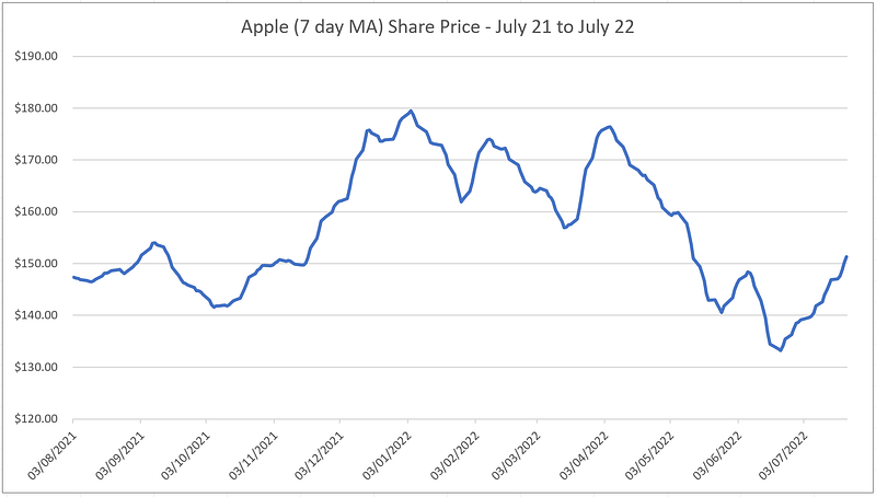
Our results show a much smoother graph vs the daily graph we had previously below. The chart is a lot easier to read, and daily movements have been ironed out into a 7-day trend which becomes a lot clearer to understand
We can go even further and produce a Moving Average chart over 30 days or 60 days or 90 days, this will give us an even smoother and flatter line, generally speaking for a 12-month data set a 30-day moving average will give us the best result, anything more and the line graph will appear too flat.
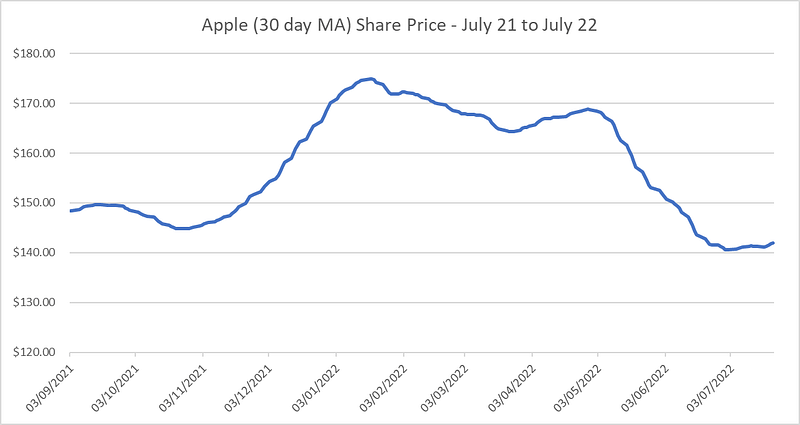
The above chart now shows us that Apple’s share price had risen in early 2022 but fell back down to pre-2022 levels from May 2022 onwards on a Moving Average basis.
Next time we will look at Weighted Averages and how useful they can be in analysing data.
Please follow and subscribe for more Data Analysis techniques and content if you like this article, thank you.
For more check out: