
More than a Christmas Card
Weird or wonderful? Is this famous Byzantine Icon just a poorly painted throwback or simply way ahead of its time?
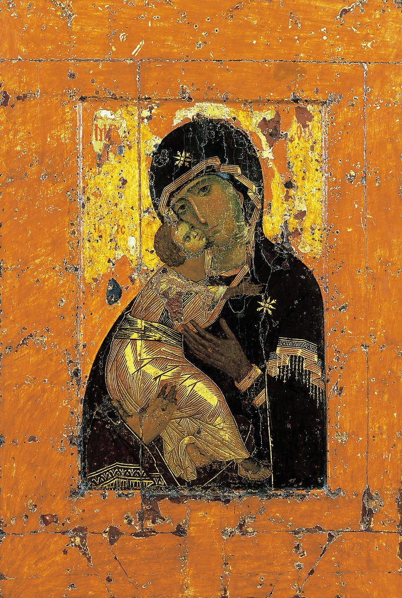
The Virgin Eleousa of Vladimir was painted in the early 1100s and it’s one of the most famous, and most copied, Christian icons depicting the subject of the Holy Mother and Child. It originated in Constantinople, then the capital of the Byzantine Empire. In the 1130s it was gifted by the Church to Yuri Dolgorukiy, a Grand Prince of Russia. It was displayed in the city of Vladimir from 1155 until 1395 when it was moved to Moscow.
Moscow had been under Tartar oppression for 17 years, yet on the day that the icon arrived in the city, they withdrew and ended the siege. The icon was given credit for this and was proclaimed to be “the protector of Russia”, becoming the most venerated icon of the Orthodox Russian Church.
This is a clear example of the great cultural significance that can be generated by a single piece of art, and also how art embodies and perpetuates the ideals of the culture that values it. It is the concept behind a work that gives it value beyond its material worth.
This artefact has certainly done its job as an icon! It’s worshipped for what it represents and many people are profoundly moved in its presence. It became a ‘template’ for later icon painters, including Andrei Rublev who rendered his version of the Theotokos of Vladimir in 1405. Many art historians comment on the advances in art represented by this work, whilst others see it as a throwback.
Its supporters point out the formal flatness that foreshadows many Modern works by the likes of Gaugin and Matisse. The white curved shape formed by the shroud of the baby Jesus perfectly balances the black robe of mother Mary, reminiscent of the oriental yin-yang symbol of harmony. The face of Mary, though simple, does express a melancholic tenderness and the response of Jesus is touching — though to the modern eye, his adult face detracts. (It was traditional to attempt to express the wisdom of Jesus by giving him a gown-up head, even when shown as a baby, but the result can be rather uncanny.)
In terms of anatomical observation, the proportioning is inhuman and the postures of both Mary and Jesus are forced and awkward. The positioning of both faces within their cranial frames is distorted, as are the shape and size of the hands. More than once during my lectures, students have noted that the baby resembles a banana wrapped in bandages and often ask if the lady is wearing a crash helmet…
This is far from the observed naturalism of Classical figures we see more than six centuries earlier. But perhaps the artist intended to make these figures look non-human, to emphasise how different they were from the everyday folk, who were the very embodiment of sin according to many church doctrines at the time. This distortion of the human form, in order to express a concept, is a key tool used by many Modern artists, as seen in typical portraits by Pablo Picasso, nearly nine centuries later...
Some readers may recognise Mary’s left eye as the logo for the Icon Productions film company and, whether you like the image or not, don’t be surprised if you see it on a Christmas card!
a version of this article first appeared in my book, Evolution of Western Art (questing beast books, 2012)


