Mastering Aesthetics in Obsidian
In the realm of digital organization and note-taking, I recently stumbled upon a post by PKM Beth that sparked my curiosity.
Her article is about a 12-month project to delve into historical centuries. What immediately sparked my curiosity was the beautiful page layout she created in Capacities. It left me wondering whether I could replicate this aesthetics and functionality using Obsidian?
As I delved into the visual details of the page Beth created, I identified three distinct elements that make up her page design:
- A banner image that sets the tone for the content below.
- A two-column layout: On one side, collapsible categories offer a neatly organized repository of links for deep dives into specific subpages, while the opposite column presents an engaging image related to the content.
- A grid of 12 cards, each representing a century, offering a visually appealing metaphor to dive into the chronological exploration of history.
By default, Obsidian’s standard setup doesn’t support these features — banner images, multi-column layouts, and card grids remain beyond its default capabilities. However, the beauty of Obsidian lies in its versatility and the power of customization. With the application of one custom themes provided by the Obsidian community and a handful of CSS snippets, I achieved a layout that mirrors the elegance and structure of Beth’s Capacities page.
I basically went from

to
In this article, I will describe what I did to mimic the work done by PKM Beth.
The necessary steps were
- Crafting Unique Images
- Implementing a Captivating Banner Image
- Designing a Two-Column Layout
- Creating a Grid of Historical Cards
Crafting Unique Images
To create the images, I used the paid version of ChatGPT-4 that now includes DALL-E3. To create images for the various centuries was as easy as submitting the following prompt:
create an image representing the X. century in 16:9 formatOf course, it is also possible to tweak the images using a more elaborate prompt, but for the purpose of this experiment the results were good enough.
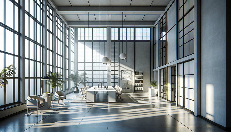
To add a personal touch to the banner images, I aimed for images of modern office aesthetic with muted colors also in the 16:9 ratio. Here, some more retries were necessary until I got the images I wanted.
Implementing a Captivating Banner Image
To implement a banner image functionality, I used TfTHacker’s CSS snippet for Obsidian that creates Notion-like banner images without plugins. It can be found here:
I installed the snippet in the appropriate folder and enabled it under “Appearance/CSS snippets” in the Obsidian settings. I also increased the banner-height to 200px using the Style Settings plugin.
If the image used for the banner is higher than the configured banner-height, the CSS snippet always displays the center part of the banner image. However, I wanted to display a part of the image below the center position. I therefore added a small CSS snippet banner-pos.css that allows to set the starting y-position of the image.
This can be done by using one of the y-positions predefined in the snipped. The value py-0 sets the start position to the top of the image, py-10 to 10% under the top, py-20 to 20% and so on. Here is the CSS-snipped I implemented to achieve that:
.banner-image img[alt*="py-0"] {
 object-position: center 0%;
}

.banner-image img[alt*="py-10"] {
 object-position: center 10%;
}

.banner-image img[alt*="py-20"] {
 object-position: center 20%;
}

.banner-image img[alt*="py-30"] {
 object-position: center 30%;
}

.banner-image img[alt*="py-40"] {
 object-position: center 40%;
}

.banner-image img[alt*="py-50"] {
 object-position: center 50%;
}

.banner-image img[alt*="py-60"] {
 object-position: center 60%;
}

.banner-image img[alt*="py-70"] {
 object-position: center 70%;
}

.banner-image img[alt*="py-80"] {
 object-position: center 80%;
}

.banner-image img[alt*="py-90"] {
 object-position: center 90%;
}
The banner image of my sample page positions the image at 60% of its container. The required code is a simple callout that looks like.
> [!banner-image] ![[Office12.png|py-60]]
>
The cssclasses property of the sample file has to include the value banner-image to work. I show the full source including the set of properties required at the end of this post.
Designing a Two-Column Layout
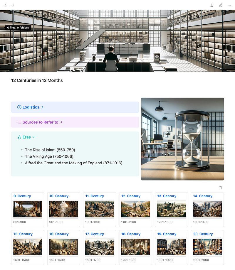
Under the banner image, Beth’s layout uses a two-column layout. One column displays collapsible categories filled with links, and the other shows an image.
At first, I was tempted to use the Multi-Column Markdown plugin, but that seemed like an overkill for the task. The use of Markdown tables did not work, since callouts in cells are not supported. So I went with an approach similar to the banner-image by TfTHacker. That solution does not implement a full-blown multi-column system! Instead, it provides just a simple method for placing an image next to an area of Markdown content.
The solution uses a simple custom callout with the type-identifier img-float. The title of the callout is an embedding of the image, the content of the callout is the area that is rendered on the left side of the image. The width of the image column can be set by setting the metadata of the callout itself. Here is the code I used for the sample:
> [!img-float|pr-40] ![[Hourglass8.png]]
>> [!info]- Logistics
>> ![[Logistics]]
>
>> [!Example]- Sources to Refer to
>> ![[Sources]]
>
>> [!Tip]- Eras
>> ![[Eras]]- img-float is the type-identifier of the callout
- pr-40 states that the right side containing the image shall take up 40% of the whole callout. The content then takes 60%.
- Hourglass8.png is the image I want to embed and place on the right side
- The rest of the code just creates 3 regular callouts inside the img-float callout
The rendering is achieved with a simple CSS snippet img-float.css that has to be placed in the snippets directory of Obsidian and must be activated like the banner-image.css. Here is the CSS-code:
/* The callout uses a CSS grid */
.img-float.markdown-preview-view [data-callout="img-float"] {
   display: grid;
   column-gap: 10px;
   height: auto;
   align-items: stretch;
   grid-template-columns: 50% 50%; /* Default value */
   grid-template-areas: "content title";
   background: transparent;
   padding: 0;
}

/* Place the direct child .callout-title-container to the right and set its width */
.img-float.markdown-preview-view [data-callout="img-float"] > .callout-title {
   grid-area: title;
}

/* Make the direct child .content take up all remaining space */
.img-float.markdown-preview-view [data-callout="img-float"] > .callout-content {
   grid-area: content;
   vertical-align: top;
}

/* Hide .icon inside direct child .title-container of div with data-type="pr" */
.img-float.markdown-preview-view [data-callout="img-float"] > .callout-title > .callout-icon {
   display: none;
}

/* Set the height of the image container */
.img-float.markdown-preview-view [data-callout="img-float"] > .callout-title > .callout-title-inner{
   height: 100%;
}

/* The title image */
.img-float.markdown-preview-view [data-callout="img-float"] > .callout-title img {
   display: block; /* Ensures that it can be centered */
   object-fit: cover;
   align-self: center;
   max-height: 100%; /* Limit height to parent's height */
   max-width: 100%; /* Ensure it doesn't overflow */
   height: 100%; /* Maintain aspect ratio */
   width: auto; /* Maintain aspect ratio */
   margin: auto; /* Center the image */
}

/* Sizing properties for the areas */
.img-float.markdown-preview-view [data-callout="img-float"][data-callout-metadata="pr-10"] {
   grid-template-columns: 90% 10%;
}

.img-float.markdown-preview-view [data-callout="img-float"][data-callout-metadata="pr-20"] {
   grid-template-columns: 80% 20%;
}

.img-float.markdown-preview-view [data-callout="img-float"][data-callout-metadata="pr-30"] {
   grid-template-columns: 70% 30%;
}

.img-float.markdown-preview-view [data-callout="img-float"][data-callout-metadata="pr-40"] {
   grid-template-columns: 60% 40%;
}
Creating a Grid of Historical Cards
To implement a grid of cards, I use the Obsidian Minimal theme. This theme provides some additional CSS helper classes that create a grid of cards from a Dataview query.
So all I had to do was to create notes for every single century and add the properties
- banner — with the link to the image representing the century,
- start — with the start date of the century and
- end — with the end date of the century to each of the notes.
In addition to that, a tags property is used for identifying the note as a note for a historical century. This is later used in the Dataview query to select the notes.
Here is the 19. Century as an example:
---
...
tags:
	- type/century
start: 1801-01-01
end: 1900-12-31
banner: "![[19_Century.png]]"
---
The overview page then only has to create a Dataview query that collects these properties for the centuries to display.
table
banner,
(start.year + "-" + end.year) as "Span"
from #type/century and !"90 System"
sort start
To display the result as a grid of cards, the cssclasses property of the overview note has to contain a value cards. Since I want to display 6 cards in one row, I also added the value cards-cols-6. The list of properties supported by the Minimal theme can be found in the documentation
Conclusion
Obsidian is not focussed on creating aesthetically pleasing notes. It lacks possibilities, that other note-taking, like Capacities, have to support that. However, using the Minimal theme, the Dataview plugin and some simple CSS snippets, it is possible to enhance the look of the notes quite a bit.
The source for a note that mimics the Capacities page of PKM Beth is quite simple:
---
cssclasses:
  - banner-image
  - img-float
  - cards
  - cards-cols-6
---
>[!banner-image] ![[Office12.png|py-60]]

> [!img-float|pr-40] ![[Hourglass8.png]]
> >[!info]- Logistics
> >![[Logistics]]
>
>> [!Example]- Sources to Refer to
>> ![[Sources]]
>
>> [!Tip]- Eras
>> ![[Eras]]

---dataview
table
banner,
(start.year + "-" + end.year) as "Span"
from #type/century and !"90 System"
sort start
---
If you like to see the complete vault I created for this demo, you can visit the corresponding project on Github.


