
Master Data Visualization with Python Bar Chart: Tips, Examples, and Techniques #4

Table of Contents:
1. Introduction 1.1 What is a Bar Chart? 1.2 When to Use a Bar Chart 1.2.1 Compare Quantities or Values Across Different Categories 1.2.2 Display Changes or Trends in Data Over Time 1.2.3 Visualize the Distribution of a Single Category 1.3 Python Libraries with Bar Chart Functionality 1.3.1 Using Matplotlib 1.3.2 Using Seaborn (built on Matplotlib) 1.3.3 Using Plotly 1.3.4 Using Pandas
2. Creating Bar Charts with Python — Scenario 1: Sales Performance Comparison — Scenario 2: Student Grades Comparison — Scenario 3: Monthly Expenses Comparison — Scenario 4: Product Sales Comparison — Scenario 5: Temperature Comparison
3. Practical Tips for Customizing Bar Charts 3.1 Customizing Colors and Styles 3.2 Handling Labels and Annotations 3.3 Adjusting Bar Width and Spacing 3.4 Managing Axis Limits and Scale
4. Advanced Topics in Bar Charts 4.1 3D Bar Charts 4.2 Bar Charts with Error Bars 4.3 Advanced Bar Chart Types — Stacked Bar Chart Example — Horizontal Bar Chart Example 4.4 Grouped Bar Chart with Multiple Categories
5. FAQ 5.1 Commonly Asked Interview Questions 5.2 Practical Advice for Data Scientists
6. Interview Question about Bar Charts for Data Scientists 6.1 Commonly Asked Interview Questions 6.2 Practical Advice for Data Scientists
7. Explore Additional Data Visualization Resources
1. Introduction to Bar Charts
1.1 What is a Bar Chart?
A bar chart is a fundamental data visualization tool that uses rectangular bars to represent data. Each bar’s length or height is proportional to the value it represents. Bar charts are effective for comparing values across different categories or showing trends within a single category.
1.2 When to Use a Bar Chart
1.2.1 Compare Quantities or Values Across Different Categories Bar charts are particularly useful when you need to compare the magnitudes or quantities of different categories or groups. Here are some common scenarios:
- Product Sales: Compare the sales figures of different products, where each product is a category, to identify top performers.
- Market Share: Visualize the market share of various companies in an industry or sector.
- Survey Responses: Display the frequency of responses to a survey question with multiple answer options.
- Demographic Data: Compare population statistics, such as age groups or income brackets, across different regions or countries.
1.2.2 Display Changes or Trends in Data Over Time Bar charts can be employed to show changes or trends in data over time when you have discrete time intervals or categories. Here are some examples:
- Monthly Revenue: Display the monthly revenue of a business over the past year to observe seasonal trends.
- Quarterly Sales Growth: Compare quarterly sales figures over multiple years to identify growth or decline trends.
- Website Traffic by Day: Analyze daily website traffic data to understand usage patterns.
- Student Performance: Compare the performance of students in different subjects over several semesters.
1.2.3 Visualize the Distribution of a Single Category In some cases, bar charts are used to visualize the distribution of a single category or variable. This can be particularly effective when dealing with categorical data. Examples include:
- Frequency Distribution: Display the frequency of different types of customer complaints or defects in a manufacturing process.
- Product Categories: Visualize the distribution of products in a store by category, such as the number of electronics, clothing items, or groceries.
- Grade Distribution: Show the distribution of grades received by students in a class, indicating the number of A’s, B’s, C’s, etc.
- Customer Preferences: Display the preference of customers for different types of services or products, such as preferred payment methods or favorite food items.
Bar charts are versatile and widely applicable because they provide a clear and intuitive way to compare data across different categories or time intervals. However, it’s essential to choose the right type of chart for your specific data and objectives, as there are situations where other types of visualizations, like line charts or pie charts, may be more suitable. Always consider the nature of your data and the story you want to convey when deciding whether to use a bar chart.
1.3 Python Libraries with Bar Chart Functionality
Python offers various libraries to create bar charts:
1.3.1 Using Matplotlib:
import matplotlib.pyplot as plt

# Sample data
categories = ['Category A', 'Category B', 'Category C']
values = [10, 15, 7]
# Create a bar chart
plt.bar(categories, values)
# Add labels and title
plt.xlabel('Categories')
plt.ylabel('Values')
plt.title('Matplotlib Bar Chart')
# Show the chart
plt.show()
1.3.2 Using Seaborn (built on Matplotlib):
import seaborn as sns
import matplotlib.pyplot as plt

# Sample data
data = {
    'Category': ['A', 'B', 'C'],
    'Value': [10, 15, 7]
}
# Create a Seaborn bar chart
sns.barplot(x='Category', y='Value', data=data)
# Add labels and title
plt.xlabel('Categories')
plt.ylabel('Values')
plt.title('Seaborn Bar Chart')
# Show the chart
plt.show()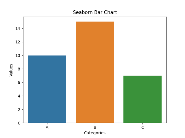
1.3.3 Using Plotly:
import plotly.express as px

# Sample data
data = {'Category': ['A', 'B', 'C'], 'Value': [10, 15, 7]}
# Create an interactive Plotly bar chart
fig = px.bar(data, x='Category', y='Value', title='Plotly Bar Chart')
# Show the chart
fig.show()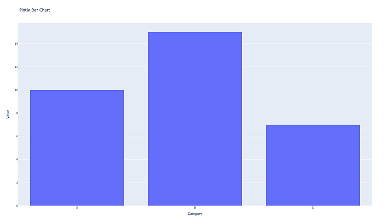
1.3.4 Using Pandas:
import pandas as pd
import matplotlib.pyplot as plt

# Sample DataFrame
data = pd.DataFrame({'Category': ['A', 'B', 'C'], 'Value': [10, 15, 7]})
# Create a Pandas bar chart directly from the DataFrame
data.plot(kind='bar', x='Category', y='Value', legend=False)
# Add labels and title
plt.xlabel('Categories')
plt.ylabel('Values')
plt.title('Pandas Bar Chart')
# Show the chart
plt.show()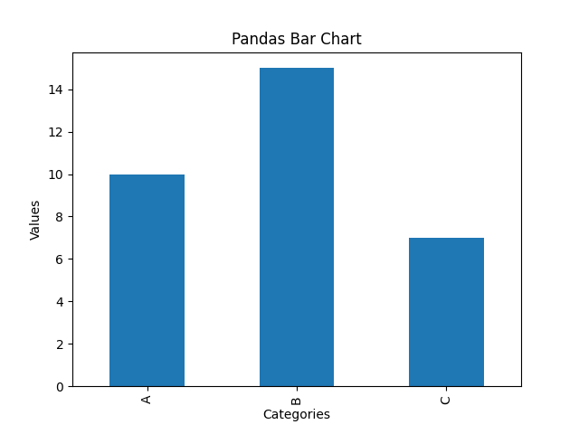
These examples showcase how to create bar charts using Matplotlib, Seaborn (which is built on Matplotlib), Plotly for interactive charts, and Pandas directly from a DataFrame. You can further customize and enhance these charts as needed for your specific data and visualization requirements.
2. Creating Bar Charts with Python
Scenario 1: Sales Performance Comparison
Imagine you work for a retail company, and you want to compare the sales performance of different products in the last quarter. You have collected data on the total sales revenue for three different products (Product A, Product B, and Product C) for each month in the quarter (January, February, and March).
import matplotlib.pyplot as plt

# Data for sales revenue for each product and month
products = ['Product A', 'Product B', 'Product C']
months = ['January', 'February', 'March']
sales_data = {
    'Product A': [50000, 60000, 75000],
    'Product B': [60000, 55000, 72000],
    'Product C': [55000, 58000, 71000]
}
# Create a bar chart
fig, ax = plt.subplots(figsize=(10, 6))
# Set the width of the bars
bar_width = 0.2
# Create a list of x positions for the bars
x = range(len(months))
# Create bars for each product
for i, product in enumerate(products):
    # Offset the x position for each product's bars
    offset = i * bar_width
    plt.bar([pos + offset for pos in x], sales_data[product], bar_width, label=product)
# Set the x-axis labels
plt.xlabel('Months')
plt.xticks([pos + bar_width for pos in x], months)
# Set the y-axis label
plt.ylabel('Sales Revenue')
# Set the chart title
plt.title('Sales Performance Comparison for Q1 2023')
# Add a legend
plt.legend()
# Show the chart
plt.tight_layout()
plt.show()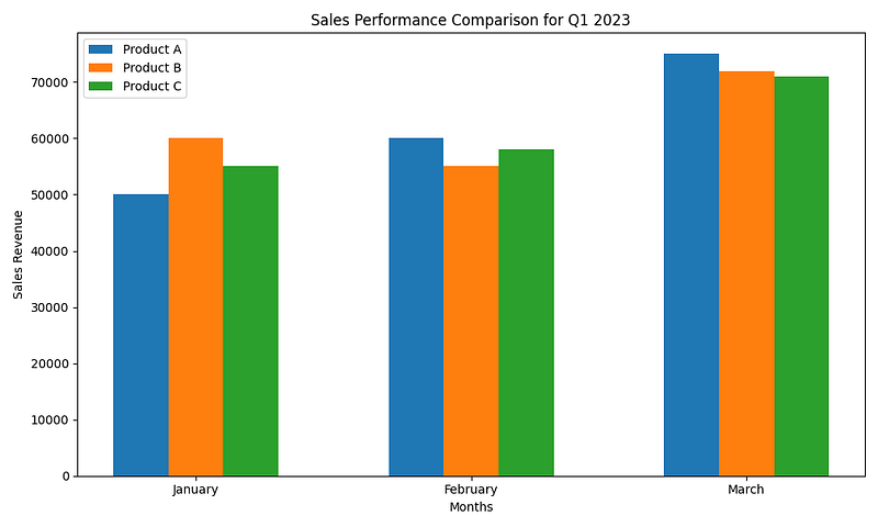
Scenario 2: Student Grades Comparison
In this scenario, you want to compare the final grades of three different classes (Class A, Class B, and Class C) for a particular subject. You have collected the average final grades for each class.
import matplotlib.pyplot as plt

# Data for average final grades for each class
classes = ['Class A', 'Class B', 'Class C']
average_grades = [85, 78, 92]
# Create a bar chart
fig, ax = plt.subplots(figsize=(8, 5))
# Create bars for each class
plt.bar(classes, average_grades, color=['blue', 'green', 'orange'])
# Set the y-axis label
plt.ylabel('Average Final Grade')
# Set the chart title
plt.title('Comparison of Average Final Grades by Class')
# Display the grades on top of the bars
for i, grade in enumerate(average_grades):
    plt.text(i, grade + 1, str(grade), ha='center', va='bottom')
# Show the chart
plt.tight_layout()
plt.show()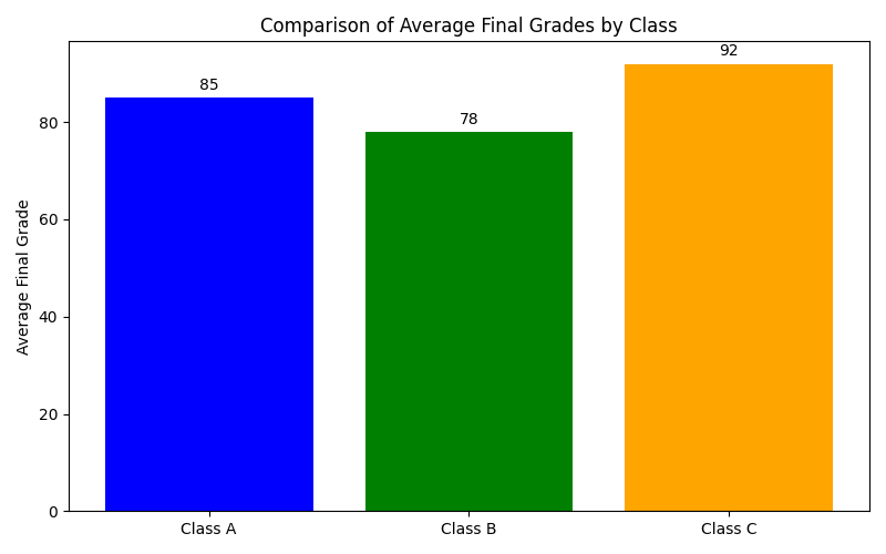
Scenario 3: Monthly Expenses Comparison
Suppose you want to compare your monthly expenses for different categories (e.g., Rent, Groceries, Transportation, Entertainment) over a span of three months (January, February, and March).
import matplotlib.pyplot as plt
import numpy as np

# Data for monthly expenses
categories = ['Rent', 'Groceries', 'Transportation', 'Entertainment']
months = ['January', 'February', 'March']
expenses_data = {
    'Rent': [1200, 1200, 1200],
    'Groceries': [300, 350, 320],
    'Transportation': [150, 160, 140],
    'Entertainment': [100, 120, 90]
}
# Create a grouped bar chart
fig, ax = plt.subplots(figsize=(10, 6))
# Set the width of the bars
bar_width = 0.2
index = np.arange(len(months))
# Create bars for each category and month
for i, category in enumerate(categories):
    plt.bar(index + i * bar_width, expenses_data[category], bar_width, label=category)
# Set the x-axis labels
plt.xlabel('Months')
plt.xticks(index + (len(categories) - 1) * bar_width / 2, months)
# Set the y-axis label
plt.ylabel('Expenses (in USD)')
# Set the chart title
plt.title('Monthly Expenses Comparison')
# Add a legend
plt.legend()
# Show the chart
plt.tight_layout()
plt.show()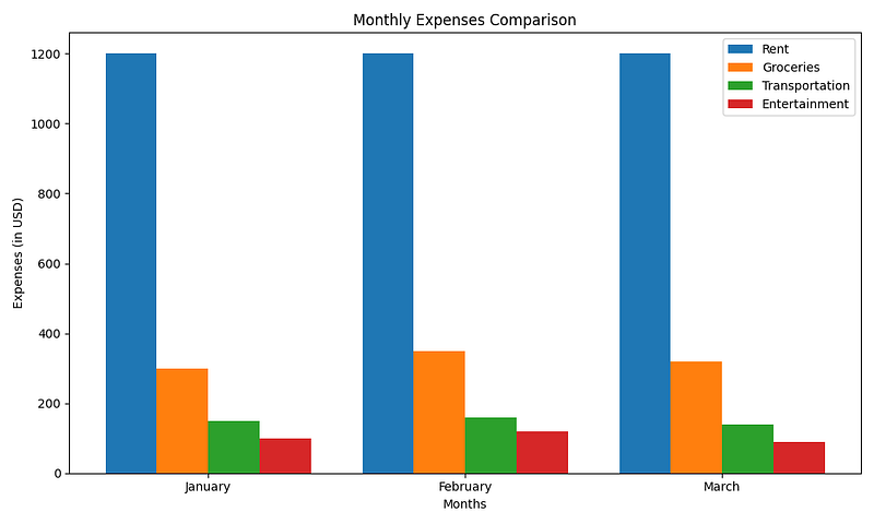
Scenario 4: Product Sales Comparison
You are an e-commerce business owner who wants to compare the sales of two different products (Product X and Product Y) in different regions (East, West, North, South).
import matplotlib.pyplot as plt
import numpy as np

# Data for product sales in different regions
products = ['Product X', 'Product Y']
regions = ['East', 'West', 'North', 'South']
sales_data = {
    'Product X': [50000, 60000, 55000, 48000],
    'Product Y': [45000, 58000, 52000, 51000]
}
# Create a stacked bar chart
fig, ax = plt.subplots(figsize=(10, 6))
# Set the width of the bars
bar_width = 0.5
index = np.arange(len(regions))
# Initialize a variable to keep track of the bottom position for each product
bottom = np.zeros(len(regions))
# Create stacked bars for each product and region
for product in products:
    plt.bar(index, sales_data[product], bar_width, label=product, bottom=bottom)
    bottom += sales_data[product]
# Set the x-axis labels
plt.xlabel('Regions')
plt.xticks(index, regions)
# Set the y-axis label
plt.ylabel('Total Sales')
# Set the chart title
plt.title('Product Sales Comparison by Region')
# Add a legend
plt.legend()
# Show the chart
plt.tight_layout()
plt.show()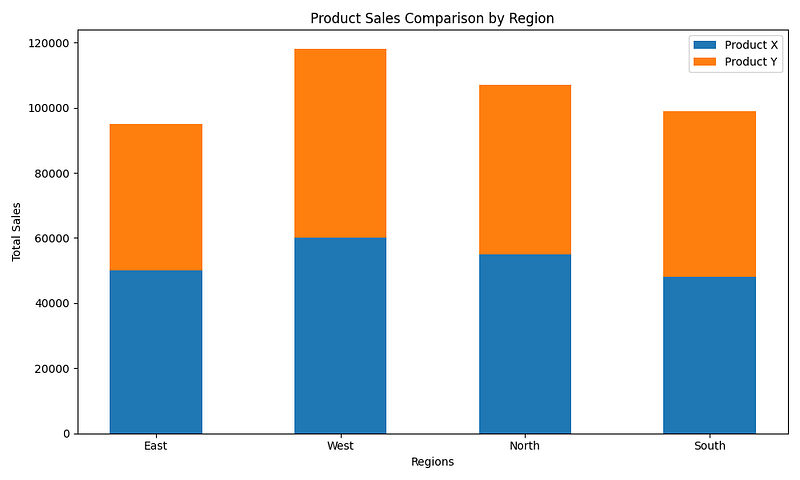
Scenario 5: Temperature Comparison
In this scenario, you want to compare the average daily temperatures in two cities (City A and City B) over the course of a week.
import matplotlib.pyplot as plt

# Data for average daily temperatures in Celsius
cities = ['City A', 'City B']
days_of_week = ['Monday', 'Tuesday', 'Wednesday', 'Thursday', 'Friday', 'Saturday', 'Sunday']
temperature_data = {
    'City A': [20, 22, 21, 24, 23, 22, 21],
    'City B': [19, 23, 20, 22, 25, 24, 20]
}
# Create a side-by-side bar chart
fig, ax = plt.subplots(figsize=(10, 6))
# Set the width of the bars
bar_width = 0.35
index = range(len(days_of_week))
# Create side-by-side bars for each city and day of the week
for i, city in enumerate(cities):
    plt.bar([pos + i * bar_width for pos in index], temperature_data[city], bar_width, label=city)
# Set the x-axis labels
plt.xlabel('Days of the Week')
plt.xticks([pos + bar_width / 2 for pos in index], days_of_week)
# Set the y-axis label
plt.ylabel('Average Temperature (°C)')
# Set the chart title
plt.title('Temperature Comparison between City A and City B')
# Add a legend
plt.legend()
# Show the chart
plt.tight_layout()
plt.show()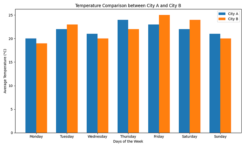
3. Practical Tips for Customizing Bar Charts
3.1 Customizing Colors and Styles
Choose Appropriate Colors for Your Bars
import matplotlib.pyplot as plt

# Sample data
categories = ['Category A', 'Category B', 'Category C']
values = [10, 15, 7]
# Define custom colors for bars
colors = ['red', 'green', 'blue']
# Create a bar chart with custom colors
plt.bar(categories, values, color=colors)
# Add labels and title
plt.xlabel('Categories')
plt.ylabel('Values')
plt.title('Bar Chart with Custom Colors')
# Show the chart
plt.show()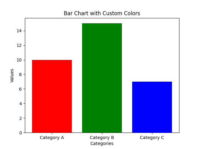
Explanation: In this example, custom colors (red, green, blue) are chosen for the bars to make the chart visually appealing and distinguishable.
Utilize Color Palettes to Enhance Aesthetics
import seaborn as sns
import matplotlib.pyplot as plt

# Sample data
data = {
    'Category': ['A', 'B', 'C'],
    'Value': [10, 15, 7]
}
# Use a color palette from Seaborn
colors = sns.color_palette('pastel')
# Create a bar chart with the color palette
sns.barplot(x='Category', y='Value', data=data, palette=colors)
# Add labels and title
plt.xlabel('Categories')
plt.ylabel('Values')
plt.title('Bar Chart with Color Palette')
# Show the chart
plt.show()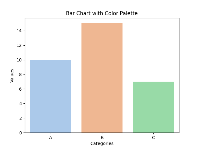
Explanation: Here, we use Seaborn’s color palette (‘pastel’) to apply a pleasing and harmonious color scheme to the bars.
3.2 Handling Labels and Annotations
Add Data Labels to Bars for Clarity
import matplotlib.pyplot as plt

# Sample data
categories = ['Category A', 'Category B', 'Category C']
values = [10, 15, 7]
# Create a bar chart
plt.bar(categories, values)
# Add data labels above each bar
for i, v in enumerate(values):
    plt.text(i, v + 0.5, str(v), ha='center', va='bottom')
# Add labels and title
plt.xlabel('Categories')
plt.ylabel('Values')
plt.title('Bar Chart with Data Labels')
# Show the chart
plt.show()
Explanation: In this example, data labels (values) are added above each bar to provide clarity and make it easier for the audience to interpret the chart.
Use Annotations to Provide Additional Context
import matplotlib.pyplot as plt

# Sample data
categories = ['Category A', 'Category B', 'Category C']
values = [10, 15, 7]
# Create a bar chart
plt.bar(categories, values)
# Add an annotation
plt.annotate('Important Event', xy=(1, 15), xytext=(0.5, 18),
             arrowprops=dict(facecolor='black', shrink=0.05),
             )
# Add labels and title
plt.xlabel('Categories')
plt.ylabel('Values')
plt.title('Bar Chart with Annotation')
# Show the chart
plt.show()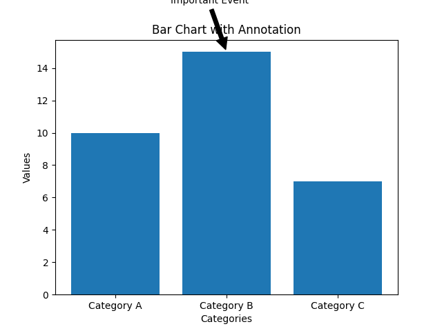
Explanation:
In this example, an annotation is added to the chart to provide additional context or highlight specific data points (e.g., an important event) using plt.annotate. An arrow with a description points to a specific bar.
3.3 Adjusting Bar Width and Spacing
Control Bar Width for Emphasis
import matplotlib.pyplot as plt

# Sample data
categories = ['Category A', 'Category B', 'Category C']
values = [10, 15, 7]
# Create a bar chart with custom bar width
plt.bar(categories, values, width=0.5)
# Add labels and title
plt.xlabel('Categories')
plt.ylabel('Values')
plt.title('Bar Chart with Custom Bar Width')
# Show the chart
plt.show()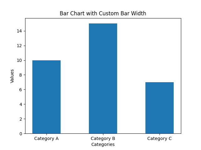
Explanation: In this example, the width of the bars is adjusted to make them narrower (0.5) for emphasis on individual data points.
Create Clustered Bars
import matplotlib.pyplot as plt
import numpy as np

# Sample data
categories = ['Category A', 'Category B', 'Category C']
values1 = [10, 15, 7]
values2 = [8, 12, 5]

# Create clustered bars
x = np.arange(len(categories))
width = 0.35

plt.bar(x - width/2, values1, width, label='Dataset 1')
plt.bar(x + width/2, values2, width, label='Dataset 2')

# Add labels and title
plt.xlabel('Categories')
plt.ylabel('Values')
plt.title('Clustered Bar Chart')
plt.xticks(x, categories)

# Add a legend
plt.legend()

# Show the chart
plt.show()
Explanation:
- In this example, clustered bars are created to represent two different datasets (Dataset 1 and Dataset 2) side by side for each category. This is achieved by adjusting the bar positions and widths. Clustered bars are useful when you want to compare multiple datasets within the same categories.
3.4 Managing Axis Limits and Scale
Adjusting Axis Limits for Precision
import matplotlib.pyplot as plt

# Sample data
categories = ['Category A', 'Category B', 'Category C']
values = [10, 15, 7]

# Create a bar chart
plt.bar(categories, values)

# Adjust the y-axis limits for better visualization
plt.ylim(0, 20)

# Add labels and title
plt.xlabel('Categories')
plt.ylabel('Values')
plt.title('Bar Chart with Adjusted Y-Axis Limits')

# Show the chart
plt.show()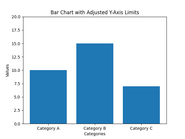
Explanation:
In this example, the y-axis limits are adjusted using plt.ylim(0, 20) to focus on a specific range of values. This can be useful when you want to highlight details or outliers in the data.
Scaling Data for Relative Comparison
import matplotlib.pyplot as plt

# Sample data
categories = ['Category A', 'Category B', 'Category C']
values = [10, 1500, 700]

# Create a bar chart
plt.bar(categories, values)

# Use a logarithmic scale for the y-axis
plt.yscale('log')

# Add labels and title
plt.xlabel('Categories')
plt.ylabel('Values (log scale)')
plt.title('Bar Chart with Logarithmic Y-Axis Scale')

# Show the chart
plt.show()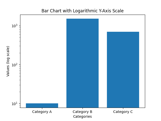
Explanation:
In this example, a logarithmic scale is applied to the y-axis using plt.yscale('log'). This is beneficial when dealing with data that varies over a wide range, allowing for a more meaningful relative comparison between values.
Adding Secondary Y-Axis for Multiple Scales
import matplotlib.pyplot as plt

# Sample data
categories = ['Category A', 'Category B', 'Category C']
values1 = [10, 50, 20]
values2 = [2000, 4000, 6000]

# Create a bar chart for values1
plt.bar(categories, values1, color='blue', label='Values 1')

# Create a secondary y-axis for values2
plt.twinx()
plt.plot(categories, values2, color='red', marker='o', label='Values 2')

# Add labels, title, and legend
plt.xlabel('Categories')
plt.ylabel('Values 1')
plt.title('Bar Chart with Secondary Y-Axis')
plt.legend()

# Show the chart
plt.show()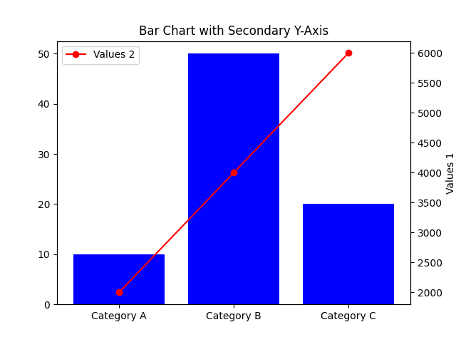
Explanation:
In this example, two datasets (Values 1 and Values 2) with different scales are plotted on the same chart.
plt.twinx() is used to create a secondary y-axis on the right side, allowing you to compare two sets of data with different units or magnitudes.
4. Advanced Topics in Bar Charts
4.1 3D Bar Charts
Create 3D Bar Charts for a Unique Perspective
# Example of a 3D bar chart with Matplotlib
from mpl_toolkits.mplot3d import Axes3D
import matplotlib.pyplot as plt

# Sample data
categories = ['Category A', 'Category B', 'Category C']
values = [10, 15, 7]

# Create a 3D bar chart
fig = plt.figure()
ax = fig.add_subplot(111, projection='3d')
ax.bar(categories, values, 0.5, zdir='y')

# Add labels and title
ax.set_xlabel('X-Axis')
ax.set_ylabel('Y-Axis')
ax.set_zlabel('Values')
plt.title('3D Bar Chart')

# Show the chart
plt.show()
Explanation:
- In this example, we use Matplotlib to create a 3D bar chart for a unique perspective on the data.
- The
mpl_toolkits.mplot3dlibrary is used to enable 3D plotting. zdir='y'specifies that the bars should be drawn along the y-axis in 3D space.
4.2 Bar Charts with Error Bars
Enhance Bar Charts with Error Bars to Represent Uncertainty
# Example of a bar chart with error bars using Matplotlib
import matplotlib.pyplot as plt

# Sample data with error values
categories = ['Category A', 'Category B', 'Category C']
values = [10, 15, 7]
errors = [1, 2, 0.5]

# Create a bar chart with error bars
plt.bar(categories, values, yerr=errors, capsize=5)

# Add labels and title
plt.xlabel('Categories')
plt.ylabel('Values')
plt.title('Bar Chart with Error Bars')

# Show the chart
plt.show()
Explanation:
- In this example, error bars are added to the bar chart to represent uncertainty or variability in the data.
- The
yerrparameter is used to specify the error values for each bar, andcapsizecontrols the size of the error bar caps.
4.3 Advanced Bar Chart Types
Explore Other Bar Chart Types for Specific Use Cases Stacked Bar Chart Example:
# Example of a stacked bar chart using Matplotlib
import matplotlib.pyplot as plt

# Sample data
categories = ['Category A', 'Category B', 'Category C']
values1 = [10, 15, 7]
values2 = [5, 8, 12]

# Create a stacked bar chart
plt.bar(categories, values1, label='Dataset 1')
plt.bar(categories, values2, label='Dataset 2', bottom=values1)

# Add labels, title, and legend
plt.xlabel('Categories')
plt.ylabel('Values')
plt.title('Stacked Bar Chart')
plt.legend()

# Show the chart
plt.show()
Explanation — Stacked Bar Chart:
- In this example, a stacked bar chart is created to show the contribution of two datasets (Dataset 1 and Dataset 2) to each category. The
bottomparameter is used to stack the bars on top of each other.
Horizontal Bar Chart Example:
# Example of a horizontal bar chart using Matplotlib
import matplotlib.pyplot as plt

# Sample data
categories = ['Category A', 'Category B', 'Category C']
values = [10, 15, 7]

# Create a horizontal bar chart
plt.barh(categories, values)

# Add labels and title
plt.xlabel('Values')
plt.ylabel('Categories')
plt.title('Horizontal Bar Chart')

# Show the chart
plt.show()
Explanation — Horizontal Bar Chart:
- In this example, a horizontal bar chart is used to represent the data with categories on the y-axis and values on the x-axis. This is useful when you have long category names or want to emphasize the values.
4.4 Grouped Bar Chart with Multiple Categories
Create a Grouped Bar Chart to Compare Multiple Categories
import matplotlib.pyplot as plt
import numpy as np

# Sample data
categories = ['Category A', 'Category B', 'Category C']
values1 = [10, 15, 7]
values2 = [8, 12, 5]

# Define the width of each bar
bar_width = 0.35

# Calculate the positions for the bars
x = np.arange(len(categories))

# Create grouped bars for two datasets
plt.bar(x - bar_width/2, values1, bar_width, label='Dataset 1')
plt.bar(x + bar_width/2, values2, bar_width, label='Dataset 2')

# Add labels, title, and legend
plt.xlabel('Categories')
plt.ylabel('Values')
plt.title('Grouped Bar Chart with Multiple Categories')
plt.xticks(x, categories)
plt.legend()

# Show the chart
plt.show()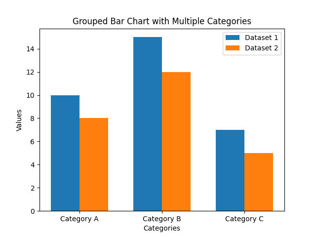
Explanation:
- In this example, a grouped bar chart is created to compare two datasets (Dataset 1 and Dataset 2) across multiple categories.
- The
bar_widthvariable is used to specify the width of each bar, andxdetermines the positions of the bars on the x-axis. - By adjusting the positions and widths, you can create a clear comparison between different categories and their corresponding datasets.
5. FAQ
Q1: How to Handle Missing Data in a Bar Chart?
A1: To handle missing data in a bar chart, you have a few options depending on the situation:
- Remove NaN Values: If the missing data is minimal and doesn’t significantly impact your analysis, you can remove data points with missing values before creating the bar chart.
- Interpolate Data: In cases where you want to estimate missing values, you can use interpolation techniques to fill in the gaps with estimated values based on the surrounding data points.
Q2: What Are the Best Practices for Labeling Bars?
A2: The best practices for labeling bars in a bar chart are:
- Label Bars Clearly: Always label bars with their actual values to provide clarity and make it easy for the audience to interpret the chart.
- Use Data Labels or Annotations: When necessary, use data labels or annotations to provide additional context, highlight specific data points, or explain any unusual observations in the chart.
Q3: How to Create a Bar Chart with a Logarithmic Scale?
A3: To create a bar chart with a logarithmic scale, you can:
- Specify a logarithmic scale for the axis you want to represent logarithmically (e.g., the y-axis) using appropriate functions or settings provided by your chosen visualization library. For example, in Matplotlib, you can use
plt.yscale('log')to set a logarithmic scale for the y-axis.
Q4: How to Save a Bar Chart as an Image File?
A4: To save a bar chart as an image file, you can:
- In Matplotlib, use the
plt.savefig('chart.png')function, specifying the desired file format (e.g., 'png', 'jpg', 'svg', etc.) and file name. - In other visualization libraries, similar functions or methods are available to save charts as image files. Consult the documentation of the specific library you’re using for details on how to save your chart as an image.
Q5: How to Create Animated Bar Charts?
A5: To create animated bar charts, consider using libraries that offer animation features, such as:
- Matplotlib’s FuncAnimation: Matplotlib allows you to create animated charts using the
FuncAnimationclass. You can update the data or properties of the chart in each frame to create dynamic animations. - Plotly: Plotly is known for its interactive and web-based charts. It provides animation features for various chart types, including bar charts. You can specify animation frames and transitions to create animated bar charts.
- Other visualization libraries may offer their own animation capabilities. Consult the documentation and examples provided by the library you choose to work with for creating animated bar charts.

6. Interview Question about Bar Charts for Data Scientists
6.1 Commonly Asked Interview Questions
Q1: How do Bar Charts Differ from Other Types of Charts? A1: Bar charts differ from other types of charts in several ways:
- Use of Bars: Bar charts use rectangular bars to represent data, while line charts use lines and pie charts use slices of a circle.
- Categorical Data: Bar charts are suitable for categorical or discrete data, while line charts are used for continuous data.
- Comparison Emphasis: Bar charts emphasize comparing values between categories, making them ideal for showing differences, trends, and distributions.
Q2: Can You Explain the Concept of Grouped Bar Charts? A2: A grouped bar chart, also known as a clustered bar chart, displays multiple bars side by side within each category. In a grouped bar chart:
- Each category on the x-axis is divided into sub-categories, and for each sub-category, there is a set of bars representing different data series or datasets.
- Grouped bar charts are used when you want to compare values not only within a category but also within sub-categories.
- They are useful for showing how data points within different sub-groups contribute to the overall category.
Q3: What Are the Advantages of Using Plotly for Bar Chart Creation? A3: Plotly offers several advantages for creating bar charts, especially for data scientists:
- Interactivity: Plotly generates interactive and web-based charts, allowing users to hover over bars for details, zoom in and out, and pan through data. This enhances data exploration.
- Ease of Use: Plotly provides a user-friendly interface and supports various programming languages like Python, R, and JavaScript, making it accessible to a wide range of users.
- Customization: Data scientists can easily customize Plotly bar charts to match their specific needs, including color schemes, annotations, and hover effects.
- Online Sharing: Plotly allows for easy online sharing and collaboration on charts, making it a valuable tool for data scientists working on collaborative projects or sharing insights with non-technical stakeholders.
6.2 Practical Advice for Data Scientists
Q4: How Can Data Scientists Choose the Right Type of Bar Chart Based on Data and Objectives? A4: To choose the appropriate bar chart type based on data and objectives, data scientists should consider:
- Standard Bar Charts: Use these for comparing values across different categories when categories are independent.
- Grouped Bar Charts: Employ them for comparing values within sub-categories of each main category, showing how different datasets contribute.
- Stacked Bar Charts: Consider them for representing cumulative totals within each category, emphasizing part-to-whole relationships.
Q5: What Should Data Scientists Pay Attention to Regarding Labeling and Annotations in Bar Charts? A5: Data scientists should focus on labeling and annotations for clarity:
- Data Labels: Always include data labels on the bars to provide precise values, enhancing readability and data interpretation.
- Axis Labels: Ensure clear x-axis and y-axis labels to specify what each axis represents and provide context.
- Annotations: Use annotations to add context or explanations to specific data points or features in the chart, conveying key insights to the audience.
Q6: How Can Data Scientists Experiment with Customization to Enhance Visual Appeal of Bar Charts? A6: Data scientists can experiment with customization to enhance visual appeal by considering the following:
- Colors and Styles: Choose visually appealing color palettes and styles that are accessible to all viewers.
- Bar Width and Spacing: Adjust bar width and spacing to emphasize specific data points or create visual separation between bars.
- Logarithmic Scales: Use logarithmic scales when dealing with data spanning multiple orders of magnitude for a clearer representation.
7. EXPLORE ADDITIONAL DATA VISUALIZATION RESOURCES
Important Note! For more comprehensive information on alternative data visualization techniques, please visit the following link.
1. Introduction to Data Visualization 2. Scatter Plots 3. Line Charts 4. Bar Charts 5. Histograms 6. Pie Charts 7. Box Plots 8. Heatmaps 9. Violin Plots 10. Area Charts 11. Bubble Charts 12. Radar Charts 13. Sankey Diagrams 14. Tree Maps 15. Choropleth Maps 16. Word Clouds 17. Gantt Charts 18. Streamgraphs 19. Scatterplot Matrices 20. Polar Plots 21. 3D Plots 22. Parallel Coordinates Plots 23. Network Graphs 24. Sunburst Charts 25. Waterfall Charts 26. Kiviat Diagrams


