
Logistic Regression Overview through 11 Practice Questions + Practice Notebook
Overview
In this post we continue our journey of learning about Data Science Role Requirements by focusing on one of the most common machine learning classification models called Logistic Regression.
We are going to first learn what Logistic Regression is through a conceptual overview. Then we will start looking at the data which we will use to train a Logistic Regression model on. We will start with cleaning the data, then move on to building our model and then will look at various metrics that can be used in evaluating the performance of our trained Logistic Regression machine learning model, including accuracy, confusion matrix, precision, recall, Receiver Operating Characteristic (ROC) curve and area under the ROC curve (AUC).
Let’s get started!
Conceptual Overview
Logistic Regression, despite its name, is a classification algorithm where the dependent variable can only take two classes (e.g. yes vs. no or 0 vs. 1). Classification tasks with only two possible outcomes for the dependent variables are called binary classification, while classification tasks with more than two classes are called multi-class classification.
If you need a refresher on the distinction between regression and classification, feel free to visit this post.
Pro Tip: Although Logistic Regression is normally used for binary classification, extensions of it can be used for multi-class classification (e.g. Multinomial Logistic Regression and Softmax Regression). These extensions are beyond the scope of this post. Another approach is to use the “one-vs-rest” strategy to extend a binary classification to a multi-class classification task. Let’s say there are 3 classes of A, B and C. One can start the binary classification task with A vs the rest (i.e. group B and C together and consider them as one unit so that there are a total of two classes) to make this into a binary classification task. Then repeat the same process for B vs. the rest (i.e. A + C) and so forth for larger number of classes. This strategy can be used for multi-class classification tasks using a binary classifier, if needed.
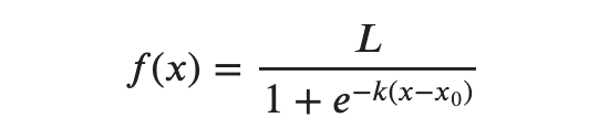
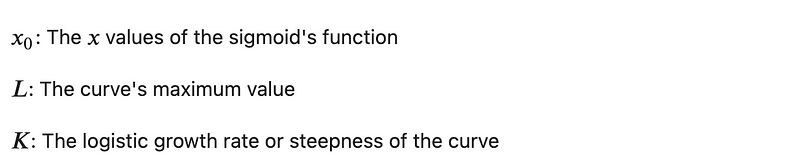
Logistic regression relies on the logistic function, which is a sigmoid curve with the following equation (understanding the math behind the model is not necessary for a successful use of Logistic Regression model and is provided for reference only).
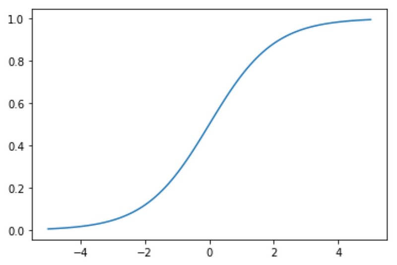
With some simplifying assumptions, logistic regression plot is as follows:
Assumptions:

A logistic regression model calculates the probability based on the formula above, which will always end up between 0 and 1. Then when the probability is between 0 and 0.5 (assuming a 50% threshold), assigns it to one class, such as 0 or not-spam and then when the probability is between 0.5 and 1, assigns it to the other outcome, such as 1 or spam.
Tutorial + Questions and Answers
I will include a brief overview of some of the concepts and then most of the learning will be during the practice questions included for each topic. The Jupyter notebook including questions and answers is provided in the last section. To maximize learning, try to answer the questions yourself before looking at the notebook. Then look at the notebook to verify your answer.
Exercise Overview and Data Set
The goal of this exercise is to use logistic regression to predict the risk of heart attack, in the form of a binary classification with two categories of higher or lower chance of heart attack.
In order to do so, we will be using a data set from Kaggle, which can be downloaded from this link.
The data set, which will be explored further below, includes a target column with a binary outcome of 1 for more chance of heart attack and 0 for less chance of heart attack. target column will be used as the output / dependent variable and other columns will be used as features / input / independent variables to predict the dependent variable.
Let’s look at the columns before starting to look at the values. Please note definition of some of the columns are technical in nature and are not necessarily required for understanding the methodology and creating this predictive model.
- age
- sex
- cp: Chest pain type (4 values)
- trestbps: Resting blood pressure
- chol: Serum cholesterol in mg/dl
- fbs: Fasting blood sugar > 120 mg/dl
- restecg: Resting electrocardiographic results (values 0, 1 and 2)
- thalach: Maximum heart rate achieved
- exang: Exercise induced angina
- oldpeak: ST depression induced by exercise relative to rest (ST is part of the schematic representation of electrocardiography)
- slope: The slope of the peak exercise ST segment
- ca: Number of major vessels (0–3) colored by fluoroscope
- thal: 0 is normal; 1 is fixed defect; 2 is reversible defect
- target: 0 is for less chance of heart attack; 1 is for more chance of heart attack
Let’s import the libraries we will be using and then get started.
# Import libraries
import matplotlib.pyplot as plt
%matplotlib inline
import numpy as np
import pandas as pd
from sklearn.linear_model import LogisticRegression
Now let’s take a glance at the data set.
df = pd.read_csv('heart.csv')df.head()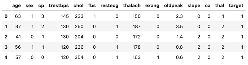
1. Outliers
Question 1:
Create a count_outliers function that takes a numerical column name as input and counts how many values within that column are more than 1.5 times standard deviations away from that column’s mean. Then using the function, print the number of such outliers for column age.
Answer:
One usual task in cleaning up the data is identifying outliers and potentially doing something about them — we could take them out or replace them with something else but regardless of what we decide to do with them, first we need to be able to identify them.
Let’s look at column `age` as an example.
round(df.age.describe(), 2)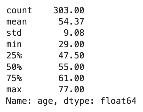
(df.age.max()-df.age.mean())/df.age.std(), (df.age.min()-df.age.mean())/df.age.std()
As we see, the mean is 54.37 with an standard deviation of 9.08 but the minimum and maximum are 29.00 and 77.00, which are around 2.79x and 2.49x times standard deviation below and above the mean. So there is a variance among the data, which is expected, but at what point do we call these outliers? The answer to that question will depend on the problem we are trying to solve and the distribution of the data. For this specific question, we are interested in identifying and counting those values more than 1.5 times standard deviations away from the mean.
Let’s build the function.
def count_outliers(column):
    mean = df[column].mean()
    std = df[column].std()
    count = df[column][(df[column] > (mean + 1.5 * std)) | (df[column] < (mean - 1.5 * std))].count()
    return count
Let’s try this function on column age.
print(f"There are {count_outliers('age')} values (out of {df['age'].shape[0]} total) more than 1.5 times standard deviation away from the mean in column 'age'.")
2. Weight of Categorical Variables
Question 2:
The goal of this question is to determine the percentage of each class in a categorical column. Create a lambda function for column restecg that creates a dictionary where keys of the dictionary are the classes of the categorical variable and the values of the dictionary are the percentages of total for each of those classes.
As an example, in a case of a column with two classes of A and B, where 20% of the values are A and the remaining 80% are B, the outcome will be:
{‘A’: 0.2, ‘B’: 0.8}Tip: If you need a refresher on Python functions, including Lambda functions, take a look at this post.
Answer:
column = 'restecg'
{x[0]: x[1] for x in map(lambda x: (x, df[column].value_counts(normalize = True)[x]), range(df[column].nunique()))}
So there are three classes of 0, 1 and 2 in column restecg and each account for around 48.5%, 50.2%, and 1.3% of the total, respectively.
3. Balanced Data
Question 3:
How balanced are the classes of each categorical variable in our data set? In a balanced data set, values are equally distributed among classes of each categorical variable. What about the target variable?
Answer:
We will first identify the categorical variables. Then we can use the lambda function developed in the last question to get the class weights for each categorical variable. Let’s look at the data again.
df.head()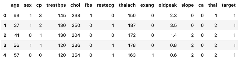
Now let’s create a list of the categorical variables and then apply the function that we developed in the previous question to those categorical columns.
# List of categorical variables
categoricals = ['sex', 'cp', 'restecg', 'ca', 'thal', 'target']
for column in categoricals:
print(f"Column Name: {column}")
print({x[0]: x[1] for x in map(lambda x: (x, df[column].value_counts(normalize = True)[x]), range(df[column].nunique()))})
print("")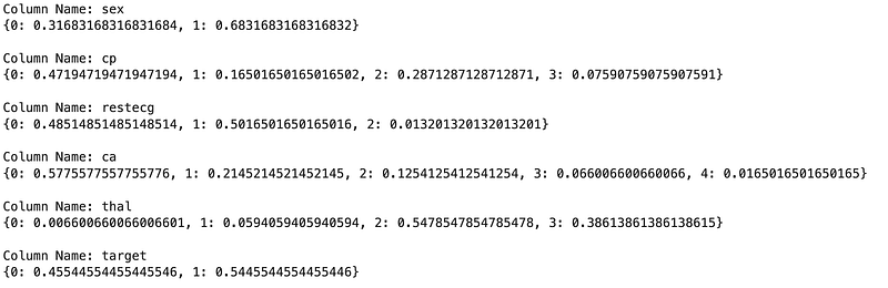
Since we will be doing a predictive classification modeling, the balanced class that matters most is for the target variable, which seems to be roughly balanced (46% vs. 54%). Other columns do not seem to be as balanced, which should be fine.
4. Modeling
Question 4:
Break down the data into train and test sets, with a random_state of 1234.
Answer:
# assign target variable to y as the dependent variable
y = df['target']
# assign other variables to X as features/predictors/independent variables
X = df.drop('target', axis = 1)# Import library to split the data
from sklearn.model_selection import train_test_split# Split the data into training and testing sets
X_train, X_test, y_train, y_test = train_test_split(X, y, random_state = 1234)Question 5:
Now that we have our training data, fit a logistic regression model to the training data, using the same random_state of 1234.
Hint: Use LogisticRegression from sklearn.linear_model.
Answer:
# Import the package
from sklearn.linear_model import LogisticRegression
lgr = LogisticRegression(random_state = 1234, solver = 'lbfgs', max_iter = 10000)
lgr.fit(X_train, y_train)Notes:
- solver: We used the
lbfgssolver here, which is the default solver for this model and is a good one for multi-class tasks. Other solves are also available and can be used based on the type of the problem, for example,liblinearis usually a good choice for small datasets since it is not very fast. On the other hand, we might have usedsagorsagafor larger datasets, since those are faster. - max_iter: Indicates the maximum number of iterations taken for the solvers to converge. Default value is 100 but we used a higher number just in case more iterations are required for convergence, given the dataset is not very large.
- Documentation: Further details can be found here.
5. Model Evaluation
In a two-class target variable (i.e. a binary classification task) where the target variable can only be positive (or 1) and negative (or 0), there are four possible outcomes for a prediction:
- True Positive (TP): A positive event was correctly predicted.
- False Positive (FP): A negative event was incorrectly predicted as positive. This is also known as a Type I error.
- True Negative (TN): A negative event was correctly predicted.
- False Negative (FN): A negative event was incorrectly predicted as positive. This is also known as a Type II error.
We will be using these outcome definitions in various evaluation metrics going forward.
5.1. Model Evaluation — Accuracy
Accuracy is the proportion of correct predictions over total predictions. Using the outcomes described above, we can create an equation for Accuracy as follows:

Question 6:
What is the score of the model? Look at the class percentages of the target column and determine whether the model is predicting better than the class weights.
Hint: sklearn.linear_model.LogisticRegression.score() provides the accuracy.
Answer:
# Model score
score = lgr.score(X_train, y_train)
print(f"Training score is: {score}")
# Class weights
class_weights = round(y_train.value_counts(normalize = True), 2)
class_weights_dic = {class_weights.index[0]:class_weights[0], class_weights.index[1]:class_weights[1]}
print(f"Class weights of the 'target' column are: {class_weights_dic}")
As we can see, the prediction accuracy of the training data is better than the original weight classes.
Question 7:
Use the trained model to predict values for the test set.
Answer:
y_pred = lgr.predict(X_test)5.2. Model Evaluation — Confusion Matrix
Confusion matrix is a tabular presentation of the results of a classification exercise. We looked at Accuracy previously, which calculates the proportion of correct predictions out of total predictions. But it does not report on what percentage of predictions were incorrectly predicted. This shortcoming is more apparent in scenarios with more than 2 classes and also where the data is imbalanced. For example, if we had 3 classes of A, B and C that each accounted for 80%, 15% and 5% of total and then accuracy of the model is 80%, what does that mean? There is a possibility that our model is really not doing anything and for any entry, it is just returning A. Then all of predictions are A but we are still getting 80% accuracy because A accounted for 80% of the total data. Confusion matrix helps by adding more context in such scenarios.
Let’s create a table to show these four outcomes:
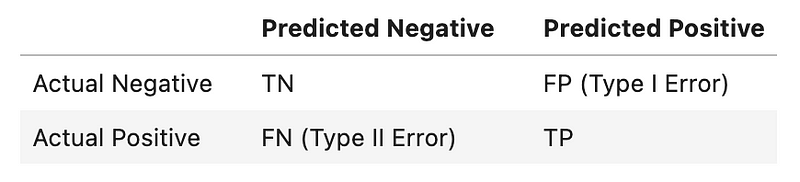
This tabular presentation is called a confusion matrix. More formally, a confusion matrix C is such that C(i,j) is equal to the number of observations known to be in group i and predicted to be in group j. Therefore, in a binary classification, the count of true negatives is C(0,0), false negatives is C(1,0), true positive is C(1,1), and false positives is C(0,1).
Note: Placement of TP, FP, TN, and FN in a confusion matrix is simply based on an agreement. In other words, they can move around, based on how the confusion matrix is defined. In this exercise, I have used the placement that sklearn.metrics.confusion_matrix uses, since we will be using that in the next part.
Question 8:
Create a confusion matrix to evaluate the performance of the trained model on the test set. What are true positives, false positives, true negatives and false negatives?
Answer:
from sklearn.metrics import confusion_matrixcm = confusion_matrix(y_test, y_pred)
print("Confusion Matrix:")
print(f"{cm}\n")
print(f"TN: {cm[0][0]}, FP: {cm[0][1]}, FN: {cm[1][0]}, TP: {cm[1][1]}.")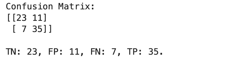
# Alternative approach
tn, fp, fn, tp = confusion_matrix(y_test, y_pred).ravel()
print(f"TN: {tn}, FP: {fp}, FN: {fn}, TP: {tp}.")
5.3. Model Evaluation — Precision vs. Recall
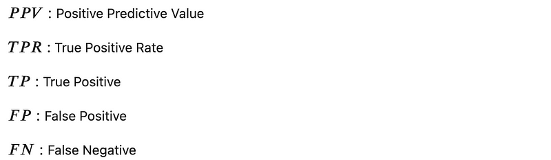
Precision and Recall are two of the performance metrics that you will hear about in the context of classification. Precision, also called Positive Predictive Value (PPV), is the fraction of relevant instances among the retrieved instances, while Recall, also called sensitivity or True Positive Rate (TPR), is the fraction of relevant instances that were retrieved. Let’s use the terminology that we have learned so far and convert the textual definitions to equations to better understand these two:

5.4. Model Evaluation — F1 Score
Finally, F1 score combines Precision and Recall into one metric by creating a harmonic mean of the two as follows:

Question 9:
What are precision, recall and $F_1$ score of the test set?
Answer:
precision = tp / (tp + fp)
recall = tp / (tp + fn)
f1_score = 2*tp / (2 * tp + fp + fn)print(f"Precision: {round(precision, 2) * 100}%, Recall: {round(recall, 2) * 100}%, F1: {round(f1_score, 2) * 100}%.")Results:

5.5. Model Evaluation — ROC Curve
A Receiver Operating Characteristic (ROC) curve is a graphical presentation of the performance of a binary classifier. ROC curve is created by plotting True Positive Rate (TPR or Recall) against the False Positive Rate (FPR). Let’s look at how TPR and FPR are calculated.
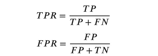
An ROC curve plots TPR vs. FPR at different classification thresholds. Lowering the classification threshold classifies more items as positive and therefore increasing both False Positive and True Positives.
Question 10:
Create the ROC curve for our classification model, first for the training set and then for the test set.
Hint: We can use sklearn.metrics.roc_curve() to compute ROC and then plot the results. Alternatively, we can use sklearn.metrics.RocCurveDisplay.from_predictions() to plot the ROC curve directly. We will use the latter approach.
Answer:
# Import packages
from sklearn.metrics import roc_curve
from sklearn.metrics import RocCurveDisplay
import matplotlib.pyplot as plt
# Create the predictions for the training data
y_train_pred = lgr.predict(X_train)# Plot the ROC curve for the training data
RocCurveDisplay.from_predictions(y_train, y_train_pred)
plt.title('In-Sample ROC Curve')
plt.show()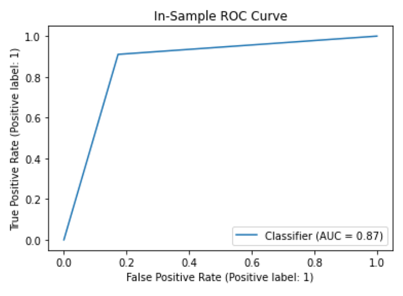
# Plot ROC curve for the test set
RocCurveDisplay.from_predictions(y_test, y_pred)
plt.title('Out-Sample ROC Curve')
plt.show()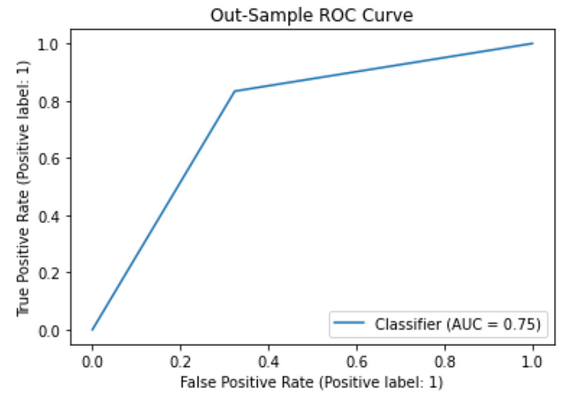
5.6. Model Evaluation — Area Under ROC Curve (AUC)
AUC or Area Under ROC Curve measures the entire two-dimensional area underneath the ROC curve. AUC provides an overall measure of performance across all possible classification thresholds (since ROC covers various thresholds). AUC can be interpreted as the probability that the model ranks a random positive example more highly than a random negative example.
AUC values range from 0 to 1, where a model with 100% wrong predictions will have an AUC of 0, while a model with 100% correct predictions will have an AUC of 1.
Question 11:
The plots created in the previous question also show the AUC in their legends. Compare the AUC for the training and test sets. Which one did you expect to be larger and why? Did the plots confirm your expectations?
Answer:
An AUC value of closer to 1 is preferred in this context. We expect the model to perform better on the training set, compared to the test set, since training set is what the model is trained on and the model has seen the training data. On the other hand, test set is a held-out data set that the model has not seen before so we expect the performance of the model to be better on the training set compared to the unseen test set. AUC numbers are aligned with this expectation.
Notebook with Practice Questions
Below is the notebook with both questions and answers that you can download and practice.
Thanks for Reading!
If you found this post helpful, please follow me on Medium and subscribe to receive my latest posts!


