
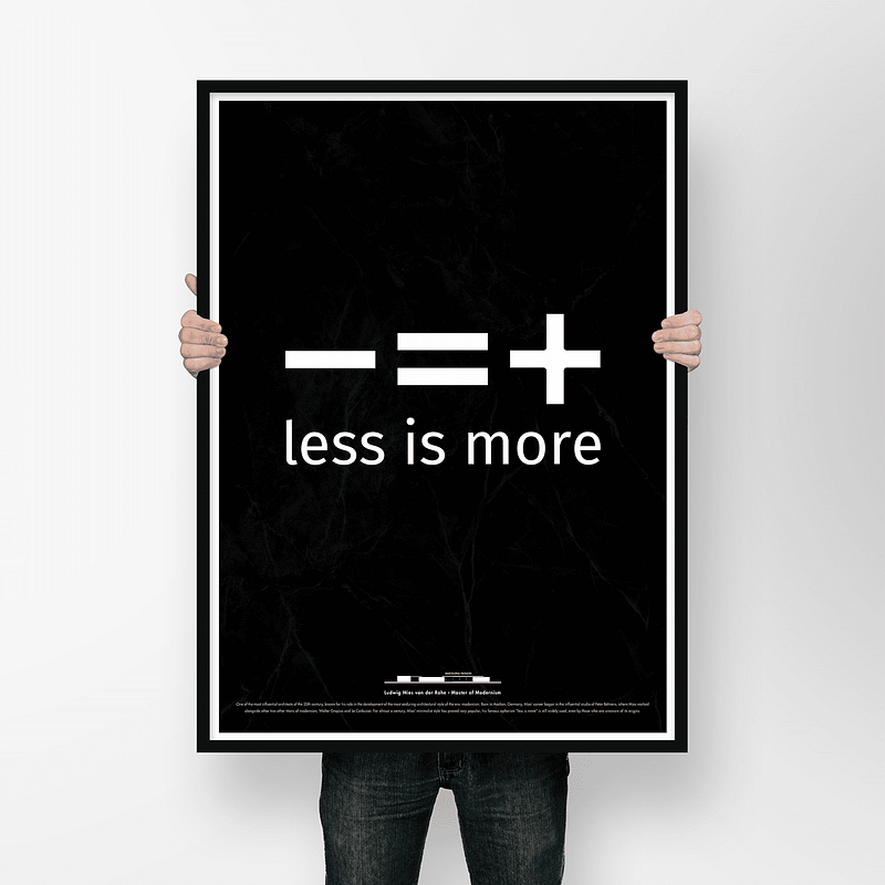
Less is More is Less
It’s time to go back to design basics.
Some argue that less is more, and some rephrase it and claim that more is less. By that logic, we must then conclude that less is less, which contradicts our premise “less is more”. What went wrong?
I’ve always been cautious against adopting catchy phrases such as “less is more” because I honestly don’t agree with them. Not because they’re semantically wrong (they are), but because I’m generally against over-simplifying things that could very well depend on the context.
I’m of the opinion that when marketing wordplay replaces fruitful discussions on design principles, the result is a user interface (UI) that is more about being philosophically appealing to its designers and less about being actually usable by its end-users.
“Less is more” leads to less user happiness and more designer satisfaction.
It is in this sense that I argue that “less is more” is less, because it takes away visual cues that users often use to identify objects and interact with them properly. Let me explain this with an example:
Imagine a world where the flat design principles of the minimalist movement are applied to every aspect of our daily life: You want to open a door? Good luck, because the knob is not clearly visible. Are you a pilot and want to fly the plane? Have fun trying to figure out which shapes (buttons in the cockpit) you can press on and which you cannot. You might think these hypothetical scenarios would never happen in real life, but they are prevalent on the web, your gadgets, smart refrigerator, and so on.

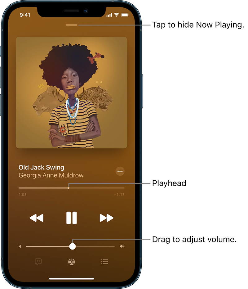
To give an example, let us look at the following image of Windows 10’s UI:
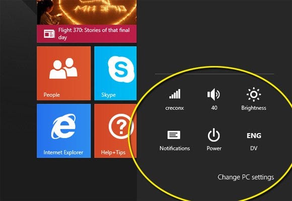
- What do you think these shapes do?
- Should you click on them, or are they merely showing information?
- Where should you click? Is there a definite border around them, or should you click precisely on the white areas?
Do you now see how this example applied to a door would result in a door without an obvious knob? But Microsoft is not the only one who screwed up. Indeed, Apple was probably one of the first megacorps that drank the flat design cool aid, after firing Scott Forstall, the former Apple Senior VP of iPhone Software who believed strongly in skeuomorphic design. Shortly after, Apple re-designed iOS 7 with a completely flat design. Below you can see the differences:
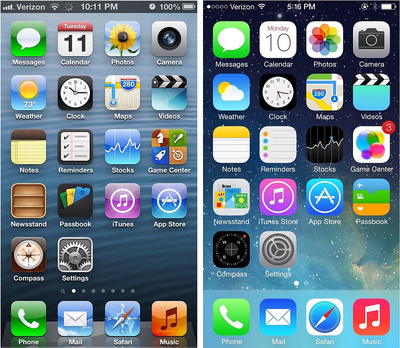
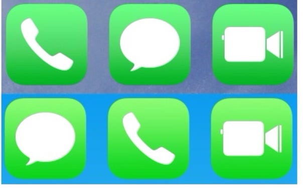
To many, the new design was a big step back not just because it let go of so much detail in icons, but also because it caused a lot of confusion. Take the iOS Music app for example. How should users know which shapes are buttons and which are not? Which one can you tap and which you cannot? The following picture shows the differences between two schools of thought in UI design. One of them uses shapes/texts/icons that seem to do nothing, but are in fact buttons. Can you tell which one it is?
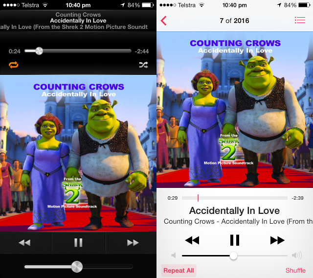
See that metallic volume button on the bottom left? Apple’s attention to detail was so much that soon people found out that iOS 6 adjusts the reflections of this button as you tilt your phone! 🤯 See this video:
Small discoveries such as these make end-users delighted, and let’s face it: A skeuomorphic design provides more opportunities for such easter-eggs. In comparison, this is the Music app on the latest iOS: Simple and Bland.
Is there any good news?
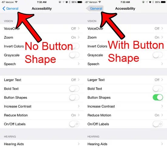
It’s not all dark and gloomy, however. First, it seems that Apple knows that the new flat design might be confusing for some users. That’s why iOS has a “Button Shapes” option to highlight the area around texts that are in fact buttons:
Second, Apple has been slowly increasing the amount of skeuomorphism in its flat design. Icons on the newer versions of iOS have a sense of “depth” to them, as if opening an app gives a feeling of actually pressing its icon, as opposed to simply tapping on a piece of glass. One way Apple achieved this was by increasing the dark tone in icons, which to be honest, makes them less childish as well!
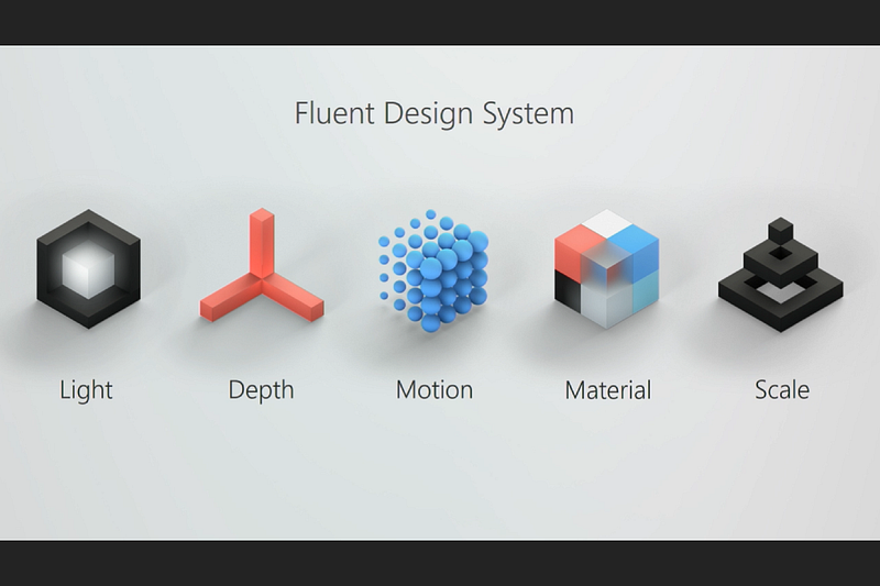
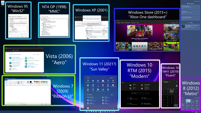
Microsoft, too, has learnt its lesson and is abandoning the flat design. Fluent, Microsoft’s new design language is a drastic departure from the infamous Metro which plagued Windows 8, 8.1, 10, and Windows Phone, potentially contributing to the downfall of MS’s mobile operating system. Fluent focuses on light, depth, motion, material, and scale.
That being said, Microsoft has been hit with a lot of criticism over its lack of consistency in UI, but that’s a story for another time…
What do you think about “less is more”, minimalist and flat design, and the return of sanity to design?