
Learning Android Development
Jetpack Compose Swipe To Dismiss Made Easy
Sharing Jetpack Compose Swipe To Dismiss the Simplest Possible Way

There are many guides and links related to Jetpack Compose Swipe to Dismiss, but it still took me a few days to wrap my head around it.
Here I will share on
- The minimal essentials on
SwipeToDismissfor Jetpack Compose - The additional nice-to-have items make
SwipeToDismissbetter - The few gotchas I encountered, where took me a few days to resolve.
The Minimal Essential of SwipeToDismiss
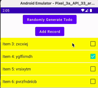
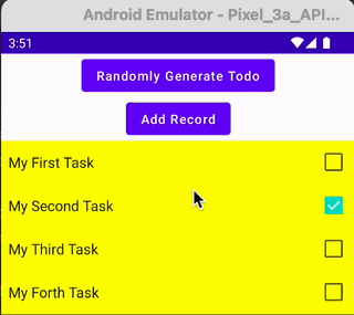
I believe in most cases, SwipeToDimiss is used together with LazyColumn. Without SwipeToDismiss, LazyColumn looks like the below, where it is the TodoItemRow is the UI of each row.
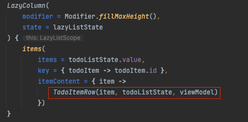
To have the ability to Swipe to Dismiss, we’ll wrap the TodoItemRow around with another SwipeToDismiss function.
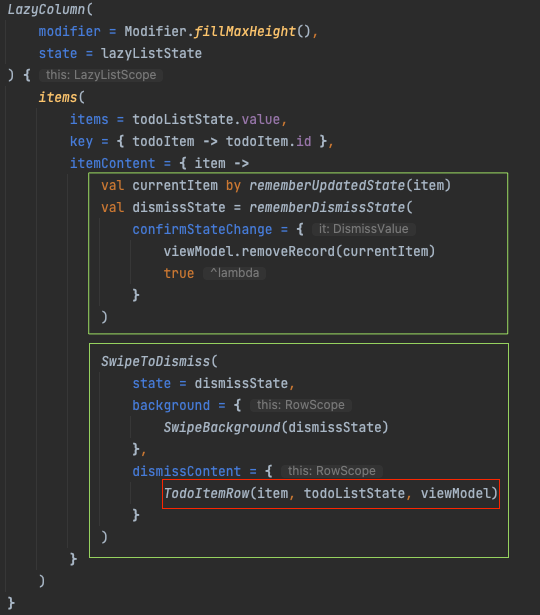
As you can see above, there are 2 green boxes needed to get Swipe To Dismiss function properly. Let me illustrate them both below.
1. The SwipeToDismiss Composable Function
The function is still under experiment at the time of writing. The declaration looks as below.
@Composable
@ExperimentalMaterialApi
fun SwipeToDismiss(
    state: DismissState,
    modifier: Modifier = Modifier,
    directions: Set<DismissDirection> = setOf(EndToStart, StartToEnd),
    dismissThresholds: (DismissDirection) -> ThresholdConfig = { FractionalThreshold(0.5f) },
    background: @Composable RowScope.() -> Unit,
    dismissContent: @Composable RowScope.() -> Unit
)
From here we’ll know that only 3parameters are required
state— this is needed to detect the state of SwipeToDelete, i.e. is it moving from Start to End or End to Start or Default (no movement)background— when we are swiping away the item, this will render how the exposed background looks. I personally think this can be made optional, with a blank body, but looks like it is needed.dismissContent— this is where we place the original Row item of the LazyColumn
2. The SwipeToDismiss State
This is the part where we define the state required for SwipeToDismiss.
The dismiss state If we don’t plan to have any action (e.g. remove the item after swipe), we can then simply define it as below.
val dismissState = rememberDismissState()However, in our case, we wanted to remove the item if we detect a state change. We can then add confirmStateChange as below, where when any state changes, just remove the item.
val dismissState = rememberDismissState(
    confirmStateChange = {
        viewModel.removeRecord(currentItem)
        true
    }
)
The currentItem
The other important control shown is, if the dismissState need to get to the latest item (outside confirmStatechange lambda), we should use the currentItem from rememberUpdatedState
val currentItem by rememberUpdatedState(item)Else it might store the old item, and if the list is updated, some weird bug will exhibit, given the item is not the latest current one. More illustration is explained in the Gotcha section below (or you can also refer to this StackOverflow)
That’s it!! It’s not too hard to code the simple SwipeToDismiss
But it is not as nice, on some UI aspects. Let’s explore a little nicer UI consideration below
The Nice-To-Have of SwipeToDismiss
The animation
When we swipe an item out, if using the most basic implementation, there’s no animation. The item below quickly displays up
If we like some animation, we can add Modifier to SwipeToDimiss as shown below.
                    SwipeToDismiss(
                        state = ...,
                        modifier = Modifier
                            .padding(vertical = 1.dp)
                            .animateItemPlacement(),
                        background = ...,
                        dismissContent = ...
                    )
The padding is just to add space in between the item
The animateItemPlacement is the one that will enable some animation moving the items below up
The supported direction
We can either swipe Right (aka End) or Left (aka Start) through the direction parameter of SwipeToDismiss.
By default, both directions are enabled. We can override to switch off one of them.
directions: Set<DismissDirection> = setOf(EndToStart, StartToEnd),
- The
EndToStartis enabling swipe from right to left - The
StartToEndis enabling swipe from left to right
We can also customize the behavior for different actions, in the confirmStatechange lambda of the dismissState variable.
val dismissState = rememberDismissState(
    confirmStateChange = {
        when (it) {
            DismissValue.DismissedToEnd -> {
                // Do Something when swipe Start To End
                true
            }
            DismissValue.DismissedToStart -> {
                // Do Something when swipe End To Start
                true
            }
            else -> { false }
        }
    }
)
The dismiss threshold
When we swipe, we only want the action to be triggered after we swipe across a certain threshold e.g. 50%.
This can be set through dismissThresholds parameter of SwipeToDismiss. By default, it is a 50% threshold (for either direction).
dismissThresholds: (DismissDirection) -> ThresholdConfig =
    { FractionalThreshold(0.5f) }
We can set a different value for different directions as shown below, where I set it for
StartToEnd, it will get triggered when it moves 66%EndToStart, it will get triggered when it moves 50%
SwipeToDismiss(
    state = ...,
    directions = ...,
    dismissThresholds = { direction ->
        FractionalThreshold(
           if (direction == DismissDirection.StartToEnd) 0.66f else 0.50f)
    },
    background = ...,
    dismissContent = ...
)
To demonstrate that, I have made changes to show that it has been enabled when the background is changed from Grey to either Red or Green (which is done with the Background setting change as per the next point)
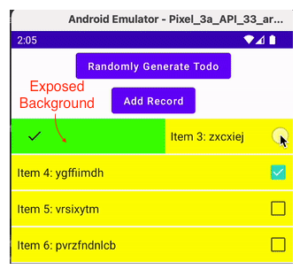
Background Change With DismissState value
As you probably see in the above GIF, that
When we move StartToEnd
- There’s a Checked Icon on the far left
- The background turns from Grey to Green as it gets enabled
- The Checked Icon grows bigger as it gets enabled
When we move EndToStart
- There’s a Bin Icon on the far right
- The background turns from Grey to Red as it gets enabled
- The Bin Icon grows bigger as it gets enabled
We have all this controlled through the Background parameter of SwipeToDismiss by passing in our dismissState as shown in the code below
The SwipeBackground shown below is just a custom Composable function I made to factorize the code. It is not part of SwipeToDismiss requirement.
background = {
    SwipeBackground(dismissState)
}
With the dismissState, we can gather
dismissState.dismissDirectionwhere it is eitherStartToEndorEndToStart(or null i.e. the default)dismissState.targetValuewhere it is eitherDefaul(when the dismiss is not yet triggered) ortDismissedToEndorDismissedToStart
The complete code for SwipeBackground is as below, where it is relatively self-explanatory of the Background UI drawn
@Composable
@OptIn(ExperimentalMaterialApi::class)
fun SwipeBackground(dismissState: DismissState) {
    val direction = dismissState.dismissDirection ?: return

    val color by animateColorAsState(
        when (dismissState.targetValue) {
            DismissValue.Default -> Color.LightGray
            DismissValue.DismissedToEnd -> Color.Green
            DismissValue.DismissedToStart -> Color.Red
        }
    )
    val alignment = when (direction) {
        DismissDirection.StartToEnd -> Alignment.CenterStart
        DismissDirection.EndToStart -> Alignment.CenterEnd
    }
    val icon = when (direction) {
        DismissDirection.StartToEnd -> Icons.Default.Done
        DismissDirection.EndToStart -> Icons.Default.Delete
    }
    val scale by animateFloatAsState(
        if (dismissState.targetValue == DismissValue.Default) 0.75f else 1f
    )

    Box(
        Modifier
            .fillMaxSize()
            .background(color)
            .padding(horizontal = 20.dp),
        contentAlignment = alignment
    ) {
        Icon(
            icon,
            contentDescription = "Localized description",
            modifier = Modifier.scale(scale)
        )
    }
}
Nicer UI and animation
If you like to explore nicer UI or animation related to SwipeToDismiss, e.g. make it more discoverable, below is another article with sample code that will help.
The SwipeToDimiss Gotchas to Avoid
During learning, I encountered a few tricky bits, and worth sharing with you, so you don’t learn the hard way.
As this writing seems to get a little lengthy, let me share it in another blog.


