
Intro to material-table for React
Exploring the docs and building some examples

Material-table is a relatively new addition to the suite of libraries providing data table functionality in React. The particular claims to fame for material-table is that it is quick to get running and built on Material-UI. In this intro to material-table, I’ll implement a few material-table examples and discuss the pros and cons.
First, some stats:
- The first material-table version was released in 2018.
- As of writing this, material-table runs about 100k weekly downloads (one-quarter of react-table).
- 292KB unpacked size (one-third of react-table) but it does require Material-UI, which is pretty hefty.
So we’ve got a table that is relatively popular (read: good community support) and, if you’re already using MUI in your app, material-table doesn’t add too much additional weight. From here, let’s dive into actual code. I will investigate the following:
- How quickly can I spin up the most basic table?
- How quickly can we add a few out-of-the-box features? I will add an action and override a component. These are the first two features listed in the docs. I will also add styling because that will be almost universally desired.
- How quickly can I find a solution to some kind of customization I want to do? I decided I simply wanted to remove the title but not the search box.
Here’s the final code sandbox. We’ll build it together in the steps below.
If you prefer live coding with commentary, I embedded a video version at the end in the Resources section. I also include a gist with the final code there.
A Basic material-table
I’d peg spinning up the most basic material-table example in CodeSandbox or with create-react-app at less than two minutes. It was as simple as:
- Use the code sandbox React template (or create-react-app).
- Include @material-ui/core, @material-ui/icons, and material-table as dependencies.
- Use code like the following from the material-table Getting Started docs:
The docs were easy to follow and the only dependency is @material-ui/core (m-ui icons are recommended). I’d label this a beginner-friendly library.
Two Out-of-the-Box Features + Styling
Being relatively unfamiliar with material-table before jumping into this article, I of course chose a very unscientific approach to deciding how to explore the library: I picked the first two key features listed and implemented them.
The first feature I will explore is Actions.
The Simple Action Example from the docs was as short as the following (I added TypeScript to mine):
actions={[
    {
      icon: () => <SaveIcon />,
      tooltip: "Save User",
      onClick: (event, rowData) => (
         alert("You saved " + (rowData as unknown as Column).name)
      )
    }
]}
This results in an alert popping up. So far, so good. But….
I tried the Duplicate Action Example in the docs and was unsuccessful in getting it to run. The sample code still uses Class syntax (most material-table examples are functional components), and I believe it is not compatible with functional components. I kept getting a “_this.props.data is not a function” error even after two hours of attempted workarounds.
There were several other action examples that didn’t use Class syntax, and I expect they would work fine. Also, I explored the editable feature in this post. It encapsulates three actions and worked great.
The second feature I will explore is Component Overriding. The docs were excellent here.
I tried the Action override (the second example) and that worked perfectly:
components={{
   Action: props => (
      <Button
         onClick={event => props.action.onClick(event, props.data)}
         color="primary"
         variant="text"
         style={{ textTransform: "none" }}
         size="small"
      >
         Save
      </Button>
   )
}}
Remember that this button is a MUI button; that is where the configs on it come from.
I also attempted a Row override. It took me a bit to figure out, but you are required to use MTableBodyRow somewhere in the Row override. MTableBodyRow is imported from material-table. This implies that these overrides are more about adding additional functionality than fundamentally changing the table behavior.
Finally, I took a look at Styling.
Styling was a breeze. It was reminiscent of Material-UI styling where specific names are provided in the API to make styling easy. I ran into no issues.
This is a way to provide default styling to the header.
options={{
   headerStyle: {
       backgroundColor: '#01579b',
       color: '#FFF'
   }
}}
One cool feature was that the individual columns could receive a style to override the default provided:
columns={[
   {
      title: "Name",
      field: "name",
      headerStyle: {
          backgroundColor: "green"
      }
   },
...
Customization and Support
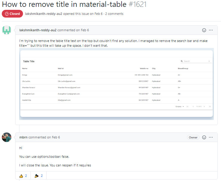
I decided to remove the title as a quick test of customization. A quick Google search returned an issue opened in February. I was impressed to see the library creator with a same-day response to the issue. Furthermore, another user responded with an alternative suggestion. While my request was pretty simple, I was still surprised at how easy it was to find a solution. Essentially no digging was required.
Takeaways
High fives:
- Consider material-table if you are already using Material UI.
- The docs are easy to follow and a simple example can be spun up in less than five minutes.
- Customization is relatively easy if you consider the fact that someone else has probably done the thing you are trying to do.
- There’s impressive support from the library creator and community.
Drawbacks:
- At least one doc example didn’t work as-is, and it seems the docs need to be fully updated for React hooks syntax.
- The docs also don’t include TypeScript examples. Sometimes it was tedious getting TypeScript working.
If you want an example of the customization options with material-table, take a look at this post where I override the first column component and give it autoFocus functionality. Material-table is well thought out and designed for this kind of flexibility.
All things considered, material-table is a great library. I hope this introduction to material-table for React will give you another great data table to choose from when designing a great UI.
Resources
If you prefer to watch me code it with commentary, watch here:
Here is the final code:
Thanks for reading!