📈Python for finance series
Identifying Outliers — Part One
How to find and visualize outliers in your dataset by Pandas

Update 10/28/2020 : Winsorization added at the end of this article. It is one of the common ways to limit/remove extreme values in financial data.
Warning: There is no magical formula or Holy Grail here, though a new world might open the door for you.
📈Python For Finance Series
- Identifying Outliers
- Identifying Outliers — Part Two
- Identifying Outliers — Part Three
- Stylized Facts
- Feature Engineering & Feature Selection
- Data Transformation
- Fractionally Differentiated Features
- Data Labelling
- Meta-labeling and Stacking
Pandas has quite a few handy methods to clean up messy data, like dropna,drop_duplicates, etc.. However, finding and removing outliers is one of those functions that we would like to have and still not exist yet. Here I would like to share with you how to do it step by step in details:
The key to defining an outlier lays at the boundary we employed. Here I will give 3 different ways to define the boundary, namely, the Average mean, the Moving Average mean and the Exponential Weighted Moving Average mean.
1. Data preparation
Here I used Apple’s 10-year stock history price and returns from Yahoo Finance as an example, of course, you can use any data.
import pandas as pd
import yfinance as yf
import matplotlib.pyplot as plt
plt.style.use('seaborn')
plt.rcParams['figure.dpi'] = 300df = yf.download('AAPL',
start = '2000-01-01',
end= '2010-12-31')As we only care about the returns, a new DataFrame (d1) is created to hold the adjusted price and returns.
d1 = pd.DataFrame(df['Adj Close'])
d1.rename(columns={'Adj Close':'adj_close'}, inplace=True)
d1['simple_rtn']=d1.adj_close.pct_change()
d1.head()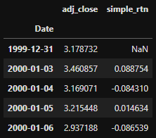
2. Using mean and standard deviation as the boundary.
Calculate the mean and std of the simple_rtn:
d1_mean = d1['simple_rtn'].agg(['mean', 'std'])If we use mean and one std as the boundary, the results will look like these:
fig, ax = plt.subplots(figsize=(10,6))
d1['simple_rtn'].plot(label='simple_rtn', legend=True, ax = ax)
plt.axhline(y=d1_mean.loc['mean'], c='r', label='mean')
plt.axhline(y=d1_mean.loc['std'], c='c', linestyle='-.',label='std')
plt.axhline(y=-d1_mean.loc['std'], c='c', linestyle='-.',label='std')
plt.legend(loc='lower right')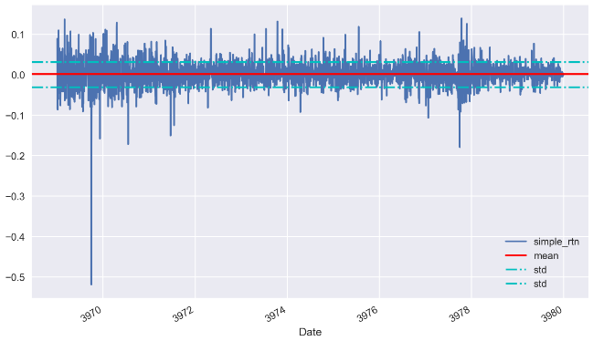
What happens if I use 3 times std instead?
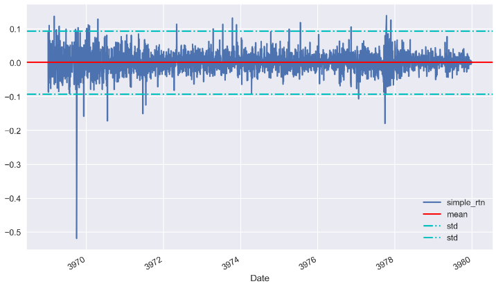
Looks good! Now is the time to look for those outliers:
mu = d1_mean.loc['mean']
sigma = d1_mean.loc['std']
def get_outliers(df, mu=mu, sigma=sigma, n_sigmas=3):
'''
df: the DataFrame
mu: mean
sigmas: std
n_sigmas: number of std as boundary
'''
x = df['simple_rtn']
mu = mu
sigma = sigma
if (x > mu+n_sigmas*sigma) | (x<mu-n_sigmas*sigma):
return 1
else:
return 0After applied the rule get_outliers to the stock price return, a new column is created:
d1['outlier'] = d1.apply(get_outliers, axis=1)
d1.head()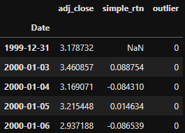
✍Tip!
#The above code snippet can be refracted as follow:cond = (d1['simple_rtn'] > mu + sigma * 2) | (d1['simple_rtn'] < mu - sigma * 2)
d1['outliers'] = np.where(cond, 1, 0)Let’s have a look at the outliers. We can check how many outliers we found by doing a value count.
d1.outlier.value_counts()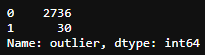
We found 30 outliers if we set 3 times std as the boundary. We can pick those outliers out and put it into another DataFrame and show it in the graph:
outliers = d1.loc[d1['outlier'] == 1, ['simple_rtn']]fig, ax = plt.subplots()ax.plot(d1.index, d1.simple_rtn,
color='blue', label='Normal')
ax.scatter(outliers.index, outliers.simple_rtn,
color='red', label='Anomaly')
ax.set_title("Apple's stock returns")
ax.legend(loc='lower right')plt.tight_layout()
plt.show()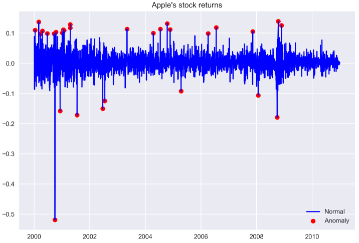
In the above plot, we can observe outliers marked with a red dot.
3. Winsorization
Winsorization is the process of replacing a specified number of extreme values with a smaller data value. It is named after the engineer-turned-biostatistician Charles P. Winsor (1895–1951). The effect is the same as clipping in signal processing.
A typical strategy is to set all outliers to a specified percentile of the data; for example, a 95% winsorization would see all data below the 5th percentile set to the 5th percentile, and data above the 95th percentile set to the 95th percentile. It can be realized in pandas with clip() function.
outlier_cutoff = 0.01
d1.pipe(lambda x:x.clip(lower=x.quantile(outlier_cutoff),
                        upper=x.quantile(1-outlier_cutoff),
                        axis=1,
                        inplace=True))
d1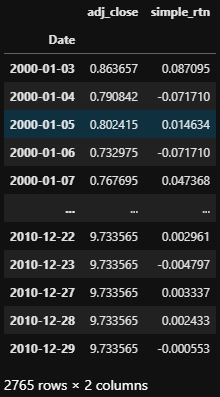
Note here, the shape of the dataframe remains the same. Those values below the 5th percentile set to the 5th percentile, and data above the 95th percentile set to the 95th percentile. We can visualize the difference in a plot.
fig, ax = plt.subplots()
ax.plot(d.index, d.simple_rtn,
        color='red', label='Normal')
ax.plot(d1.index, d1.simple_rtn,
        color='blue', label='Anomaly_removed')
ax.set_title("stock returns outliers_winsorize returns")
ax.legend(loc='lower right');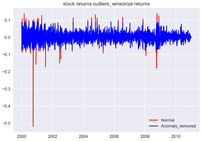
The reason I prefer Winsorization is that no information was removed by accident when there are more than 1 features for your machine learning model along with the simple return.
In the next post, I will show you how to use Moving Average Mean and Standard deviation as the boundary.
Happy learning, happy coding!


