
How to turn your Notebook into a Dashboard using Pandas-Bokeh
Story telling is the key part of data science daily job. Being able to visualize data and explain thinking process line by line within Jupyter notebook is one of the key reasons companies choose Jupyter notebook for their POC code development.
However, in the real business world, people have to extract jupyternotebook visualizations into a powerpoint presentation or changed into dashboard visualization using BI tools such as PowerBI, Tableu or Grafana.
It will be more efficient if DS can somehow quickly organize and deploy our Jupyter notebook into a “semi-BI dashboard” either embedded in the notebook or exported as a web app.
Recommended by my friend, I recently tested Pandas Bokeh (pronounced as ‘Bow-Key’). I am impressed by following features 1. the convenience and efficiency that Bokeh turns notebook visualization into dashboard. 2. since Bokeh use plotly as backend, all dashboards have nice tool tips, interactively pan and zoom-in/out 3. Last but not least, unlike Atoti or other BI tools, it adopts open source spirit, it is free to use as long as you copy the BSD statement if you redistributed it.
As always, Bokeh has almost seemless integration with Pandas, however, I encountered several limitation during my test such as plotting heat map is not straightforward. However, it is not show-stopper. By some online search and manipulate the dataframe, I am able to generate the plot meets my expectation.
Now, in this article, we provide a tutorial using Iris dataset to build a simple classification model; and then we will visualize data and model prediction using Bokeh.
As always, if it is your first time using Bokeh, you will need to pip install into your notebook.
!pip install pandas_bokehAfter installing pandas_bokeh, lets import packages we will need for this tutorial
import pandas as pd
import numpy as np
import seaborn as sns
import pandas_bokeh
from sklearn.model_selection import train_test_split
from sklearn.linear_model import LogisticRegressionSpecify export as part of notebook or file, here we choose to embedding in notebook
# Embedding plots in Jupyter/Colab Notebook
pandas_bokeh.output_notebook()
# Save as HTML
output_file('iris.html', title='iris classification')Load Iris dataset
df=sns.load_dataset('iris')
df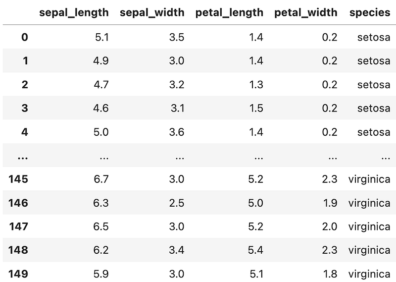
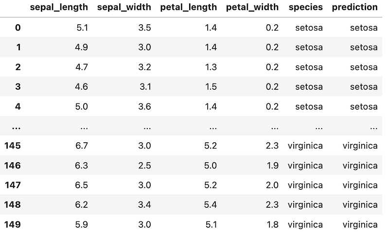
Create a Simple Machine Learning Model To demo the whole workflow , let’s create a quick Logistic Regression model to predict species and compare with ground truth (species column)
# 1. Splitting the df into the Training set and Test set
X = df.iloc[:, [0,1,2, 3]].values
y = df.iloc[:, 4].valuesX_train, X_test, y_train, y_test = train_test_split(X, y, test_size = 0.25, random_state = 0)#2. Fitting Logistic Regression to the Training set
classifier = LogisticRegression(random_state = 0, solver='lbfgs', multi_class='auto')
classifier.fit(X_train, y_train)#3. Predicting the Test set results
y_pred = classifier.predict(X_test)
# Predict probabilities
probs_y=classifier.predict_proba(X_test)# 4. use the trained model to predict the whole dataset
df['prediction']=classifier.predict(X)Output DataFrame looks like below. A new column called prediction is created by applying logistic regression.
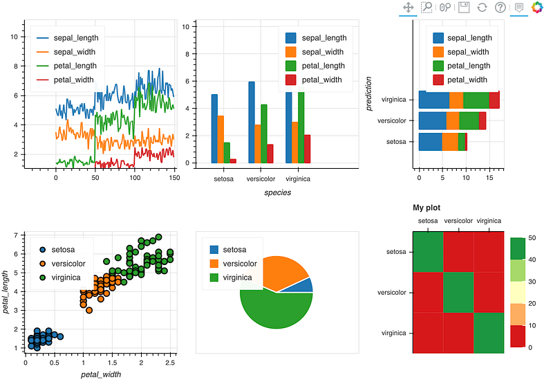
Create Dashboard using Bokeh. similar to python plot(), you just change it to plot_bokeh(). Let’s plot line plot and Barplot and stacked bar chart first.
# Plot1 - Line plot one liner
p_line= df.plot_bokeh(kind="line",plot_data_points=False,show_figure=False)
# Plot2- Barplot one liner
p_bar = df.groupby(['species']).mean().plot_bokeh(kind="bar",show_figure=False)# Plot3- stacked bar chart one liner
df_species=df.drop([‘species’],axis=1)
p_stack=df_species.groupby([‘prediction’]).mean().plot_bokeh(kind=’barh’, stacked=True,show_figure=False)pandas_bokeh.plot_grid([[p_line, p_bar, p_stack]], width=300, height=300)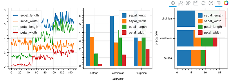
Then let’s plot scatter plot and pie chart.
#Plot4- Scatterplot
p_scatter = df.plot_bokeh(kind="scatter", x="petal_width", y="petal_length",category="prediction",show_figure=False)
#Plot5- Pie chart
p_pie= df.groupby(['prediction']).mean().plot_bokeh.pie(y='petal_width',show_figure=False)
Confusion Matrix and Heat Map in Bokeh
It is important to plot confusion matrix for classification problems as in sklearn. However, the internal heatmap from Bokeh is a little awkward. It needs few more steps of dataframe manupulation to get the heatmaps we expect.
After 30min. stackoverflow search and some testing, here is a function you could use to generate the heatmap for model evaluation.
step 1: use sklearn package to compute confusion matrix; the output in numpy array is then converted to dataframe.
# sklearn to calculate confusion Matriximport pandas as pd
from sklearn.metrics import confusion_matrixdef compute_confusionmatrix(confM):
return pd.DataFrame(confusion_matrix(confM.species, confM.prediction))confMdf=compute_confusionmatrix(confM)step 2: change column and index names and rename columns and indices to have a confusion matrix follows ML convention.
#change names
confMdf.index.name = 'Species'
confMdf.columns.name = 'Prediction'
confMdf.columns=['setosa', 'versicolor', 'virginica']
confMdf.index=['setosa', 'versicolor', 'virginica']
confMdf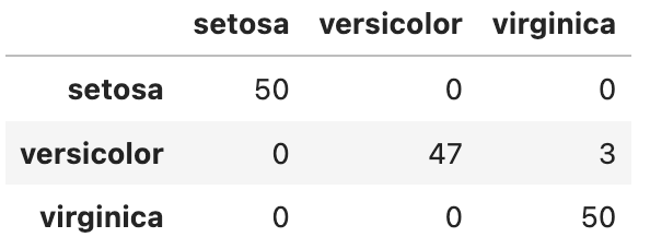
step 3 : prepare data in the right format. Bokeh heatmap needs the confusion matrix output in a unpivot format, which is done by stack() function.
# Prepare data.frame in the right format
confM_df = confMdf.stack().rename("value").reset_index()
confM_df.columns=['Species', 'Prediction', 'value']
confM_df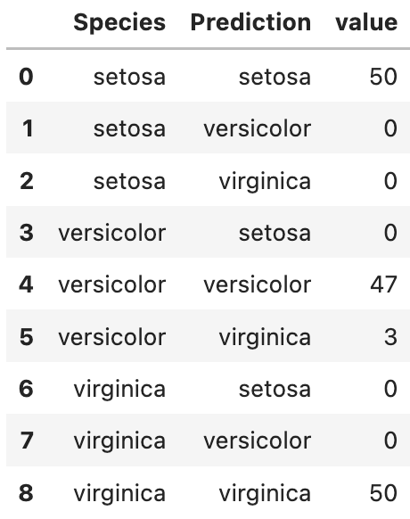
step 4. create heatmap plotting function. Unfortunately, the default heatmap function cannot generate heatmap visually appealing and following machine learning convention. I modified from a good answer form stackoverflow[2] to generate following function to plot. you will need to copy the function and paste into your code and then use it with one line code: heatmap=heat(df)
from bokeh.io import output_file, show
from bokeh.models import BasicTicker, ColorBar, LinearColorMapper, ColumnDataSource, PrintfTickFormatter
from bokeh.plotting import figure
from bokeh.transform import transform
def heat(confMdf):
''' plot as heat map
'''
# You can use your own palette here
colors = ['#d7191c', '#fdae61', '#ffffbf', '#a6d96a', '#1a9641']
#extract col names
col1=confMdf.columns.to_list()[0]
col2=confMdf.columns.to_list()[1]
col3=confMdf.columns.to_list()[2]
# Had a specific mapper to map color with value
mapper = LinearColorMapper(
palette=colors,
low=confMdf[col3].min(), high=confMdf[col3].max()
)# Define a figure
p = figure(
plot_width=300,
plot_height=300,
title="My plot",
x_range=list(confMdf[f'{col1}'].unique()),
#reverse the order of axis to create heatmap following ML convention y_range=list(confMdf[f'{col2}'].unique())[::-1],
toolbar_location=None,
tools="",
x_axis_location="above")# Create rectangle for heatmap
p.rect(
x=col1,
y=col2,
width=1,
height=1,
source=ColumnDataSource(confMdf),
line_color=None,
fill_color=transform('value', mapper))# # Add legend
color_bar = ColorBar(
color_mapper=mapper,
location=(0, 0)
,ticker=BasicTicker(desired_num_ticks=len(colors))
)p.add_layout(color_bar, 'right')return pp_heat=heat(confM_df)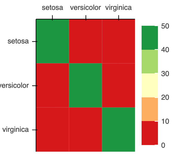
Now we can put all the individual plots into a dashboard with plot_grid()
#Make Dashboard with Grid Layout:
pandas_bokeh.plot_grid([[p_line, p_bar,p_stack],[p_scatter, p_pie, p_heat]], width=300, height=300) If this is not impressive to you, check out the Hans Rosling’s iconic TED Talk from bokeh website .
Another tip about learning Bokeh is starting with Bokeh Gallery. Find out the visualization you are interested in and reverse engineer the sample code to fit for your purpose.
In summary, the Pandas Bokeh package is convenient, powerful tool and easy to learn. There are some limitation of certain type of plots but it can be overcome by some python coding. and leave some feedback to the developers, your request might be implemented in the next release.
If you found this article useful, please clap or follow or signup my email list, happy learning!
If you get this far, you might found my another article “how to make your dashboard scalable” useful, FYI.
References
[1]Bokeh documentation: https://docs.bokeh.org/en/0.10.0/docs/contributing.html#:~:text=Bokeh%3A%20Python%20library%20for%20interactive,.bokeh.pydata.org.&text=Bokeh%20is%20BSD%20licensed%2C%20so,see%20the%20License%20for%20details).
[2] stackoverflow.com solution to create heatmap: https://stackoverflow.com/questions/49135741/bokeh-heatmap-from-pandas-confusion-matrix


