
How to Make Bokeh Dashboard Scalable

In our previous article we demonstrated how to turn your Jupyter notebook into a Bokeh dashboard.
One challenge remains that there is no obvious way to automatically create dashboards for multiple features.
Often there are many features in our dataset, manually creating dashboard is tedious and error prone. Although there are many blogs, stackoverlow threads about how to use Bokeh, there is not much articles about how to make Bokeh dashborads scalable.
After few failed attempts, a moment of epiphany comes when I used array to record figure objects. and then the plots are arranged using Gridlayout to plot dashboards. The intuition is since the Bokeh is built on plotly and matplotlib, those operations should be transferable to Bokeh.
A tutorial to automatically create and arrange plots in dashboard is illustrated in this article. The workflow could be used at different stage of your machine learning process (i.e. EDA, model training, building and monitoring). Enjoy!
load dataset and package: we will use seaborn iris dataset
import pandas as pd
import numpy as np
import seaborn as sns
# Embedding plots in Jupyter/Colab Notebook
import pandas_bokeh
from bokeh.io import show, reset_output,output_notebook
from bokeh.plotting import figure
reset_output()
output_notebook()confM=sns.load_dataset('iris')
confM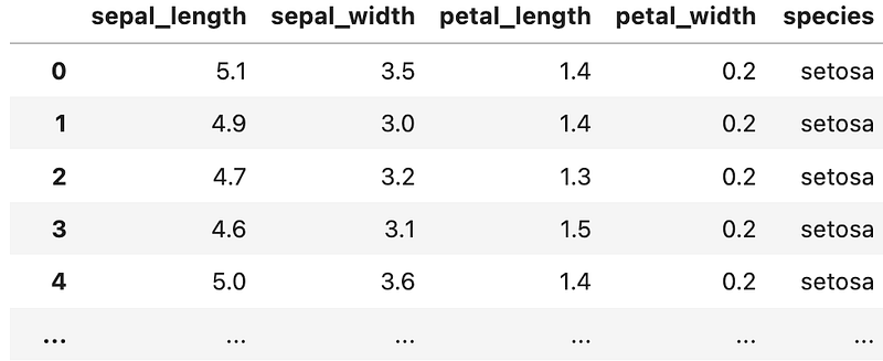
Generate feature list create feature list from dataframe
features=confM.columns
features
we will loop through the feature list and use bokeh plot API to create plot automatically for each feature; and those plots will be arranged automatically in a dashboard fashion. The trick is using array to store the objects and use Gridlayout function to arrange dashboard.
Bokeh Plot Basic Bokeh plots following following template. 1. p[i] if initialized as figure object; 2. plot type such as line, vbar or circle. here you can find more detailed gallery and user guide 3. input x, y variable as a list
p[i].line(x list, y list, options)
Workflows to automatically Generated Dashboard
Example 1: Line plots, Following is an example to plot and create a dashboard automatically.
p=[0]*len(features)
for i, feature in enumerate(features): #wrap in a loop
#1. define the figure object
p[i] = figure(width=400, height=200) #2. plot individual feature
p[i].line(confM.index.values, confM[feature], line_color='green', legend_label=f"{feature}")
p[i].title.text = f'{feature} '#3. create a plot object list and assign to dashboard in gridlayout
res=[p[i] for i in range(4)] # create a list from above plot list
grid_layout = grid(res, nrows=2) # design how many rows to showshow(grid_layout) #show the plots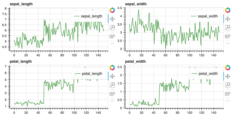
Example 2: create scatter plots and dashboard automatically repeat the same pattern above.
p=[0]*len(features)
for i, featurex in enumerate(features):
    p[i] = figure(width=300, height=300)
    p[i].circle(x='sepal_length', y=featurex, source=confM)
p[i].title.text = f'sepal_len vs {featurex} 'res=[p[i] for i in range(4)]
grid_layout = grid(res, nrows=2)show(grid_layout)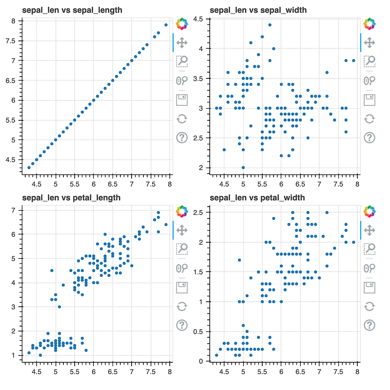
Example 3. Create histogram and dashboard. Following example is plotting histograms. we use dataframe generated by pandas.describe() function to illustrate the functionality
confM.describe()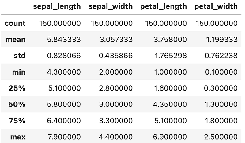
p=[0]*len(confM)
i=0
for stat, dfrow in confM.describe().iterrows():
    xlabels=dfrow.index.tolist()
    p[i] = figure(x_range=xlabels, width=300, height=200)
    p[i].vbar(x=dfrow.index.tolist(), top=dfrow.values.tolist(), width=0.9)
    p[i].title.text = f'{stat} '
i+=1res=[p[i] for i in range(8)]
grid_layout = grid(res, nrows=3)show(grid_layout)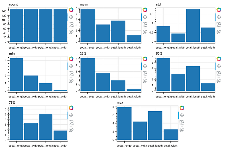
In summary, the key learning is using array to store Bokeh plots and using grid_layout API to arrange multiple plots.
If you found this article useful, please clap or follow or signup my email list, happy learning!
References
https://readmedium.com/how-to-turn-your-jupyter-notebook-into-a-dashboard-using-bokeh-397e4cf37f9e