
How to Make Colored Country Maps in Python (TLDR Edition)
A quick how-to on turning a map of New Zealand into a “choropleth” map (i.e., a colored heatmap).
This is a TL;DR version of this article, which explains all of these steps, as well as maps and data wrangling, in more detail. Both of these articles have the same author.
Steps
- Install Python, Pandas, Geopandas, and Matplotlib.
- Find a shapefile of New Zealand that has the borders of NZ’s districts.
- Feed the shapefile into Geopandas.
import geopandas as gpd

map_dataframe = gpd.read_file('nz-police-district-boundaries.shx')- Find some data about New Zealand’s police districts. (Oct 2022 Firearms data available here.)
- Feed that data into regular Pandas.
import pandas as pd

firearm_licenses = pd.read_file('nz_firearm_licenses.csv')- Combine the Geopandas and Pandas dataframes wherever their District columns match. The
DISTRICT_NandResidence Districtcolumns are both 12 rows of names of New Zealand’s districts.
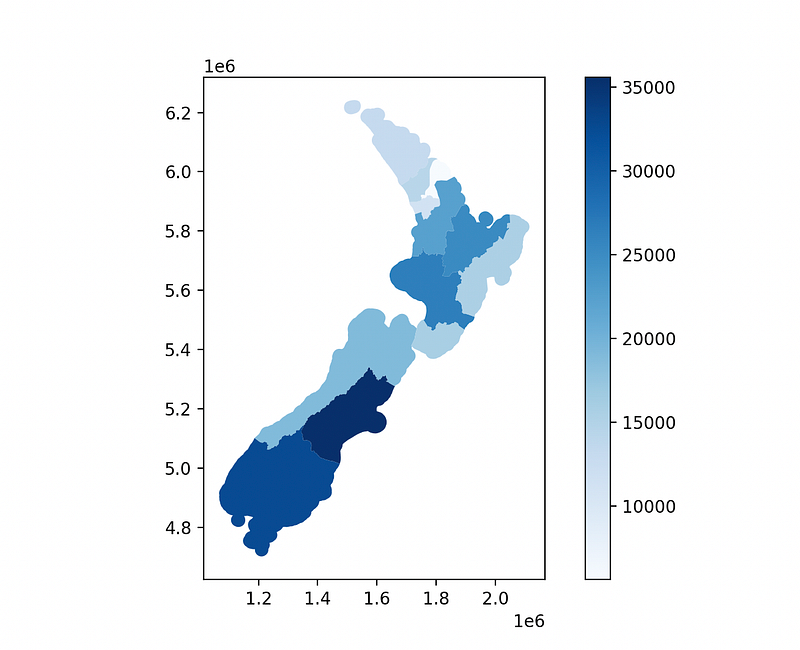
merged_dataframe = map_dataframe.merge(firearm_licenses, left_on=["DISTRICT_N"], right_on=["Residence District"])- Give the combined dataframe to Matplotlib to make the actual map.
merged_dataframe.plot(column="Licenses", cmap="Blues", legend=True)- Save the map as an image, and open it.
plt.savefig("nz_firearm_licenses.png", dpi=300)
plt.show()
Full Script
import pandas as pd
import geopandas as gpd
import matplotlib.pyplot as plt

# Load New Zealand coordinates into Geopandas
map_dataframe = gpd.read_file("nz-police-district-boundaries.shx")

# Load firearm license data into Pandas
firearm_licenses = pd.read_csv("nz_firearm_licenses.csv")

# Combine both dataframes along their district columns
merged_dataframe = map_dataframe.merge(firearm_licenses, left_on=["DISTRICT_N"], right_on=["Residence District"])

# Create a Matplotlib plot/map with the combined dataframe. Use the "Licenses" column to decide colors.
merged_dataframe.plot(column="Licenses", cmap="Blues", legend=True)

# Save and show the map
plt.savefig("nz_firearm_licenses.png", dpi=300)
plt.show()
Result
How do I make my Matplotlib graphs look better?
Questions and Feedback
If you have questions or feedback, email us at [email protected] or message us on Instagram (@protobioengineering).
If you liked this article, consider supporting us by donating a coffee.
Terms
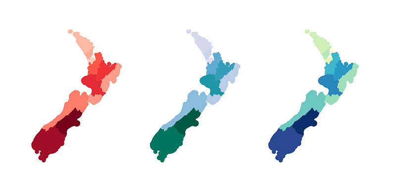
Choropleth maps are colored maps of states, countries, etc. that show data.
Pandas is a Python library that helps you mess with data sets, like those in CSVs and Excel sheets.
Matplotlib is the most popular way to make graphs and charts in Python. Works well with Pandas.
Geopandas is Pandas with extra geographical/GIS functions added, which makes map-making easier.
shapefile — the file that has the coordinates for our map. It knows the shape of the states/provinces/countries/etc.