
Make Awesome Maps in Python and Geopandas
Learn how to make beautiful choropleth maps in Python and Geopandas

In this tutorial, you’ll learn how to make amazing maps in Python using GeoPandas and Matplotlib. Maps can be an incredibly approachable form of data visualization that people can readily understand. The process of making maps, however, isn’t the most straightforward task. This tutorial aims to fix that by guiding you through using GeoPandas and Matplotlib.
By the end of this tutorial, you’ll have learned:
- How to load and manage shapefiles in GeoPandas
- How to create beautiful choropleth maps in Python
- How to customize the maps using GeoPandas and Matplotlib
Let’s dive right in!
How Does GeoPandas Work?
GeoPandas combines the powerful features of Pandas to use DataFrames and of Shapely to work with geometric data. This allows you to work with the familiar syntax of Pandas while extending its functionality to create beautiful maps.
We’ll be creating the map below. To start off, you can download the shapefiles from the US Census website here. Download the State shapes (a lower resolution, like the 20m will work well). Unzip the file, and place it into a folder near your script.
Let’s get started with creating the map!
Loading a ShapeFile into a GeoPandas DataFrame
You can load a Geopandas DataFrame by using the code below:
We can see that by loading the data into a GeoPandas DataFrame, it very much resembles a normal Pandas DataFrame. What’s great about this is that we can actually use the different functions and methods available in Pandas.
Let’s now load our population data in order to analyze it. We’ll load it into a Pandas DataFrame and make a few calculations.
In the code above, we load our DataFrame df and apply some cleaning to it. Because the data are loaded as strings, we first remove any commas and convert the values. Then, we calculate the percentage change between the two years.
Now that our datasets are prepped, let’s create our final dataset!
Creating Our Final Dataset
Because GeoPandas DataFrames have access to the underlying DataFrames, we can now merge our two datasets. We’ll want to merge into our shape DataFrame and do some final cleanup:
In the code above, we merge our two datasets. We then drop any missing values between them. Finally, we filter out the non-continental US states and territories to zoom in on our map.
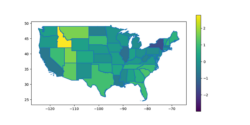
We can now plot our map using the following code:
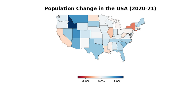
In the code above, we create an ax object, which is a shape.boundary style plot. We then plot our population change column on the axes. This returns the following visualization.
We’ve done quite a bit. Let’s customize our image further to make it look better and be more informative!
Customizing Our Map Using Python
We can customize our map further by changing the color scheme, removing our borders, adding a title, and more. This will make the visualization cleaner as well as more informative.
Let’s see how we can make some of these customizations:
In the code above, we make the following customizations:
- We change the
.plot()function call to use black lines with a smaller line width - We change the color map of our data and pass in some legend keywords
- We turn off the axes and spines
- We set a title to make our plot more descriptive
These changes return the following image:
Conclusion
In this tutorial, you learned how to create beautiful choropleth maps in Python using GeoPandas! Because GeoPandas uses the Pandas DataFrame under the hood, you were able to use familiar code to analyze and combine data.
Hopefully, this tutorial made you more interested in how to work with maps in Python. Maps can be an incredible data visualization tool that are readily understood by many audiences!


