
How to Make a Boxplot in R
Exploring Data Quantitatively Using Boxes

But, why?
A common task in data science is to explore a continuous variable (for example, numeric measurements or test results), in the context of a grouping variable (for example, treatment yes/no, cats/dogs, etc). In this entry we’ll look at some simple ways to structure the data, visualise it, and apply a statistical test to help us draw conclusions from it.
This article is for beginners with R, and it doesn’t matter if you’re a student or a professional. The only thing you need to follow this is an installation of R (although we generally advise using RStudio as well!) — you don’t need to have installed any libraries or external data packages for this, and you should be able to simply run the code chunks below for yourself.
1. Structure of the Data
- We need some data.
- Luckily, R ships with some built-in data.
- Alternatively, you could read some data from somewhere else; see our other articles for tips with this!
The Sleep Dataset
data(sleep) # use the data() function to access a built-in dataset
str(sleep) # use the str() function to look at the structure of this data
## 'data.frame': 20 obs. of 3 variables:
## $ extra: num 0.7 -1.6 -0.2 -1.2 -0.1 3.4 3.7 0.8 0 2 ...
## $ group: Factor w/ 2 levels "1","2": 1 1 1 1 1 1 1 1 1 1 ...
## $ ID : Factor w/ 10 levels "1","2","3","4",..: 1 2 3 4 5 6 7 8 9 10 ...This data object is a data.frame - a flexible table-like format, similar to a spreadsheet in other data. The sleep data represents 20 results - comparing two treatments and observing the difference in sleep time of each individual (compared to control). There are two key variables in the data: extra and group. These are the continuous and categorical variables respectively. There is also another variable ID, indicating which individual gave which result.
- We can access specific columns by using the dollar sign (among other ways…).
sleep$extra # this is a numeric vector## [1] 0.7 -1.6 -0.2 -1.2 -0.1 3.4 3.7 0.8 0.0 2.0 1.9 0.8 1.1 0.1 -0.1
## [16] 4.4 5.5 1.6 4.6 3.4sleep$group # this is a factor vector of group labels## [1] 1 1 1 1 1 1 1 1 1 1 2 2 2 2 2 2 2 2 2 2
## Levels: 1 2sleep$ID # another factor vector of individual labels## [1] 1 2 3 4 5 6 7 8 9 10 1 2 3 4 5 6 7 8 9 10
## Levels: 1 2 3 4 5 6 7 8 9 10Remember, if you can structure your own data like the sleep data, you can do the following analyses.
2. Plots
Plotting Data Summaries
A straightforward way to look at this data is a ‘box plot’ - sometimes referred to as a ‘box and whisker plot’. R has a built-in function we can use to plot it, which we can customise to our liking. Check our other articles on how to make more complicated (and perhaps more beautiful?) versions of this plot.
- We’ll use the
boxplot()function. - It features the interesting use of the squiggly line character ‘~’.
- Don’t be afraid.
boxplot(extra~group, data = sleep) # we tell the function what columns to use, and where to find them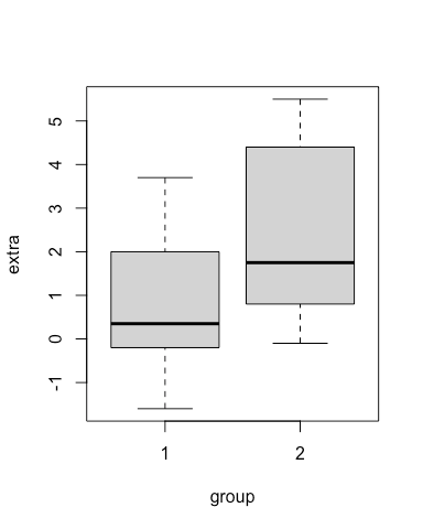
Hey, it worked.
This usage (extra~group) is called ‘formula interface’, and is used in some functions to indicate doing something by groups. You might see it again in our articles that include regressions.
A boxplot has several elements, which the function boxplot has computed on our behalf, for each group we specified. The line in the middle indicates the median value of the data, the grey shaded box indicates the 1st and 3rd quartiles, and the dotted lines indicate the minimum and maximum values… after removal of ‘suspected outliers’. The threshold for a suspected outlier is:
- values greater than 1.5*IQR + 3rd quartile
- values less than 1.5*IQR - 1st quartile
The thing to remember here is that: boxplots help you visualise summaries of the data. We are plotting descriptive, statistical measurements.
Plotting Actual Data
We can also plot the actual raw data values, using stripchart().
# to make it readable this code chunk is split over multiple lines - a new line after each comma

stripchart(extra~group,
           data = sleep, # similar to boxplot
           vertical = TRUE, # default is horizontal
           method = "jitter") # this 'jitters' the points a little horizontally to improve readability
And we can plot them both simultaneously, as the stripchart function allows us to add it over the top of an existing plot.
boxplot(extra~group, data = sleep) # first use boxplot

stripchart(extra~group, # and then stripchart
           data = sleep,
           vertical = TRUE,
           method = "jitter",
           add=TRUE) # add the stripchart to the existing plot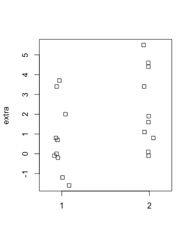
So, here are the actual data points. What about plotting them simultaneously with the data?
Combining The Plots
We can combine the functions we’ve used so far.
boxplot(extra~group, data = sleep) # first use boxplot

stripchart(extra~group, # and then stripchart
           data = sleep,
           vertical = TRUE,
           method = "jitter",
           add=TRUE) # add the stripchart to the existing plot
Aha.
3. Tweak the Plot
For simplicity, the above plots have been kept quite plain, but for presentation or publication use you may want to customise various parameters. There are lots of things we can improve with these plots - as in the following example. We aren’t changing the data or the statistics involved, just tweaking the visuals.
# this code is similar to above, but with some optional parameters used inside the function calls
oldpar = par(no.readonly = TRUE) # make a copy of the default graphical parameters
par(bg = "ivory") # this lets us specify an overall background colour

boxplot(extra~group, # same boxplot as above... but with some additions
        data = sleep,
        xlab = "Treatment Group", # add a custom x-axis label
        ylab = "Difference in Sleep", # and a custom y-axis label
        main = "Boxplot of Sleep Data",# and a main title
        lwd = 2, # thickness of box lines
        border= "slategrey", # colour of the box borders
        col = "slategray2", # colour of the inside of the boxes
        col.axis = 'grey20', # colour of the axis numbers
        col.lab = 'grey20', # colour of the axis labels
        frame = F, # remove the outer box
        boxwex = 0.5) # overall width of the boxes

stripchart(extra~group,
           data = sleep,
           vertical = TRUE,
           method = "jitter",
           add = TRUE,
           pch = 16, # specify the type of point to use
           cex = 1, # how big the points should be
col = "darkred") # and the colour to plot them aspar(oldpar)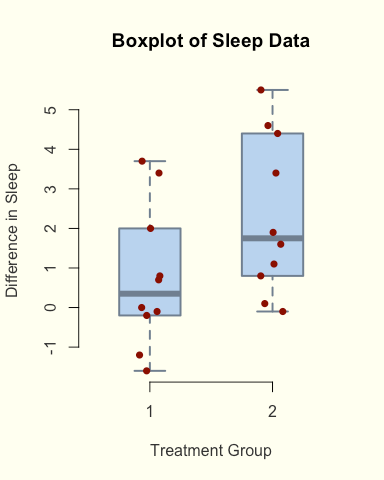
Here we’ve demonstrated a couple of concepts. The par() function lets us alter graphics parameters like plot background colour - although it’s permanent, so we make a copy first and then revert back to the defaults at the end of the code. RStudio has a ‘Clear All Plots’ button that also does this.
The rest of the code here are simply style choices - choosing the colours for various elements, the size of points, the width of lines, and so on.
4. Do a Statistical Test
To continue exploring these data, we can perform an appropriate statistical test. Here, we will ask if there is a significant difference between these two groups of values: ie. whether the results we observed were due to chance or due to the effect of the treatment. The null hypothesis is that both sets of results have (effectively) equal means.
We aren’t diving deep into this topic here, just showing how to apply such a test to this data.
In R, we can simply use the appropriately named t.test function.
t.test(extra~group,
       data = sleep, # notice how similar this is to the boxplot/stripchart functions!
paired = TRUE) # our data is paired, and the observations are ordered by the individual ID, so we should tell the function that##
## Paired t-test
##
## data: extra by group
## t = -4.0621, df = 9, p-value = 0.002833
## alternative hypothesis: true difference in means is not equal to 0
## 95 percent confidence interval:
## -2.4598858 -0.7001142
## sample estimates:
## mean of the differences
## -1.58By default, the t.test function outputs a chunk of text including some values of interest. As the p-value is quite small (below the commonly used threshold 0.05), we can say that the likelihood of these results happening by chance is very low, and that there is a significant difference between the two groups.
We can also save this test result to a variable, and do something else with it downstream - like use it in a label for a plot!
# save the result of the test to a new variable
t_result = t.test(extra~group,
       data = sleep,
       paired = TRUE)
# round to 3 significant figures
p_value = signif(t_result$p.value,digits = 3) # make a new title for the plot
main_title = paste("Boxplot of Sleep Data","\n","p = ",p_value)par(bg = "ivory") # this lets us specify an overall background colour
boxplot(extra~group,
data = sleep,
xlab = "Treatment Group", # add a custom x-axis label
ylab = "Difference in Sleep", # and a custom y-axis label
main = main_title, # use our custom title
lwd = 2, # thickness of box lines
border= "slategrey", # colour of the box borders
col = "slategray2", # colour of the inside of the boxes
col.axis = 'grey20', # colour of the axis numbers
col.lab = 'grey20', # colour of the axis labels
frame = F, # remove the outer box
boxwex = 0.5) # overall width of the boxes
stripchart(extra~group,
data = sleep,
vertical = TRUE,
method = "jitter",
add = TRUE,
pch = 16, # specify the type of point to use
cex = 1, # how big the points should be
col = "darkred") # and the colour to plot them aspar(oldpar)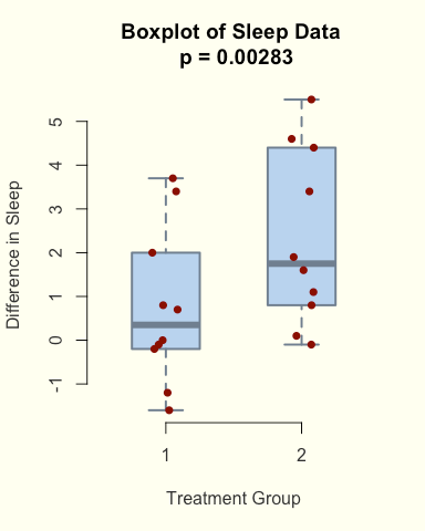
Here we made a custom title, by pasting together the results from the t.test() into a custom string, and then using that as a parameter in the plot.
5. Final Thoughts
This entry has covered a couple of topics, and the key points to remember are as follows:
- If your data is a mix of categorical and continuous data, you may be interested in using box plots to explore it.
- You can visualise both statistical measurements and the raw data on the same plot.
- There are lots of ways to customise plots in R. This is just the tip of the iceberg.
- A statistical test can helps us draw conclusions from the data, and we can combine the result with the plot labels.
Thanks for reading! If you have any questions, or suggestions for other articles, please feel free to comment.
Check out this article by Lewis Gallagher if you’re interested in a similar guide for Python, and I’ll be posting more articles about R!