
Beautiful Beginner Box Plots in Python
Exploring Data Quantitatively With Boxes

Why box plots?
In data science it is a common task to visualise the impact of categorical variables (such as Country A vs Country B or cats vs dogs) against a continuous measurement (such as weight or test results and so on.). Box plots are the perfect tool for visualising such data.
Seaborn or Matplotlib?
Plotting in Python from scratch can be a little daunting. Matplotlib is, in my experience, a complicated package and not a great place to start for beginner plotters. Seaborn is a wrapper for Matplotlib making the syntax and plotting parameters far more user-friendly and readable. We’re going to create beautiful and reproducible box plots, the perfect plot for comparing categorical variables with continuous measurements.
1. Install required packages
If you want to interact with tables of data in Python, the easiest way hands-down is with the Pandas package. It also happens to play very nicely with our plotting package, Seaborn. You will need to install these via pip or conda. For tutorials on how to install Python packages through these package managers, check out our other tutorials.
Once they’re installed, we need to tell python we want to use them with import.
>>> import pandas as pd
>>> import seaborn as sns
Tip: we use the as pd and as sns syntax to give these libraries short hand accessors, allowing us to access Pandas by typing pd instead of writing the full name every time.
2. Create a data frame
You’ll first need a table of data. The easiest way to manage data tables in Python is with the Pandas library. It lets you visualise your tables as you code and integrates with plenty of plotting packages.
An example data set can be accessed at the URL below. The fmri.csv file contains FMRI signal data from multiple subjects, scanning regions and time points. The pandas pd.read.csv() function reads a comma delimited file into a data frame class.
>>> raw_data = "https://raw.githubusercontent.com/mwaskom/seaborn-data/master/fmri.csv">>> mri = pd.read_csv(raw_data)# Take a peek at the top of the data frame with .head()
>>> mri.head()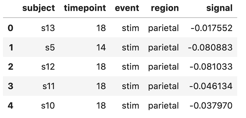
3. Interrogate the data
It’s always smart to check if your data looks as expected before attempting any visualisation. Let’s look at the region column (stored under mri[“region”]) and the signal column (stored under mri[“signal”]).
First of all, what do these variables even look like? The pandas .describe() method returns some summary statistics of data frame columns.
>>> mri["region"].describe()
 count         1064
 unique           2
 top       parietal
 freq           532
 Name: region, dtype: object
Region is an object, meaning it is a categorical variable.
>>> mri["signal"].describe()count 1064.000000
mean 0.003540
std 0.093930
min -0.255486
25% -0.046070
50% -0.013653
75% 0.024293
max 0.564985
Name: signal, dtype: float64Signal is a float, meaning it is a continuous variable.
4. Plotting with Seaborn
We now have our data nicely organised in a Pandas data frame called mri. We can pass this data over to Seaborn, a pretty and user-friendly method of plotting data.
Seaborn can produce a box plot by using the boxplot() function. Three variables are required:
1. data is our Pandas data frame: mri
2. x is our categorical variable: region
3. y is our continuous variable: signal
Don’t forget to run import seaborn as sns if you haven’t already!
# The box plot
>>> b = sns.boxplot(data = mri, x = “region”, y = “signal”)
# Show the plot
>>> b.get_figure();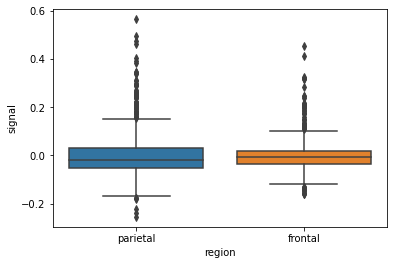
Nice!
A boxplot has several elements, which the function boxplot() has computed on our behalf, for each region in the region column. The line across the middle of the boxes indicates the median value of the data. The boxes coloured areas indicate the upper and lower quartiles, and the whiskers indicate the minimum and maximum values after removal of outliers. The threshold for aoutlier is:
values greater than 1.5*IQR + 3rd quartile values less than 1.5*IQR — 1st quartile
Any data points that lie beyond these boundaries are known as ’fliers’ and are represented by diamonds on this box plot.
The above box plot looks okay, but I think we can do better…
5. Add data points
We can add dots to represent the actual raw data values, using Seaborn’s stirpplot().
>>> b = sns.boxplot(data = mri,
                    x = "region",
                    y = "signal")
>>> b = sns.stripplot(data = mri,
x = "region",
y = "signal",
color = "black")>>> b.get_figure();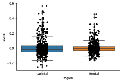
Nearly there! It still looks a bit clunky…
Let’s change the box and dot colours (click here to see a list of valid colours), make the boxes thinner and change the plot background. This is all done by providing a few more variables beyond our data, x and y variables. And can be found in the Seaborn documentation.
Don’t be scared! Take it one line at a time.
# Change some of seaborn's style settings with `sns.set()`
>>> sns.set(
        style="ticks",                   # The 'ticks' style
        rc={"figure.figsize": (6, 9),      # width = 6, height = 9
            "figure.facecolor": "ivory",  # Figure colour
            "axes.facecolor": "ivory"})  # Axes colour
# Box plot
>>> b = sns.boxplot(data = mri,
x = "region", # x axis column from data
y = "signal", # y axis column from data
width = 0.4, # The width of the boxes
color = "skyblue", # Box colour
linewidth = 2, # Thickness of the box lines
showfliers = False) # Sop showing the fliers# Strip plot
>>> b = sns.stripplot(data = mri,
x = "region", # x axis column from data
y = "signal", # y axis column from data
color = "crimson", # Colours the dots
linewidth = 1, # Dot outline width
alpha = 0.4) # Makes them transparentNow let’s add plot title and format the axis labels.
# Set the y axis and font size
>>> b.set_ylabel("Signal", fontsize = 14)
# Set the x axis label and font size
>>> b.set_xlabel("Region", fontsize = 14)# Set the plot title and font size
>>> b.set_title("FMRI signal by region", fontsize = 16)# Remove axis spines
>>> sns.despine(offset = 5, trim = True)# Show the figure
>>> b.get_figure();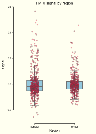
Neat, right? Let’s draw some conclusions from this data by asking if the FMRI signal is significantly different between these two regions.
6. Add a statistical test
Now let’s perform a statistical test to see if there is a significant difference between these two measurements. Our null hypothesis is that no significant difference in signal measurement exists between the two scanned regions.
To test this, we can simply import the ttest_ind library from scipy.stats; this package is included with Python. No installation is necessary, just import it and you’re good to go. Apply thettest_ind function to our two groups.
from scipy.stats import ttest_ind# Group 1 is 'signal' values when the 'region' is "frontal"
>>> group1 = mri['signal'][mri['region'] == "frontal"]# Group 2 is 'signal' values when the 'region' is 'parietal'
>>> group2 = mri['signal'][mri['region'] == "parietal"]# Run the t-test
>>> t = ttest_ind(group1, group2)# The t-test returns 2 values: the test statistic and the pvalue
>>> print(t)
Ttest_indResult(statistic=-0.7783271025229704, pvalue=0.4365495728493708)We just want the p-value, so take the value stored under the [1] index.
>>> pval = t[1]# We can round it using round()
>>> pval = pval.round(3)print("Pvalue = ", pval)
Pvalue = 0.4377. Bring it all together
Now we have the t-test result stored in the pval variable. We can use this variable when writing the plot’s title. Check out the line near the bottom where we define b.set_title.
# Change some of seaborn's style settings with `sns.set()`
>>> sns.set(
        style="ticks",                   # The 'ticks' style
        rc={"figure.figsize": (6, 9),      # width = 6, height = 9
            "figure.facecolor": "ivory",  # Figure colour
            "axes.facecolor": "ivory"})  # Axes colour
# Box plot
>>> b = sns.boxplot(data = mri,
x = "region", # x axis column from data
y = "signal", # y axis column from data
width = 0.4, # The width of the boxes
color = "skyblue", # Box colour
linewidth = 2, # Thickness of the box lines
showfliers = False) # Sop showing the fliers# Strip plot
>>> b = sns.stripplot(data = mri,
x = "region", # x axis column from data
y = "signal", # y axis column from data
color = "crimson", # Colours the dots
linewidth = 1, # Dot outline width
alpha = 0.4) # Makes them transparent# Set the y axis and font size
>>> b.set_ylabel("Signal", fontsize = 14)# Set the x axis label and font size
>>> b.set_xlabel("Region", fontsize = 14)# Set the plot title with the pval variable and font size
>>> b.set_title("p-value = " + str(pval), fontsize = 16)# Remove axis spines
>>> sns.despine(offset = 5, trim = True)# Show the figure
>>> b.get_figure();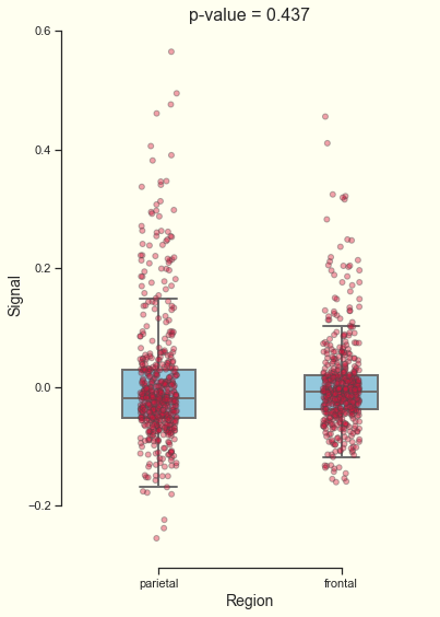
8. Save the figure
Now that’s a beautiful box plot. When you’re happy with how it looks you can save the figure. Give it a name and lower/raise the dpi parameter to change the resolution of the saved image.
>>> b = b.get_figure()
>>> b.savefig("myBoxplot.png", dpi=200)
9. Final thoughts
We’ve covered some key points to consider when producing box plots.
- If your data is a mix of categorical and continuous data, a box plot is a brilliant way to visualise it.
- You can visualise both statistical measurements and the raw data on the same plot.
- There are lots of ways to customise plots in Python with Seaborn.
- A statistical test can helps us draw conclusions from the data, we can combine the statistical result with the plot labels to add value to our box plot.
Thank you for reading! If you have any questions or suggestions for other articles, you are more than welcome to comment. I hope you enjoyed it!
If you’d like to see how this is done in R, please head over to my good friend George Seed’s article on How to Make A Boxplot in R.


