
How to evaluate the performance of a machine learning model
We will discuss the different metrics used to evaluate a regression and a classification machine learning model.
Prerequisites: Machine learning basics

Let’s first revisit briefly a few things
Supervised Machine learning are of two types
Regression — The output is a continuous variable (eg. Predict Housing Prices).
Classification — The output is a discrete variable (eg. Cat vs Dog). Classification could be binary or a multi class classification.
How do I measure the performance of my model?
A good fitting model is one where the difference between the actual or observed values and predicted values for the selected model is small and unbiased for train, validation and test data sets
How do I measure the performance of my regression model?
A few statistical tools like coefficient of determination also called as R², Adjusted R² and Root mean square Error -RMSE are commonly used to evaluate the performance of the regression model.
What is R²?
It is also called as coefficient of determination.
R² gives us a measure of how well the actual outcomes are replicated by the model or the regression line. This is based on the total variation of prediction explained by the model.
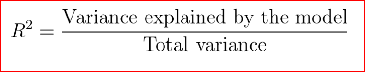
R² is always between 0 and 1 or between 0% to 100%.
A value of 1 means that the model explains all the variation in predicted variable around its mean.
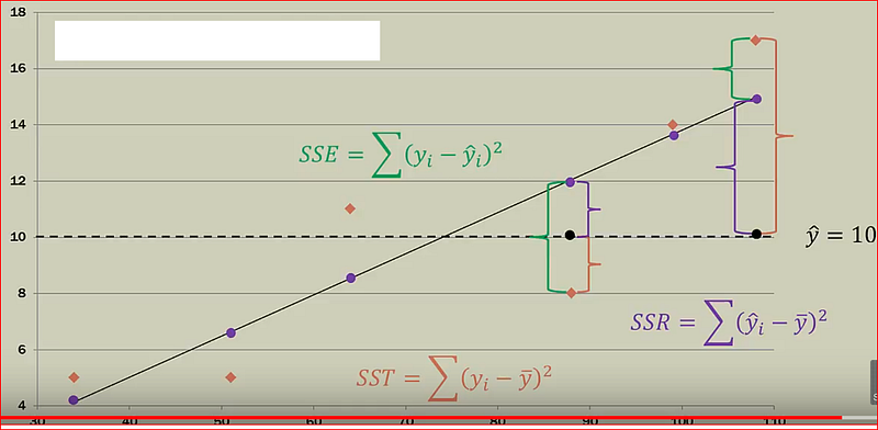
Sum square of errors(SSE) or Residuals, how far did we predict a value when compared to the actual value
SSE = Actual value -Predicted value
Sum square of total (SST), how far is the actual value when compared to the mean value
SST = Actual value -Mean value
Sum square of Regression(SSR), how far is the actual value when compared to the mean value
SSR = Predicted value -mean value
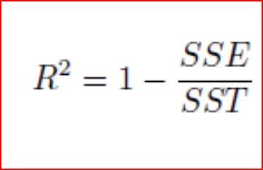
If the error in prediction is low then SSE will be low and R² will be close to 1.
A caution of note here, when we add more independent variables, R² gets higher value. R² value keeps on increasing with addition of more independent variables even though they may not really have a significant impact on the predictions. This does not help us to build a good model.
To overcome this issue, we use Adjusted R². Adjusted R² penalizes the model for every addition of an insignificant independent variable.
A value close to 1 for R² means a good fit.we can also calculate root mean square error also referred as RMSE.
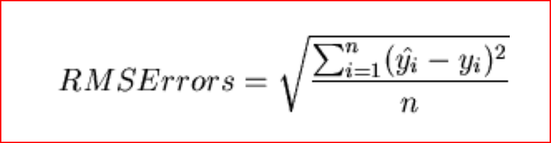
Root Mean Square Error
RMSE shows the variation between the predicted and the actual value. Since the difference between predicted and actual values can be positive or negative . To offset that difference we take the square of the difference between predicted and actual value.
Step 1: Find the difference between predicted and actual value for every observation and square the value and add them
Sum of all observation (predicted value — actual value)²
Step2: divide the sum by number of observations
Sum of all observation (predicted value — actual value)²/number of observations
Step 3: Take the square root of the value from step 2
How do I measure the performance of my classification model?
For Binary classification we expect an output of 0 or 1. The output is a predictive score which conveys the probability of the output to be either a 0 or a 1. Typically if the score is the above a certain threshold value then we set the output to 1 else the output will be 0. This threshold value is usually selected as 0.5 but can vary.
To evaluate the performance of a binary classification model we use Log Loss/Cross Entropy, Confusion matrix or AUC.
Log Loss or Logarithmic Loss or Cross Entropy Loss
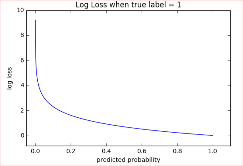
Log loss should be close to 0 for a good binary classification model. Log loss increases as the predicted values diverges from the actual value. A perfect model will have a log loss of 0.
Log loss penalizes classifier that predicts false classification. It is better to be slightly wrong then being emphatically wrong. It measure the uncertainty of the probabilities of the model to the actual output.
We can remember this by thinking that if we tell a blatant lie then log loss function will penalize us heavily compared to a trivial lie.
If we predict a probability for an output to be 0.15 when the actual value was 1, then we are diverging from the actual output and so we will get a higher log loss,
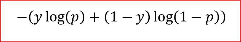
In the above equation
y :is the actual output
p : predicted value
In our previous example where the predicted value was 0.15 and actual output value was 1.
Log Loss = -(1 log(0.15) +(1–1) log(1–0.15))
Log Loss = -log(0.15) +0 =-log(0.15) = 0.82
This shows our prediction was heavily penalized as the classifier made a false prediction
Accuracy is the proportion of correct predictions for positive and negative class over the total number of observations. It is the most popular measure to evaluate a model’s performance but we need to be aware of Accuracy Paradox or Null Error Rate.
Null Error Rate or Accuracy paradox tell us how often we will be wrong when we always predict the majority class.
for example, in a sample of 100 data points where 98 patients do not have cancer, then not having cancer is our majority class. If we predict that 100 patients will not have cancer then out accuracy is 98%, this is accuracy paradox. To overcome accuracy paradox we have to use different metrics for evaluating a model’s performance.
Let’s understand other metrics for evaluating a classification model
Confusion Matrix
Confusion matrix is a table that tells us how many actual values and predicted values exists for different classes that the model will predict. Also referred as Error matrix.
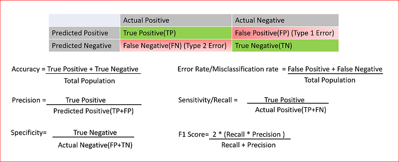
Explaining the key terms
True Positive : When patient has cancer and we predicted that patient will have cancer.
True Negative : When patient did not have cancer and we predicted that patient will not have cancer
False Negative : When patient had cancer but we predicted patient will not have cancer. Also called as Type 2 error.
False Positive: When Patient did not had cancer but we predicted that patient has cancer. This is Type 1 error
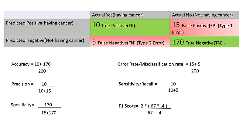
Let’s take an example and explain this.
we want to predict if a person will have cancer or not based on certain features and our sample size is 200 patients as shown below. we put all the number sin the table and calculate different metrics
F1 is the harmonic mean between precision and recall. F1 scores are used for binary as well as multiclass classification evaluation. Range for F1 score is between 0 and 1 and a larger value means better prediction.
Receiver Operating characteristics(ROC) and Area under ROC Curve(AUC)
ROC curve is a graph showing the performance of a classification model at different classification threshold. ROC curve is a plot between true positive rate(TPR) and false positive rate(FPR).
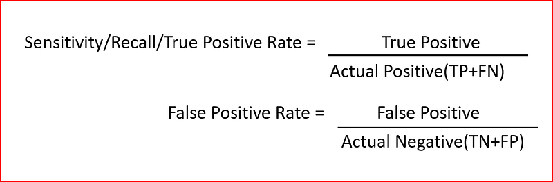
What is true positive rate and false positive rate?
True Positive Rate(TPR) is the proportion of the positive data points correctly predicted to all the actual positive data points. It is also referred as recall. Higher TPR means we will have less positive data points that will be misclassified.
False Positive Rate(FPR) is the proportion of the negative data points falsely predicted as positive to all the actual negative data points. Higher FPR implies that more negative data points have been classified incorrectly.
ROC is a plot between TPR and FPR at different classification thresholds so various thresholds results in different true positive rate and false positive rates
When we lower the classification threshold say from 0.5 to 0.3. In that scenario we will classify more data points as positive thus increasing the true positive and false positives.
To compute the points in an ROC curve we can evaluate the model at different classification threshold but that would be inefficient and so we use AUC or Area under ROC Curve
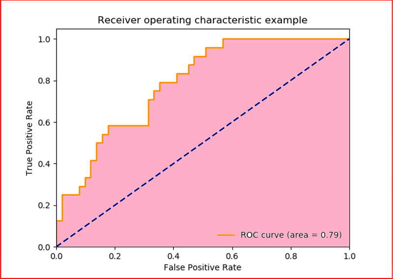
AUC measures the area under the ROC curve which is the area in pink. The dashed line is random classifier from which you can expect as many true positives as false positives.
we can think of AUC as the probability where model ranks a randomly positive example more highly than a randomly negative example.
AUC ranges between 0 and 1.
A value of 0 means 100% prediction of the model is incorrect. A value of 1 means that 100% prediction of the model is correct.


