avatarArpita Ghosh

Free AI web copilot to create summaries, insights and extended knowledge, download it at here

2179

Abstract

      <div>
          <div>
            <h2>How to Calculate Variability measures (variance SD etc) in Statistics and Python</h2>
            <div><h3>In this blog, I am going to talk about Variability measures with hands on in python. If you miss my previous blog about…</h3></div>
            <div><p>medium.com</p></div>
          </div>
          <div>
            <div style="background-image: url(https://miro.readmedium.com/v2/resize:fit:320/1*5JKgySkilsCqLo7j25eTNQ.jpeg)"></div>
          </div>
        </div>
      </a>
    </div><h1 id="9cc2">How to Create a Correlation Plot?</h1><p id="2926">You can find this Correlation Plot under Custom Visual. In Power BI, many custom visuals are based on R packages. This visual uses <b><i>corrplot </i></b>R packages.</p><p id="3a8a">Now you will create a Correlation Plot step by step.</p><ol><li>Goto <b>Visualization </b>section → Click on <b>Get more visuals</b>.</li><li>Open the “<b>Power BI Visuals</b>” dialog box. Search with “<b>correlation plot</b>”.</li><li>Click on <b>Add </b>button beside on Correlation Plot</li></ol><figure id="e214"><img src="https://cdn-images-1.readmedium.com/v2/resize:fit:800/1*pjtdlxaIb7ZXyJFpS48vxQ.png"><figcaption>Image by Author</figcaption></figure><p id="7e94">4. Select <b>Correlation Plot </b>visual and add it to your current <b>page </b>after clicking on <b>Enable </b>button.</p><p id="c1eb">5. Now add some relevant <b>measures </b>to this plot under the <b>Values </b>section.</p><figure id="57ca"><img src="https://cdn-images-1.readmedium.com/v2/resize:fit:800/1*3bg_5wu_zzQdGyxAFhddCA.png"><figcaption>Image by Author</figcaption></figure><p id="cf22">6. Now you can add some <b>formatting</b>.</p><p id="4912">7. First enable <b>Labels</b>, increase the <b>font </b>size and change the <b>color</b>.</p><p id="eab4">8. Next enable <b>Correlation plot parameters</b>. You can change the <b>Element shape</b> to <b>shade </b>and keep the <b>default </b>selection for <b>other options</b>.</p><p id="31a0">9. Now you can enable <b>Correlation coefficients</b> to display <b>data labels </b>with modified <b>color</b>, <b>font

Options

</b>and<b> number of digits</b> after the decimal point.</p><p id="e56a">10. Lastly enable the <b>Additional Settings </b>and enable <b>Show warnings</b>.</p><figure id="7a42"><img src="https://cdn-images-1.readmedium.com/v2/resize:fit:800/1*ow7VLJgQrLaocJApndA4aQ.png"><figcaption>Image by Author</figcaption></figure><p id="579f">11. Now Correlation Plot is ready to serve.</p><figure id="6867"><img src="https://cdn-images-1.readmedium.com/v2/resize:fit:800/1*CT15ndFhs7gOKMRW0yBXtg.png"><figcaption>Image by Author</figcaption></figure><h2 id="60bb">Analysis</h2><p id="f733">The plot reveals that there is some negative correlation for the discount with all the other measures. You see a positive correlation between the profit and all other measures, except for the discount. In this way, you can explain this visual to your customers.</p><h1 id="9f3f">Download</h1><p id="a4ec">Please find the code in the below location</p><p id="c53a"><a href="https://github.com/arpitag1/Power-BI">AI and Power BI — Chapter </a>5</p><h1 id="1a4f">Video</h1> <figure id="08e0"> <div> <div> <img class="ratio" src="http://placehold.it/16x9"> <iframe class="" src="https://cdn.embedly.com/widgets/media.html?src=https%3A%2F%2Fwww.youtube.com%2Fembed%2Fm6VRNsYDvLw%3Ffeature%3Doembed&amp;display_name=YouTube&amp;url=https%3A%2F%2Fwww.youtube.com%2Fwatch%3Fv%3Dm6VRNsYDvLw&amp;image=https%3A%2F%2Fi.ytimg.com%2Fvi%2Fm6VRNsYDvLw%2Fhqdefault.jpg&amp;key=a19fcc184b9711e1b4764040d3dc5c07&amp;type=text%2Fhtml&amp;schema=youtube" allowfullscreen="" frameborder="0" height="480" width="854"> </div> </div> </figure></iframe></div></div></figure><h1 id="e0e4">Conclusion</h1><p id="48af">In this blog, we understand how to create and analyse correlation plots in Power BI.</p><p id="bc28">In my next blog, we will learn more about AI and Power BI.</p><p id="13d4">If you have any questions related to this project, please feel free to post your comments.</p><p id="5e47">Please like, comment and subscribe to my YouTube channel which you have already seen. :-) Keep Learning.</p></article></body>

How to Create Correlation Plot in Power BI — AI and Power BI — Chapter 5

You will learn how to build smart visualizations like correlation plots in Power BI.

Photo by Sam Moqadam on Unsplash

A correlation Plot is an important visualization for any data analysis or data science project. Power BI has some small visualization capability and custom visual features are enabling to implement this.

In this blog, we are going to explore the one smart and AI visualizations, named correlation plot.

Get Data

For this case study, I consider the US Superstore dataset from Kaggle.

  • Let’s start with the Get Data option under the Home tab. As this is a CSV file, select the Text/CSV option from the drop-down list
  • Select the file named US Superstore data.csv
  • After selecting the file, data will be displayed in the below format
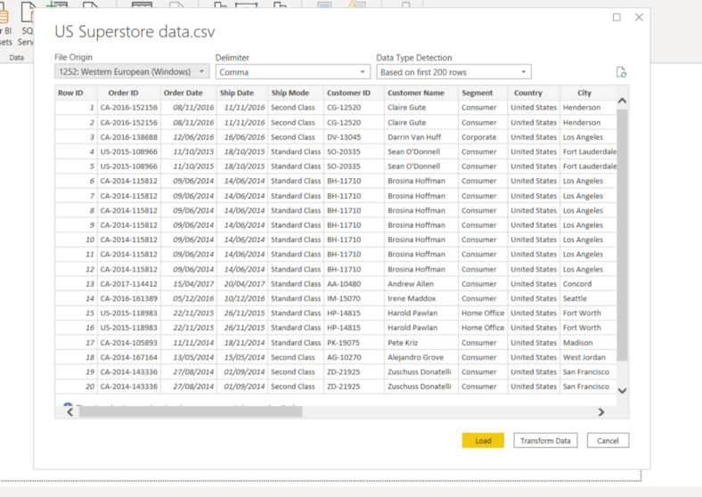
Image by Author
  • Click on Load and save data.

What is Correlation Plot?

A correlation plot can display the correlation among different measures, and optionally you can create some clusters by correlation coefficient.

If you want to know more about the correlation coefficient, you can go through my blog related statistics.

How to Create a Correlation Plot?

You can find this Correlation Plot under Custom Visual. In Power BI, many custom visuals are based on R packages. This visual uses corrplot R packages.

Now you will create a Correlation Plot step by step.

  1. Goto Visualization section → Click on Get more visuals.
  2. Open the “Power BI Visuals” dialog box. Search with “correlation plot”.
  3. Click on Add button beside on Correlation Plot
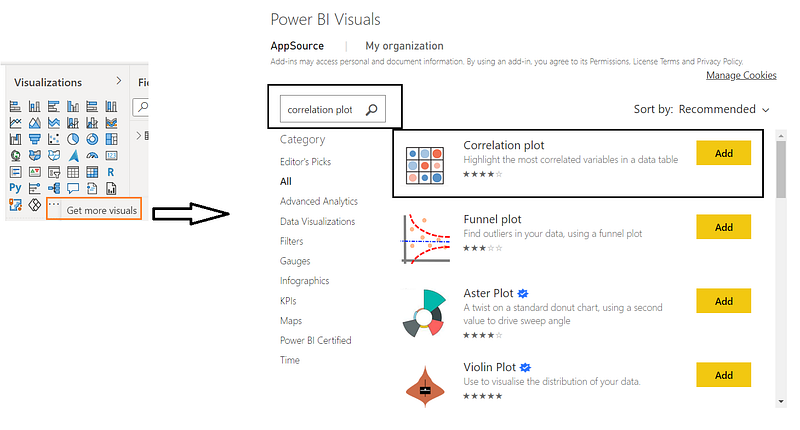
Image by Author

4. Select Correlation Plot visual and add it to your current page after clicking on Enable button.

5. Now add some relevant measures to this plot under the Values section.
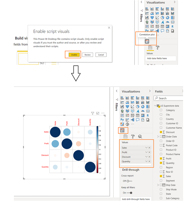
Image by Author

6. Now you can add some formatting.

7. First enable Labels, increase the font size and change the color.

8. Next enable Correlation plot parameters. You can change the Element shape to shade and keep the default selection for other options.

9. Now you can enable Correlation coefficients to display data labels with modified color, font and number of digits after the decimal point.

10. Lastly enable the Additional Settings and enable Show warnings.
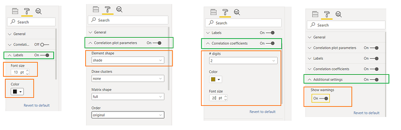
Image by Author

11. Now Correlation Plot is ready to serve.

Image by Author

Analysis

The plot reveals that there is some negative correlation for the discount with all the other measures. You see a positive correlation between the profit and all other measures, except for the discount. In this way, you can explain this visual to your customers.

Download

Please find the code in the below location

AI and Power BI — Chapter 5

Video

Conclusion

In this blog, we understand how to create and analyse correlation plots in Power BI.

In my next blog, we will learn more about AI and Power BI.

If you have any questions related to this project, please feel free to post your comments.

Please like, comment and subscribe to my YouTube channel which you have already seen. :-) Keep Learning.

Data Visualization
Power Bi
Correlation
Data Analysis
Artificial Intelligence
Recommended from ReadMedium