
How to Create a Header Image for Your Profile on Medium.com
Spice up your Medium profile with a picture or gradient
You may have seen a lot of changes to Medium’s platform lately. Some seem good (more customization) and some seem bad (what’s with the massive reduction in reading time?).
There’s lots to gripe about, but let’s focus on the positive today.
‘Cuz it’s Sunday and I just had an amazing breakfast (a peanut butter hamburger with a bacon 蛋餅 on the side).
Anywho, let’s take a quick look at how to add some flavor to your profile by adding pictures, colors, or gradients!
Examples of new Medium.com profile headers
*Note, this guide is for the browser version of Medium and not mobile.
First things first. What am I talking about? Well, here are some examples of a few cool profiles using the new design features from Medium.
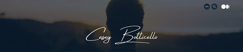
First up to bat is Casey Botticello with a classy picture/signature combo straight out of a Rolex commercial:
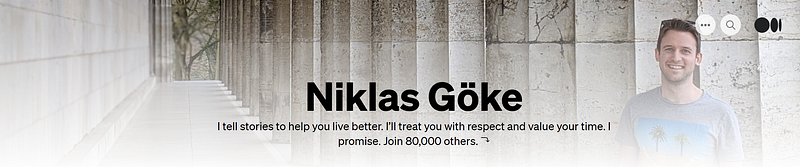
Then we have a nice trustworthy everyman’s faded gradient picture from Niklas Göke:
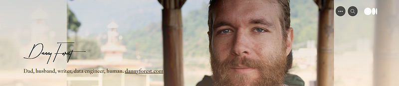
On to a cool-yet-classy photo background of, uhh, Italy(?), with a prestigious signature brought to us by Danny Forest’s profile: (*I’ve since been told it was in India — cool!)
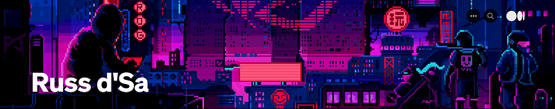
Lastly, the wackiest one comes to us from one of Medium’s own staffers. Here’s a crazy retro synthwave GIF header from Russ d'Sa:
Pretty cool right? I’m also in awe of these people’s signatures. I have no idea how someone can handwrite so prettily.
Here’s mine for reference:
Writing cheques is a bitch.
How to make your own custom header image on Medium.com?
Did you like any of the above profiles? I’m sure we’ll see more and more cool ones as time goes on and writers start using the new function.
Or maybe one of you reading this will create something rad for us to see?
If so, send me a link in the comments and I’ll check it out!
Now let’s begin with a step-by-step guide.
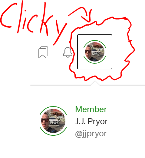
1. Go to your profile menu
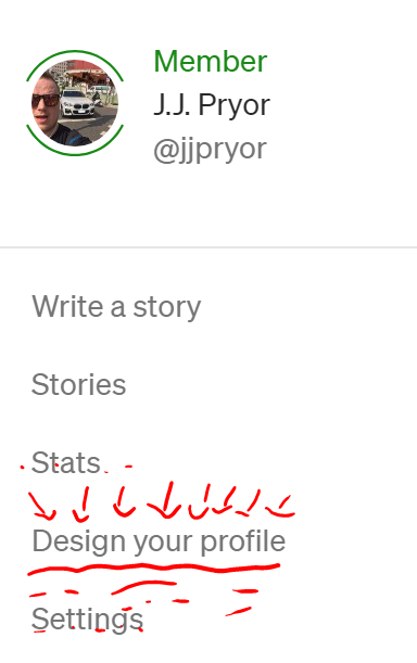
2. Click on ‘Design your profile’
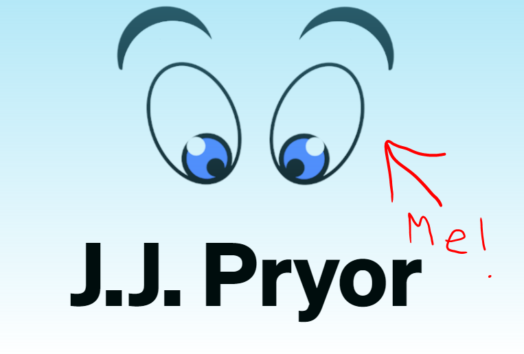
3. Now you’re at the design page, and you’ll see something like this (but less eyebally)
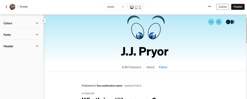
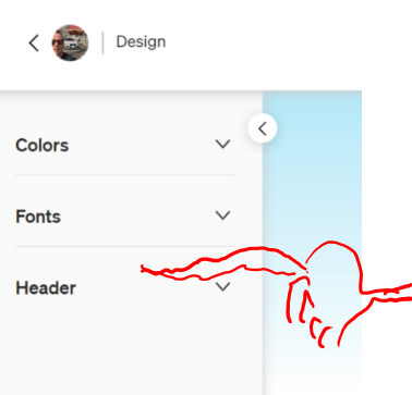
4. Click on the ‘Header’ section on the left side
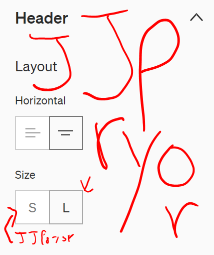
5. Choose your name’s size and location (ex. JJ Pryor)
6. Choose your color type (solid or gradient) and play with it
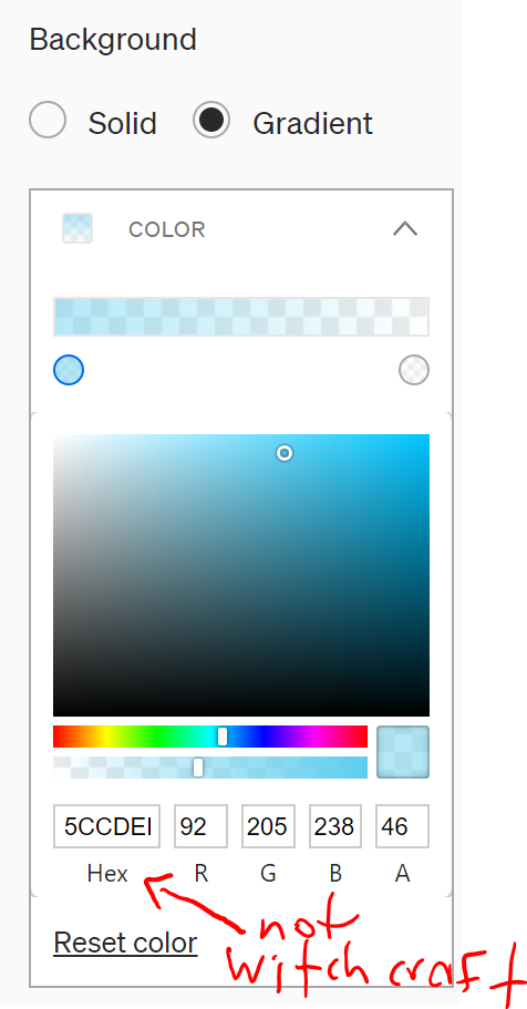
I’d recommend using gradient style as it just looks a bit cleaner on digital screens. Have fun with the colors and play around with the fading bar (the 2nd bar below the color pad).
Or if you want to ‘borrow’ a color from a famous brand or webpage (you thief), you can often use Google to find out the exact Hexcode or RGB of those colors.
For example, if you want a nasty puke green color sans pumpkin spice, you could search ‘Starbucks logo green RGB’ and you’ll get the exact answer.
7. Adjust your story background color (if you want)
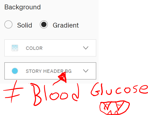
I’d recommend going for something related to whatever style and color you choose for your profile background, just to keep some brand consistency.
Or just leave it white. Nothing wrong with plain vanilla.
Just ask my girlfriend.
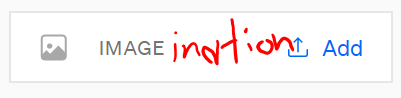
8. Now click on the ‘Add’ button beside ‘IMAGE’ on the left
It will show a pop up like this after:
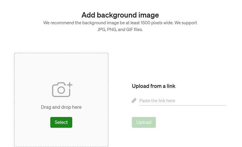
You can drag and drop or just select a file from your computer. Alternatively, you can paste a link from a specific webpage image. Usually, it’s just easier to download it if that’s an option.
Important note 1: This can get troublesome when trying to position the new background image. Medium is displayed on 1001 devices and might not always look the same on each one. You can play around with the sizing and settings until you get it just right, though.
Important note 2: Make sure your image is at least 1500 pixels wide. I used 2000 pixels for mine. The higher you go, the slower the loading time for the page will be. Also, please remember to use a ratio of 8:1 for your width to height! (ex. 2000 wide x 250 height for mine).
After you’ve added your image, the mockup screen should load up with it’s positioning. It might look ugly at first, but we can move it around next.
9. Now click on ‘Image display’ to change how to view your picture
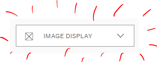
That button will then expand to a box giving you 4 options:
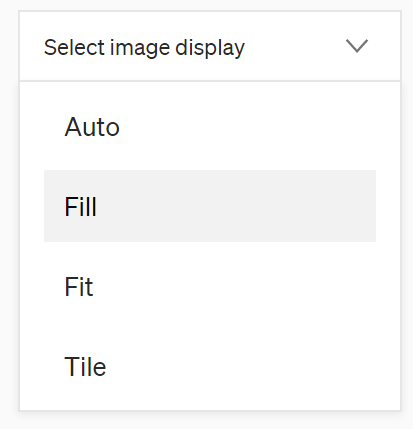
- Auto — possibly short for Autobots™ — is probably your best option.
- Fill — Makes the picture appear a bit larger (kind of like a zoomed-in effect)
- Fit — Possibly a reminder that I have a few pounds to lose — or it means it makes the picture appear smaller (like a zoomed-out effect)
- Tile — Much like the gawdy tiles seen I’ve seen in some questionable bars over the years in my travels, this will repeat your image multiple times throughout the layout.
10. Choose the positioning
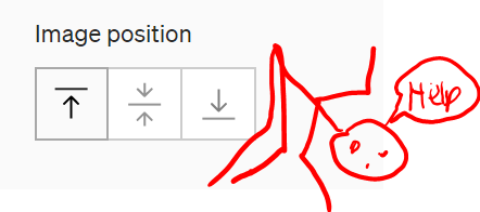
You can choose one of three positions here — I hope you’ve been practicing your yoga.
- The one on the left shows the top part of the image.
- The middle button tries to show the middle part of the image.
- The last button tries to show only the bottom of the image.
How it ends up looking largely depends on your image shape and size, but that’s the gist of it.
11. Be sure to play around with the preview buttons at the top-middle of the page
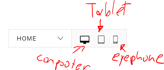
You can choose to preview either the Home profile page or the Story page. To the right of that, you can preview what it would look like on a PC, tablet, or mobile phone.
Important note: The previews and the actual appearance after publishing don’t seem to match 100% just yet — hopefully Medium is fixing that problem.
12. Once you’re finished, hit the ‘Publish’ button at the top-right of the screen!
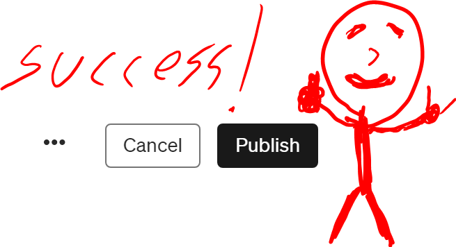
And congrats! You’re finished!
By now, you should have an absolutely stunning profile page that you can showcase in Le Louvre the next time they ask you.
Which I’m sure will be any day now that you’ve created the world’s next masterpiece.
Thanks for reading!
…and yes — I have too much time on my hands today.
If you wish to see more of my amazing artwork and shenanigans, please join my free newsletter. Or else.


