Free AI web copilot to create summaries, insights and extended knowledge, download it at here
2105
Abstract
="hljs-attribute">data</span>=df, <span class="hljs-attribute">x</span>=<span class="hljs-string">"DiastolicBP"</span>, <span class="hljs-attribute">kde</span>=<span class="hljs-literal">True</span>, <span class="hljs-attribute">color</span>=<span class="hljs-string">"gold"</span>, <span class="hljs-attribute">ax</span>=axs[1, 0])
sns.histplot(<span class="hljs-attribute">data</span>=df, <span class="hljs-attribute">x</span>=<span class="hljs-string">"BS"</span>, <span class="hljs-attribute">kde</span>=<span class="hljs-literal">True</span>, <span class="hljs-attribute">color</span>=<span class="hljs-string">"teal"</span>, <span class="hljs-attribute">ax</span>=axs[1, 1])
sns.histplot(<span class="hljs-attribute">data</span>=df, <span class="hljs-attribute">x</span>=<span class="hljs-string">"BodyTemp"</span>, <span class="hljs-attribute">kde</span>=<span class="hljs-literal">True</span>, <span class="hljs-attribute">color</span>=<span class="hljs-string">"teal"</span>, <span class="hljs-attribute">ax</span>=axs[2, 0])
sns.histplot(<span class="hljs-attribute">data</span>=df, <span class="hljs-attribute">x</span>=<span class="hljs-string">"HeartRate"</span>, <span class="hljs-attribute">kde</span>=<span class="hljs-literal">True</span>, <span class="hljs-attribute">color</span>=<span class="hljs-string">"blue"</span>, <span class="hljs-attribute">ax</span>=axs[2, 1])
sns.histplot(<span class="hljs-attribute">data</span>=df, <span class="hljs-attribute">x</span>=<span class="hljs-string">"RiskLevel"</span>, <span class="hljs-attribute">kde</span>=<span class="hljs-literal">True</span>, <span class="hljs-attribute">color</span>=<span class="hljs-string">"purple"</span>, <span class="hljs-attribute">ax</span>=axs[3,0])</pre></div><div id="dcaa"><pre>fig.tight_layout<span class="hljs-comment">()</span></pre></div><p id="9600">Then we will get nice multiple histograms like this.</p><p id="6bf6">For the code above, sns.set(style=”whitegrid”) was used. There are additional options such as dark, white, darkgrid, ticks in addition to the whitegrid.</p><figure id="da0d"><img src
Options
="https://cdn-images-1.readmedium.com/v2/resize:fit:800/1*VWv02IoI7uvpggGBQpf1pQ.png"><figcaption></figcaption></figure><p id="c3c2">Using Dark Style</p><figure id="a848"><img src="https://cdn-images-1.readmedium.com/v2/resize:fit:800/1*ks6GZlGBAsDg_0TtEbNHfQ.png"><figcaption></figcaption></figure><p id="19b3"><b>Multiple Histograms using Matplotlib Histgram Method</b></p><p id="9d0b">Python Code</p><div id="faf9"><pre>%matplotlib <span class="hljs-keyword">inline</span>
<span class="hljs-keyword">import</span> matplotlib.pyplot <span class="hljs-keyword">as</span> plt</pre></div><div id="c2d2"><pre>fig = plt<span class="hljs-selector-class">.figure</span>(figsize = (<span class="hljs-number">8</span>,<span class="hljs-number">10</span>))
ax = fig<span class="hljs-selector-class">.gca</span>()
df<span class="hljs-selector-class">.hist</span>(ax=ax, <span class="hljs-attribute">color</span> = <span class="hljs-string">"skyblue"</span>)
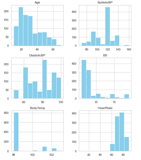
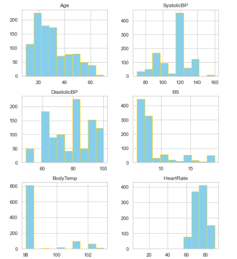
plt<span class="hljs-selector-class">.show</span>()</pre></div><figure id="0745"><img src="https://cdn-images-1.readmedium.com/v2/resize:fit:800/1*jnrDwiRRSRGQmDjXn3y1XQ.png"><figcaption></figcaption></figure><p id="f75b">We can decorate the above figure a bit by adding edge color.</p><p id="084e">So the code will look like this.</p><div id="56e4"><pre>fig = plt<span class="hljs-selector-class">.figure</span>(figsize = (<span class="hljs-number">8</span>,<span class="hljs-number">10</span>))
ax = fig<span class="hljs-selector-class">.gca</span>()
df<span class="hljs-selector-class">.hist</span>(ax=ax, <span class="hljs-attribute">color</span> = <span class="hljs-string">"skyblue"</span>, edgecolor = <span class="hljs-string">"gold"</span>)
plt<span class="hljs-selector-class">.show</span>()</pre></div><p id="3c58">And here’s the final figure!</p><figure id="51d4"><img src="https://cdn-images-1.readmedium.com/v2/resize:fit:800/1*0PCX4F20IspIsIN60TJICg.png"><figcaption></figcaption></figure><p id="1d1a">Enjoy Seaborn’s and Matplotlib’s Histograms! Please feel free to follow me and drop a line if you have any suggestions!</p></article></body>
