
How Spotify returned to profitability in 2023
A case study of new feature adoption and product-led growth
Last week, Spotify announced it returned to profitability for the first time since 2021. With an income of $34 million and 2 million more users than forecast, they really smashed it out the park.
Monthly Active Users (MAU) hit 574 million, up 26% on the last quarter representing their 2nd largest performance result in history.
The reason?
Keeping costs tight.
As well as laying off 6% of their employees this year and rising premium plan prices, Daniel Ek their CEO said:
“We are still focusing on efficiencies, but efficiencies for us doesn’t mean just cost cutting, it means getting more out of each dollar,” —Daniel Ek quoted in Reuters
In addition to keeping personnel costs tight, the return to profitability also came from keeping a tight lid on ‘marketing costs’.
I imagine this means cutting channels that are poor performing and focusing on lower-cost acquisition. Which brings me to the second reason Spotify has managed to grow while cost cutting: product-led growth (PLG).
As many know, one of the best ways to keep markting costs low is to find ways to use PLG to bring in new users. It doesn’t work for every product but, when it does work, it means that users come in for free.
$0 acquisition cost.
Nothing. Nada.
This is the stuff of dreams.
I’ve covered what Product-Led Growth means in the context of consumer apps before, but to sum for those of you who are not familiar, this could look like:
- Using content to bring in new users (through sharing mechanisms or through SEO)
- Creating referral programs to incentivise the sharer (the person sharing) and sharee (the new user who comes in)
- Creating micro networks out of subscription packages like family plans, couple plans
- Gamification that drives retention through repeat engagement over time (i.e. streaks to unlock features)
- And, of course, virality and network effects (I don’t cover these much as I don’t think they’re hugely applicable to 99% of products unfortunately)
All of the above mean that your current user base are doing exactly what Spotify CEO Daniel means by “getting more out of each dollar”. Every user is working hard to drive acquisition and retention via growth loops (little do they know).
While Spotify’s PLG strategy isn’t in their press release (no surprises there), it is clear when you dive into the product that their new feature releases in 2023 focus on referral loops and sharing mechanisms.
We’ll dig into these in much more detail and look at some sharing and referral tactics you can try.
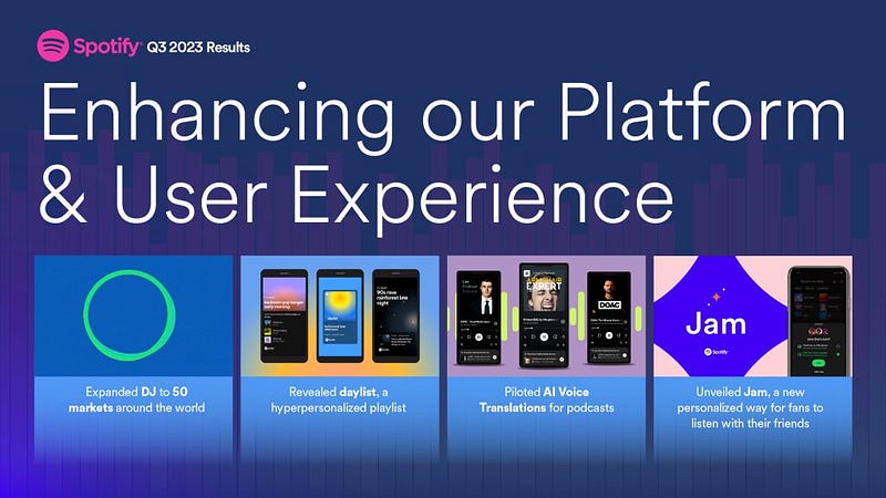
Spotify’s PLG mechanisms, an overview
On the surface, there’s many ways that Spotify uses sharing mechanisms to drive user growth, including but not limited to:
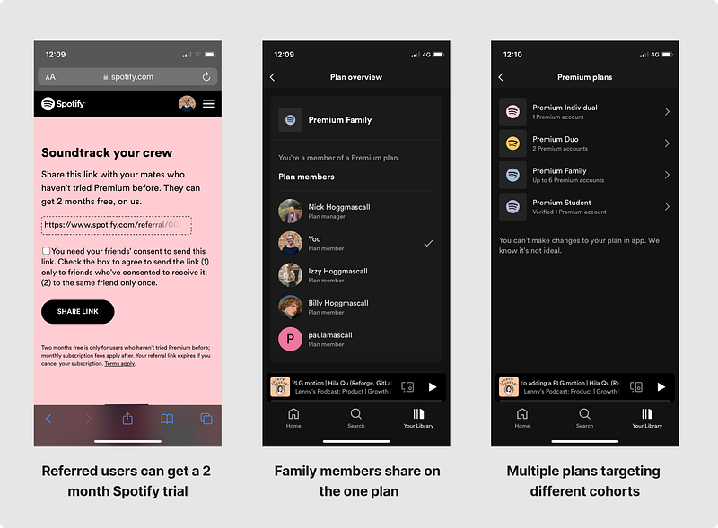
- Duo plans, enabling two people to be on a subscription for less than the price of 2X individual memberships
- Family plans to encourage family members to upgrade to invite their family
- Benefits for referred users: a 2-month trial instead of the normal 1-month trial
- Shared playlists — allowing your music-nerdy-friend to take the lead (as I do)
- Jam sessions, where you can listen live with friends and family (until you have a falling out over the creative direction of up next)
Points 1 and 2 target the less-likely customers and drive incremental subscribers. Think your less tech-savvy family member who wouldn’t have paid for a subscription themselves, but who’s happy to be shown the ropes by their millennial/gen-Z family member.
Point 3 drives referral loops, while points 4 and 5 drive both engagement and retention loops for current users (getting your friends back in the product). Moreover, they can drive an increase in new users if the recipient of the share happens to not have Spotify already.
Instead of covering all in this article, we’ll go into one example in detail.
Let’s take Daylist as a case study of how Spotify users all means possible to make sure that each new feature drives PLG for the business, brings in old/new users and ultimately helps them toward profitability.
First, an overview of the overlapping-and-very-confusing startup terminology that relates to PLG.
How to measure PLG: the K-Factor
There’s many buzzwords that overlap in the area of sharing/referrals/virality/PLG. Try not to get too caught up in language and instead think about growth levers.
One extremely useful concept is that of the K-Factor.
The K-factor it is the number of new users that a single user attracts to a product. — Ark Kaptial
In formula terms, that looks like:
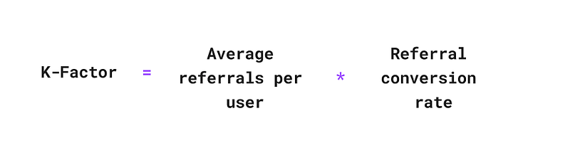
If your K-Factor is <1 then your viral coefficient is relatively low. That means each user only leads to less than one other user and your growth via this channel won’t make a significant dent.
As soon as your K-factor is >1, that’s where you start to see compound growth.
There’s a few levers that impact this:
- % of users that share
- Frequency of sharing (i.e. shares per user)
- Conversion from viewed share link to sign up (invite acceptance rate)
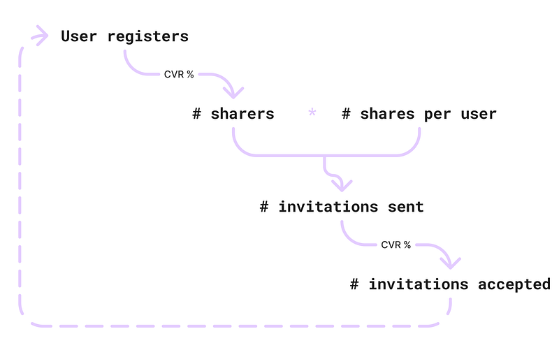
These levers all interplay with each other to drive the PLG loop of a product. The key thing is to track each step to work out where users are dropping off and focus your efforts.
We’re going to look at how Spotify optimises for both side of the share loop (sharer and sharee) to drive conversion to share and invites accepted.
Part 1: Sharer experience
The first thing that struck me with Spotify is how they have optimised their recent daylist feature for sharing and use personalisation in multiple parts of the UX flow.
We’ll look into the share UI, UX and personalisation across channels one by one.
Share button placement
When I first dived into daylist in the original analysis I didn’t notice the share button. But when looking closer, Spotify has made an important change to its location.
In my daylist, the share icon is the third button in the UI. This means the share bottom sheet is one tap away from the daylist, versus two taps and a scroll away in the normal playlist UI.
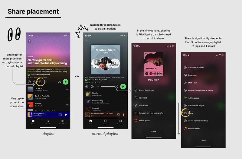
A minor but very significant difference.
In a normal playlist, sharing is much deeper in the UX. I’d love to know if this has had a significant improvement in view playlist → share conversion for daylists, as I suspect it does (hmu Spotify, my DMs are open 👀).
A quick note on icons. Spotify use the common icon used on iOS for share (the square box with an arrow pointing up).
In user psychology, this is called following a Mental Model, i.e. following patterns that users expect.
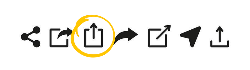
I’ve seen other iOS products use varying share icons like three dots with a sideways V….. which always makes me do a double take, check it is a share, then continue (or just give up).
Following the Mental Model means users are less likely to stall on that step and drop off.
I’d strongly recommend using the common icons for the platform and OS you’re on when building buttons for sharing and copying a link.
Now, on to what happens after you tap on the share icon.
Share bottomsheet UI
My favourite thing about the Spotify share sheet is how well it uses space.
I’m always on an iPhone 12 mini (bc of my small hands...) meaning that sometimes UI can feel small and claustrophobic.
Not Spotify.
The share icons at the bottom of the sheet are so neat and tidy. The best share sheets also allow you to share by content type:
- Instagram story
- Instagram direct message
- Etc.
This further reduces the length of the tap share → send share UX and meets users where they are at.
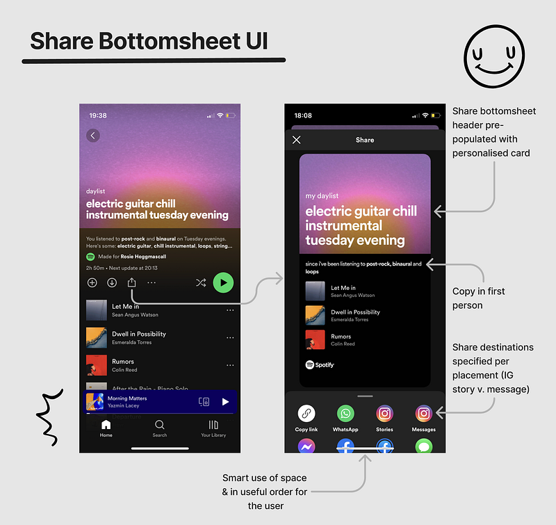
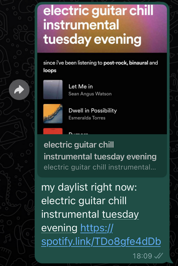
Not only do I get clean share icons and a visual thumbnail of my daylist, I get personalised copy:
my daylist
electric guitar chill instrumental tuesday evening
since I’ve been listening to post-rock, binaural and loops
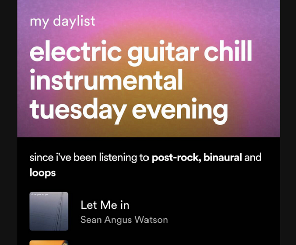
What’s great about this copy is that it is cool, concise and helps show how the daylist works. From this copy, its clear that this is a smart, personalised recommendation based on my listening history.
What gives the copy this cool-as-a-cucumber air is the lower-case sentences. As I’ve written about before, the lower caps weren’t put there by mistake. According to a 2017 study in Marketing Letters Published by Springer Nature:
Psychologically, consumers feel closer to lowercase wordmarks, which increase perceptions of brand friendliness compared with the uppercase wordmarks
Next, lets have a look at what happens after we’ve selected the share channel from the bottomsheet.
Share UX and channel personalisation
There’s a real knack with share flows when it comes to drafting copy that users don’t feel the need to edit before sending to their network.
As we’ve already seen, there’s an insanely short UX flow from daylist to share. When you count the taps, theres:
- Tap share icon just below the fold on the daylist
- Tap the channel icon on the share sheet (no scroll needed)
- Tap ‘send’ or ‘post’ on WhatsApp, Instagram etc.
That’s just 3 taps to a successful share. In terms of levers that impact the K-Factor, this flow will be optimising the conversion from registered user → sharer by reducing drop off in the flow.
And, if the user has a successful share experience, perhaps this impacts number of shares per user.
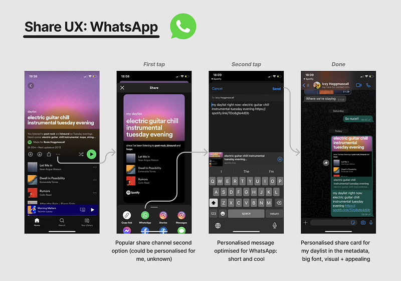
Now, the share copy:
my daylist right now: electric guitar chill instrumental tuesday evening
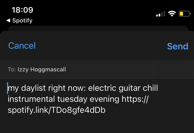
The range of rogue genres in there is enough to intrigue anyone — the sharer has essentially said:
Hey, look at my wildly unique and cool music taste. What does it sound like? You’re going to have to listen to find out
Its interesting, its short and colloquial, and it uses the same grammatical rules as the daylist. Very cool.
The use of the colon in my daylist right now: also reminds me of the common meme format:
me:
also me:
For example:
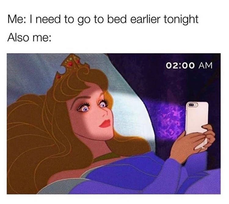
Again adding to how natural and easy it feels to directly share the copy Spotify has drafted. As, lets be honest, we all are lazy and want to be cool.
Now, let’s look at the experience for the recipient: the sharee.
Part 2: Sharee experience
The thumbnail we saw shows up well on a WhatsApp DM, as it managed to squeeze in:
- Title
- Nice sunset background
- Personalised copy
- The first 3 song names, artists and thumbnails
It is wild how hard the thumbnail works.
Spotify even commented on the role of the thumbnail and sharing more generally in their feature launch announcement:
Daylist is all about expressing your individuality, so we’ve built shareability into the playlist experience like never before. Choose from three different sharecard options to upload:
- A ready-made screenshot of your daylist
- A social media sticker that captures the essence of your daylist
- A changing sharecard with up to four different background graphics depending on the time of day you post your daylist
The lever here is the conversion from seeing the share link to registering as a new user or opening the app as a returning user.
What’s key is the amount of context you can give in the metadata (i.e. the copy and image that populates with the link).
Yes, you can do nothing and leave the sharer to explain to the sharee. But this drastically reduces the chance you convert that invitation.
The key parts here are:
- The invitation is visual
- The invitation is personalised
- The invitation isn’t cringy (as a lot of share copy is)
This is another excellent example of a Curiosity Gap. Last week we looked at how Loom uses a Curiosity Gap in their emails to drive email click rate and their retention loop.
In essence a Curiosity Gap is when there is missing information in an experience on purpose, as this leads the user to seek out that information.
When there’s a gap between the information given and the information withheld, people want to close the gap. — Why We Buy
Here, the sharee is met with two intriguing nuggets of information at once:
- What the hell electric guitar chill instrumental music sounds like
- What vibe I listen to on a tuesday evening
The first gap is genuinely amusing and a 10/10 example of a content loop.
Spotify’s daylist AI will be generating millions of these one-liners personalised for each user on a daily basis. This means I could be sharing multiple amusing one-liners like this per day, all different and all creating that curiosity gap.
The second curiosity gap is almost like a window into someone’s life.
What does this person listen to on a Tuesday morning? Or a Friday night?
Its like when you go to a museum and can look at the cross section of a beehive — like you are pausing the world and analysing that moment in time. Or less romantically, kinda like those one-way mirrors they use in scientific studies or investigation rooms.
In any case, these one-liners and the curiosity gap are a tactic to increase the invite acceptance rate.
Very well done, Spotify.
In summary: PLG as easy as 1–2–3
By 2030, Spotify’s MAU is projected to reach 1 billion users and $100 billion in profit. And I’m optimistic.
By digging into the share functionality of one feature, we’ve seen how short UX flows, expert use of small spaces and AI-generated content can drive referral levers.
PLG doesn’t work for all products, but by being creative about their new features and creating curiosity gaps, Spotify have managed to create flows that bring in new users or up the engagement of old users — for free.
Here’s some key pointers to take away:
- Track each step of your referral loop. You can’t drive growth if you don’t know where to focus, and you can’t backdate events that are not tracked
- Work out which step of the referral loop you need to optimise to drive growth (conversion to referrer, referrals per user or invite acceptance rate)
- Focus on creating frictionless and personalised flows that are optimised for each share channel to reduce drop off at each step
- Pay extra attention to the thumbnail to make your share metadata as attractive, personalised and context-filled as possible
- Consider how you can use the Curiosity Gap to drive users to take action on the share link
My mum said this article was too long. What do you think? Shall I shorten them?


