
How I rewrote all of Handshake’s empty states
An empty state audit

Empty states are the digital equivalent of a blank canvas, a moment when the user encounters a blank screen.
For example, when your inbox doesn’t have any messages, when your cart is empty, or when you haven’t saved anything in your bookmarks folder yet.
These moments, often overlooked by designers and engineers, are crucial in the user experience journey.
They serve as the first impression, setting the tone for the interaction to come.
How to write an empty state
Every empty state will have different circumstances. Some require a CTA and others don’t; however, the following are my general rules of thumb:
- Write a short, concise headline. (only one line)
- Always offer value for the user.
- Don’t tell the user how to feel. Meet them where they are.
- Inject some personality.
Here are some examples
I conducted an empty state audit when I was a content design intern at Handshake, and I rewrote over 50 empty states. Here’s five of my favorite rewrites.
Jobs search
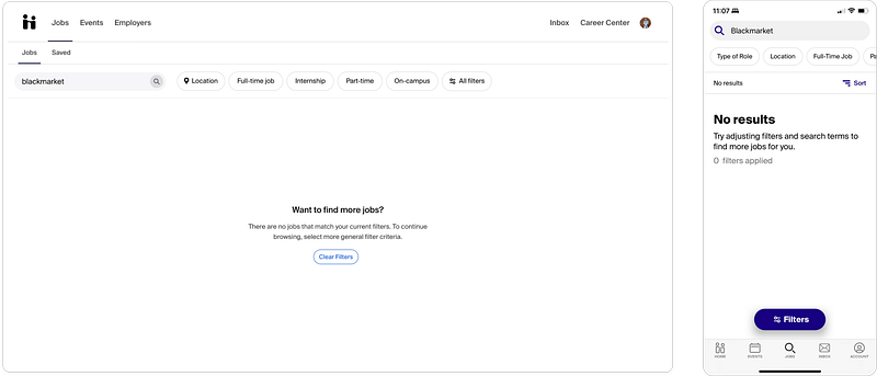
As you’ll see in most of these empty states, the web and the mobile versions don’t match!
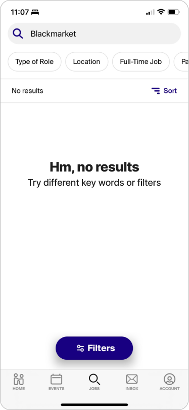
The jobs search screen is pretty self-explanatory, but you reach this empty search when you search for something and you don’t get any results. I figured “blackmarket” would be a safe bet to get zero results. :)
The goal with this empty state was to simplify it and match the two versions.
I liked the web version because the copy was conversational, but it was a little wordy. The mobile version seemed slightly more technical, but it offered value to the user (told them how to fix the problem more clearly than the web version did).
So, I wanted to make it more concise, slightly less formal, but keep it conversational.
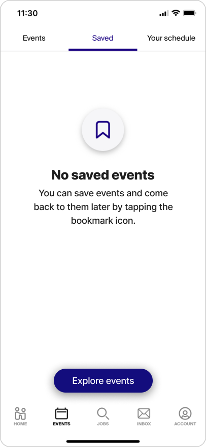
Saved events
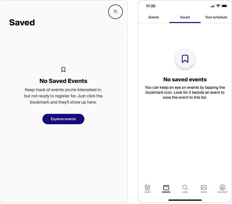
The saved events screen is another example of the web and mobile versions not matching.
Users end up here when they look for events they’ve saved for later, but they haven’t saved any yet.
Before jumping into the copy, there’s some important things that needed to be observed between the two versions of this screen.
- The illustrations don’t match.
- The copy doesn’t match.
- The mobile version doesn’t have a CTA!
- The web version’s headline needs to be sentence case (to match Handshake’s style guide)
The copy here wasn’t bad actually (because my amazing mentor wrote it), but I wanted to make it a little more concise and add a CTA to mobile.
User profile, documents
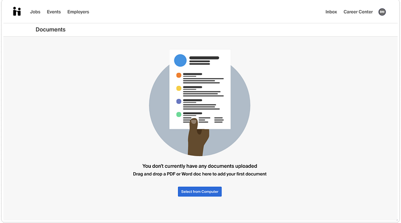
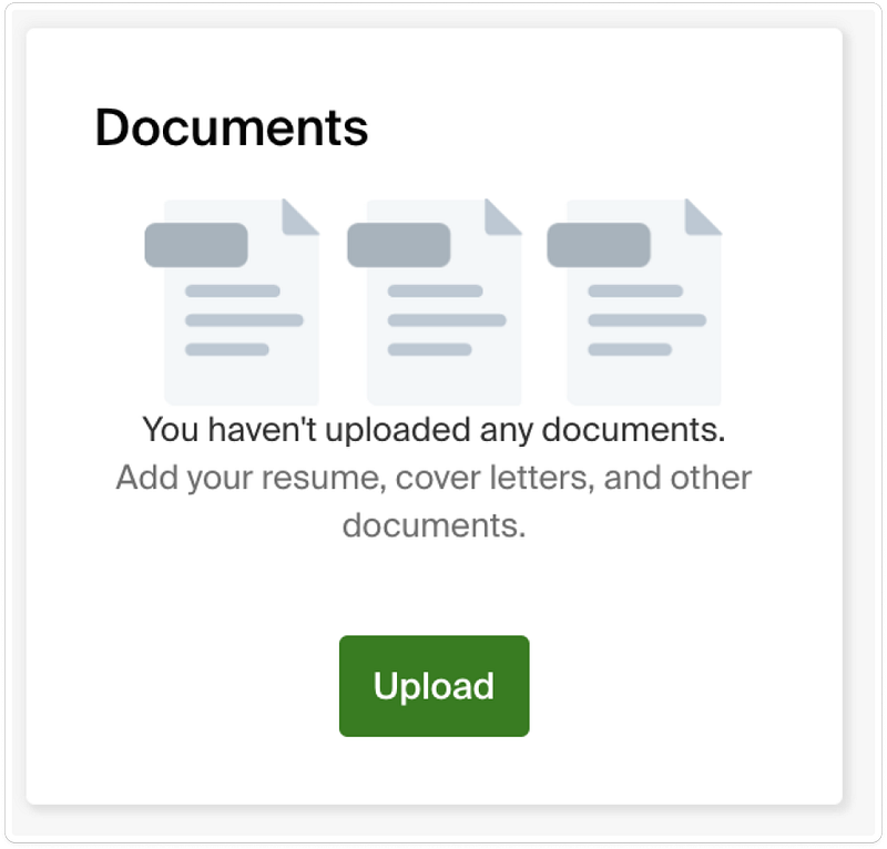
This empty state had the biggest glowup in my opinion. Above you’ll see, once again, that the two screens don’t match.
The first version of the screen tells the user they don’t have any documents and says to upload a PDF or word doc. There’s not very much value there.
What kind of document would they upload? And why would a user upload a document?
The second version offers more value, but it’s slightly accusatory: “You haven’t uploaded any documents.”
Other observations were that the illustrations didn’t match, the CTAs didn’t match, and there still wasn’t a clear purpose for uploading documents.
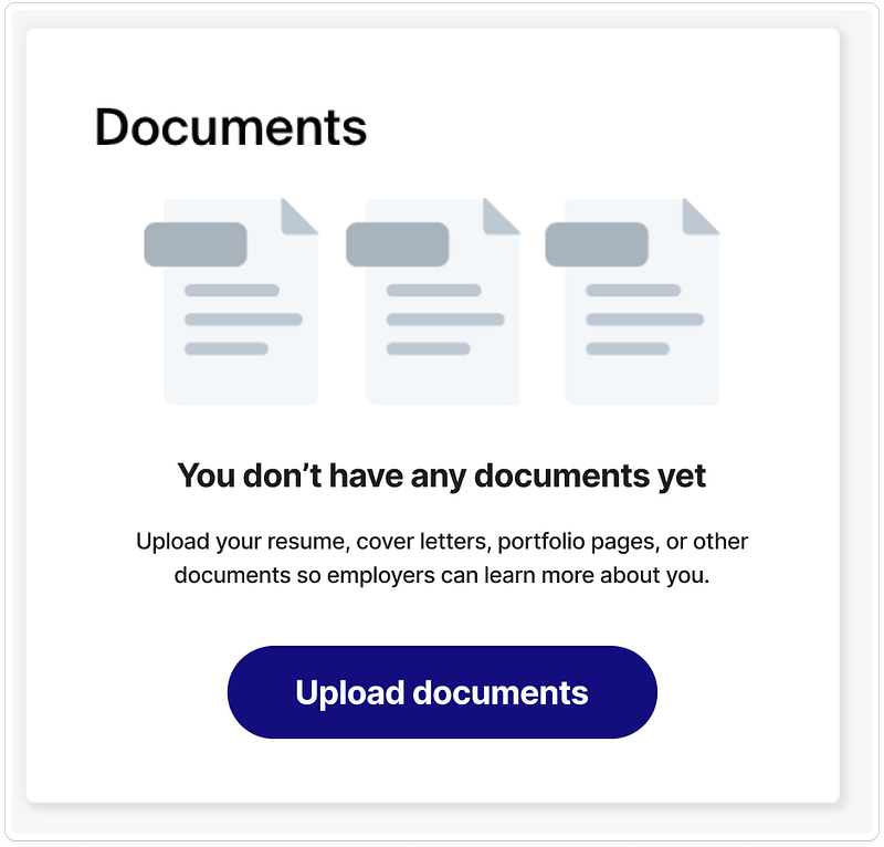
So, here’s what I wrote:
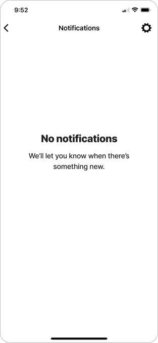
Notifications
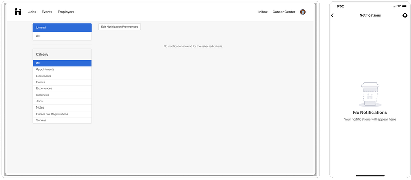
It’s a bit hard to read, even blown up, but the web version of the notifications empty state says “No notifications found for the selected criteria.”
Yikes. No value. No personality. No headline. No CTA. Not conversational.
The mobile version wasn’t quite as bad, saying “Your notifications will appear here.” Although the headline needed to be changed to sentence case.
Where do we start? Well, let’s use the copy in the mobile version as a starting point. (throw out the web copy!)
The copy was already conversational, and it’s hard to offer value on a screen like this because it’s already so intuitive.
If you go back to the rules of thumb I shared in the beginning, I said to never tell the user how to feel, but meet them where they are.
With this in mind, I thought, how can I meet them where they are? If they’re going to the notifications page, they’re presumably looking to see if someone’s trying to reach them, or see if they’ve missed anything.
So, how about this:
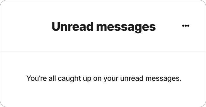
Unread messages
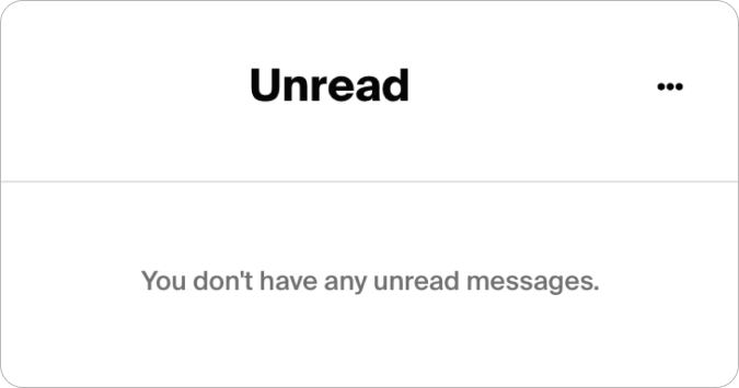
For this empty state I took inspiration from Slack, arguably one of the best companies when it comes to content design/ux writing. The way they write some of their empty states is masterful.
I was thinking about how the user might feel when getting to this screen and seeing there’s nothing there for them. So, like Slack, I decided to turn this screen into an achievement.
Conclusion
Blank screens with no guidance can lead to confusion, uncertainty, and disappointment, which can result in higher abandonment rates and lower overall satisfaction with the product.
Empty states are the perfect opportunities to offer value and make an impact on the user by using conversational copy, personality, and guiding them to their next interaction.
How would you have rewritten these empty states?
Thought this article was interesting? Leave a clap, comment, and follow for more. I write about design, work, and many other miscellaneous things.
Here’s some of my most popular articles:
Check out some of my work at my website.
Thanks for reading!


