How I Analyzed Medium’s Popular Page With Python (Part 2)
Understanding the data with Pandas and visualizing it with Tableau

This is the second part of a series analyzing Medium’s Popular page, covering the tools and output of the analysis. For the data collection and pre-processing steps, check out Part 1.
Let’s recap where we got to in Part 1. To get the data ready, we have:
- Successfully taken the HTML of the Popular page.
- Scraped the necessary metadata with Python.
- Processed that data, so it would be ready for analysis.
- Loaded the data into a Pandas
DataFrame.
Now, we’re ready to answer the main question:
How popular is COVID-19 on Medium?
Analyzing the Data
The first thing to do was set up the keywords I wanted to search for. I‘d be unlikely to get every article related to COVID-19 on the Popular page if I only searched for “coronavirus” and “COVID-19.” I skimmed the DataFrame’s titles and subtitles and came up with a list that I thought would capture the majority of relevant pieces:
# define keywords to look for
keywords = ['coronavirus',
'quarantine',
'COVID-19',
'mask',
'N95',
'disinfect',
'pandemic',
'outbreak',
'zoom',
'quarantine',
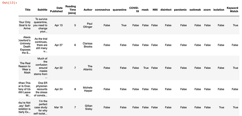
'isolation']Next, I wrote a loop that would check each row of the DataFramefor a keyword. This meant combining the rows together, converting that output to a string, and checking to see if each keyword was in the string. If the keyword was in the string, True would be added to the keyword column in the DataFrame.
# search rows for keywords and show True if there is a match
for keyword in keywords:
    df[keyword] = df.astype(str).sum(axis=1).str.contains(keyword, case=False)
I also wanted a row that would show if any of the keywords matched, to have one column that showed whether or not the piece was related to COVID-19. I added another line to check whether any of the df[keyword] columns were true.
df['Keyword Match'] = df.astype(str).sum(axis=1).str.contains('True', case=False)The DataFrame now looked like this:
At this point, I could have moved directly to Tableau for more analysis and visualization. But since I was already working with Pandas, I decided to do a bit more processing in my notebook to get more practice.
The next step was to count how many times each keyword was used, as well as how articles were related to COVID-19. I created a new DataFrame with only the keywords containing the true or false value. Then, I used the value_counts to count the number of times True and False appeared in each column. The apply so the value_counts function can be applied along the axis of the DataFrame.
# add to existing keywords list for the total count column created
keywords.append('Keyword Match')
# define count of keywords df and get count of each column
count_of_keywords = df[keywords]
count_of_keywords = count_of_keywords.apply(pd.Series.value_counts)The resulting DataFrame gave us a count of how many times each keyword was present, as well as the total number of articles that had a COVID-19 related keyword.
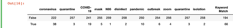
At this point, I had my main finding. I could say that based on the keywords I had defined, 66 out of 260 articles on the Medium Popular page were related to COVID-19. (In the main article I published, I wrote that it was out of 262 articles, as two more had been added to the Popular page.) This meant that:
In other words, 66/262 ≈ 25% of the pieces on the Medium Popular page are about the coronavirus.
Next, I wanted to see if other topics or keywords were coming up frequently on the Medium Popular page. This would be a secondary metric, to determine how popular the topic of COVID-19 was. Perhaps I was biasing my analysis by only looking for COVID-19 keywords. So I did a second check to find all the most common words in the titles and subtitles.
I used the nltk module’s stopwords to filter out common words like “by”, “for” and “with.” I then converted the title and subtitle to text and Python’s Counter and .most_common to find out how many times each word occurred. (If you haven’t encountered these before, check out the docs.) I loaded the results into a DataFrame and exported the results to Excel.
# Generate DF out of Counter
rslt = pd.DataFrame(Counter(words).most_common(100),columns=['Keyword', 'Frequency']).set_index('Keyword')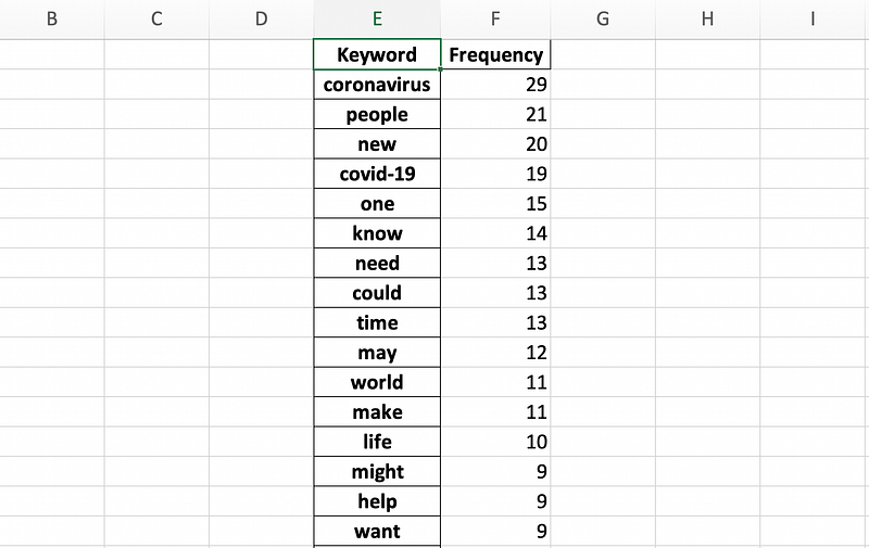
I immediately thought something was wrong. The count for “coronavirus” was 29, when my previous analysis showed that it was 38. However, when I scrolled down, I saw that there was another keyword “coronavirus:”, which made up the rest of the missing values. The “COVID-19” keyword count matched with my initial keyword matching, so I continued with the analysis.
Based on the new keywords, it didn’t look like there were any other major trends. No other words mentioned more than 10 times were a noun that pointed to any other trending topics. As such, I moved forward with the premise that COVID-19 was the most popular topic on Medium from November 2019 to May 2020. I was ready to move on to visualizing the results.
Data Visualization
As I had already completed most of the processing with Pandas, so I was ready to create my graphs on Tableau. This section demonstrates how easy it is to use Tableau to create graphs — it does not include any complex Tableau functionalities.
With four clicks, I imported the Excel export containing the count of the COVID-19 related keywords.
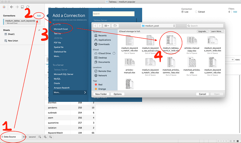
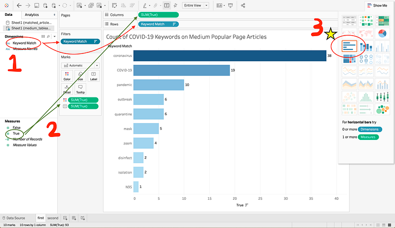
Tableau is very drag-and-drop friendly. To create this graph, I moved Keyword Match (which in the Excel sheet is a list of the Keywords) to Rows, then I moved True (i.e. if a keyword was in the title or subtitle) to Columns. This should automatically create a graph for you. You’re free to choose whatever kind of graph you want if you click the Show Me on the top right. I chose the horizontal bar graph, as it looked like the best way to visualize the data. I repeated this process when creating the graph for all other common keywords.
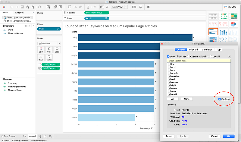
Here, I did a bit more processing, removing words that I felt did not help with understanding what was popular on Medium. For example “possible”, “right” and “using” also occurred more than once, but did not point to any specific trend. You can exclude keywords by adding a filter, as you can see in the screenshot above, or by clicking any individual bar in the graph, you’ll see an option to exclude it from results.
Manual Reading
To take the analysis a step further, I wanted to extract the most common themes from the articles specifically about COVID-19. I couldn’t do this from the keywords extracted earlier, as the only common words among all the articles were “coronavirus’ and “COVID-19.” As such, I decided to skim the whole list of titles and manually take a look at a random sample of five pieces.
In the spirit of keeping things on Python, I wrote this quick line to select the articles:
# Random article index generator
import random
for i in range(0,5):
print(random.randint(0,68))Then, I went and read the five pieces and wrote a quick summary of them all. The most common topics were:
- Current events.
- Health and safety.
- Personal experiences.
Now you know all the steps I took to write my “How Popular is COVID-19 on Medium?” article!
So, How Popular Is COVID-19 on Medium?
I don’t think it’s just me constantly seeing coronavirus related pieces on my feed. I included articles as early as November 2019 in my analysis, as the (allegedly) first case of COVID-19 was on the first of December. That’s how I came up with the statistic that one in four articles on the Medium Popular page has something to do with corona (66 matches out of 262 total pieces).
It’s interesting to note that if we go from the time the first article about COVID-19 was published, that brings our total to 121 pieces on the Popular page. So, 54% of articles on Medium’s Popular page from March 2 to May 1 have something to do with the coronavirus.
I guess I wasn’t that far off the mark when I said half of what I’ve been reading is about COVID-19. The point of this isn’t to say that this trend is good or bad. It’s just a look at what everyone on Medium has been reading about.
Limitations and Follow Up
The first thing I want to point out is that all this analysis is littered with extra processing I made on the data based on my own judgment. This includes the possibility of false positives in my count of which articles were related to COVID-19. I manually looked at many pieces that came up as positive so I could make the claim that 1/4 of articles were about COVID-19. However, it’s possible that the keywords I defined may have included an article that used a word like “mask” or “isolation” without discussing the pandemic. This also includes my choice to remove other “common keywords” when presenting the graph from Tableau.
I find that doing projects like this exposes a lot of gaps in my knowledge. After this, I learned new ways to use Python, like leveraging lxml to use XPath selectors so I could parse HTML. As always, StackOverflow gave me answers to questions and ideas on how to get started (and some copy-paste-worthy code to use). One of the big takeaways from this, however, is to set aside more time to just learn. I think I’ve done a lot of learning by doing recently, but I also need to balance that with learning by learning.
Some personal follow-up learning ideas:
- Creating a constantly updated database with metadata from pieces featured on Medium’s Popular page.
- Reviewing some core Pandas functionality and how to best use it.
- Taking an in-depth look at what
nltkis capable of.
I hope this clearly informed you how I did a quick and dirty research project on Medium’s Popular page. It’s definitely not perfect, but I thought documenting what I did now would mean that a year later, I can look back at this and whip something up of far better quality.
Bonus: Authors That Frequent Medium’s Popular Page
Since I already had the data, I figured I could showcase who was consistently topping Medium’s Popular page. I thought I could try and find a secret formula from their writing, but all I really took away was “wow, they are good writers”. Here’s the one line of code and resulting DataFrame of the author names and the number of times they’ve been on the Popular page (from November 2019 to May 2020):
# authors to hit the popular page most
popular_authors = df[['Author','Title']].groupby(['Author']).count().sort_values(by='Title',ascending=False).head(20)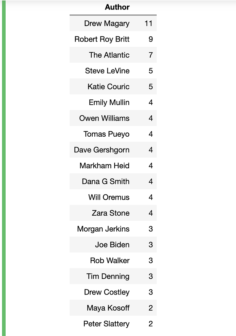
I wanted to say thank you once again to everyone working in the medical sector during the COVID-19 pandemic. Some countries look well on their way to recovery, which brings much-needed hope and comfort to those affected by the virus. It’s because of your efforts that we have that hope, so thank you so much for the risk you take every day working to fight this disease.