
Hierarchical and K-Means Clustering through 14 Practice Questions + Notebook
In this post we will take another step into preparing for the Technical Requirements to Become a Data Scientist by learning about two unsupervised clustering algorithms.
We will start with an overview of what clustering algorithm types are out there. Then we will use actual data to implement one of each type of clustering algorithms. And finally we will compare the results between different algorithms to see which one is the right one for us to use.
Similar to my other posts, most learning is achieved with the help of practice questions. I will include hints and explanation in the questions as needed to make the journey easier. Lastly, the notebook that I used for this exercise is also linked in the bottom of the post, which you can download, run and follow along.
Let’s get started!
1. Clustering — Overview
Clustering (aka cluster analysis) is a type of unsupervised machine learning task that finds groups (or clusters) within the existing data. It is unsupervised, meaning it does not rely on labeled data (as opposed to a supervised learning task). Clustering is commonly used for discovering underlying patterns in the population in study, such as groups of customers, etc.
In this post, we will go over two types of clustering algorithms and then will implement a clustering algorithm from each of the two types of clustering.
2. Clustering — Types
There are many different clustering algorithms but the most common ones are broken down into two types:
2.1. Connectivity Models
Connectivity models cluster the data based on how close data points (aka observations) are to each other in the space. Such models either start with all data points as their own clusters, connecting nearby data points with each iteration or, start with one cluster and divide data points based on distance. Distance is determined by a number of different algorithms. Hierarchical cluster analysis is one of the most commonly-used connectivity models, which is one of the algorithms we will implement in this post.
2.2. Centroid Models
Centroid models cluster the data based on their closeness to a specified number of centroids set by the user. These centroids are randomly-assigned points in the linear space, used as a reference point to calculate the distance of data points, and are iterated over until the optimal centroid locations are determined for the specified number of clusters. K-Means cluster analysis is one of the most commonly-used centroid models, which is one of the algorithms we will implement in this post.
Now that we are familiar with what clustering models are, let’s start looking at the data that we will be using for clustering implementation.
3. Data Preparation
In order to implement our clustering models, we will be using a data set about customers’ credit card activity information from kaggle, which can be downloaded from here.
Some columns are easy to understand and some are not as clear so I have included a description of the columns below. Feel free to take a glance now and then refer back to this list as needed during the analysis:
CUSTID: Identification of credit card holderBALANCE: Balance amount left to make purchasesBALANCE_FREQUENCY: How frequently the Balance is updated, score between 0 and 1 (1 = frequently updated, 0 = not frequently updated)PURCHASES: Amount of purchases made from accountONEOFF_PURCHASES: Maximum purchase amount done in one-goINSTALLMENTS_PURCHASES: Amount of purchase done in installmentCASH_ADVANCE: Cash in advancePURCHASES_FREQUENCY: How frequently the Purchases are being made, score between 0 and 1 (1 = frequently purchased, 0 = not frequently purchased)ONEOFF_PURCHASES_FREQUENCY: How frequently Purchases are happening in one-go (1 = frequently purchased, 0 = not frequently purchased)PURCHASES_INSTALLMENTS_FREQUENCY: How frequently purchases in installments are being done (1 = frequently done, 0 = not frequently done)CASH_ADVANCE_FREQUENCY: How frequently the cash in advance being paidCASH_ADVANCE_TRX: Number of Transactions made with “Cash in Advance”PURCHASES_TRX: Numbe of purchase transactions madeCREDIT_LIMIT: Limit of Credit Card for userPAYMENTS: Amount of Payment done by userMINIMUM_PAYMENTS: Minimum amount of payments made by userPRC_FULL_PAYMENT: Percent of full payment paid by userTENURE: Tenure of credit card service for user
Now that we are familiar with the columns in our data, we will import the necessary libraries.
# Import libraries
import numpy as np
import pandas as pd
import matplotlib.pyplot as plt
import seaborn as sns
%matplotlib inline
# Show all columns in one view
from IPython.display import display, HTML
display(HTML(""))Question 1:
Read the dataset ('credit_cards.csv') and return the top five rows of the data. How many rows and columns are available in the dataset?
Note: Data can be downloaded from here.
Answer:
# Read the data into a dataframe
df = pd.read_csv('credit_cards.csv')
# Look at top 5 rows of the dataset
df.head()Results:

# Count of rows and columns
print(f"There are {df.shape[0]} rows and {df.shape[1]} columns in the dataframe.")
Results:

Question 2:
Are there any null values in the dataset? If yes, what columns are they located in and what would you recommend we do with them?
Answer:
Let’s first see if there are any null values in the dataset.
df.isna().sum()Results:
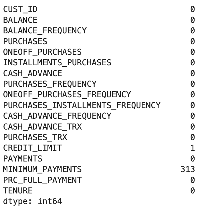
There is one null row in CREDIT_LIMIT column and there are 313 null rows in the MINIMUM_PAYMENTS column. These are relatively small numbers compared to the total size of the dataset and we are not familiar enough with the business to replace them with appropriate values so we will just go ahead and drop the rows with null values in them. We will also keep an eye on the number of rows before and after dropping these rows to verify the changes.
We know there are 8,950 rows at this point (based on previous question). So let’s go ahead and drop them and then see how many rows will be left.
# Drop rows containing null values
df.dropna(inplace = True)
# Shape of the dataframe
df.shapeResults:

Number of rows decreased from 8,950 to 8,636 so we know some rows were dropped. Now let’s look at number of null values again to make sure there are none left.
# Count rows with null values
df.isna().sum()
Results:
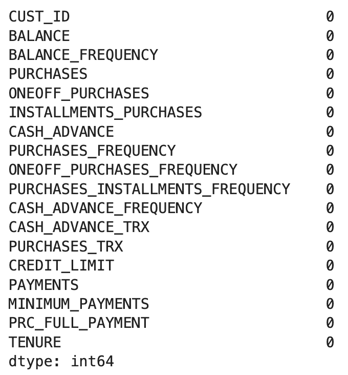
As expected, there are no longer any null values.
Question 3:
In our clustering exercise, we will only be using numerical columns (e.g. float or integer). Are there any columns that is not numerical? If so, go ahead and drop such columns from the dataframe.
Answer:
We will use .info() for this part, which presents us with some useful information, including the column data types.
df.info()Results:
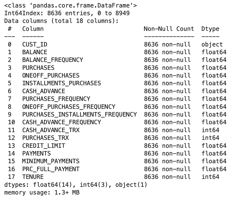
All column data types are numerical (14 float64 columns and 3 int64 ones) except for CUST_ID, which is an object. We can also see that there are 8,636 columns and all are non-null for all columns (as we had confirmed in the previous question). Let’s go ahead and drop CUST_ID.
# Drop `CUST_ID` column from the dataframe
df = df.drop('CUST_ID', axis = 1)
Let’s look at the column names to make sure it was dropped.
df.columnsResults:
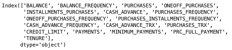
This confirms that the CUST_ID column was dropped.
Question 4:
At this point, we are going to make a smaller dataframe to make visualizing the clustering easier. In order to do so, create a shortened version of our dataframe (named as df_shortened) that only contains the following columns:
['PURCHASES', 'CREDIT_LIMIT', 'PRC_FULL_PAYMENT']Answer:
# Shortening the dataframe
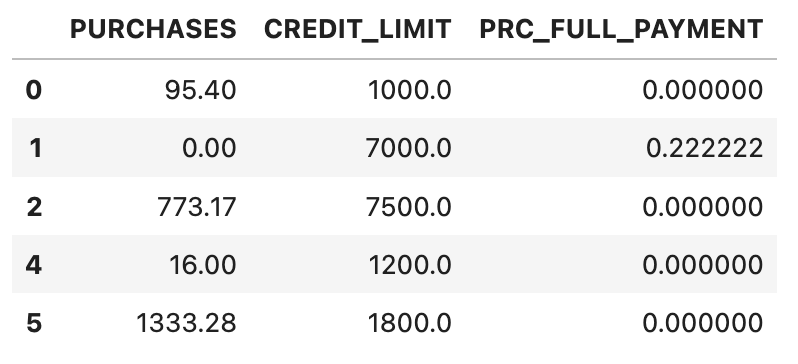
df_shortened = df.loc[:, ['PURCHASES', 'CREDIT_LIMIT', 'PRC_FULL_PAYMENT']]# Returning top five rows to see what the shortened dataframe looks like
df_shortened.head()Results:
4. Hierarchical Clustering
Hierarchical clustering is a connectivity model that creates a hierarchy of clusters. In a “bottom-up” approach (aka Agglomerative Clustering), each data point begins as its own cluster and with each iteration as we move up the hierarchy, the two nearest clusters are merged until all data points become a single cluster. An alternative is the “top-down” approach (aka Divisive Clustering), where all data points start in one cluster and splits are performed recursively as one moves down the hierarchy.
Connectivity models cluster the data based on how close they are to each other in space. There are a number of algorithms that can be used to determine “distance” between two clusters, such as Euclidean distance, squared Euclidean distance, Manhattan distance, Maximum distance, etc.
For our exercises in this post, we will generally rely on scipy.cluster (documentation for reference).
Question 5:
Implement a bottom-up hierarchical clustering through scipy.cluster.hierarchy.linkage for the shortened dataframe, using method = ‘ward’ for calculating the distance between clusters.
Answer:
# Import packages for clustering
from scipy.cluster.hierarchy import dendrogram, linkage
# Perform hierarchical clustering
hc = linkage(df_shortened, method = 'ward')At this point we imported the libraries and performed the clustering. Next we will work on visualizing the results.
4.1. Hierarchical Clustering — Visualization
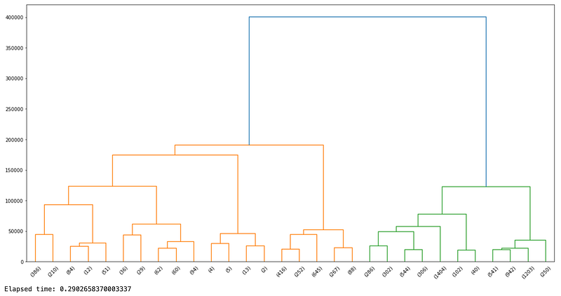
Hierarchical clustering is frequently visualized as a dendrogram, which is a diagram representing a tree. Such a dendrogram illustrates the arrangement of the clusters produced by the clustering analysis, thanks to its hierarchical structure. The dendrogram draws a U-link between a non-singleton cluster and its children, which aggregated together becomes the overall dendrogram. This is much easier to understand when we create a dendrogram in our exercise so let’s go ahead and implement it.
Question 6:
Create a dendrogram of the hierarchical clustering of the shortened dataframe. Note that we will create the dendrogram first and then will discuss how to read it after.
Hint: Visualize the results in a dendrogram using scipy.cluster.hierarchy.dendrogram.
Answer:
Pro Tip: I was curious about how long this step (dendrograms are notoriously resource intensive) would take so I added a few lines to calculate the elapsed time for this step. Feel free to use this in other exercises whenever you are looking for how long a command takes!
# Import packages to track time
import timeit
# Get the start time
start_time = timeit.default_timer()# Define plot size
plt.figure(figsize = (20, 10))# Create the dendrogram
dendrogram(hc, truncate_mode = 'lastp', orientation = 'top', distance_sort = 'descending')# Display the plot
plt.show()# Get the end time
end_time = timeit.default_timer()# Calculate and print the elapsed time
elapsed_time = end_time - start_timeprint(f"Elapsed time: {elapsed_time}")Results:
Question 6:
Explain how to read the above dendrogram.
Answer:
Here are the most important parts in order to read the dendrogram:
- Each vertical line represents a cluster
- Each horizontal line represents a cluster merging with another
- Y-axis is the distance
Starting from the bottom of the dendrogram, as we go further up and the distance increases on the Y-axis, the more clusters merge together, until they all become one single cluster.
Question 7:
Based on the dendrogram, how many clusters should we use for this dataset?
Answer:
Deciding on the number of clusters is a subjective matter. For example, if we were looking at a dataset of individuals’ heights and weights and wanted to group them into T-shirt size groups (e.g. Small, Medium, and Large), then we would choose 3 clusters (to correspond to Small, Medium and Large). In this exercise, we do not have such a criteria so the answer to this question is not as obvious in our use case.
Question 8:
We want to keep a manageable number of clusters. What max depth (i.e. distance) should we use if we want 6 clusters?
Answer:
As we learned, each vertical line represents a cluster. So we need a point in the Y-axis (i.e. distance) where a horizontal line (parallel to the X-axis) would pass through 6 vertical lines, resulting in 6 clusters.
If we assume a horizontal line at y = 100000, then 6 vertical lines will be crossed, suggesting there are 6 clussters at that level, so let’s go with that.
Let’s add the horizontal line at 100,000 distance and visually confirm the number of clusters.
# Define plot size
plt.figure(figsize = (20, 10))
# Create the dendrogram
dendrogram(hc, truncate_mode = 'lastp', orientation = 'top', distance_sort = 'descending')# Create a horizontal line at 100,000
plt.axhline(y = 100000, color = 'black')# Display the plot
plt.show()Results:
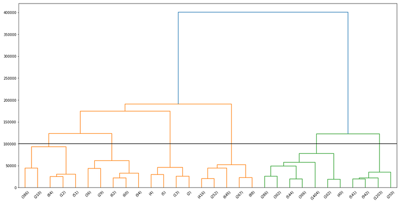
As we can see in the plot, the horizontal line of y = 100000 crosses six vertical lines, which results in 6 clusters.
Question 9:
Implement 6 clusters on the shortened dataframe using scipy.cluster.hierarchy.fcluster, and then create a column named hc_cluster_6 to store the assigned clusters in the shortened dataframe.
Answer:
# Import fcluster
from scipy.cluster.hierarchy import fcluster
# Set max depth to 100,000
max_depth = 100000# Redo the clustering
clusters = fcluster(hc, max_depth, criterion = 'distance')# Assign cluster number to each row of the dataframe
df_shortened['hc_cluster_6'] = clustersLet’s look at the results to see how many values are assigned to each cluster.
df_shortened.hc_cluster_6.value_counts()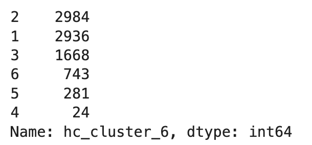
5. K-Means Clustering
K-means clustering is a centroid model that finds the best location of a specified number of centroids (K), to cluster nearby data points. The steps included in a K-means clustering are as follows:
- Specify the number of clusters or K (we will review a method for determining the best value).
- Randomly assign data points to one of the K clusters.
- Determine the centroid or the central point between all data points based on the random cluster assignment.
- Reassign data points to the nearest centroid.
- Recalculate the centroid.
- Repeat steps 4 and 5 until the model converges. Convergence occurs when the resources are exhausted and model no longer improves by further data point reassignment.
As we saw in the steps above, K-means clustering starts with specifying the number of centroids used to cluster the data. The number of clusters can impact the performance of the model (which we will review). So how can we find the right number of clusters to use? We will explore that in the next exercise.
But there is one more concept to understand before getting into the example, which is called the Within-Cluster Sum of Squares (WCSS). Step 3 above calculates the distance between each data point and the centroid, with the goal of minimizing this number over time. In other words, the best centroid for a data point to belong to is the centroid with the lowest amount of distance from all the data points (since K-means by definition is a centroid model). WCSS is a measure of such a distance and is calculated based on the Euclidean distance between the observation (i.e. data point) and the centroid.
What you know so far about WCSS is enough to continue with the exercise but in case you are curious, I am also going to provide a mathematical overview of how WCSS is calculated below:

With that out of the way, let’s go back to implementing a solution together to find the best number of clusters, called the Elbow Method, in the form of an exercise.
Question 10:
What is a suitable number of clusters to use for the shortened dataframe in a K-means clustering methodology? Implement an Elbow method to find out and visualize the results in a plot. For consistency, use a range of 1 to 10 clusters and a random_state of 1234, where necessary.
Answer:
Elbow method is implemented through the following steps:
- Initiate an empty list to append WCSS values
- Use a for loop to fit a K-means clustering algorithm for the range of values of K. We will use up to 10, as described in the question
- Append the inertia value (i.e. WCSS) to the list
- Plot the WCSS for the range of cluster numbers (i.e. K)
Let’s start by importing KMeans from scikit-learn.
# Import K-means package
from sklearn.cluster import KMeans
# Implement Elbow method
# Initiate an empty list for WCSS
w = []# Create a loop to try various K values
for i in range(1, 10):
# Implement the clustering
kmeans = KMeans(n_clusters = i, init = 'k-means++', random_state = 1234)
kmeans.fit(df_shortened)
# Add the calculated WCSS for each K to the list
w.append(kmeans.inertia_)
# Plot the results of the Elbow method
plt.plot(range(1, 10), w)# Title the plot
plt.title('Elbow Method')# Label the X-axix
plt.xlabel('Number of Clusters', fontsize = 12)# Label the Y-axix
plt.ylabel('WCSS', fontsize = 12)
plt.show()Results:
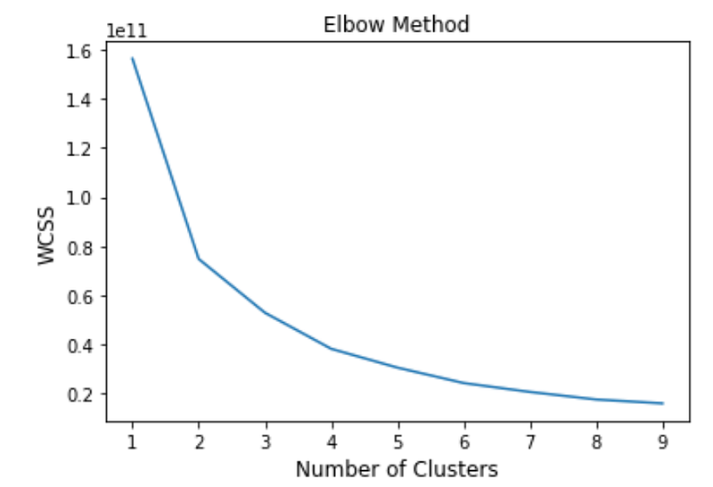
The above plot visualizes WCSS in the Y-axis and the number of centroids or clusters in the X-axis. As explained before, we prefer a lower WCSS but there is also a limit where adding more clusters diminishes the return. This part is subjective but based on my judgement, the elbow seems to appear between 4 and 6 clusters. The most appropriate number of clusters depends on the business needs bet let’s play around with 4 to 6 clusters and look at the results.
Question 11:
Implement a 4-cluster K-means clustering on the shortened data set. Then add a new column in the shortened dataframe named km_cluster_4.
Answer:
# Assign the number of clusters
n = 4
# Implement K-means clustering
kmeans_n = KMeans(n_clusters = n, init = 'k-means++', random_state = 1234)# Assign the results to the data points
clusters_n = kmeans_n.fit_predict(df_shortened)# Add the column to the shortened dataframe
df_shortened['km_cluster_4'] = clusters_n5.1. K-Means Clustering — Visualization
Question 12:
Create three scatterplots based on the generated K-means clustering. Each scatter plot will visualize two of the three total variables used in creation of the clustering (i.e. [‘PURCHASES’, ‘CREDIT_LIMIT’, ‘PRC_FULL_PAYMENT’]).
Note: I have provided comments to explain each step below. If you would like to learn more about visualization in Python, please refer to this post.
Answer:
# Create subplots
fig, (ax1, ax2, ax3) = plt.subplots(1, 3)
# Assign figure size
fig.set_figwidth(20)# Create the scatter plots
sns.scatterplot(x = 'PURCHASES', y = 'CREDIT_LIMIT', hue = 'km_cluster_4', data = df_shortened, ax = ax1)
sns.scatterplot(x = 'PURCHASES', y = 'PRC_FULL_PAYMENT', hue = 'km_cluster_4', data = df_shortened, ax = ax2)
sns.scatterplot(x = 'CREDIT_LIMIT', y = 'PRC_FULL_PAYMENT', hue = 'km_cluster_4', data = df_shortened, ax = ax3)plt.show()Results:
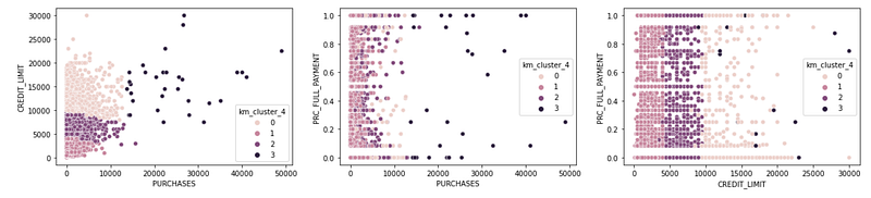
There are a lot of interesting observations here. Let’s look at CREDIT_LIMIT vs. PURCHASES. As expected, smaller credit limits, result in smaller purchases (presumably those individuals cannot purchase above their credit limit) but it also looks like larger credit limits do not necessarily mean larger purchases and there are some individuals with very high credit limits that do not make very large purchases.
What about CREDIT_LIMIT vs. PRC_FULL_PAYMENT? Did you expect those with higher credit limits to make a higher percentages of on-time payments? Plot does not seem to support that hypothesis.
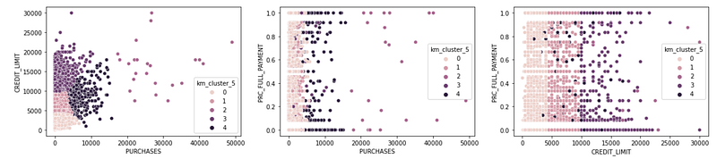
Question 13:
Repeat the same process for five and six clusters and visualize the results. What number of clusters do you prefer among 4 to 6?
Answer:
Let’s first create a 5-centroid K-means clustering.
# Create a 5-centroid K-means clustering
n = 5
kmeans_n = KMeans(n_clusters = n, init = 'k-means++', random_state = 1234)
clusters_n = kmeans_n.fit_predict(df_shortened)df_shortened['km_cluster_5'] = clusters_n# Visualize the results
fig, (ax1, ax2, ax3) = plt.subplots(1, 3)
fig.set_figwidth(20)sns.scatterplot(x = 'PURCHASES', y = 'CREDIT_LIMIT', hue = 'km_cluster_5', data = df_shortened, ax = ax1)
sns.scatterplot(x = 'PURCHASES', y = 'PRC_FULL_PAYMENT', hue = 'km_cluster_5', data = df_shortened, ax = ax2)
sns.scatterplot(x = 'CREDIT_LIMIT', y = 'PRC_FULL_PAYMENT', hue = 'km_cluster_5', data = df_shortened, ax = ax3)plt.show()Results:
Now let’s create a 6-centroid K-means clustering.
# Create a 6-centroid K-means clustering
n = 6
kmeans_n = KMeans(n_clusters = n, init = 'k-means++', random_state = 1234)
clusters_n = kmeans_n.fit_predict(df_shortened)df_shortened['km_cluster_6'] = clusters_n# Visualizing the results
fig, (ax1, ax2, ax3) = plt.subplots(1, 3)
fig.set_figwidth(20)sns.scatterplot(x = 'PURCHASES', y = 'CREDIT_LIMIT', hue = 'km_cluster_6', data = df_shortened, ax = ax1)
sns.scatterplot(x = 'PURCHASES', y = 'PRC_FULL_PAYMENT', hue = 'km_cluster_6', data = df_shortened, ax = ax2)
sns.scatterplot(x = 'CREDIT_LIMIT', y = 'PRC_FULL_PAYMENT', hue = 'km_cluster_6', data = df_shortened, ax = ax3)plt.show()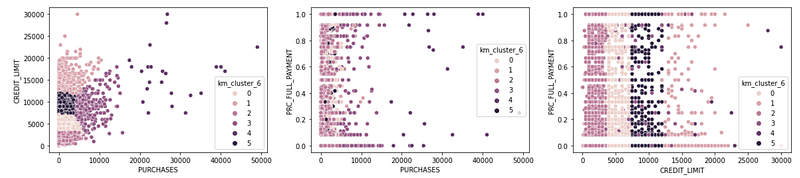
Since selecting the number of clusters is a subjective matter, I will leave that to the reader to decide. I personally like the distinction that I can see in a 6-cluster approach, especially when looking at CREDIT_LIMIT vs. PURCHASES.
6. Hierarchical vs. K-Means Clustering
Question 14:
Now that we have 6-cluster assignments resulting from both algorithms, create comparison scatterplots between the two. The results will be 3 sets of 2 scatter plots for each combination of available data. For example, the first set will be two plots comparing PURCHASES vs. CREDIT_LIMIT clustering output of the two approaches and so forth.
Answer:
# Create subplots
fig, (ax1, ax2) = plt.subplots(1, 2)
# Add figure size
fig.set_figwidth(15)# Create the scatter plots
sns.scatterplot(x = 'PURCHASES', y = 'CREDIT_LIMIT', hue = 'hc_cluster_6', data = df_shortened, ax = ax1, legend = 'full')
sns.scatterplot(x = 'PURCHASES', y = 'CREDIT_LIMIT', hue = 'km_cluster_6', data = df_shortened, ax = ax2, legend = 'full')plt.show()Results:
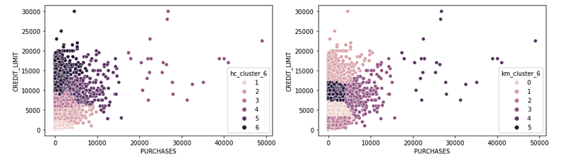
These two look quite different! I personally appreciate the clearer distinction that K-means is making in the smaller purchases. I can see exact credit limit border lines there but in the hierarchical, the borders are fuzzy.
Let’s try other variables.
# Create subplots
fig, (ax1, ax2) = plt.subplots(1, 2)
# Add figure size
fig.set_figwidth(15)# Create the scatter plots
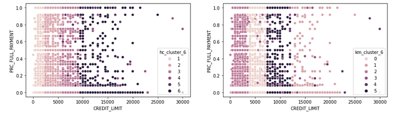
sns.scatterplot(x = 'CREDIT_LIMIT', y = 'PRC_FULL_PAYMENT', hue = 'hc_cluster_6', data = df_shortened, ax = ax1, legend = 'full')
sns.scatterplot(x = 'CREDIT_LIMIT', y = 'PRC_FULL_PAYMENT', hue = 'km_cluster_6', data = df_shortened, ax = ax2, legend = 'full')plt.show()Results:
And the last one:
# Create subplots
fig, (ax1, ax2) = plt.subplots(1, 2)
# Add figure size
fig.set_figwidth(15)# Create the scatter plots
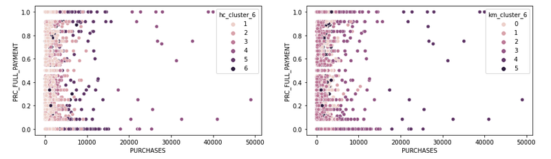
sns.scatterplot(x = 'PURCHASES', y = 'PRC_FULL_PAYMENT', hue = 'hc_cluster_6', data = df_shortened, ax = ax1, legend = 'full')
sns.scatterplot(x = 'PURCHASES', y = 'PRC_FULL_PAYMENT', hue = 'km_cluster_6', data = df_shortened, ax = ax2, legend = 'full')plt.show()Results:
7. Conclusion — What Clustering Algorithm To Choose?
We walked through two distinct unsupervised algorithms (hierarchical and K-Means) for clustering, each one representing a different approach (including Connectivity and Centroid, respectively).
There are pros and cons when it comes to each approach. Hierarchical clustering algorithms are more sensitive to outliers in the data. A small number of outliers can impact cluster assignments (and therefore it might be a good idea to do a more extensive data clean up before implementing a hierarchical clustering approach). Hierarchical clustering is further limited by earlier cluster assignments. In other words, once data points are combined into clusters, they won’t be reassigned. On the other hand, K-means re-assigns the centroids iteratively, which can result in a more optimized clustering.
Lastly, hierarchical clustering are not ideal for very large data sets. We shortened the dataframe and truncated the results for visual purposes but that is a consideration if you work on larger data sets.
Notebook with Practice Questions
Below is the notebook with both questions and answers that you can download and practice.
Thanks for Reading!
If you found this post helpful, please follow me on Medium and subscribe to receive my latest posts!