
9 Practice Questions to Master Data Visualization in Python (Matplotlib + Pandas) for a Data Scientist in Amazon
In this post, we are going to continue our path into the Data Scientist Role Requirements in Amazon and dive deeper into data visualization, which is an essential part of a Data Scientist’s work.
Topics that will be covered include:
- Matplotlib’s Line Plots
- Matplotlib’s Bar Plots
- Matplotlib’s Histograms
- Matplotlib’s Box Plots
- Panda’s Scatter Matrix (or Pair Plots)
Let’s get started!
Practice Questions and Answers
Similar to my other posts, we are going to learn various concepts through a series of questions and answers. I have also provided the Jupyter notebook that includes all the questions and answers for you to download and follow along. To maximize learning, try to answer the questions yourself before looking at the notebook. Then look at the notebook to verify your answers.
Before we start, let’s import the libraries that we will be using during the questions:
import pandas as pd
import numpy as np
import matplotlib.pyplot as plt
from sklearn import datasets
import scipy.stats as sp
import math
# Avoid warnings
import warnings
warnings.filterwarnings("ignore")With that out of the way, let’s look at the practice questions.
1. Matplotlib’s Line Plots
These are the most common / basic type of plots where y versus x is plotted as lines or markers.
The overall format is:
matplotlib.pyplot.plot(*args, scalex=True, scaley=True, data=None, **kwargs)Let’s look at a few examples to better understand line plots.
Question 1:
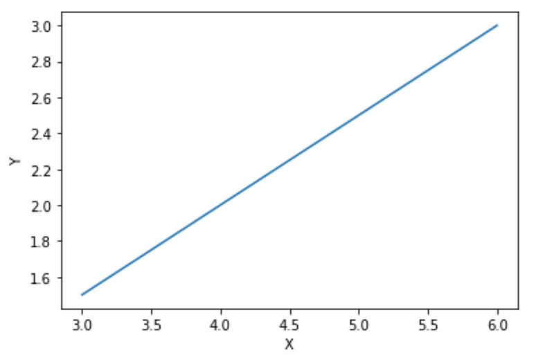
Create a line plot using the x and y values provided below. Label the y-axis as “Y” and label the x-axis as “X”.
x = [3, 4, 5, 6]
y = [1.5, 2, 2.5, 3]
Answer:
plt.plot(x, y)
plt.ylabel("Y")
plt.xlabel("X")
plt.show()
Results:
Question 2:
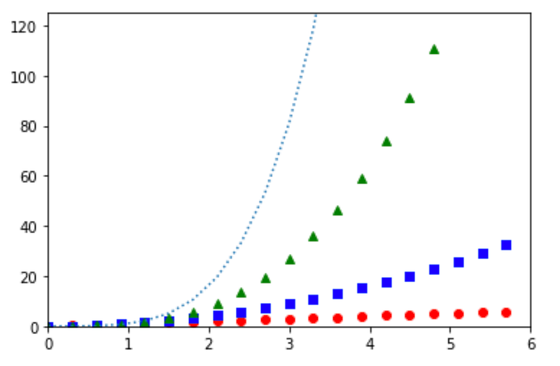
Create an array of numbers between 0 and 6 with increments of 0.3 and name it “x”. Then on the same plot, plot x, x², x³, and x⁴. For consistency, use the following style lines respectively, “ro”, “bs”, “g”, and “:”. Lastly, make sure that the x-axis covers 0 to 6, while the y-axis spans from 0 to 125. Do not worry if you are not familiar with the style lines — you will recognize them as soon as you see the plot.
Answer:
x = np.arange(0, 6, 0.3)plt.plot(x, x, 'ro', x, x**2, 'bs', x, x**3, 'g^', x, x**4, ':')
plt.axis([0, 6, 0, 125])
plt.show()Results:
Question 3:
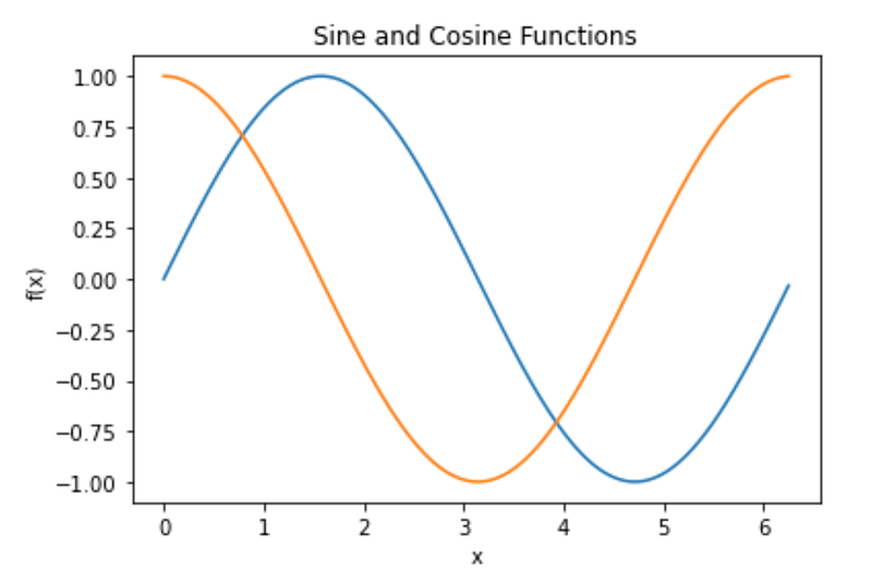
Create the x-axis as a Numpy array spanning from 0 to 2*pi. Next, create two plots to show the Sine and Cosine functions for x. Title the plot as “Sine and Cosine Functions”, and also add relevant x-axis and y-axis labels.
Answer:
# Create the x-axis
# Array of angles between 0 and 2π
x = np.arange(0, math.pi*2, 0.05)
sin = np.sin(x)
cos = np.cos(x)plt.plot(x, sin, x, cos)
plt.xlabel('x')
plt.ylabel('f(x)')
plt.title('Sine and Cosine Functions')
plt.show()Results:
2. Matplotlib’s Bar Plots
Bar plots are a great way to compare visually across time or across different groups. In bar plots, bars are positioned at x with the given alignment and their dimensions are given by height and width.
They are formatted as:
matplotlib.pyplot.bar(x, height, width=0.8, bottom=None, *, align='center', data=None, **kwargs)Let’s look at some examples to better understand these plots.
Question 4:
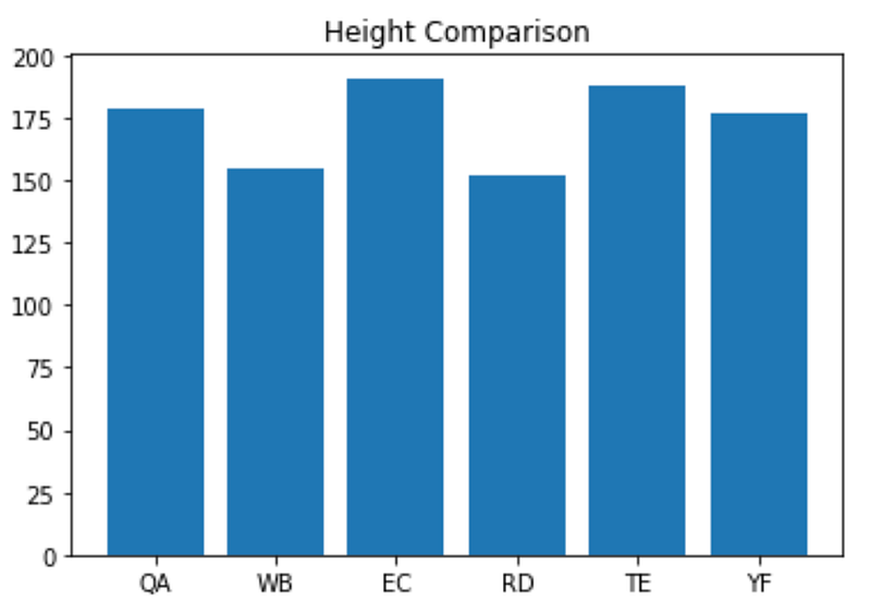
Heights and initials of a group of individuals are provided below. Create a bar plot titled “Height Comparison” to compare the heights among this group.
height = [179, 155, 191, 152, 188, 177]
names = ['QA', 'WB', 'EC', 'RD', 'TE', 'YF']
Answer:
y = np.arange(len(height))plt.bar(y, height)
plt.title("Height Comparison")
plt.xticks(y, names)
plt.show()Results:
Question 5:
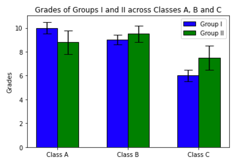
Grades of two groups of students (I and II) are presented below across three classes (A, B and C), along with the error bars (error bars add error ticks to the tip of the bars and are included here for demonstration and practice only). Create a bar plot for grades across these three classes for each of the two groups (Group I should be in blue while Group II should be in green), title the plot accordingly and add legends for Groups I and II based on their color.
# width of the bars
bar_width = 0.3
# Grades of "Group I", which will be the height of the blue bars
blue = [10, 9, 6]
# Grades of "Group II", which will be the height of the green bars
green = [8.8, 9.5, 7.5]# Height of the error bars for "Group I"
yerr_blue = [0.5, 0.4, 0.5]
# Height of the error bars for "Group II"
yerr_green = [1, 0.7, 1]Answer:
# x-axis position of bars
ax1 = np.arange(len(blue))
ax2 = [x + bar_width for x in ax1]
# Ticks
plt.xticks([r + bar_width * 0.5 for r in range(len(blue))], ['Class A', 'Class B', 'Class C'])# Plot "Group I"
plt.bar(ax1, blue, width = bar_width, color = 'blue', edgecolor = 'black', yerr=yerr_blue, capsize=7, label='Group I')
# Plot "Group II"
plt.bar(ax2, green, width = bar_width, color = 'green', edgecolor = 'black', yerr=yerr_green, capsize=7, label='Group II')# Plot details
plt.title('Grades of Groups I and II across Classes A, B and C')
plt.ylabel('Grades')
plt.legend()plt.show()Results:
Pro Tip: There are a lot of details included in each of these plots, which can be overwhelming. What I recommend is to try to remove them one by one and then add them back in and look how the bar plot changes with each step, based on such variations — i.e. (compare the resulting plot before and after inclusion/exclusion). I find that helps me learn about the steps one at a time.
3. Matplotlib’s Histograms
When I think about histograms, they always remind me of how distributions look. For example, imagine a normal distribution but it is a bunch of boxes (we call them bins here) that create the distribution, when the number of boxes or bins are very large.
And now a more formal description — What histogram method in Matplotlib does is to bin the data in x and count the number of values in each bin. Then it draws it either as a BarContainer or Polygon. There are some variables (e.g. bins, range, density, and weights) that we can use and it is generally formatted as follows:
matplotlib.pyplot.hist(x, bins=None, range=None, density=False, weights=None, cumulative=False, bottom=None, histtype='bar', align='mid', orientation='vertical', rwidth=None, log=False, color=None, label=None, stacked=False, *, data=None, **kwargs)Note: You are not expected to know all of these variables! This is just like an encyclopedia that you can refer to as needed but there is no need to know everything that is in there.
Question 6:
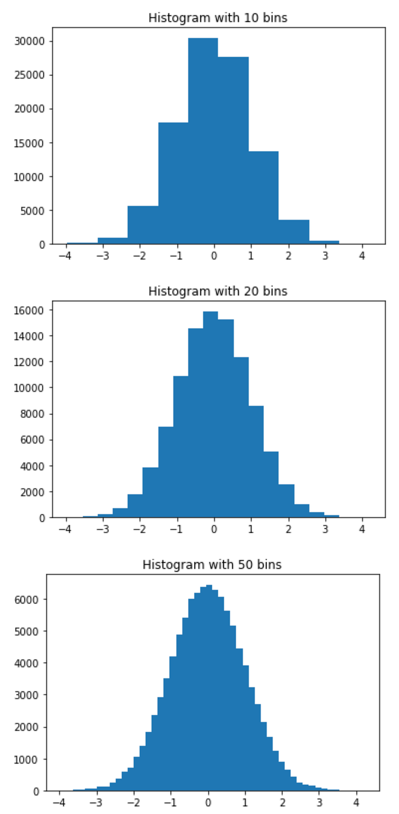
Plot a histogram of x, where x consists of 100,000 randomly-selected points with a normal distribution (hint: you can use numpy.random.randn() to generate the random points). The histogram should have 10 bins. Look at how the histogram changes when we try 20 and 50 bins.
Answer:
np.random.seed(1234)
point_count = 100000
bin_count = [10, 20, 50]
x = np.random.randn(point_count)for bc in bin_count:
plt.hist(x, bins = bc)
plt.title(F'Histogram with {bc} bins')
plt.show()Results:
Question 7:
In this question, we are going to create two histogram based on a distribution that we create on our own. Let’s take the following steps in the same order described here for consistency:
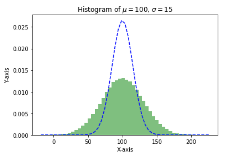
Mean of the distribution will be 100 and the standard deviation of the distribution will be 15. We’re going to use the same bin count of 50 for this exercise.
For the first plot, we’re going to use the formula below:
x = mu + 2 * sigma * np.random.randn(100000)When plotting this one, we’re going to use a few new variables to learn more about them. Let’s use the following:
density = True, which results in sum of the histograms to be normalized to 1.facecolor = green, which changes the color to green — you can try other options such as yellow, red, etc.alpha = 0.5, which changes the opacity — you can safely try different values and see how it changes.
For the second plot, we are going to use SciPy’s scipy.stats.norm.pdf(), which is a probability density function as the name suggests (understanding PDFs is not a requirement for this exercise). We’re going to plot this one using the same bin count around the mean and standard deviation defined above.
Finally, we’re going to title the plot as the “Histogram of mu=100, sigma=15”.
Let’s see how this is done.
Answer:
np.random.seed(1234)# Distribution mean
mu = 100
# Distribution standard deviation
sigma = 15
x = mu + 2 * sigma * np.random.randn(100000)
bin_count = 50n, bins, patches = plt.hist(x, bin_count, density = True, facecolor = 'green', alpha = 0.5)
y = sp.norm.pdf(bins, mu, sigma)
plt.plot(bins, y, 'b--')
plt.xlabel('X-axis')
plt.ylabel('Y-axis')
plt.title('Histogram of $\mu=100$, $\sigma=15$')
plt.show()Results:
4. Matplotlib’s Box Plots
Box plots show more information about the distribution of the data, such as the minimum, first quartile, median, third quartile, and the maximum. More specifically, the box extends from the first quartile (Q1) to the third quartile (Q3) and there is a vertical line at the median. The distance between Q3 and Q1 is called the Inter-Quartile Range or IQR. There are also whiskers extending outwards from the first and the third quartiles by 1.5 times the length of IQR. Fliers are points that are beyond the whiskers at each end. These are demonstrated below (source: matplotlib.org):
     Q1-1.5*IQR   Q1  Median  Q3   Q3+1.5*IQR
                  |-----:-----|
  o      |--------|     :     |--------|    o  o
                  |-----:-----|
 Flier             <----------->            Fliers
                       IQR
There are quite a number of variables that we can change in creating Box Plots (as demonstrated below) and we will go over some of the more common ones in our example.
matplotlib.pyplot.boxplot(x, notch=None, sym=None, vert=None, whis=None, positions=None, widths=None, patch_artist=None, bootstrap=None, usermedians=None, conf_intervals=None, meanline=None, showmeans=None, showcaps=None, showbox=None, showfliers=None, boxprops=None, labels=None, flierprops=None, medianprops=None, meanprops=None, capprops=None, whiskerprops=None, manage_ticks=True, autorange=False, zorder=None, capwidths=None, *, data=None)Note: You are not expected to know all of these variables! This is just like an encyclopedia that you can refer to as needed but there is no need to know everything that is in there.
Question 8:
There is a random set of data provided below. Create a box plot for the data named “Custom Box Plot” and name the x-axis as “Random Data”. “flierprops” variable of box plot is a dictionary that dictates the style of the fliers. Use the “green_diamond” for that variable when you create the box plot.
# Data generation
np.random.seed(1234)
spread = np.random.rand(100) * 80
center = np.ones(15) * 40
flier_high = np.random.rand(5) * 80 + 80
flier_low = np.random.rand(10) * -80
data = np.concatenate((spread, center, flier_high, flier_low))
# Boxplot's flierprops variable
green_diamond = dict(markerfacecolor = 'g', marker = 'D')Answer:
plt.boxplot(data, flierprops = green_diamond, vert = False)
plt.title("Custom Box Plot")
plt.xlabel("Random Data")
plt.show()
Results:
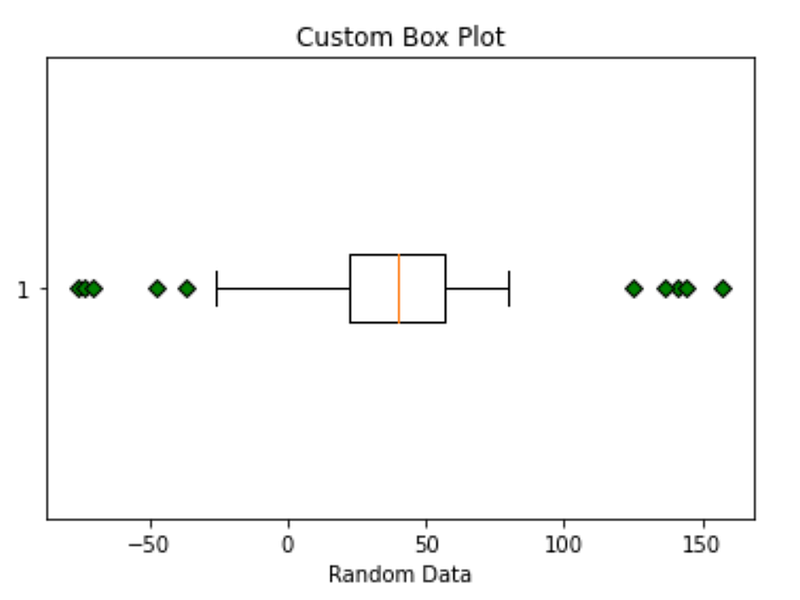
Note that we specified vert = False and as a result the box plot is now horizontal. If we want a vertical box plot, we can change that variable to True or just do not specify it, as it will default to True.
5. Panda’s Scatter Matrix (or Pair Plots)
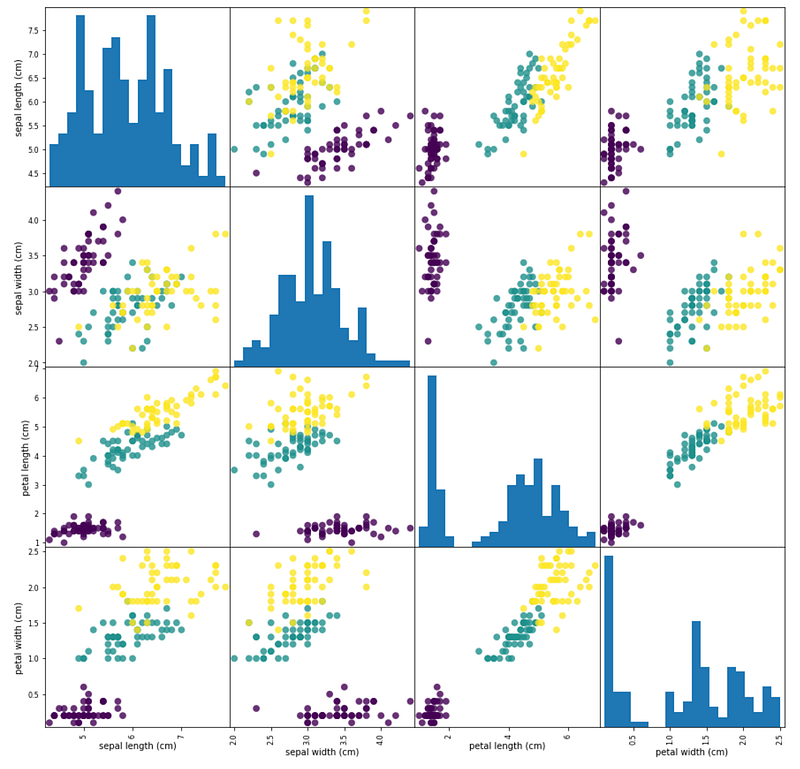
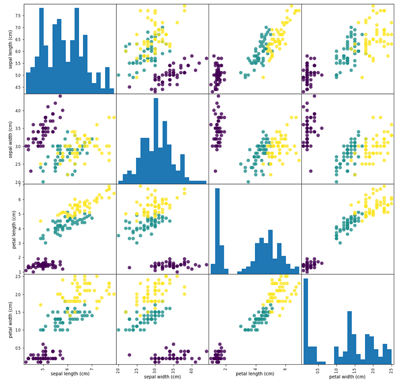
This one is from Pandas, unlike the ones we covered so far. Scatter Matrix draws a matrix of scatter plots. Each of the scatter plots shows the relationship between a pair of variables.
This one is difficult to describe but it is much easier to see in an example. But let’s first take a look at the variables available as follows:
pandas.plotting.scatter_matrix(frame, alpha=0.5, figsize=None, ax=None, grid=False, diagonal='hist', marker='.', density_kwds=None, hist_kwds=None, range_padding=0.05, **kwargs)Now, let’s look at an example together.
Question 9:
For this question, we are going to use one of the existing data sets within the sklearn library. This is a very well-known data set in pattern recognition literature. The data set includes 3 classes of 50 instances, where each class refers to a type of iris plant. Background on this data is not required but it is available for reference here. We will create a data frame from the iris data set and call it iris_df as shown below:
iris = datasets.load_iris()
X = iris.data
Y = iris.target
iris_df = pd.DataFrame(X, columns = iris.feature_names)Next, create a scatter matrix from the above data frame using the following variables:
- Size the matrix as 15 by 15
- Use
'o'as marker - Use 20 bins in the histogram (
hist_kwds = {'bins' : 20}) - Use an opacity (or transparency) of 0.8
Answer:
pd.plotting.scatter_matrix(iris_df, c = Y, figsize = (15, 15), marker = 'o', hist_kwds = {'bins' : 20}, s = 60, alpha = 0.8)plt.show()Results:
Notebook
Below is the notebook with both questions and answers for reference.
Thanks for Reading!
If you found this post helpful, please follow me on Medium and subscribe to receive my latest posts!


