
Graphing Billy Corgan’s Network: Analyzing and Mapping Social Relationships with Python’s NetworkX Library — Part 4
Continue learning how to conduct social network analysis with NetworkX and Python
At the beginning of our investigation into Billy Corgan’s sphere of influence, we introduced social network analysis and basic concepts like nodes and edges. In Part 2, we expanded our understanding of social network analysis by graphing the relationships between the members of the bands Smashing Pumpkins and Zwan. Then, we examined metrics like degree centrality and betweenness centrality to investigate the relationships between the members of the different bands. At the same time, we discussed how domain knowledge helps to inform our understanding of the results.
In Part 3, we introduced a third centrality measure, closeness centrality. We also began a discussion on the concept of communities and subgroups and demonstrated different community graphs and how we might use closeness centrality to inform our interpretation. Using the network of musicians that were members of the bands Zwan and Smashing Pumpkins, we made inferences about the relationships between the members.
This time around, we will make our results more interesting by expanding the network and adding additional bands. At the same time, we will expand our understanding of measures of centrality and the concept of community while refining our Matplotlib skills to make your NetworkX graphs even more engaging.
Adding Complexity to the Network
In previous installments, we covered three essential metrics in social network analysis: degree centrality, betweenness centrality, and closeness centrality. We also discussed the concept of communities and described how that framework can be applied to understand network dynamics among the communities/bands that comprise Billy Corgan’s network.
While even a small group of musicians can exhibit interesting network dynamics, the lack of complexity in the network made our results less interesting and did not provide insights beyond what we might glean from common sense. This time around, we will add more bands and musicians to the network to observe how communities emerge the connections between the musicians influence network dynamics.
Another Sphere of Influence
Another popular rock band that emerged during the 1990s is Tool — known for their unique and progressive approach to rock music. Tool often combines elements of alternative metal, progressive rock, and art rock, resulting in a distinctive and experimental sound. Their songs often incorporate metaphorical and allegorical storytelling that leaves room for interpretation.
From a data science perspective, Tool is an interesting choice, because they also incorporate mathematical themes in various ways within their music. While they don’t explicitly utilize mathematical formulas or equations (in other words — we can’t exactly call them a math rock band), they often employ complex time signatures and rhythmic patterns that can be seen as mathematically inspired. One of the better-known examples of mathematical themes in Tool’s music is the Fibonacci Sequence and the Golden Ratio in the song Lateralus.

Fans will note that Maynard James Keenan, the lead singer of Tool and A Perfect Circle, has other projects that we will save for a future installment. But what does any of this have to do with Billy Corgan? Let’s use measures of centrality to investigate.
Before you start…
- Do you have basic knowledge of Python? If not, start here.
- How about Pandas? If not, start here.
- Are you familiar with basic concepts in social network analysis, like nodes and edges? If not, start here.
- Are you comfortable with concepts in social network analysis, like degree centrality and betweenness centrality? If not, start here! How about communities? If not, start here.
Measures of Centrality with Python and NetworkX
In the code cells below we will expand our network by adding Tool and A Perfect Circle to our network of 1990s musicians. Then, we will use measures of centrality to analyze the network.
1. Constructing Communities
In the code cell below, we import NetworkX and Matplotlib. Just like we did in Part 3, we create a graph object with NetworkX and make a list of all the band members in each band. Then, we combine all of the bands and assign them to the variable communities .
Note: Current and former members are included in the lists of members.
Next, we are going to use a for-loop to iterate over the list of band members. Then, we use .add_nodes_from() to add each band member to the network graph.
To connect members of the same community (i.e., band) , we input a list comprehension that contains each member in the band and eliminates any doubles (e.g., (Billy Corgan, Billy Corgan) ) into the .add_edges_from() .
2. Calculate Measures of Centrality
With our data in place and our network graph populated, we can call on methods from NetworkX to calculate measures of centrality and analyze the network. The results will be stored in a Pandas dataframe.
The output should look something like this:
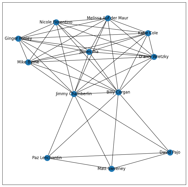
This is significantly more interesting than our results in the last episode, which looked like this:
Before we move on to build a visualization with Matplotlib of this NetworkX graph, let’s digest our observations about the table that we generated. To do this, we will describe each centrality measure, then make an interpretation based on the results from our data.
1. Betweenness Centrality
(Quantifies how often a node acts as a bridge or intermediary in the flow of information or interactions between other nodes.)
When our network contained only two bands (Smashing Pumpkins and Zwan), Billy Corgan and Jimmy Chamberlain ranked the highest in betweenness centrality. Since Tool and A Perfect Circle share a common frontman, we see that Maynard James Keenan usurps some of the betweenness, lowering the betweenness between Billy and Jimmy. However, the band member with the new highest betweenness centrality is James Iha. This suggests that James Iha is the node that links these subgroups together. Using domain knowledge, this checks out. As a member of both Smashing Pumpkins and A Perfect Circle, he is the common link between Billy Corgan’s bandmates and Maynard James Keenan’s bandmates.
2. Degree Centrality
(Measures the number of direct connections (edges) that a node (individual) has in the network.)
James Iha has the highest degree centrality score (0.782609), indicating that he has the most direct connections with other individuals in the network. This is because unlike Zwan and Tool, Smashing Pumpkins and A Perfect Circle have had a rotating cast of members that all share a connection with James Iha.

3. Closeness Centrality
Closeness centrality measures how close a node is to all other nodes in the network, taking into account the shortest paths. In this case, James Iha has the highest closeness centrality score (0.821429), indicating that he can reach other individuals in the network quickly and efficiently.
These centrality measures provide a way to identify key individuals who have significant connections, act as bridges, and have efficient access to other individuals in the network.
Now that we have calculated the measures of centrality, we can create a NetworkX graph with Matplotlib. This time, we will make the graph more engaging by adding colors, labels, titles, and more.
Visualize NetworkX Graphs with Matplotlib
The table we created in the previous section provides important information about influential musicians in the network. To make these results more intuitive, we can create a visualization of the graph with Matplotlib and NetworkX. In previous installments, we have kept our graphs relatively simple. This time, we will use some advanced functionality to make our visualization especially engaging.
As a reminder, this is what our previous network graph looked like:
1. Add Color with Matplotlib
If you check the NetworkX documentation for the method .draw_networkx_nodes(), you will notice an argument for node_color that accepts a color or array of colors. In our case, we want to go with the array of colors so that we can assign a color to each node based on which band the member is in.
Before we get into those details, let’s select some colors. 🎨
When creating plots with Matplotlib, you can use named colors or hex codes. For more information about color choices and the many techniques available, check out the documentation (they even provide code so that you can generate this chart yourself 🤩).
In our case, the goal is to create a dictionary of band names that are mapped to the colors we selected. Then, we want to loop over the nodes and add the selected color for that node to a list. Since we want to emphasize connections between the communities, we will choose a special color for members that appear in more than one band.
To accomplish this, we use a for-loop to iterate over every node in the network. Then, we use a series of if-else statements to assign the special color to any member that appears more than once in flat_communities. If the node for that member only appears once, a color is assigned based on which band the member belongs to.
Using the code block above, we generated a list of twenty-four colors. This directly maps to the list of twenty-four nodes in the network.
This output will be the input for .node_colors() when we call on .draw_networkx_nodes() to start populating our graph’s visualization.
2. Plotting Figures and Calculating Node Position
To begin drawing the visualization, we call on Matplotlib’s .figure() and set figsize to 20 x 12 to provide room for our network graph.
Then, we use NetworkX’s .spring_layout() to calculate the position of each node in the network. This will allow us to plot the nodes on the visualization.
3. Draw Nodes and Edges
Next, we will use .draw_networkx_nodes() and .draw_networkx_edges() to graph each node and their connection. Let’s discuss the arguments for each.
.draw_networkx_nodes()
G: the NetworkX graph object (G)pos: the position of each of the nodes we generated above (pos)node_color: the list of colors we generated (node_colors)node_size: how big should each node be?alpha: how transparent should each node be?
.draw_networkx_edges()
G: the NetworkX graph object (G)pos: the position of each of the nodes we generated above (pos)edge_color: what color should the edges be?alpha: how transparent should each edge be?
This is what it looks like in Python
4. Add Labels to NetworkX Graphs
To add labels, we can use the NetworkX method .draw_networkx_labels .
Let’s go through each parameter and understand their significance. We will skip the ones we have recently reviewed, like G and pos. Then, I’ll show you how to put it all together.
font_size: This parameter sets the font size for the node labels. It specifies how large or small the text representing the node label should be.font_color: This parameter sets the color of the node labels. You can specify the color using various formats, such as named colors (‘red’, ‘blue’, etc.) or hexadecimal values (‘#RRGGBB’) .verticalalignment: This parameter controls the vertical alignment of the node labels with respect to the nodes. For example, setting it to `’top’` aligns the labels above the nodes.bbox: This parameter is a dictionary containing properties for the bounding box (bbox) of the node labels. It is typically used to define a background box or a rectangle around the labels to improve visibility and readability.labels: This is an optional parameter that allows you to specify a dictionary with custom node labels. The dictionary’s keys should be node IDs (usually integers), and the values should be the corresponding labels you want to assign to each node. If this parameter is not provided, the default node labels will be used (usually the node IDs).
This is what the code will look like:
5. Add a Legend to Matplotlib Visualizations
Finally, we want to add a legend to provide context for the viewer. To accomplish this, we need to create three lists (legend labels, legend colors, and legend markers), then provide those lists as arguments to plt.legend() . We will also use the optional args loc, fontsize, frameon, borderpad, and borderaxespad , to stylize the legend.
Let’s review the purpose of each optional arg we selected.
loc: Where should the legend be located on the screen?fontsize: Determines the text size of the legend.frameon: Adds a border around the legend.borderpad: Adds a little pad space between the border and the text.borderaxespad: The pad between the axes and legend border, in font-size units.
These are just a few of the many optional args you can use to stylize your matplotlib legends. Check out the documentation to review all of them, as well as the possible values that you can provide.
For legend labels , we simply provide the name of each band. For legend_colors we refer to the dictionary we created, color_palette , and use the key values to define the color of each band. Next, legend_markers positions the markers in a straight vertical line, and define their size and shape.
Finally, we pull it all together with plt.legend() . This is what it looks like:
6. Adding Finishing Touches
To put a bow on our NetworkX graph, we can add a title by calling plt.title(), then stylizing the title with fontsize, fontweight, and pad.
By using the off parameter with plt.axis(), we can remove the border around the network graph, allowing for more even spacing and readability.
Calling plt.tight_layout() automatically adjusts the placement of graph elements, for even more improved spacing and readability.
Finally, we simply call plt.show() to display our visualization!
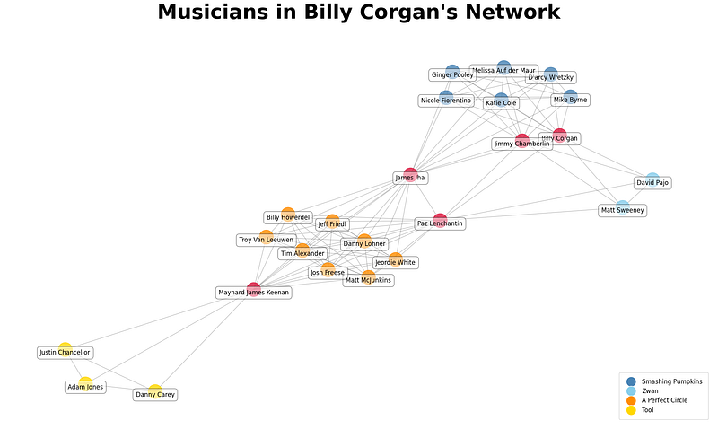
This is the final product:
Interpreting NetworkX Graphs
In this tutorial, we used Billy Corgan’s network to demonstrate foundational concepts in social network analysis, by building on the network we built in Part 1, Part 2, and Part 3. This time, we made the network more complex by adding two additional bands, Tool, and A Perfect Circle. This allowed us to observe the effect of additional individuals (nodes) in the network, and how that impacts measures of centrality.
What we discovered is that James Iha is an important intermediary between the community of musicians associated with Billy Corgan (Smashing Pumpkins and Zwan) and Maynard James Keenan (Tool and A Perfect Circle). This result is interesting because it suggests that lead singers are not necessarily the most influential players in the larger network. If we consider how this technique can be used at scale with large networks, we can appreciate the utility of NetworkX graphs and how they can help us quickly identify important nodes in the network. Then, we can use metrics, like degree centrality, betweenness centrality, and closeness centrality to highlight the nuances in our findings. Finally, we imbue our interpretation with domain knowledge to reach an explainable result.
So, if you are a subject matter expert when it comes to alternative music, what do you think of these results? If you noticed any interesting changes in the network after the addition of Tool and A Perfect Circle, be sure to mention it in Responses 💬!
If you would like the annotated notebook for this tutorial, visit my GitHub! Give it a ⭐️ for easy reference. 👩🏻💻 Christine Egan | medium | github | linkedin