
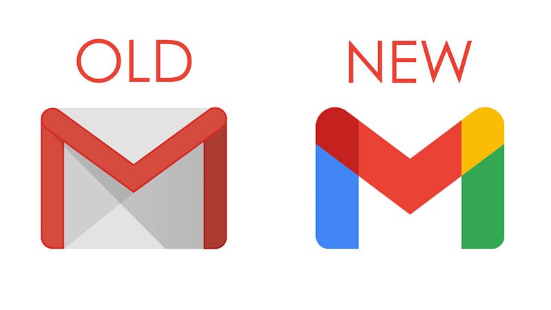
Gmail Embraced The “M”
We’re still not happy.
Over the past week, we all noticed how Medium moved away from the M to stylized ellipses. It upset a lot of people.
On the other end of the spectrum, you now have Gmail embracing the M. Gmail moved away from the old envelope to a Google colored M.
Now Gmail users are fuming!
Whatever you guys do, we’ll always be upset.
M or no M. We hate change.
Or, it gives us something to talk about.
Pretend like we can come up with a better logo.
Or that we care more about the logo than anyone else in the world.
The truth is, I’m now used to the new Medium logo. I couldn’t care less about it.
At first, yes, It bothered me. I wrote about it.
Less than 10 days later, I no longer care. I’ve gotten used to it as if nothing had happened.
I wonder why we waste time whining about things in the first place.
Let the logos be. Just leave them alone (myself included).