
WEEKLY BUSINESS ROUNDUP
Global Business Week: The Buffet indicator is at an all-time high
The state of Financial markets & Economies, Weekly Charts, Business Trends & Statistics
A noisy week for investors ended flat as major indices ended pretty much where they started. The recent rip in energy prices due to the deep freeze across the U.S. abated on Friday as oil prices fell from their 13-month highs. For the week, the S&P 500 fell 0.7% and the Nasdaq Composite lost 1.6%, while the Dow Jones fared better with a slight gain. Benchmark 10-year Treasury yields climbed above 1.35% Friday to the highest in nearly a year. The U.S stocks fizzled somewhat this week amid inflation fears caused by the stimulus being pumped into the financial system.
Dollar Index’s (DXY) recent rebound has done little to revert the strong bearish trend that we have seen in recent months — remaining below the rising trendline from the April 2011 and February 2018 lows. As said last week, a short-covering rally may soon emerge on the basis of net-short US Dollar futures positioning remains near its highest level since March 2011. In the short-term, DXY has created a lower high, closing at 90.34 — just above the recent support level.
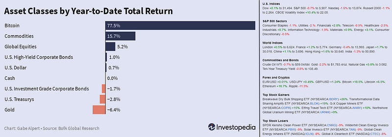
Although it has been an incredible first six weeks for stocks and commodities, Bitcoin’s rise in 2021 is putting these asset class returns to shame (Figure 1). Forget going to the moon, seems like BTC is poised to join the recently landed Perseverance rover on Mars — with its most all-time high (ATH) around $57,500. Ethereum has also charted a new ATH, overtaking the psychological barrier of $2,000.
Another important achievement for Bitcoin was achieving the $1 trillion market cap. MicroStrategy announced last Tuesday it will offer $600M in convertible bonds to buy more Bitcoin, while ride-hailing giant Uber is mulling whether to accept cryptocurrencies as payment.
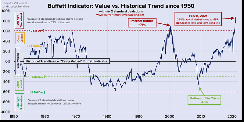
Today’s chart by Current Market Valuation (CMV) provides an overview of how the Buffett Indicator has changed since 1950. In 2001, Warren Buffett famously described the stock market capitalization-to-GDP ratio as “the best single measure of where valuations stand at any given moment.” This ratio is now commonly known as the Buffett Indicator and compares the size of the stock market to that of the economy. A high ratio indicates an overvalued market — and as of February 11, 2021, the ratio has reached all-time highs, indicating that the U.S. stock market is currently strongly overvalued.
Here’s a weekly roundup of the financial markets before we move on to some of the other interesting statistics.
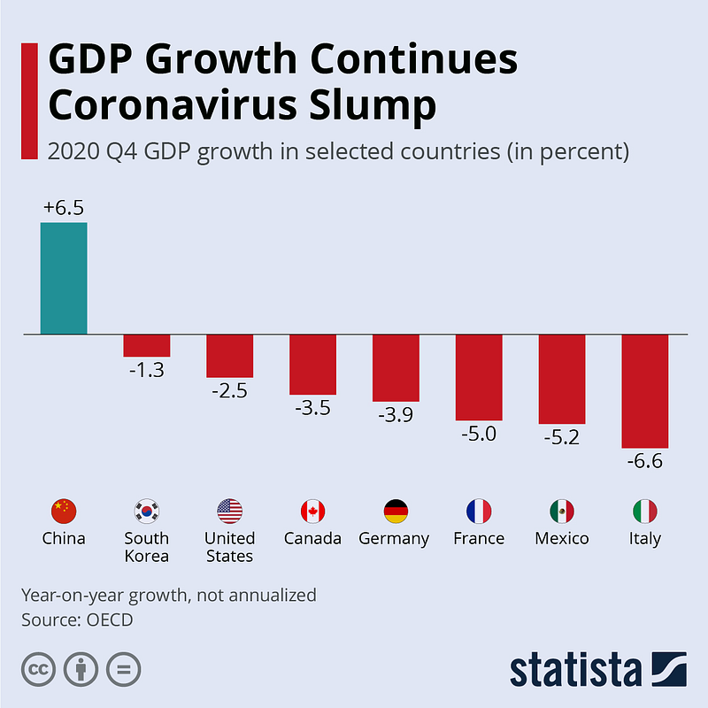
GDP Growth Continues Coronavirus Slump
GDP figures by the OECD for the fourth quarter of 2020 show the ongoing impact the coronavirus is having on economies around the world. According to the data (Figure 2), China was the first (and only) economy that bounced back from its coronavirus losses, recording a year-over-year growth of 6.5% in Q4 of 2020 after having already grown by 4.9% in the third and by 3.2% in the second quarter — seeing only one quarter of negative growth due to the pandemic. The U.S., which reopened its economy despite an ongoing outbreak, saw Q4 GDP growth just 2.5% below last year’s levels despite a quarter-on-quarter bounce back.
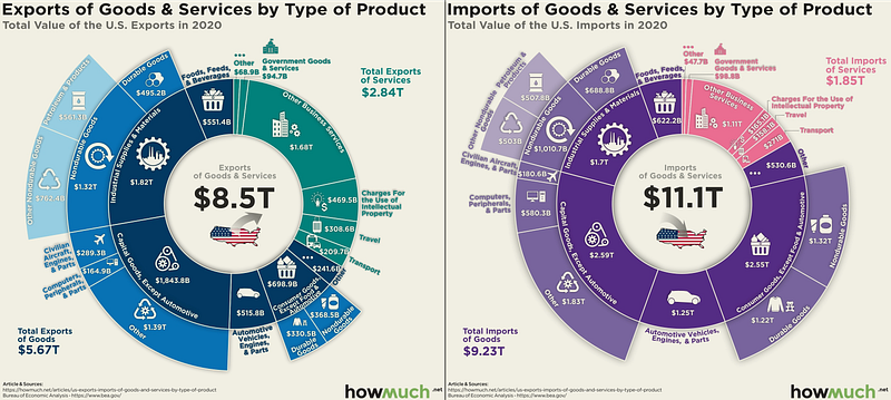
Breaking Down America’s Imports and Exports
According to the data from the U.S. Bureau of Economic Analysis, the infographic below from Howmuch.net visualizes the imports & exports of the United States broken down into various categories. America exports $2.84 trillion in services, nearly twice the $1.85 trillion in imports (Figure 3). The largest imbalance favoring imports is in the consumer goods category. While the same gap is highest for exports in the business services category. Overall, total exports dropped by $1.55 trillion and imports by $1.41 trillion in 2020 compared to 2019.
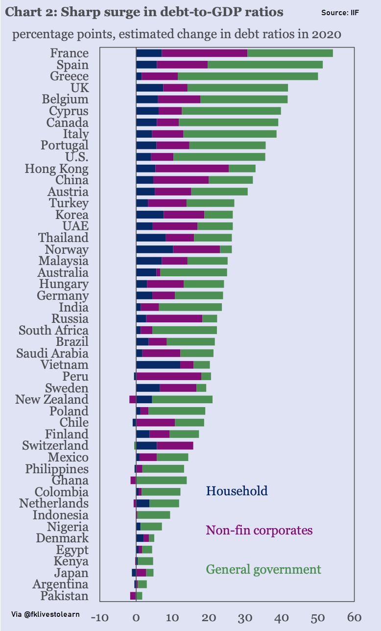
A sharp surge in Global Debt-to-GDP ratios
According to the Institute of International Finance, total global private and public debt at the end of 2020 stood at $281 trillion — a record high, and last year’s increase of $24 trillion makes up over a quarter of the $88 trillion rises over the past decade. More than half of the increase came from government debt as countries announced massive fiscal stimulus packages to fend off the financial impact of the pandemic. Consequently, the global debt-to-GDP ratio surged by 35 percentage points to over 355% of GDP in 2020, dwarfing the 10–15% pts increase during the global financial crisis (2009). The countries with the biggest increases in debt-to-GDP ratios were mainly developed markets — led by France, Spain, and Greece (Figure 4). Switzerland was the only mature market that avoided an increase.
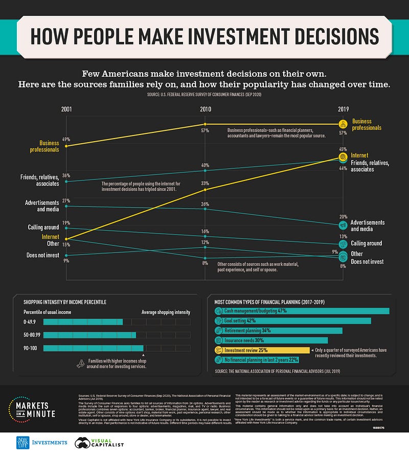
How Americans make Investment Decisions
The Markets in a Minute infographic below from New York Life Investments (Figure 5) shows which sources of information American families rely on for investment decisions, and how their popularity has changed over the last two decades. When you are making investment decisions, there can be a lot of different things to consider. Which types of asset classes should you hold? What is your risk profile? How much money will you need to retire? It’s no surprise, then, that few Americans make these decisions on their own.
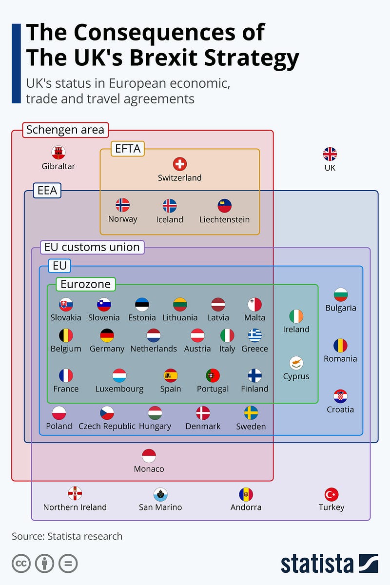
The Consequences of BREXIT on the UK
A report published by the British Foreign Policy Group, an independent think tank, has found that a majority of people in the United Kingdom are unhappy at how Brexit turned out — 27% seeking a closer relationship with Europe with a view to rejoining the EU, 22% wanting a closer relationship but remaining outside the EU and 12% stating that they want to move further away from Europe. According to the infographic below (Figure 6), the UK is now firmly on the sidelines as British businesses struggle to cope with the new reality.
Space Economy Boom
According to Space Capital, the total equity investment over the last 10 years across 1,343 unique companies in the space economy comes to about $177 billion. Firms in the U.S. and China collectively accounted for 75% of that amount, followed by Singapore (6%), Britain (4%), Indonesia (3%), and India (3%). The space economy isn’t just rockets, spaceships, and tourism. In fact, companies involved in applications, like positioning, navigation & earth observation, account for the lion’s share of funds each year (Figure 7).
The pandemic has brought about rapid digitization of the global economy. A survey by Global Web Index found that South Koreans are the most likely to pay by card with 77% of respondents indicating that they avoid using cash transactions. What is also interesting is that according to the most recent World Bank statistics, South Korea still has the highest density of ATMs globally when special administrative regions and territories are excluded. In 2018, South Korea had 267 ATMs per 100,000 of its inhabitants, ahead of second-place Canada with 214 (Figure 8).

Previous Edition of GBW
