
Further Implementation of Dynamic Risk Management Methods in Python
15 Time-varying Techniques for Proactive Risk Analytics [Part 2/2]

1. Introduction
Building on the foundational principles of dynamic risk management discussed in our prior article, we now discuss specific techniques that address both the peaks and valleys of financial risk. While the first segment centered on broader risk metrics and their foundational implications, this continuation brings to light tools specifically tailored to measure extremities, stability, and investor sentiments in financial markets. As a refresher, here’s the complete list of the 15 dynamic risk management techniques we’re exploring across this two-part series:
- Historical Volatility
- Sharpe Ratio
- Treynor Ratio
- Rolling Beta
- Jensen’s Alpha
- Value at Risk
- Conditional Value at Risk
- Tail Ratio
- Omega Ratio
- Sortino Ratio
- Calmar Ratio
- Stability of Returns
- Maximum Drawdown
- Upside Capture and Downside Capture
- Pain Index
This is the continuation of our discussion on dynamic risk management, covering the last eight techniques. If you’re new to this series, you might find it useful to start with the first part where the initial seven methods are introduced.
2. Dynamic Risk Management in Python
2.1 Tail Ratio
The Tail Ratio provides an understanding of the relative extremity of positive and negative returns for an asset. Essentially, it offers a metric to evaluate the potential for upside against the downside risk. A tail ratio greater than 1 indicates that the asset’s potential for extreme positive returns (at the 95th percentile) is greater than its potential for extreme negative returns (at the 5th percentile). Conversely, a tail ratio below 1 suggests the opposite.

The Tail Ratio is particularly useful as it helps investors gauge how skewed an asset’s returns might be towards positive or negative extremes. For investors, periods where the Tail Ratio consistently exceeds 1 might be of interest as they hint at an asset’s potential for skewed positive returns without correspondingly extreme negative returns.
import pandas as pd
import numpy as np
import yfinance as yf
import matplotlib.pyplot as plt

tickerSymbol = "VOW.DE"
tickerData = yf.Ticker(tickerSymbol)
tickerDf = tickerData.history(period='1d', start='2010-1-1')
tickerDf['returns'] = tickerDf['Close'].pct_change()
tail_ratio = tickerDf['returns'].rolling(252).apply(lambda x: np.abs(np.percentile(x, 95)) / np.abs(np.percentile(x, 5))).dropna()

# Aesthetics
plt.figure(figsize=(15,7))
plt.style.use('seaborn-darkgrid')
palette = plt.get_cmap('Set1')

# Plot stock price
ax1 = plt.gca()
tickerDf['Close'].plot(ax=ax1, color='gray', linewidth=0.5, label='Stock Price')
ax1.set_ylabel('Stock Price', fontsize=14, color=palette(1))
ax1.legend(loc='upper left')

# Plot tail ratio
ax2 = ax1.twinx()
ax2.plot(tail_ratio.index, tail_ratio, color=palette(0), linewidth=1.5, label='Tail Ratio')

# Plotting a simple moving average of the tail ratio
ax2.plot(tail_ratio.index, tail_ratio.rolling(window=252).mean(), color='orange', linestyle='--', label='1-Year MA of Tail Ratio')

# Horizontal line for benchmark tail ratio of 1
ax2.axhline(y=1, color='red', linestyle='-.', label='Benchmark (1)')

# Shade region where tail ratio is above 1
ax2.fill_between(tail_ratio.index, tail_ratio, 1, where=(tail_ratio > 1), color='green', alpha=0.3, label='Above Benchmark')

# Aesthetics for the tail ratio plot
ax2.set_ylabel('Tail Ratio', fontsize=14, color=palette(0))
ax2.legend(loc='upper right')
plt.title('Rolling 1-Year Tail Ratio with Stock Price', fontsize=16)
ax2.grid(False)  # Turn off grid for the second axis

plt.tight_layout()
plt.show()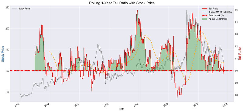
2.2 Omega Ratio
The Omega Ratio is a popular performance measure used to evaluate the return of an investment relative to its risk. It gauges the potential reward received for the risk taken, with respect to a given benchmark or Minimum Acceptable Return (MAR). Essentially, it divides the upside potential (returns above MAR) by the downside risk (returns below MAR).

If the Omega Ratio is greater than 1, it indicates the investment’s return surpasses the MAR for each unit of downside risk taken. Conversely, an Omega Ratio below 1 suggests the returns do not justify the associated downside risk.
import pandas as pd
import numpy as np
import yfinance as yf
import matplotlib.pyplot as plt

tickerSymbol = "SIE.DE"
tickerData = yf.Ticker(tickerSymbol)
tickerDf = tickerData.history(period='1d', start='2010-1-1')
tickerDf['returns'] = tickerDf['Close'].pct_change()
MAR = 0  # Minimum Acceptable Return
omega_ratio = tickerDf['returns'].rolling(252).apply(lambda x: np.sum(x[x > MAR] - MAR) / np.sum(MAR - x[x < MAR])).dropna()

# Aesthetics
plt.figure(figsize=(15,7))
plt.style.use('seaborn-darkgrid')
palette = plt.get_cmap('Set1')

# Plot Omega Ratio
ax1 = plt.gca()
ax1.plot(omega_ratio.index, omega_ratio, color=palette(0), linewidth=1.5, label='Omega Ratio')

# Plotting a simple moving average of the omega ratio
ax1.plot(omega_ratio.index, omega_ratio.rolling(window=252).mean(), color='orange', linestyle='--', label='1-Year MA of Omega Ratio')

# Horizontal line for benchmark Omega Ratio of 1
ax1.axhline(y=1, color='red', linestyle='-.', label='Benchmark (1)')

# Shade region where Omega Ratio is above 1
ax1.fill_between(omega_ratio.index, omega_ratio, 1, where=(omega_ratio > 1), color='green', alpha=0.3, label='Above Benchmark')

# Aesthetics for Omega Ratio
ax1.set_ylabel('Omega Ratio', fontsize=14, color=palette(0))
ax1.legend(loc='upper left')
ax1.set_title(f'Rolling 1-Year Omega Ratio with Stock Price (MAR: {MAR*100}%)', fontsize=16)

# Stock Price Plot on secondary y-axis
ax2 = ax1.twinx()
ax2.plot(tickerDf.index, tickerDf['Close'], color=palette(1), alpha=0.4, label='Stock Price')
ax2.set_ylabel('Stock Price', fontsize=14, color=palette(1))

plt.tight_layout()
plt.show()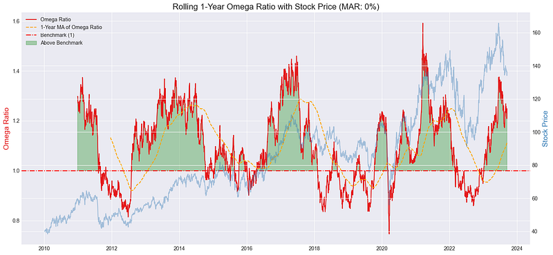
2.3 Sortino Ratio
The Sortino Ratio is a variation of the Sharpe Ratio that only factors in the downside risk or the negative volatility. Instead of assessing total volatility as a measure of risk (like the Sharpe Ratio), the Sortino Ratio focuses solely on the unwanted variability, or the risk of achieving returns below a desired threshold — typically known as the Minimum Acceptable Return (MAR). This offers a more tailored evaluation of risk by only considering the negative outcomes.

Where:
- R = Average realized return
- T = Target or required rate of return (MAR in this context)
- DR = Downside risk (standard deviation of the negative asset returns relative to MAR)
Generally, a higher Sortino Ratio indicates a better risk-adjusted performance. However, a value below the mean suggests that the returns might not sufficiently compensate for the downside risk relative to the MAR.
import pandas as pd
import numpy as np
import yfinance as yf
import matplotlib.pyplot as plt

# Fetch Data
tickerSymbol = "VOW.DE"
tickerData = yf.Ticker(tickerSymbol)
tickerDf = tickerData.history(period='1d', start='2010-1-1')
tickerDf['returns'] = tickerDf['Close'].pct_change()
MAR = 0  # Minimum Acceptable Return
sortino_ratio = tickerDf['returns'].rolling(252).apply(lambda x: np.mean(x - MAR) / np.sqrt(np.mean(np.minimum(0, x - MAR) ** 2))).dropna()

threshold = sortino_ratio.mean()

# Aesthetics
plt.figure(figsize=(15,7))
plt.style.use('seaborn-darkgrid')
palette = plt.get_cmap('Set1')

# Plot Sortino Ratio
ax1 = plt.gca()
ax1.plot(sortino_ratio.index, sortino_ratio, color=palette(0), linewidth=1.5, label='Sortino Ratio')
# Smoothened Sortino Ratio with a moving average
ax1.plot(sortino_ratio.index, sortino_ratio.rolling(window=252).mean(), color='orange', linestyle='--', label='1-Year MA of Sortino Ratio')
ax1.axhline(y=threshold, color='red', linestyle='--', label=f'Threshold (Mean: {threshold:.2f})')

# Aesthetics for Sortino Ratio
ax1.set_ylabel('Sortino Ratio', fontsize=14, color=palette(0))
ax1.legend(loc='upper left')
ax1.set_title(f'Rolling 1-Year Sortino Ratio with Stock Price (MAR: {MAR*100}%)', fontsize=16)

# Stock Price Plot on secondary y-axis
ax2 = ax1.twinx()
ax2.plot(tickerDf.index, tickerDf['Close'], color=palette(1), alpha=0.4, label='Stock Price')
ax2.set_ylabel('Stock Price', fontsize=14, color=palette(1))

plt.tight_layout()
plt.show()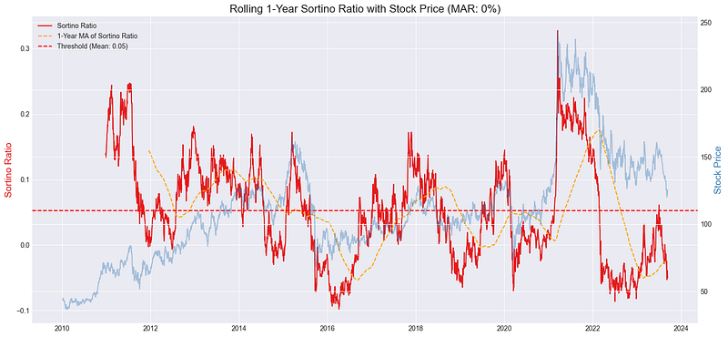
2.4 Calmar Ratio
The Calmar Ratio, also known as the drawdown ratio, is a performance metric used to assess the risk-adjusted performance of investment portfolios. The ratio measures the relationship between the portfolio’s compound annual growth rate (CAGR) and its maximum drawdown, offering insights into the potential return of an investment relative to its risk.

Where:
- CAGR (Compound Annual Growth Rate) represents the geometric progression ratio that provides a smooth annual rate, shaping the portfolio’s returns over time.
- Maximum Drawdown depicts the largest peak-to-valley decline of the investment’s value, indicating the maximum observed loss from a peak over a specified period.
A higher Calmar Ratio is generally preferred, suggesting that the potential return of the investment might justify the associated risk. However, a ratio below the average threshold could imply that the returns do not adequately compensate for the observed drawdown risk.
import pandas as pd
import numpy as np
import yfinance as yf
import matplotlib.pyplot as plt

tickerSymbol = "VOW.DE"
tickerData = yf.Ticker(tickerSymbol)
tickerDf = tickerData.history(period='1d', start='2010-1-1')
tickerDf['returns'] = tickerDf['Close'].pct_change()

calmar_ratio = tickerDf['returns'].rolling(252).apply(lambda x: (1 + x).cumprod()[-1] ** (252.0 / len(x)) / np.abs(np.min((1 + x).cumprod() / (1 + x).cumprod().cummax()) - 1)).dropna()
threshold_calmar = calmar_ratio.mean()

plt.figure(figsize=(15,7))
plt.style.use('seaborn-darkgrid')
palette = plt.get_cmap('Set1')

ax1 = plt.gca()
ax1.plot(calmar_ratio.index, calmar_ratio, color=palette(0), linewidth=1.5, label='Calmar Ratio')
ax1.plot(calmar_ratio.index, calmar_ratio.rolling(window=252).mean(), color='orange', linestyle='--', label='1-Year MA of Calmar Ratio')
ax1.axhline(y=threshold_calmar, color='red', linestyle='--', label=f'Threshold (Mean: {threshold_calmar:.2f})')
ax1.set_title('Rolling 1-Year Calmar Ratio with Stock Price', fontsize=16)
ax1.set_ylabel('Calmar Ratio', fontsize=14)
ax1.legend(loc='upper left')

ax2 = ax1.twinx()
ax2.plot(tickerDf.index, tickerDf['Close'], color=palette(1), alpha=0.4, label='Stock Price')
ax2.set_ylabel('Stock Price', fontsize=14)

plt.tight_layout()
plt.show()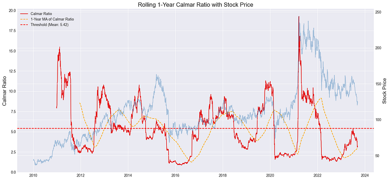
2.5 Returns Stability
Stability of returns is a valuable metric for investors as it provides insight into the consistency and predictability of a portfolio’s returns over time. Essentially, it captures the deviation of the portfolio’s returns from a linear trend, indicating how much the returns have deviated from a linear growth trajectory. The stability is calculated by comparing the cumulative logarithmic returns of the portfolio against the expected cumulative returns derived from a linear regression trend.

Where:
- Cumulative Log Returns are the running total of log-transformed returns. Expected Cumulative Returns from Linear TrendExpected Cumulative Returns from Linear Trend are obtained by fitting a linear regression on the cumulative log returns.
A lower stability value is typically desirable, indicating that the portfolio’s returns closely follow a predictable, linear trend. Conversely, higher values signify more unpredictable returns that deviate considerably from a linear growth path.
from scipy.stats import linregress

tickerSymbol = "VOW.DE"
tickerData = yf.Ticker(tickerSymbol)
tickerDf = tickerData.history(period='1d', start='2010-1-1')
tickerDf['returns'] = tickerDf['Close'].pct_change()

stability = tickerDf['returns'].rolling(252).apply(lambda x: np.std(np.log1p(x).cumsum() - linregress(np.arange(len(x)), np.log1p(x).cumsum()).intercept - linregress(np.arange(len(x)), np.log1p(x).cumsum()).slope * np.arange(len(x)))).dropna()

plt.figure(figsize=(15,7))
plt.style.use('seaborn-darkgrid')

ax1 = plt.gca()
ax1.plot(stability.index, stability, color=palette(0), linewidth=1.5, label='Stability of Returns')
ax1.plot(stability.index, stability.rolling(window=252).mean(), color='orange', linestyle='--', label='1-Year MA of Stability')
ax1.set_title('Rolling 1-Year Stability of Returns with Stock Price', fontsize=16)
ax1.set_ylabel('Stability', fontsize=14)
ax1.legend(loc='upper left')

ax2 = ax1.twinx()
ax2.plot(tickerDf.index, tickerDf['Close'], color=palette(1), alpha=0.4, label='Stock Price')
ax2.set_ylabel('Stock Price', fontsize=14)

plt.tight_layout()
plt.show()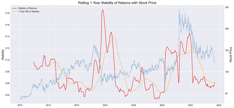
2.6 Maximum Drawdown
The maximum drawdown (MDD) is a risk metric that measures the largest single drop from peak to bottom in the value of a portfolio. In other words, it quantifies the maximum loss an investor could have experienced if they bought at the highest point before a downturn and sold at the subsequent trough. MDD is a significant indicator because it gives investors an idea of the worst-case scenario for a given investment, as seen historically.

Where:
- Cumulative Minimum Value refers to the lowest value of the cumulative returns after the Cumulative Maximum Value within the rolling period.
- Cumulative Maximum Value is the highest cumulative return value achieved before the drawdown starts.
The visual representation below portrays the maximum drawdown across time, with more pronounced dips in the red line highlighting the periods when the stock witnessed significant declines from its previous highs.
import pandas as pd
import numpy as np
import yfinance as yf
import matplotlib.pyplot as plt

tickerSymbol = "VOW.DE"
tickerData = yf.Ticker(tickerSymbol)
tickerDf = tickerData.history(period='1d', start='2010-1-1')
tickerDf['returns'] = tickerDf['Close'].pct_change()

rolling_cumulative = (1 + tickerDf['returns']).cumprod()
rolling_max = rolling_cumulative.rolling(252, min_periods=1).max()
rolling_drawdown = (rolling_cumulative - rolling_max) / rolling_max

plt.figure(figsize=(15,7))
ax1 = plt.gca()
ax1.plot(rolling_drawdown, label='Rolling Maximum Drawdown', linewidth=1.5, color='red')
ax1.set_title('Rolling 1-Year Maximum Drawdown with Stock Price', fontsize=16)
ax1.set_ylabel('Max Drawdown', fontsize=14)
ax1.legend()

ax2 = ax1.twinx()
ax2.plot(tickerDf['Close'], color='grey', alpha=0.3, label='Stock Price')
ax2.set_ylabel('Stock Price', fontsize=14)

plt.tight_layout()
plt.show()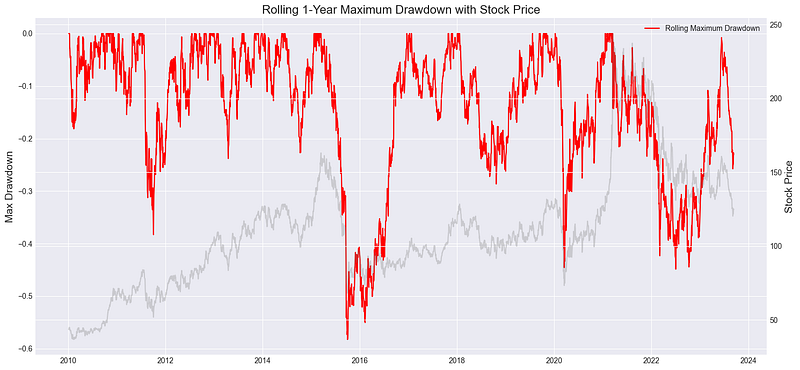
2.7 Upside Capture and Downside Capture
Capture ratios are useful metrics for understanding how an investment performs relative to a benchmark, especially during up and down market movements. The Upside Capture Ratio shows how well an investment outperforms a benchmark during periods when the benchmark has positive returns. Conversely, the Downside Capture Ratio indicates how the investment performs compared to the benchmark during times when the benchmark has negative returns.


The resulting chart below provides a dual representation:
- Rolling Upside Capture: The line indicates how well the stock has outperformed the S&P 500 during periods when the S&P 500 was increasing. Values above 100% signify outperformance relative to the benchmark during positive market movements.
- Rolling Downside Capture: This line illustrates how the stock performed relative to the S&P 500 during times when the S&P 500 was declining. Values below 100% are desirable here, as they indicate that the stock fell less than the benchmark during negative market movements.
import pandas as pd
import numpy as np
import yfinance as yf
import matplotlib.pyplot as plt

# Fetch data
tickerSymbol = "VOW.DE"
tickerData = yf.Ticker(tickerSymbol)
tickerDf = tickerData.history(period='1d', start='2010-1-1')
tickerDf['returns'] = tickerDf['Close'].pct_change()

# Market data for benchmark
market_data = yf.Ticker("^GSPC").history(period='1d', start='2010-1-1')
market_data['returns'] = market_data['Close'].pct_change()

# Align indices
market_data = market_data.reindex(tickerDf.index, method='ffill')

window_size = 252

def calculate_capture(stock_returns, market_returns, is_upside=True):
    relevant_returns = stock_returns[market_returns > 0] if is_upside else stock_returns[market_returns < 0]
    relevant_market_returns = market_returns[market_returns > 0] if is_upside else market_returns[market_returns < 0]
    return relevant_returns.sum() / relevant_market_returns.sum()

def compute_rolling_captures(stock_returns, market_returns, window):
    upside_captures = []
    downside_captures = []

    for idx in range(len(stock_returns) - window + 1):
        current_window_stock = stock_returns.iloc[idx: idx + window]
        current_window_market = market_returns.iloc[idx: idx + window]

        upside = calculate_capture(current_window_stock, current_window_market, is_upside=True)
        downside = calculate_capture(current_window_stock, current_window_market, is_upside=False)

        upside_captures.append(upside)
        downside_captures.append(downside)

    # Padding the initial values with NaNs to make the length equal to original data
    nan_padding = [np.nan] * (window - 1)
    upside_captures = nan_padding + upside_captures
    downside_captures = nan_padding + downside_captures

    return upside_captures, downside_captures

tickerDf['rolling_upside_capture'], tickerDf['rolling_downside_capture'] = compute_rolling_captures(
    tickerDf['returns'], market_data['returns'], window_size
)

plt.figure(figsize=(14, 7))
plt.plot(tickerDf['rolling_upside_capture'], label="Rolling Upside Capture", color='g')
plt.plot(tickerDf['rolling_downside_capture'], label="Rolling Downside Capture", color='r')
plt.title('Rolling 1-Year Upside and Downside Capture Ratios')
plt.xlabel('Date')
plt.ylabel('Capture Ratios')
plt.grid(True)
plt.legend()
plt.tight_layout()
plt.show()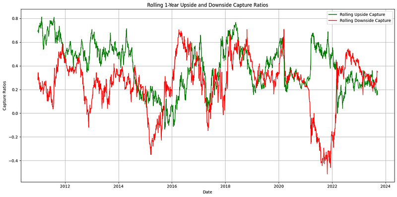
2.8 Pain Index
The Pain Index provides an insightful measure of the discomfort an investor might feel due to drawdowns in an investment. It calculates the depth, duration, and frequency of drawdowns, with a higher Pain Index indicating more frequent and deeper losses. Essentially, the index conveys how much “pain” an investor has experienced over a specific time frame.

- Drawdowni is the drawdown on day i.
- n is the number of total days.
- “Number of Drawdown Days” refers to the total number of days the portfolio experienced a drawdown.
High values of the Pain Index indicate periods when the stock saw frequent or deep drops in value. Such periods are times of higher volatility and potentially increased investor anxiety. On the contrary, low values suggest that the stock experienced milder and fewer drops, providing a relatively smoother investment experience.
import pandas as pd
import numpy as np
import yfinance as yf
import matplotlib.pyplot as plt

# Fetch Data
tickerSymbol = "VOW.DE"
tickerData = yf.Ticker(tickerSymbol)
tickerDf = tickerData.history(period='1d', start='2010-1-1')
tickerDf['returns'] = tickerDf['Close'].pct_change()

# Compute the running cumulative return
cumulative_return = (1 + tickerDf['returns']).cumprod()

# Compute the running maximum
running_max = cumulative_return.cummax()

# Calculate drawdown at each point in time
drawdown = (cumulative_return - running_max) / running_max

# Calculate Pain Index
pain_index = drawdown.rolling(252).apply(lambda x: np.mean(x[x < 0])).dropna()

# Plot
plt.figure(figsize=(15,7))
ax1 = plt.gca()
ax1.plot(pain_index, label='Rolling Pain Index', linewidth=1.5, color='red')
ax1.set_title('Rolling 1-Year Pain Index with Stock Price', fontsize=16)
ax1.set_ylabel('Pain Index', fontsize=14)
ax1.legend()

ax2 = ax1.twinx()
ax2.plot(tickerDf['Close'], color='grey', alpha=0.3, label='Stock Price')
ax2.set_ylabel('Stock Price', fontsize=14)

plt.tight_layout()
plt.show()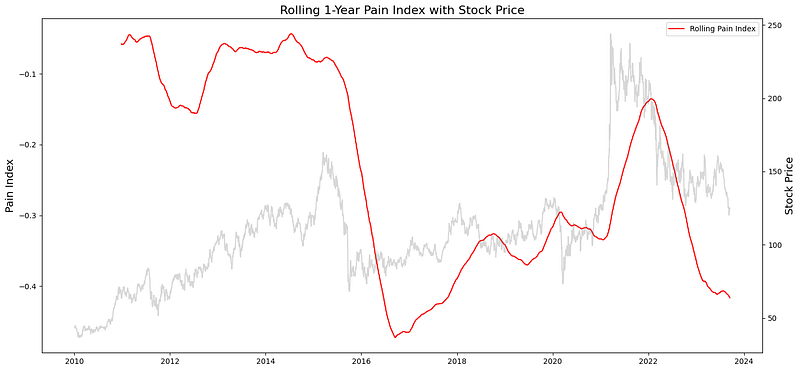
3. Applications of Dynamic Risk Management
- Understanding Tail Risks: Techniques like Tail Ratio and Maximum Drawdown focus on extreme events, the tails of the distribution. In a world of black swans and fat tails, understanding and managing these extreme risks becomes vital. For a more advanced technique on tail risk, please consider reading the following article on Copulas:
- Rewarding Positive Performance: Metrics such as the Omega and Sortino ratios emphasize the importance of gains, not just the avoidance of losses. They provide a holistic view, balancing the desire for growth with prudent risk management.
- Navigating Complex Markets: Metrics like Stability of Returns and Upside/Downside Capture provide nuanced insights, enabling investors to dissect and understand intricate market dynamics.
- Reducing Emotional Biases: In tumultuous times, emotions can cloud judgment. Dynamic tools like the Pain Index help investors stay objective, focusing on long-term strategies rather than short-term pains.
- Holistic Portfolio Assessment: These metrics, when used in tandem, offer a comprehensive risk and return profile, ensuring that every investment angle is considered. Whilst we applied to metrics on a stock level, they can similarly be applied to measure the risk of a portfolio as a whole.
4. Conclusion
In this continuation, we detailed an additional set of eight analytical techniques, each contributing uniquely to a comprehensive understanding of proactive risk analytics. The methodologies presented across both segments of this series serve as guideposts. The journey through these techniques not only empowers practitioners with refined tools but also stimulates thought on the myriad ways to approach and interpret financial risks. We anticipate that subsequent discussions will delve even further, broadening understanding within the critical domain of Risk Management.
Thank you for reading. If you’ve missed the initial part where we discussed the first seven methods, you can click on the link below. Please consider clapping if you have found this content beneficial.


