
Dynamic Risk Management using Rolling Stock Price Metrics in Python
15 Time-varying Techniques for Proactive Risk Analytics [Part 1/2]

1. Introduction
Risk management, at its core, is the identification, assessment, and prioritization of risks followed by coordinated and economical application of resources to minimize, monitor, and control the probability or impact of unforeseen events. In the financial world, risk management plays an indispensable role in ensuring that investment strategies are sound, companies remain solvent, and stakeholders are shielded from potential financial hazards.
Traditionally, risk management strategies were formulated based on historical data and set models which, although effective to a degree, couldn’t adapt swiftly to the rapidly changing landscapes of modern financial markets. This is where dynamic risk management have stepped in. Across global boardrooms, in the algorithms of hedge funds, and among individual investors, dynamic risk management is now crucial.
In a two-part series, we implement, interpret, and customize 15 dynamic risk management techniques in Python crucial for today’s Financial Analysts and Data Scientists alike:
- Historical Volatility
- Sharpe Ratio
- Treynor Ratio
- Rolling Beta
- Jensen’s Alpha
- Value at Risk
- Conditional Value at Risk
- Tail Ratio
- Omega Ratio
- Sortino Ratio
- Calmar Ratio
- Stability of Returns
- Maximum Drawdown
- Upside Capture and Downside Capture
- Pain Index
This article covers the first seven techniques of dynamic risk management. For a complete exploration, ensure you also read the second part which covers the remaining eight methods:
2. Dynamic Risk Management in Python
2.1 Historical Volatility
Historical volatility (or realized volatility) quantifies the extent of price fluctuations over a specified period. It provides insights into the unpredictability of an asset. The most common approach to calculating historical volatility is to determine the standard deviation of daily returns over a rolling window, typically scaled to annualize the value for comparison purposes.

Where ˉRˉ is Average daily return over the N days. Daily volatitility can be converted to annual volatility by using the following formula

Higher historical volatility indicates greater price unpredictability and potentially higher investment risk. The rolling nature of this metric ensures we get a dynamic view, letting investors understand how volatility is changing over time.
import yfinance as yf
import numpy as np
import pandas as pd
import matplotlib.pyplot as plt

# Define the ticker
ticker = "AFX.DE"

# Download the data
data = yf.download(ticker, start='2010-01-01', end='2023-12-21')

# Calculate the daily returns
data['Return'] = data['Close'].pct_change()

# Calculate the rolling volatility (21-day window)
data['Rolling_Volatility'] = data['Return'].rolling(window=21).std() * np.sqrt(252)

# Calculate the volatility of volatility
data['Vol_of_Vol'] = data['Rolling_Volatility'].rolling(window=21).std()

# Create a new figure with a specific size
plt.figure(figsize=(20, 10))

# Create primary axis
ax1 = data['Rolling_Volatility'].plot(label='Rolling Volatility', color='red', linewidth=2)
ax1.set_ylabel('Rolling Volatility', color='red')
ax1.set_title(f'{ticker} - Rolling Volatility vs. Volatility of Volatility', fontsize=16)
ax1.grid(True, which='both', linestyle='--', linewidth=0.5)

# Create secondary axis for Vol of Vol
ax2 = ax1.twinx()
data['Vol_of_Vol'].plot(ax=ax2, label='Volatility of Volatility', color='blue', linestyle='--', linewidth=0.5)
ax2.set_ylabel('Volatility of Volatility', color='blue')
ax2.set_ylim(0)

# Create third axis for stock price
ax3 = ax1.twinx()
ax3.spines['right'].set_position(('outward', 60))  # Move the last y-axis spine further to the right
data['Close'].plot(ax=ax3, label='Close Price', color='grey', alpha=0.5)
ax3.set_ylabel('Stock Price', color='grey')
ax3.set_ylim(0)

# Legends
ax1.legend(loc='upper left')
ax2.legend(loc='upper right')
ax3.legend(loc='center right')

plt.tight_layout()
plt.show()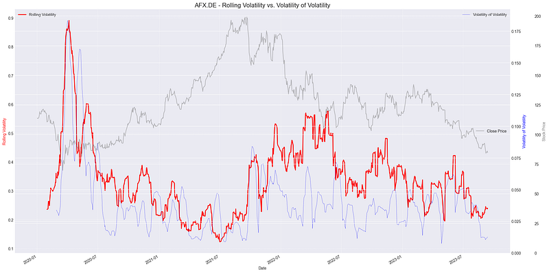
2.2 Sharpe Ratio
The Sharpe Ratio, named after its founder William F. Sharpe, is a metric used to evaluate the risk-adjusted performance of an investment. Specifically, it measures the excess return for each unit of risk taken by an investment, with the risk typically represented by the standard deviation of returns. A higher Sharpe Ratio indicates that the investment is providing a higher return for its level of risk. When calculated over a rolling window, the Sharpe Ratio provides a dynamic view of how the risk-return trade-off evolves over time.

- Rp is the expected portfolio return
- Rf is the risk-free rate
- σp is the standard deviation (or volatility) of the portfolio’s excess returns.
The Sharpe Ratio is often used to compare the risk-adjusted returns of different investments. A value greater than 1 suggests that the investment yields a return greater than the risk it entails.
import pandas as pd
import numpy as np
import yfinance as yf
import matplotlib.pyplot as plt

tickerSymbol = "ASML.AS"
tickerData = yf.Ticker(tickerSymbol)
tickerDf = tickerData.history(period='1d', start='2010-1-1')
tickerDf['returns'] = tickerDf['Close'].pct_change()

# Annualized Sharpe Ratio
rolling_sharpe = np.sqrt(252) * tickerDf['returns'].rolling(252).mean() / tickerDf['returns'].rolling(252).std()

plt.figure(figsize=(15,7))
ax1 = plt.gca()
ax1.plot(rolling_sharpe, label='Rolling Sharpe Ratio', linewidth=1.5)
ax1.axhline(y=1, color='red', linestyle='--', label='Good Sharpe Ratio Threshold: 1')
ax1.set_title('Rolling 1-Year Sharpe Ratio with Stock Price', fontsize=16)
ax1.set_ylabel('Sharpe Ratio', fontsize=14)
ax1.legend()

ax2 = ax1.twinx()
ax2.plot(tickerDf['Close'], color='grey', alpha=0.3, label='Stock Price')
ax2.set_ylabel('Stock Price', fontsize=14)

plt.tight_layout()
plt.show()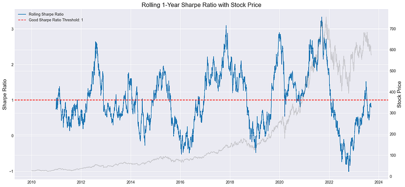
2.3 Treynor Ratio
The Treynor Ratio, sometimes referred to as the reward-to-volatility ratio, gauges the performance of an investment relative to the amount of market risk it has undertaken. Similar to the Sharpe Ratio, which uses total risk (standard deviation) as its risk measure, the Treynor Ratio specifically uses systematic risk (beta) to evaluate how well an investment has performed above the risk-free rate for its exposure to market risk.

The Treynor Ratio helps investors determine how much return they’re receiving for the systematic risk they’ve undertaken. A higher value indicates better performance on a per-unit-of-risk basis.
import pandas as pd
import numpy as np
import yfinance as yf
import matplotlib.pyplot as plt

# Fetch data
tickerSymbol = "MSFT"
tickerData = yf.Ticker(tickerSymbol)
tickerDf = tickerData.history(period='1d', start='2010-1-1')
tickerDf['returns'] = tickerDf['Close'].pct_change()

# Market data for benchmark (S&P500)
market_data = yf.Ticker("^GSPC").history(period='1d', start='2010-1-1')
market_data['returns'] = market_data['Close'].pct_change()

# Align indices
market_data = market_data.reindex(tickerDf.index, method='ffill')

window_size = 252

# Calculate rolling beta
covariance = tickerDf['returns'].rolling(window=window_size).cov(market_data['returns'])
variance = market_data['returns'].rolling(window=window_size).var()
rolling_beta = covariance/variance

# Calculate rolling Treynor Ratio
risk_free_rate = 0
avg_rolling_returns = tickerDf['returns'].rolling(window=window_size).mean()
tickerDf['rolling_treynor_ratio'] = (avg_rolling_returns - risk_free_rate) / rolling_beta

fig, ax1 = plt.subplots(figsize=(14, 7))

color = 'tab:red'
ax1.set_xlabel('Date')
ax1.set_ylabel('Rolling Treynor Ratio', color=color)
ax1.plot(tickerDf['rolling_treynor_ratio'], label="Rolling Treynor Ratio", color=color)
ax1.tick_params(axis='y', labelcolor=color)
ax1.grid(True)
ax1.legend(loc="upper left")

ax2 = ax1.twinx()
color = 'tab:blue'
ax2.set_ylabel('Stock Price', color=color)
ax2.plot(tickerDf['Close'], label="MSFT Stock Price", color=color, alpha=0.3)
ax2.tick_params(axis='y', labelcolor=color)

ax3 = ax1.twinx()
color = 'tab:green'
# Offset the twin axis to the right
ax3.spines['right'].set_position(('outward', 60))
ax3.set_ylabel('Benchmark Price', color=color)
ax3.plot(market_data['Close'], label="Benchmark (S&P 500)", linestyle="--", color=color, alpha=0.3)
ax3.tick_params(axis='y', labelcolor=color)

fig.tight_layout()  # otherwise the right y-label is slightly clipped
ax3.legend(loc="upper right")

plt.title('Rolling 1-Year Treynor Ratio with Stock Price and Benchmark')
plt.tight_layout()
plt.show()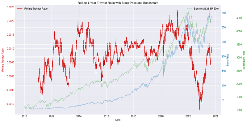
2.4 Rolling Beta
Rolling Beta provides a dynamic view of an asset’s risk relative to the broader market, adapting to recent trends and shifts. Beta itself is a critical metric in financial analysis, quantifying the sensitivity of a stock or portfolio’s returns to market fluctuations. A beta value greater than 1 indicates that the asset exhibits higher volatility than the overall market, while a beta less than 1 signifies its returns are less volatile in comparison. It’s defined by the equation:

Where:
- Rp = Return of the portfolio or stock
- Rm = Return of the market
- Cov(Rp,Rm) = Covariance between the portfolio (or stock) and the market
- Var(Rm) = Variance of the market
The chart below displays the rolling beta values using RANSAC and OLS methods. RANSAC offers smoother estimates due to its outlier resistance, while OLS can be more volatile. Consistent values between the methods suggest minimal outlier impact; divergences could indicate outliers or non-linear data relationships.
import yfinance as yf
import pandas as pd
import numpy as np
import matplotlib.pyplot as plt
from sklearn.linear_model import RANSACRegressor, LinearRegression

# Download historical data for ticker and a market index (e.g., ^AEX)
ticker = "UNA.AS"
start_date = "2016-01-01"
end_date = "2025-09-01"
stock = yf.download(ticker, start=start_date, end=end_date)
market = yf.download("^AEX", start=start_date, end=end_date)

# Calculate daily returns
stock_returns = stock["Adj Close"].pct_change().dropna()
market_returns = market["Adj Close"].pct_change().dropna()

# Align dates and remove rows with missing data
aligned_data = pd.concat([stock_returns, market_returns], axis=1).dropna()
aligned_data.columns = [ticker, "Market"]

# Calculate rolling beta using RANSAC
window = 60  # Choose the length of the rolling window
ransac = RANSACRegressor()
ols = LinearRegression()
rolling_beta_ransac = []
rolling_beta_ols = []

for i in range(len(aligned_data) - window):
    X = aligned_data["Market"].iloc[i:i+window].values.reshape(-1, 1)
    y = aligned_data[ticker].iloc[i:i+window].values

    ransac.fit(X, y)
    beta_ransac = ransac.estimator_.coef_[0]
    rolling_beta_ransac.append(beta_ransac)

    ols.fit(X, y)
    beta_ols = ols.coef_[0]
    rolling_beta_ols.append(beta_ols)

# Plot rolling beta
plt.figure(figsize=(15,7))
plt.plot(aligned_data.index[window:], rolling_beta_ransac, label="RANSAC")
plt.plot(aligned_data.index[window:], rolling_beta_ols, label="OLS")
plt.xlabel("Date")
plt.ylabel("Rolling Beta")
plt.title(f"Rolling Beta of {ticker} using RANSAC and OLS")
plt.legend()
plt.grid()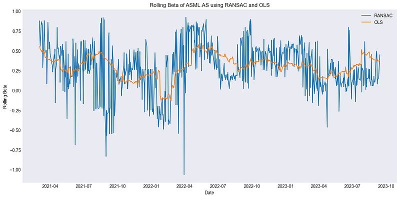
2.5 Jensen’s Alpha
Jensen’s Alpha, often just termed Alpha, represents an investment’s average excess return after adjusting for the performance predicted by the Capital Asset Pricing Model (CAPM). Essentially, it quantifies how much an asset either outperforms or underperforms relative to its systematic risk. A positive Alpha suggests that an investment has yielded returns above its expected risk-adjusted returns, while a negative Alpha denotes underperformance.

Where:
- α = Jensen’s Alpha
- Rp = Portfolio’s realized return
- Rf = Risk-free rate
- β = Portfolio’s beta with the market
- Rm = Market’s realized return
The rolling Jensen’s Alpha graphically presents how the investment’s excess returns, adjusted for market risk, evolve over time. A period with positive Alpha suggests that the investment yielded a performance superior to the CAPM’s predictions, while a negative Alpha phase indicates that it didn’t meet expectations.
import yfinance as yf
import pandas as pd
import matplotlib.pyplot as plt

# Download historical data
start_date = "2016-01-01"
end_date = "2025-09-01"
stock = yf.download("UNA.AS", start=start_date, end=end_date)
market = yf.download("^AEX", start=start_date, end=end_date)

# Calculate daily returns
stock_returns = stock["Adj Close"].pct_change().dropna()
market_returns = market["Adj Close"].pct_change().dropna()

# Align data
aligned_data = pd.concat([stock_returns, market_returns], axis=1).dropna()
aligned_data.columns = ["Stock", "Market"]

window = 60  # rolling window
risk_free_rate = 0.01  # example constant rate, adjust as required

rolling_alpha = []

for i in range(len(aligned_data) - window):
    data_window = aligned_data.iloc[i:i+window]
    beta = data_window.cov().iloc[0, 1] / data_window["Market"].var()
    expected_return = risk_free_rate + beta * (data_window["Market"].mean() - risk_free_rate)
    alpha = data_window["Stock"].mean() - expected_return
    rolling_alpha.append(alpha)

# Plotting
plt.figure(figsize=(30, 8))
plt.plot(aligned_data.index[window:], rolling_alpha, label="Rolling Jensen's Alpha")
plt.xlabel("Date")
plt.ylabel("Alpha")
plt.title(f"Rolling Jensen's Alpha for UNA.AS over {window} Days")
plt.grid()
plt.legend()
plt.show()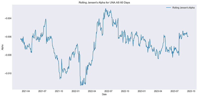
2.6 Value at Risk (VaR)
Value at Risk (VaR) is a statistical measure that quantifies the potential loss in value of a financial asset or portfolio over a specific time horizon for a given confidence interval. Essentially, it provides a worst-case scenario given a confidence level, telling us that “we should not expect to lose more than this amount X% of the time”. For instance, a 1-Year VaR at the 95% confidence level tells us the maximum loss we can expect over the next year 5% of the time.

Where:
- VaRconfidence level = Value at Risk at a specific confidence level
- Quantile = The quantile function returning the value below which a given percentage of observations in a group fall
- returns = The set of portfolio returns
- confidence level = The confidence level for the VaR estimation, typically expressed as a decimal (e.g., 0.95 for 95%)
VaR offers a measure of the maximum potential loss an investment might face for a given confidence level and time horizon. When we use a rolling window to compute VaR, it provides a dynamic view of how the risk of maximum potential loss changes over time. For instance, a rising VaR might indicate increasing risk in the asset.
import pandas as pd
import numpy as np
import yfinance as yf
import matplotlib.pyplot as plt

# Define the ticker symbol
tickerSymbol = "VOW.DE"
tickerData = yf.Ticker(tickerSymbol)
tickerDf = tickerData.history(period='1d', start='2010-1-1')
tickerDf['returns'] = tickerDf['Close'].pct_change()

# Calculate VaR for 90%, 95%, and 97% confidence levels
rolling_var_90 = tickerDf['returns'].rolling(252).quantile(0.10).dropna()
rolling_var_95 = tickerDf['returns'].rolling(252).quantile(0.05).dropna()
rolling_var_97 = tickerDf['returns'].rolling(252).quantile(0.03).dropna()

threshold = -0.04  # change this value as needed

plt.figure(figsize=(15,7))

# Plotting stock price
ax1 = plt.gca()
tickerDf['Close'].plot(ax=ax1, color='gray', linewidth=0.5, label='Stock Price')
ax1.set_ylabel('Stock Price', fontsize=14)
ax1.legend(loc='upper left')

# Plotting VaR on secondary y-axis
ax2 = ax1.twinx()
ax2.plot(rolling_var_90.index, rolling_var_90, label='Rolling VaR 90%', color='cyan', linewidth=1.5)
ax2.plot(rolling_var_95.index, rolling_var_95, label='Rolling VaR 95%', color='blue', linewidth=1.5)
ax2.plot(rolling_var_97.index, rolling_var_97, label='Rolling VaR 97%', color='purple', linewidth=1.5)

# Horizontal line to denote the threshold
ax2.axhline(y=threshold, color='red', linestyle='--', label=f'Threshold at {threshold*100:.2f}%')

# Highlight areas below the threshold for 95% VaR
ax2.fill_between(rolling_var_95.index, rolling_var_95, threshold, where=(rolling_var_95 <= threshold), color='red', alpha=0.5)

# Aesthetics
ax2.set_ylabel('VaR', fontsize=14)
ax2.grid(True, alpha=0.5)
ax2.legend(loc='upper right')
plt.title('Rolling 1-Year VaR with Stock Price', fontsize=16)

plt.tight_layout()
plt.show()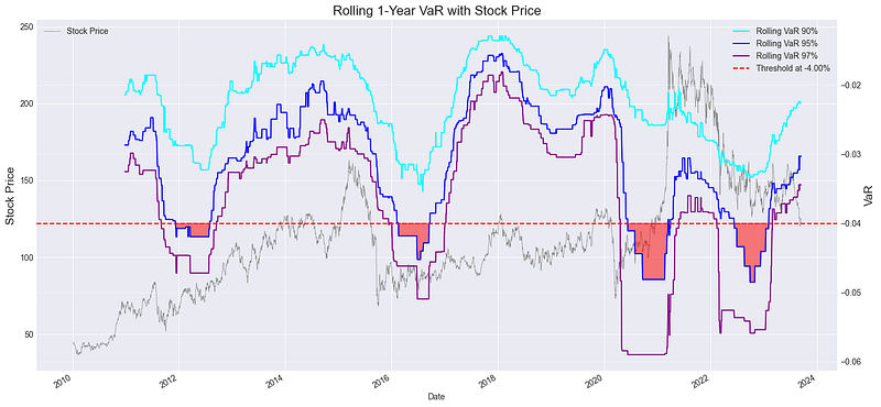
2.7 Conditional Value at Risk (CVaR)
Conditional Value at Risk (CVaR), also known as Expected Shortfall, quantifies the expected value of loss in the worst-case scenarios. It provides a clearer view of potential extreme losses than the Value at Risk (VaR) metric. In essence, while VaR gives us a threshold, CVaR tells us about the expected loss beyond that threshold.

By comparing the CVaR at different confidence levels, investors can assess the risk of extreme losses at various levels of likelihood. For instance, a sudden spike in the 97% CVaR line (orange) suggests an increased expectation of severe losses in the worst 3% of cases, indicating heightened tail risk during that period.
import pandas as pd
import numpy as np
import yfinance as yf
import matplotlib.pyplot as plt
plt.style.use('seaborn-darkgrid')

tickerSymbol = "MSFT"
tickerData = yf.Ticker(tickerSymbol)
tickerDf = tickerData.history(period='1d', start='2010-1-1')
tickerDf['returns'] = tickerDf['Close'].pct_change()

def conditional_var(x, alpha=0.05):
    var = np.percentile(x, alpha * 100)
    return np.mean(x[x < var])

rolling_cvar_95 = tickerDf['returns'].rolling(252).apply(conditional_var, raw=True).dropna()
rolling_cvar_90 = tickerDf['returns'].rolling(252).apply(lambda x: conditional_var(x, alpha=0.1), raw=True).dropna()
rolling_cvar_97 = tickerDf['returns'].rolling(252).apply(lambda x: conditional_var(x, alpha=0.03), raw=True).dropna()

mean_cvar_95 = rolling_cvar_95.mean()
mean_cvar_90 = rolling_cvar_90.mean()
mean_cvar_97 = rolling_cvar_97.mean()

plt.figure(figsize=(15,7))
ax1 = plt.gca()
ax1.plot(rolling_cvar_95, label='Rolling CVaR 95%', linewidth=1.5, color='blue')
ax1.plot(rolling_cvar_90, label='Rolling CVaR 90%', linewidth=1.5, color='green')
ax1.plot(rolling_cvar_97, label='Rolling CVaR 97%', linewidth=1.5, color='orange')
ax1.axhline(y=mean_cvar_95, color='red', linestyle='--', label=f'Mean CVaR 95%: {mean_cvar_95:.5f}')
ax1.axhline(y=mean_cvar_90, color='green', linestyle='--', label=f'Mean CVaR 90%: {mean_cvar_90:.5f}')
ax1.axhline(y=mean_cvar_97, color='orange', linestyle='--', label=f'Mean CVaR 97%: {mean_cvar_97:.5f}')
ax1.set_title('Rolling 1-Year CVaR with Stock Price for Different Confidence Levels', fontsize=16)
ax1.set_ylabel('CVaR', fontsize=14)
ax1.legend()

ax2 = ax1.twinx()
ax2.plot(tickerDf['Close'], color='grey', alpha=0.3, label='Stock Price')
ax2.set_ylabel('Stock Price', fontsize=14)

plt.tight_layout()
plt.show()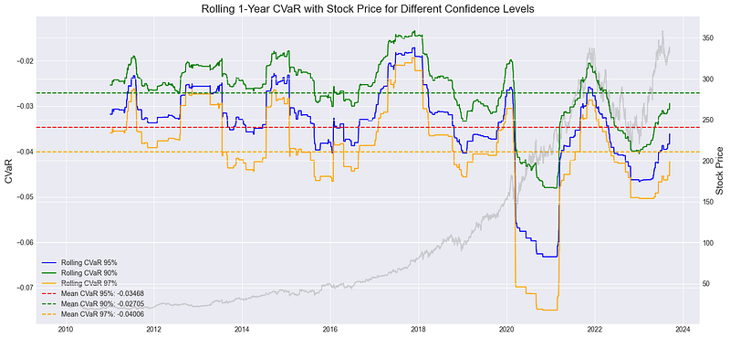
2.8 Bonus — Rolling Statistics
Dynamic risk management is also about understanding the intricacies of statistical measures that can signify impending volatility or anomalies. Rolling statistics , computed over short windows, offer a real-time snapshot of these intricacies, allowing for more responsive and informed decision-making. For our illustration, we delved into a 20-day rolling window analysis of several statistical properties of th eprice returns:
- Rolling Kurtosis: Measures the tail risk. High kurtosis indicates the potential for extreme negative or positive returns.
- Rolling Skewness: Provides a lens into the asymmetry of returns. Positive skewness hints at frequent small losses and occasional large gains, while a negative skewness implies the opposite.
- Rolling Quantile (Median in this case): Offers a continuous view of the median price, aiding in spotting unusual price movements that might divert from its typical pattern.
- Rolling Autocorrelation: Measures the similarity between the stock’s performance and a lagged version of itself, vital for identifying repeating patterns in price movement.
import yfinance as yf
import pandas as pd
import matplotlib.pyplot as plt
from scipy.stats import kurtosis, skew

# Load the data
ticker = "ASML.AS"
data = yf.download(ticker, start='2020-01-01', end='2024-09-17')

# Compute daily returns
data['Returns'] = data['Close'].pct_change()

# Calculate rolling window size
window_size = 20

# Calculate rolling kurtosis
data['Rolling_Kurtosis'] = data['Returns'].rolling(window_size).apply(kurtosis)

# Calculate rolling skewness
data['Rolling_Skewness'] = data['Returns'].rolling(window_size).apply(skew)

# Calculate rolling quantiles
quantile_value = 0.5  # adjust this for the quantile you want to calculate
data['Rolling_Quantile'] = data['Returns'].rolling(window_size).quantile(quantile_value)

# Calculate rolling autocorrelation
data['Rolling_Autocorrelation'] = data['Returns'].rolling(window_size).apply(lambda x: x.autocorr())

# Plotting
fig, axes = plt.subplots(5, 1, figsize=(30, 20))

axes[0].plot(data['Close'], label='Close')
axes[0].set_title(f'{ticker} Close Price')
axes[0].legend()

axes[1].plot(data['Rolling_Kurtosis'], label='Rolling_Kurtosis', color='orange')
axes[1].set_title('Rolling Kurtosis of Returns')
axes[1].legend()

axes[2].plot(data['Rolling_Skewness'], label='Rolling_Skewness', color='green')
axes[2].set_title('Rolling Skewness of Returns')
axes[2].legend()

axes[3].plot(data['Rolling_Quantile'], label=f'Rolling_Quantile ({quantile_value})', color='red')
axes[3].set_title('Rolling Quantile of Returns')
axes[3].legend()

axes[4].plot(data['Rolling_Autocorrelation'], label='Rolling_Autocorrelation', color='purple')
axes[4].set_title('Rolling Autocorrelation of Returns')
axes[4].legend()

plt.tight_layout()
plt.show()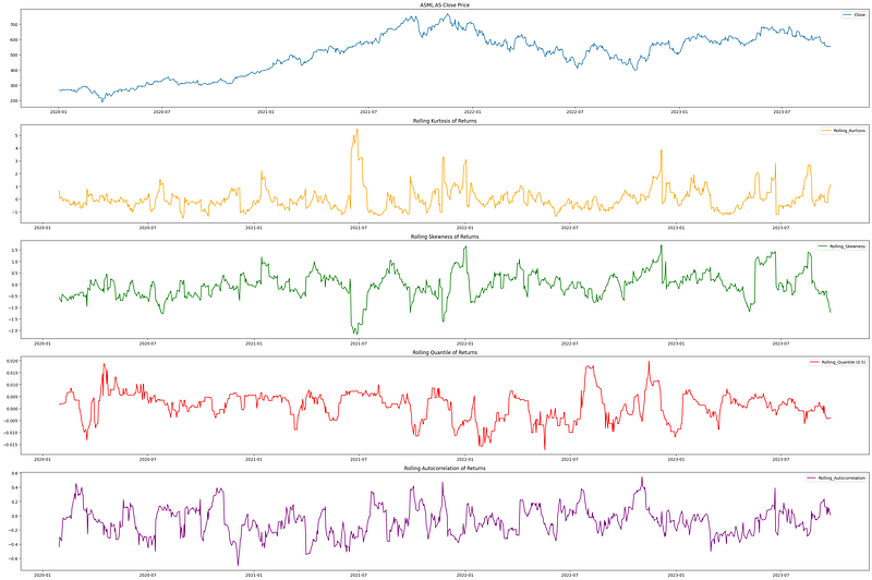
3. Applications of Dynamic Risk Management
- Adapting to Market Volatility: In our rapidly evolving financial markets, the ability to react swiftly is paramount. The dynamic risk management techniques discussed here, especially methods like Historical Volatility and Value at Risk, provide the dexterity needed to navigate volatile market environments. They constantly adjust to new data, ensuring a current and pertinent understanding of risk levels.
- Portfolio Optimization: Effective portfolio management isn’t just about maximizing returns; it’s about achieving desired returns within an acceptable risk framework. With dynamic risk measures such as the Sharpe and Treynor ratios, investors can better tailor their portfolios, ensuring assets are always in line with risk tolerance levels.
- Improved Decision Making: The regular updating of risk measures, as seen with Rolling Beta and Jensen’s Alpha, empowers investors. When market dynamics shift, these metrics ensure that investors aren’t relying on outdated data, facilitating more timely and informed decisions.
- Enhanced Reporting: In our digital age, stakeholders expect real-time insights. Dynamic metrics offer an accurate, up-to-the-minute snapshot of investment risks and returns, strengthening both trust and communication channels.
- Proactive Risk Mitigation: Tools like Conditional Value at Risk enable early trend or anomaly detection. By recognizing potential threats sooner, investors can proactively adjust positions, mitigating adverse impacts.
4. Concluding Thoughts
In this article, we delved deep into the realm of dynamic risk management, exploring its pertinence in today’s complex financial landscape. We’ve covered seven key techniques, each offering unique insights and benefits. As we navigate the future, these dynamic tools will undoubtedly form an essential part of any financial analyst’s toolkit. Stay tuned for our next article, where we’ll uncover eight more cutting-edge techniques in this arena.
This concludes our discussion on the initial seven techniques. For insights on the remaining eight methods, please proceed to the second part of this series for a much deeper understanding of dynamic risk management. lease consider clapping if you have found this content beneficial.


