avatarsimbu

Free AI web copilot to create summaries, insights and extended knowledge, download it at here

3313

Abstract

_bar_test.dart</li><li>/lib/widget/layout/tabbed_layout.dart</li></ul><p id="bb69">I then started writing tests and code to:</p><ul><li>Implement the criteria above</li><li>Provide a contract for the code.</li><li>Document the code through readable tests.</li></ul><h2 id="6c9d">Ta Da</h2><figure id="876c"><img src="https://cdn-images-1.readmedium.com/v2/resize:fit:800/1*jtEep3XUElOhXmjcjyG2wQ.png"><figcaption>Tabbed Layout screenshots.</figcaption></figure><figure id="5d41"><img src="https://cdn-images-1.readmedium.com/v2/resize:fit:800/1*A80U_UevjAsLOsSCGNzDww.png"><figcaption>Tab Bar Test result</figcaption></figure><figure id="652d"><img src="https://cdn-images-1.readmedium.com/v2/resize:fit:800/1*yYhGtNQTaw9hSbeaYGkTVQ.png"><figcaption>Content Test result</figcaption></figure><figure id="1d7a"><img src="https://cdn-images-1.readmedium.com/v2/resize:fit:800/1*DJZTmC-4KKbvIEeNZFFm1Q.png"><figcaption>Tab Item Test result</figcaption></figure><p id="8002">During the writing of the tests these additional files where added.</p><ul><li>/lib/widget/layout/domain/tab_item.dart</li><li>/test/widget/layout/fixture/tabbed_layout_fixture.dart</li><li>/test/widget/layout/tabbed_layout_tab_item_test.dart</li><li>/test/widget/layout/tabbed_layout_content_test.dart</li></ul><p id="88e0">Some of the acceptance criteria have been skipped because the functionality is covered and tested by the CupertinoTabScaffold widget:</p><ol><li>The <b>Tab Bar</b> will be anchored to the bottom of the widget</li><li>The height of the Tab Bar will be the size of the largest item</li><li>The <b>Content Area</b> will expand to fill the available height.</li><li>When a <b>Tab</b> is pressed it displays the appropriate <b>Content</b></li><li>The <b>Tabs</b> widget will expand to fill the available space.</li></ol><p id="7816">See the code for more details on the <a href="https://gitlab.com/simbu-mobile/digestibleme/-/tree/main/lib/widget/layout">new widget</a> and <a href="https://gitlab.com/simbu-mobile/digestibleme/-/tree/main/test/widget/layout">tests</a>.</p><h2 id="eeab">BackBurner</h2><ul><li>Using material design for other devices and browsers, to give a cross platform look and feel.</li><li>Branding, themes.</li></ul><p id="f874">Including these acceptance criteria:</p><ol><li>Cupertino icons will be used on Apple devices, Material on all others.</li><li>The widget can be themed.</li><li>The widget can display as a skeleton when loading.</li></ol><h2 id="2353">XP</h2><h2 id="806a">VSCode</h2><p id="3b94">Use the VSCode extension</p><figure id="137b"><img src="https://cdn-images-1.readmedium.com/v2/resize:fit:800/1*m3OfJzT0BAR0i39RpkXQvw.png"><figcaption>VSCode extenstion — Awesome Flutter Snippets</figcaption></figure><p id="6af2">to create the stateful widget skeleton code using a snippet.</p><figure id="dc52"><img src="https://cdn-images-1.readmedium.com/v2/resize:fit:800/1*cpUZHvVmbHE5K5ZdGgc1nw.png"><figcaption>Using the stateful widget snippet.</figcaption></figure><p id="9aea">Use the VSCode extension to create the TabItem class.</p><figure id="425d"><img src="https://cdn-images-1.readmedium.com/v2/resize:fit:800/1*bWFEGdOSHXKoLjOJUhyIiw.png"><figcaption>Package, Dart data class generator</figcaption></figure><p id="684c">NB: I reduced the codeine to the constructor and toS

Options

tring, we will add more if needed in later posts.</p><h2 id="85a3">People</h2><p id="8ea1">Kent Beck, Agile Manifesto founder, TDD, extreme programming.</p><figure id="c208"><img src="https://cdn-images-1.readmedium.com/v2/resize:fit:800/1*k00aI4M-R_4GALA8KTYBXA.jpeg"><figcaption>Picture of Kent Beck</figcaption></figure><figure id="f07c"><img src="https://cdn-images-1.readmedium.com/v2/resize:fit:800/1*NBgHJkYhdmVOsghB0pLeLA.jpeg"><figcaption>eXtreme programming practices</figcaption></figure><h2 id="bbe4">Sound & Vision</h2><figure id="4e00"><img src="https://cdn-images-1.readmedium.com/v2/resize:fit:800/1*bjSZW_15xJPS_1l2tFXM_Q.png"><figcaption>Love my way, Psychodelic Furs.</figcaption></figure><p id="426e">YAGNI, just sounded like Cagney…</p><figure id="9715"><img src="https://cdn-images-1.readmedium.com/v2/resize:fit:800/1*tyxoAhIo6zsv6eiwnhiIBA.png"><figcaption>Film: Public Enemy — James Cagney</figcaption></figure><h2 id="6c65">Links</h2><ul><li><a href="https://developer.apple.com/design/human-interface-guidelines/ios/bars/tab-bars/">Apple Human Interface Guidelines — Tab Bar</a></li><li><a href="https://material.io/archive/guidelines/patterns/navigation.html#">Google Material Design — Navigation</a></li><li><a href="https://mobile-patterns.com/blog/mobile-navigation-patterns/">Top 6 Basic Patterns for Mobile Navigation: Pros and Cons</a></li><li><a href="https://uxplanet.org/top-8-mobile-navigation-menu-design-for-your-inspiration-8a2d925bffc0">Top 8 Mobile Navigation Menu Design for Your Inspiration</a></li><li><a href="https://youtu.be/58jGpV2Cg50">Uncle Bob, TDD Demo.</a></li><li><a href="https://docs.flutter.dev/development/data-and-backend/state-mgmt/intro">Flutter — State Management</a></li><li><a href="https://docs.flutter.dev/development/ui/layout">Flutter — Layouts</a></li><li><a href="https://pub.dev/packages/event_bus">Dart — Event bus package</a></li><li><a href="https://docs.flutter.dev/testing/errors">Handling errors in Flutter</a></li><li><a href="https://readmedium.com/a-deep-dive-into-widget-testing-in-flutter-part-ii-finder-and-widgettester-f76f98b87a90">A Deep Dive Into Widget Testing in Flutter: Part II (Finder and WidgetTester)</a></li><li><a href="https://pub.dev/packages/cupertino_icons">Cupertino Icons</a></li><li><a href="https://readmedium.com/add-a-tab-bar-and-navigation-bar-with-ios-style-in-your-next-flutter-app-bf97b1e27e3a">Add a Tab Bar and Navigation Bar with iOS style in your next Flutter app</a></li></ul><h2 id="7fef">One more thing</h2><p id="b5f0"><i>We had a fundamental belief that doing it right the first time was going to be easier than having to go back and fix it. And I cannot say strongly enough that the repercussions of that attitude are staggering. I’ve seen them again and again throughout my business life.</i></p><p id="8e53"><b>Steve Jobs</b>_</p><h1 id="99ea">Other posts in the series</h1><p id="7b3e">Development</p><ul><li><a href="/@simbu/flutter-layout-aca3bbe4714d">Layout</a></li><li><a href="/@simbu/709f87b6a244?source=your_stories_page-m">Lists</a></li></ul><p id="b232">DevOps:</p><ul><li><a href="/@simbu/flutter-ci-workflow-460a00eb782e">Continuous Integration — Workflow</a></li><li><a href="/@simbu/flutter-ci-web-8d081bcbec5">Continuous Integration — Web</a></li></ul></article></body>

Join Medium to view all my articles.

Flutter for iOS-Layout

This is a good place to start, you can really get going with making your ideas reality, once you can show content and navigate around.

Login, logging and other framework items, although vital can and should wait until later. It’s all too easy to start a project and never get past the login screen, so simple don’t start with them.

I chose to use tab navigation for DigestableMe.

The advantage of the Tab Bar is it is always visible, one click navigation that people with Apple and Android phones are used to, which will give your app a native feel, and good Ux experience.

When you have a larger screen a Side Bar or Menu will provide a better experience. These layouts will be covered in other posts and if you are not concentrating on phone/mobile first you may want to skip this post.

Let’s assume we have analytics showing we should target iPhone users, so we can start by creating a traditional bottom Tab Bar.

In a future post we will then modify the application for Android phones and other devices.

Google recommends up to 5 top level icons and Apple 3–5, so we are going to set the max number of top level items to 5.

DigestableMe will start with these three tabs:

  • Interests, a list of things to digest.
  • Friends, people to digest with.
  • History, recent first list of actions.

The new widget will be called TabbedLayout and will contain a Tab Bar and Content Area.
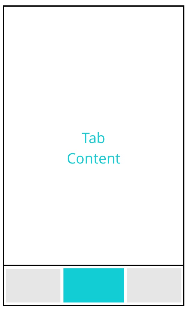
Tabbed Layout Skeleton Design

Its purpose is to:

  • Highlight the core functions
  • Simplify the user journey

We can now add some acceptance criteria to give direction and to know when we are done:

  1. It will contain a Tab Bar
  2. The Tab Bar can contain 2–5 items
  3. The Tab Bar will be anchored to the bottom of the widget
  4. The height of the Tab Bar will be the size of the largest item
  5. Each item will comprise of a title and an icon
  6. Cupertino icons will be used on Apple devices, Material on all others.
  7. There will be a Content Area above the above the Tab Bar
  8. The Content Area will expand to fill the available height.
  9. When a Tab is pressed it displays the appropriate Content
  10. Tab Items and Content are configurable I.e. inputs.
  11. The TabbedLayout widget will expand to fill the available space.
  12. The widget can be themed.
  13. The widget can display as a skeleton when loading.

To start I created these new files:

  • /test/widget/layout/tabbed_layout_tab_bar_test.dart
  • /lib/widget/layout/tabbed_layout.dart

I then started writing tests and code to:

  • Implement the criteria above
  • Provide a contract for the code.
  • Document the code through readable tests.

Ta Da
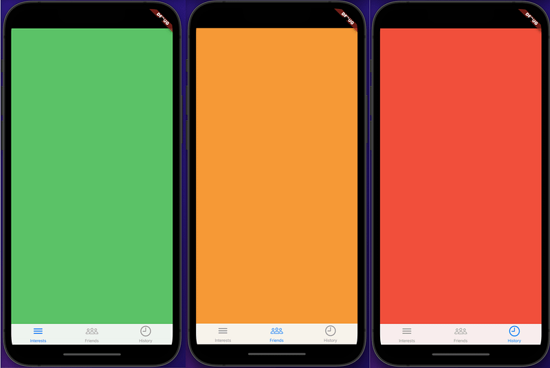
Tabbed Layout screenshots.
Tab Bar Test result
Content Test result
Tab Item Test result

During the writing of the tests these additional files where added.

  • /lib/widget/layout/domain/tab_item.dart
  • /test/widget/layout/fixture/tabbed_layout_fixture.dart
  • /test/widget/layout/tabbed_layout_tab_item_test.dart
  • /test/widget/layout/tabbed_layout_content_test.dart

Some of the acceptance criteria have been skipped because the functionality is covered and tested by the CupertinoTabScaffold widget:

  1. The Tab Bar will be anchored to the bottom of the widget
  2. The height of the Tab Bar will be the size of the largest item
  3. The Content Area will expand to fill the available height.
  4. When a Tab is pressed it displays the appropriate Content
  5. The Tabs widget will expand to fill the available space.

See the code for more details on the new widget and tests.

BackBurner

  • Using material design for other devices and browsers, to give a cross platform look and feel.
  • Branding, themes.

Including these acceptance criteria:

  1. Cupertino icons will be used on Apple devices, Material on all others.
  2. The widget can be themed.
  3. The widget can display as a skeleton when loading.

XP

VSCode

Use the VSCode extension

VSCode extenstion — Awesome Flutter Snippets

to create the stateful widget skeleton code using a snippet.

Using the stateful widget snippet.

Use the VSCode extension to create the TabItem class.

Package, Dart data class generator

NB: I reduced the codeine to the constructor and toString, we will add more if needed in later posts.

People

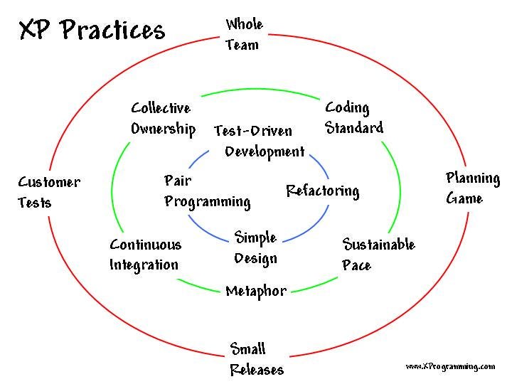
Kent Beck, Agile Manifesto founder, TDD, extreme programming.

Picture of Kent Beck
eXtreme programming practices

Sound & Vision

Love my way, Psychodelic Furs.

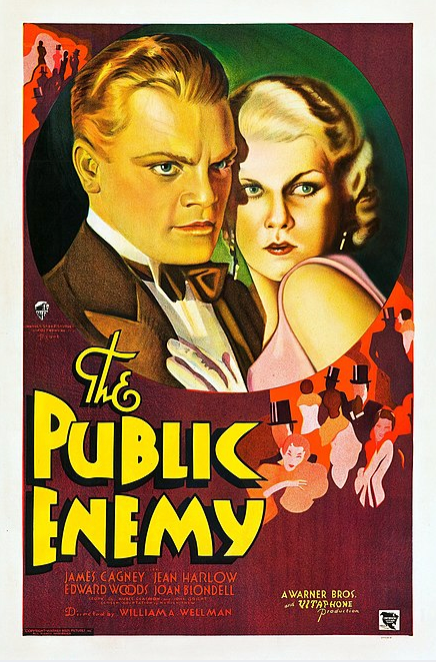
YAGNI, just sounded like Cagney…

Film: Public Enemy — James Cagney

Links

One more thing

We had a fundamental belief that doing it right the first time was going to be easier than having to go back and fix it. And I cannot say strongly enough that the repercussions of that attitude are staggering. I’ve seen them again and again throughout my business life.

Steve Jobs_

Other posts in the series

Development

DevOps:

Flutter
Programming
Dart
Mobile
iOS
Recommended from ReadMedium