
Add a Tab Bar and Navigation Bar with iOS style in your next Flutter app
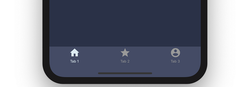
If you come from iOS and you are used to working with Swift you probably know it is super easy in xCode to add a Tab Bar in your app using the storyboard: you just drag it to your screen and voila it’s done! The main benefit of a iOS Tab Bar is that it allows you multi tasking. In iOS as you select tabs and descend into multiple viewcontrollers the app saves your state. If you move in a new tab the app still keeps the state of the other tab alive and when you change tabs back to the first one you are still at that same descended view.
Flutter makes a BottomNavigationBar class available to you however this comes with a typical Android single tasking behaviour: if you move from one tab to the other you basically lose the state in the other tab and if you go back to your original tab, you start from the begining. There are some solution you may want to explore that deal with Activities and Fragments and maintaining their states however these are all very complex solution
Today I am going to show you how to easily add a iOS like Tab in your flutter app. We are going to achieve it by leveraging the CupertinoTabBar class
Overview of Tab structures
Before jumping to the code I would like to provide you a representation of how the various classes we are going to use interact between each other. Here are the classes we are going to use
- CupertinoApp
- CupertinoTabScaffold
- CupertinoTabBar
- BottomNavigationBarItem
- CupertinoTabView
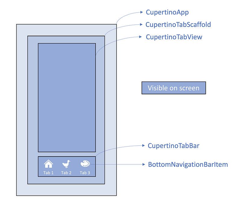
Oh that’s a lot… you said this is easy!? Well it is small amount of code but technically not simple since here we are forcing a behaviour which is not an Android standard
Lets jump into the code
Adding bottom navigation bar
First things to do is to have a CupertinoApp class which wrap all the other widgets. You can add a CupertinoThemeData theme to specify the attributes of your Navigation widgets, for example you can set the the colors of the icons in the bottom. You should also declare as many GlobalKey as many tabs you want to have in your app. We are going to use a CupertinoApp and we will differentiate the UI between iOS and Android, so it is important to ensure there is a Localizations widget ancestor for the Android widget.
final GlobalKey<NavigatorState> firstTabNavKey = GlobalKey<NavigatorState>();
final GlobalKey<NavigatorState> secondTabNavKey = GlobalKey<NavigatorState>();
final GlobalKey<NavigatorState> thirdTabNavKey = GlobalKey<NavigatorState>();
void main() {
runApp(
new CupertinoApp(
home: new HomeScreen(), localizationsDelegates: const <LocalizationsDelegate<dynamic>>[
DefaultMaterialLocalizations.delegate,
DefaultWidgetsLocalizations.delegate,
],
),
);
}After that you need declare your HomeScreen and return a CupertinoTabScaffold. This class has 2 main property:
- tabBar: this is visible bar at the bottom of your screen. You can add a CupertinoTabBar and inside your CupertinoTabBar you can add your BottomNavigationBarItem items which allow for a text and an icon above all
- tabBuilder: this is other visible part of the screen above the tabBar and where you will have most of the actions. Here you can return as many CupertinoTabView as you need, in our case we have three tabs therfore we need three CupertinoTabView.
class HomeScreen extends StatefulWidget {
@override
_HomeScreenState createState() => _HomeScreenState();
}class _HomeScreenState extends State<HomeScreen> { @override
Widget build(BuildContext context) {
return CupertinoTabScaffold(
tabBar: CupertinoTabBar(
items: [
BottomNavigationBarItem(
icon: Icon(Icons.home),
title: Text('Tab 1'),
),
BottomNavigationBarItem(
icon: Icon(Icons.map),
title: Text('Tab 2'),
),
BottomNavigationBarItem(
icon: Icon(Icons.account_circle),
title: Text('Tab 3'),
),
],
),
tabBuilder: (context, index) {
if (index == 0) {
return CupertinoTabView(
navigatorKey: firstTabNavKey,
builder: (BuildContext context) => MyFirstTab(),
);
} else if (index == 1) {
return CupertinoTabView(
navigatorKey: secondTabNavKey,
builder: (BuildContext context) => MySecondTab(),
);
} else {
return CupertinoTabView(
navigatorKey: thirdTabNavKey,
builder: (BuildContext context) => MyThirdTab(),
);
}
},
);
}
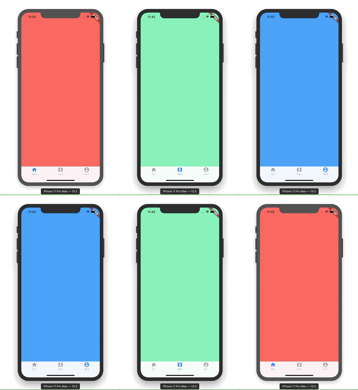
}You obviously need to create as many builder as needed, in our case MyFirstTab(), MySecond etc. For the purpose of this tutorial i am just going to have a different color for each tab but of course in your real app you need to add the functionality of your app
class MyFirstTab extends StatelessWidget {
@override
Widget build(BuildContext context) {
return Container(
color: Colors.redAccent,
);
}
}
class MySecondTab extends StatelessWidget {
@override
Widget build(BuildContext context) {
return Container(
color: Colors.greenAccent,
);
}
}
class MyThirdTab extends StatelessWidget {
@override
Widget build(BuildContext context) {
return Container(
color: Colors.blue,
);
}
}If you run the project this is what you are going to get
Adding top navigation bar
Many app use a top navigation bar to allow users to navigate through the app screen. This is something you can do by adding an AppBar or a CupertinoNavigationBar widget. Let’s ensure to have the right bar depeing if it is Apple or an Android device and let’s create a class and call it every time you need to add it to a tab. This will make the code cleaner and allow you to change the bar modifying only one class
First detect if it is an Apple or an Android device
import 'dart:io';void initState() {
Platform.isIOS ? isIOS = true : isIOS = false;
}Then write a class to show up the relevant bar. Note: it is important that you define an unique heroTag for each iOS navigation bar. This is required for the navigation through the varios screen within the same tab. If you do not have an heroTag the app will not be able to determine which screen to go back to.
class MyTopBar extends StatelessWidget {
final String text;
final TextStyle style;
final String uniqueHeroTag;
final Widget child;
MyTopBar({
this.text,
this.style,
this.uniqueHeroTag,
this.child,
});
@override
Widget build(BuildContext context) {
if (!isIOS) {
return Scaffold(
appBar: AppBar(
title: Text(
text,
style: style,
),
),
body: child,
);
} else {
return CupertinoPageScaffold(
navigationBar: CupertinoNavigationBar(
heroTag: uniqueHeroTag,
transitionBetweenRoutes: false,
middle: Text(
text,
style: style,
),
),
child: child,
);
}
}
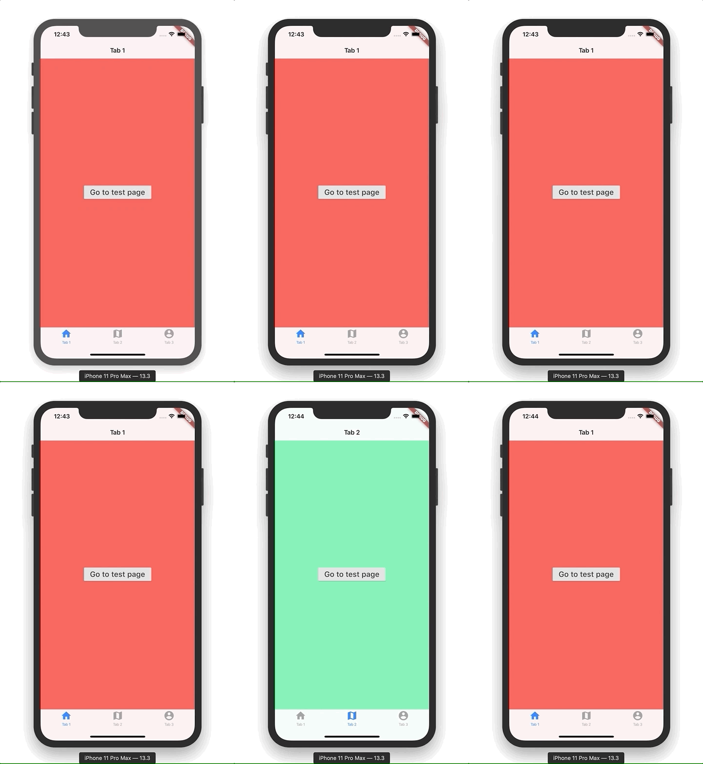
}Lastly add the widget in your tab. In order to test it all work lets create a button to move into a new screen to demonstrate the state is conserved while we navigate. As per top navigation bar, let’s add specific transition effect depening on the device, ie right to left in in iOS and pop up on Android
class MyFirstTab extends StatelessWidget {
@override
Widget build(BuildContext context) {
return MyTopBar(
text: "Tab 1",
uniqueHeroTag: 'tab1',
child: Container(
color: Colors.redAccent,
child: Center(
child: RaisedButton(
onPressed: () {
Navigator.push(
context,
isIOS
? CupertinoPageRoute(
builder: (context) => PurplePage(),
)
: MaterialPageRoute(
builder: (context) => PurplePage(),
));
},
child: Text('Go to test page', style: TextStyle(fontSize: 20)),
),
),
),
);
}
}
class PurplePage extends StatelessWidget {
@override
Widget build(BuildContext context) {
return MyTopBar(
text: "Tab 1",
uniqueHeroTag: 'purplePage',
child: Container(
color: Colors.deepPurple,
),
);
}
}
class MySecondTab extends StatelessWidget {
@override
Widget build(BuildContext context) {
return MyTopBar(
text: "Tab 2",
uniqueHeroTag: 'tab2',
child: Container(
color: Colors.greenAccent,
child: Center(
child: RaisedButton(
onPressed: () {
Navigator.push(
context,
isIOS
? CupertinoPageRoute(
builder: (context) => BlackPage(),
)
: MaterialPageRoute(
builder: (context) => BlackPage(),
));
},
child: Text('Go to test page', style: TextStyle(fontSize: 20)),
),
),
),
);
}
}
class BlackPage extends StatelessWidget {
@override
Widget build(BuildContext context) {
return MyTopBar(
text: "Tab 2",
uniqueHeroTag: 'balckPage',
child: Container(
color: Colors.black,
),
);
}
}Here is the result
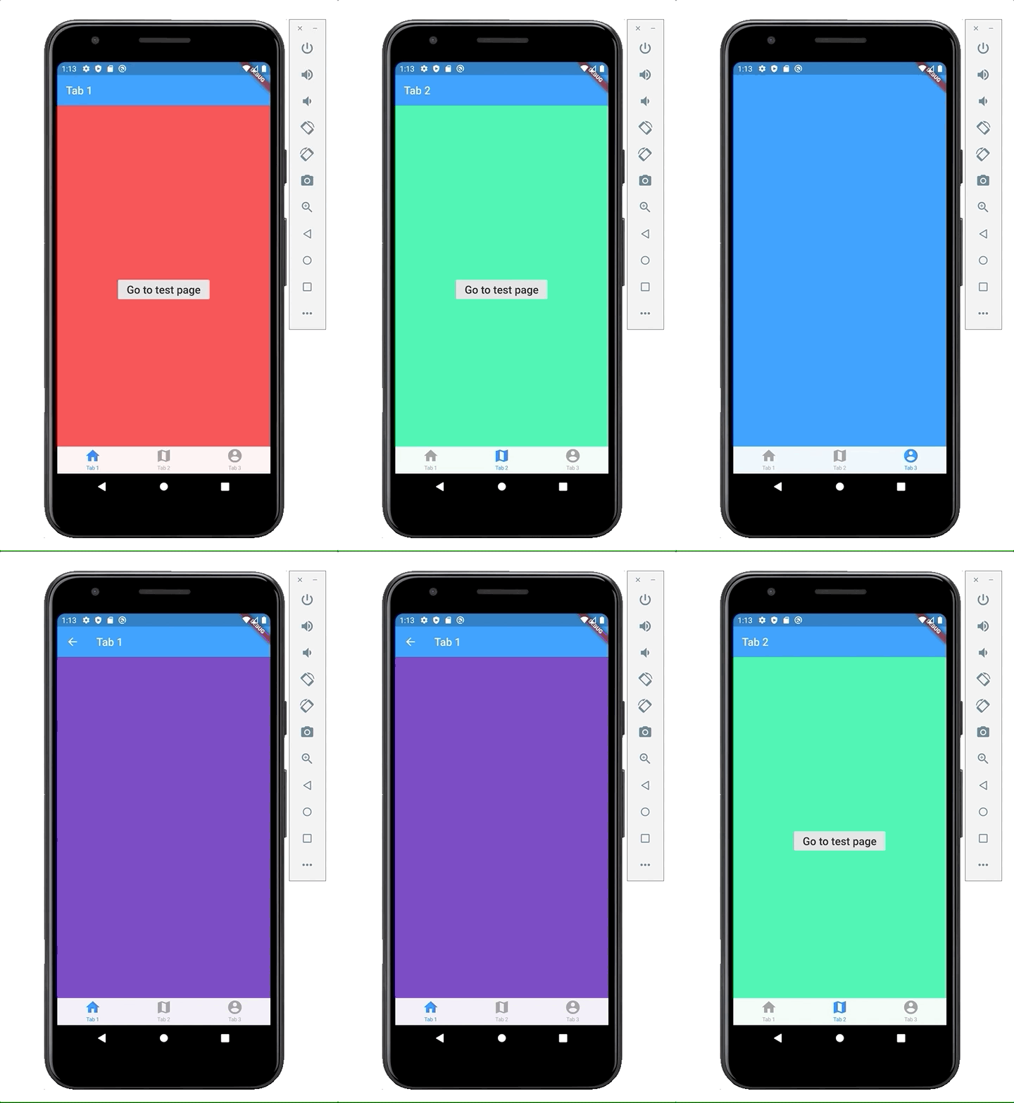
Formatting botton and top navigation bar
Colouring the top and bottom navigation bar is not entirely intuitive. We need to use 3 facilities to changes colours:
- CupertinoTabBar
- MyTopBar
- CupertinoTheme
First you can control the colour of the bottom bar background/icons using the CupertinoTabBar
import 'dart:io';@override
Widget build(BuildContext context) {
return CupertinoTabScaffold(
tabBar: CupertinoTabBar(
activeColor: Colors.black,
inactiveColor: Colors.lightGreen,
backgroundColor: yellowAccent,
items: [
BottomNavigationBarItem(......
....Secondly you can colour the top navigation bar using the MyTopBar you have just created
class MyTopBar extends StatelessWidget {
final String text; final TextStyle style;
final String uniqueHeroTag;
final Widget child; MyTopBar({
this.text,
this.style,
this.uniqueHeroTag,
this.child,
}); @override
Widget build(BuildContext context) {
if (!isIOS) {
return Scaffold(
appBar: AppBar(
backgroundColor: Colors.blue,
title: Text(
text,
style: style,
),
),
body: child,
);
} else {
return CupertinoPageScaffold(
navigationBar: CupertinoNavigationBar(
backgroundColor: Colors.blue,
heroTag: uniqueHeroTag,
border: null,
transitionBetweenRoutes: false,
middle: Text(
text,
style: style,
),
),
child: child,
);
}
}
}The only things which remain outstanding is the colour of the back icon in the top bar. The only wait to control that colour I found is to add a CupertinoTheme to the CupertinoApp (please let me know in the comments if you have found a better way of dealing with it). You can use the CupertinoTextThemeData inside the CupertinoThemeData and set the primary colour
void main() {
  runApp(
    new CupertinoApp(
      home: new HomeScreen(),
localizationsDelegates: const <LocalizationsDelegate<dynamic>>[
DefaultMaterialLocalizations.delegate,
DefaultWidgetsLocalizations.delegate,
],
theme: CupertinoThemeData(
textTheme: CupertinoTextThemeData(
primaryColor: Colors.redAccent
),
),
),
);
}Here is the result. The app looks like a rainbow … I beleive i have used all the available colours :)
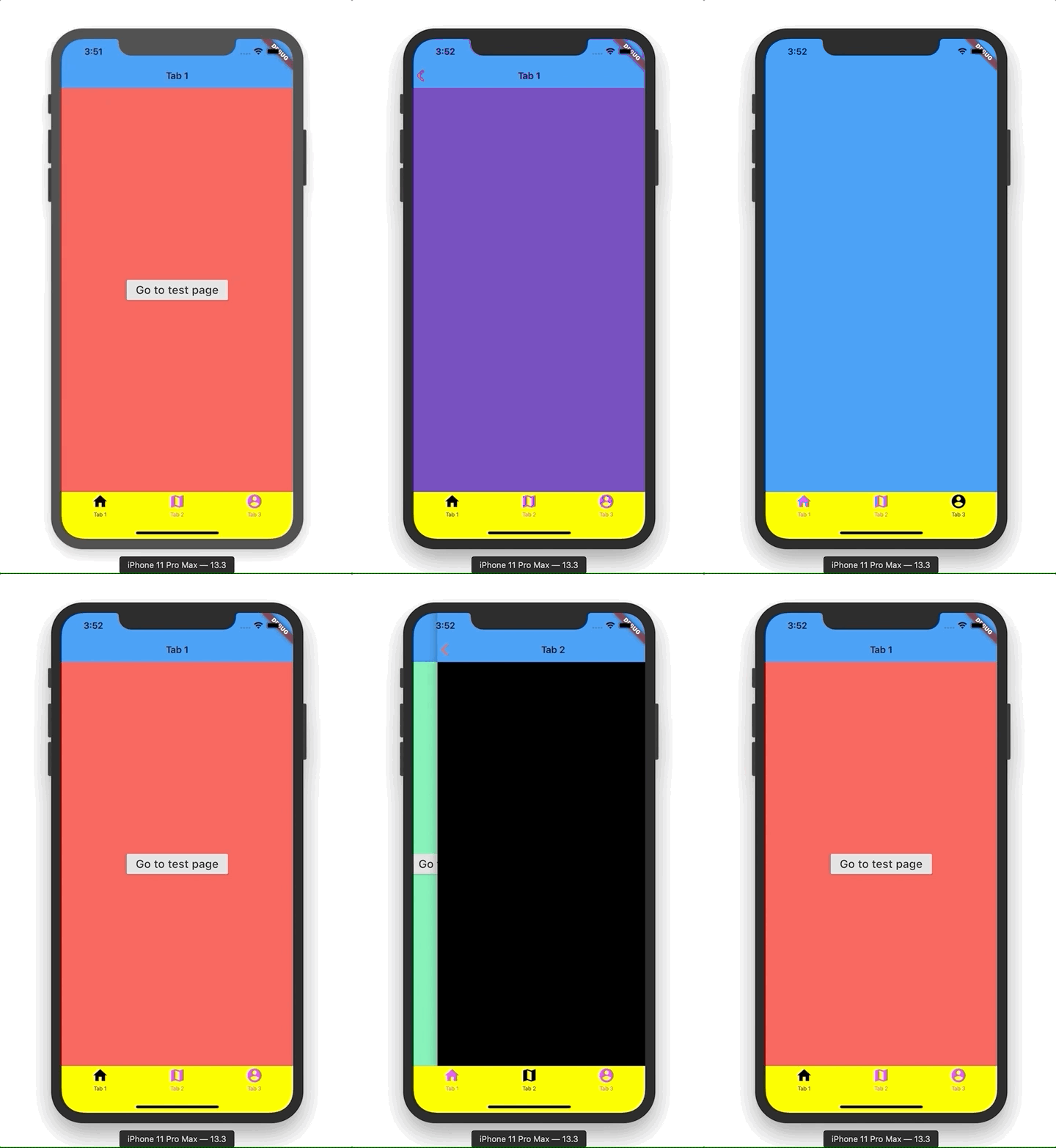
Extra functionality
In iOS you also have a cool functionality which is that if you are on a certain tab and you click on the bottomNavigation item of that tab, you are basically returned to the first screen of that tab. You can achieve this behaviour by using the onTap property of the CupertinoTabBar class (note that this works only on iOS and not on Android)
onTap: (index) {
  // back home only if not switching tab
  if (currentIndex == index) {
    switch (index) {
      case 0:
        firstTabNavKey.currentState.popUntil((r) => r.isFirst);
        break;
      case 1:
        secondTabNavKey.currentState.popUntil((r) => r.isFirst);
        break;
      case 2:
        thirdTabNavKey.currentState.popUntil((r) => r.isFirst);
        break;
    }
  }
  currentIndex = index;
},
Have a go and put all this code in your app and add you destination screen. If you run your app you should get something like this
Conclusion
You have seen it is quite easy to achieve a tab Bar navigation capability in Flutter. This will definitively make your iOS user super happy however please also consider that Android users are not familiar with this navigation paradigm so keep this into consideration when designing your app
Please show your support clapping this article if you liked it!


