
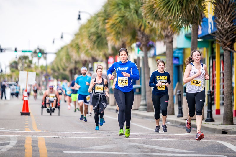
Finishers at American Marathoners are Getting Faster And Slower
Here are the results from analyzing a cross-section of different races
For a couple months now, I’ve been digging into the results from American marathons.
This research project was sparked by an article that I saw shared online. The article claimed that finishers at American marathons had been slowing down in the last two decades, and that they had in fact never been slower.
The part that really bugged me was the claim that this trend was true of runners of all kinds — from the first-timers to the front of the pack.
Something didn’t smell right, so I decided to investigate. And when I couldn’t find the data I needed to answer my question, I went about putting together a large dataset myself.
Note: This article is part of a larger series that is behind Medium’s paywall. If you’re not a member of Medium, you can use this form to get access to this series. I’ll e-mail you a special link to one article each week.
For more context, and for links to each of the articles in this series, refer back to the original post — A Deep Dive Into Marathon Data.
Since then, I’ve analyzed the results of six of the largest marathons in the United States — and I found that when you compare the results within similar gender and age groups finish times have generally been improving since 2000.
To close out the series, I identified a sample of smaller marathons to look at. And today, we’re going to take a look at what those results can tell us.
Specifically, I’m looking to answer the following questions:
- How has the type of runners finishing marathons changed since 2000?
- How have the types of marathons in the United States changed since 2000?
- Are finishers at marathons getting faster, getting slower, or staying the same — and does this vary depending on the type of marathon we look at?
A Quick Note About Methodology and Data
Compiling this data has been a work in progress, and I have continued to add to the dataset throughout this series.
For today’s article, I’m analyzing a dataset containing the age, gender, and finish time for 3.6 million runners from 1,172 races across 20 years.
I’ve categorized the races in two ways.
First, I’ve categorized races by size — more than 2,000 runners, 500 to 2,000 runners, and less than 500 runners.
Second, I’ve categorized races by the speed of the finisher — fast (male winner under 2:20), medium (male winner 2:20 to 2:45), or slow (male winner above 2:45).
For the full details of how I identified the sample, see my previous article here. In short, I created a stratified sample of races representative of all six categories.
This included:
- 6 Large and Fast Races (Boston, NYC, Chicago, Philly, LA, and CIM)
- 3 Large and Medium Races (Marine Corps, Flying Pig, and Big Sur)
- 1 Large and Slow Race (Bataan Memorial Death March)
- 3 Medium and Fast Races (Green Bay, Buffalo, Des Moines)
- 12 Medium and Medium Races (including Steamtown, Wineglass, and 10 others)
- 1 Medium and Slow Race (Pikes Peak)
- 25 Small and Medium Races
- 16 Small and Slow Races (mostly trail races)
The results were scraped from a variety of sources, typically either a) the official race website or b) Marathon Guide.
The results are spread across a twenty-year period (2000 to 2019). Although I have results for many races in 2020–2022, I’ve left them out because the changes in field sizes as a result of COVID would likely distort the results.
Not every race has results from each year, as some did not exist in the early part of the time period. From 2000 to 2005, the number of races can vary dramatically. From 2006 to 2019, there is a steady group of 63 to 65 races with only one or two missing results in any given year. The biggest potential outlier is 2012 — when NYC was canceled.
For the Bataan Memorial Death March, age data was not available for several years. As a result, it (and the entire category of Large and Slow races) is left out of the analysis when focusing on age.
Findings from Previous Articles
Before looking at the new data, I thought it would be helpful to restate some of the conclusions I’ve drawn in previous articles:
- Since 2000, there has been greater growth among female runners — leading to a more balanced field along gender lines.
- Since 2000, there has been greater growth among older runners — leading to a field that is less heavily tilted towards runners under 40.
- The results from individual races can vary greatly based on weather and other factors, making it hard to identify clear trends.
- Looking at the finish times of the field as a whole does not suggest a strong trend one way or the other.
- When you compare the results within gender and age groups, however, there is a clear trend amongst most subgroups towards faster finish times.
It is important to remember, though, that this was based on the results of six large marathons — Boston, NYC, Chicago, Philly, MCM, and LA.
So what we’re really trying to see today is whether the other types of marathons support similar conclusions.

How the Types of Marathons in the U.S. Have Changed
One reason that it’s important to investigate the trends among different types of marathons is that there has been a shift in the types of marathons that are run throughout the country.
The chart above shows the number of marathons run in the United States broken down by size — large (blue), medium (red), and small (green).
Although there is some growth at the bottom end of the graph, the vast majority of new marathons have been small races with fewer than 500 runners.
Many of these races are trail races that naturally have slower finishing times — both because there’s less competition and because the courses themselves are more difficult.
The chart above shows the total number of finishers in a given year broken down by the size of the race. Again, blue is large races, red is medium races, and green is small races.
So while there are significantly more small races today than there were in 2000 — it’s also important to keep that in perspective. These races make up a tiny portion of the overall number of runners.
The Shifting of Gender Participation Among Different Race Categories
Previously, we found that there was a shift towards more women and more older runners at the large marathons.
This has big implications for the broader question — whether times are getting faster or slower — because a change in the population of finishers could very well influence the overall distribution of overall finish times.
So what does the gender breakdown look like across the different race types, and how has that changed?
The graph above plots the percentage of men (blue) and women (red) in each race type. Remember that “Large and Slow” is one race (the Bataan Memorial Death March) and “Medium and Slow” is also one race (Pikes Peak). The rest of the categories represent multiple races.
In 2001, running was across the board a male-dominated space. But notice that the large, fast, and large, medium races are relatively more balanced. In those races — which make up an overwhelming majority of runners — the split is close to 60–40.
But in other races, it’s closer to 70–30 or 75–25.
Here’s the same graph from 2010.
Two types of races stand out — Large/Slow and Medium/Slow. These haven’t shifted much, and they’re still close to 75% male.
The rest of the races have all moved closer to a 60–40 split, with small races slightly more tilted towards men. The Large/Medium races are the only ones that have stayed the same — although they were already the most balanced. The rest of the races moved, at least somewhat, closer to parity.
Finally, here’s the same graph in 2019.
Pikes Peak still stands apart — and it was actually more male-dominated in 2019 than the previous years. Of the finishers, 79% were men.
Bataan Memorial Death March is still number two in terms of the percentage of participants that are male, but it has shifted slightly to a 69–31 breakdown.
The Small/Slow and Medium/Fast races remain about the same from 2010 to 2019, and they’re slightly more male-dominated than the rest.
But the other four categories continue to shift towards more women and fewer men.
Although the different types of races had different starting points, each category — with the exception of Pikes Peak — had a shift in its field towards fewer men and more women over the full-time period (2001 to 2019).
All else being equal, this could lead to an overall slowing of times since women on average finish marathons slower than men.
The Shifting of Age Group Participation Among Different Race Categories
The other way in which the field can shift is towards older runners.
How does the age breakdown of runners compare across the different race categories, and are the trends similar across the board?
The chart above shows the breakdown of finishers by age group — from Under 35 through 70 and Over, in 5-year increments — in each category. The age groups begin with the under 35 (blue) at the bottom of the graph, and they get older as you move up the bar.
The visual is interactive, and if you click on it you’ll be able to see the specific age group and what percentage of finishers is in that age group.
Also, note that the Large/Slow category (Bataan Memorial Death March) is excluded here because age data was not available for many of its results.
Looking at this snapshot in 2001, there are some differences between the categories. The large races tend to have larger groups of young runners (under 35) compared to the medium and small races.
The flip side of this is that the medium and smaller races have more older runners. In some cases, the big offset occurs in the 40s, but in most cases, there are also more runners in their 50s, 60s, and above.
They start in different places, and from 2001 to 2010 they tend to move towards a convergence.
The large races see reductions in their young age groups and increases among their older age groups. The other categories (with the exception of Pikes Peak) see increases among their younger runners and decreases among older age groups.
And finally, here’s the same data from the end of the time period in 2019.
The Large/Fast and Large/Medium races have continued to shift towards older runners. They have almost identical breakdowns at this point, and they both saw a shift of about 10 percentage points from runners under 35 to runners 50 and up.
The Medium/Fast races are the youngest group of races, and they shifted slightly younger overall from 2001 to 2019.
In the Medium/Slow and Small/Medium races, the percentage of young runners grows slightly — but so does the percentage of older runners. In this case, there was a relatively large group of 40–44 runners that was redistributed.
At the end of the day, all of the categories have a similar breakdown in ages — with medium/fast being slightly younger and medium/slow being slightly older. The different categories began in different places, but they settled on a similar age distribution.
Overall Distribution of Finish Times
Moving on to the main question of finish times, let’s start by looking at the overall distribution.
The chart above is a histogram with the overall distribution of finish times. Each group of bars represents a different span of finish times, in 15-minute increments. Each color represents the percentage of runners in a given year (2001, blue; 2010, red; and 2019, green) that finished in that time.
At the fast end — runners finishing between 2:30 and 3:00 — runners in 2019 seem to be doing better. The green bar is much higher.
But on the flip side, the green bar remains higher at slower times beyond five hours. Effectively, the histogram is flattening and growing longer tails.
The graph above is another way to look at the same data. But here, each bar represents the cumulative percent of runners finishing below a given time. So at 3:00, the bar represents the percentage that finished in any time under 3 hours — not just in the 15-minute increment from 2:45 to 3:00.
Here, again, at the faster end, the finishers in 2019 are faster. In 2019, 4.0% of runners finished at or below 3 hours — compared to only 2.6% in 2001.
But as you move past 3 hours, the dynamic soon flips. From 4 hours on, a greater percentage of runners in 2001 beat a given time than in 2019.
If you take this at face value — and this doesn’t disaggregate the data by gender or age, so there may be more going on here — it suggests that the fastest runners are getting faster and the slowest runners are getting slower. There are fewer runners in the middle, running moderate times around 4 hours.
Focusing on Different Race Categories
In previous articles, we established that at the large, fast races the trend is towards faster finish times — especially among the fastest runners.
What happens if we look at some of the different race categories and break out the results by gender?
In some cases, the data doesn’t tell much of a story. For the men, if you look at the Medium/Medium, Medium/Fast, and Medium/Slow races, the trendlines tracking finish times at different places in the field are pretty flat.
That’s not the case when you look at the Small/Slow races, however.
In the chart above, each line represents the finishing time at a certain percentile of the field — the 98th percentile, 90th percentile, 75th percentile, and the median. The 98th percentile is the runner finishing ahead of 98% of the other runners and the median is the one finishing directly in the middle of the pack.
At every level, finish times in this group of races are getting slower. There’s a pretty significant and clear trend upward.
Remember that small races made up the bulk of the growth among marathons in the United States over the last twenty years —this could partially explain why there are more slow finishers out there.
There’s also a similar trend when you look at the Large/Slow race (Bataan Memorial Death March). It’s always been slow, but finish times have gotten significantly slower over the last twenty years.
When you look at the Large/Medium races (and the graph for Small/Medium is similar), there’s not much change at the front of the pack. The runners towards the back — at the 75th percentile and the median — are getting a bit slower. But the runners at the front are still finishing around the same times as they did earlier.
And what does this look like on the women’s side?
Again, when you look at Medium/Fast, Medium/Medium, and Medium/Slow races, there’s not much change.
But the Small/Slow races tell the same story as it does on the men’s side.
From the runners at the front of the pack to the ones in the middle, finish times for these races got significantly slower over the time period. The effect is more exaggerated in the middle, but there’s still a clear slowing trend for finishers in the top 2%.
For the Small/Medium races (and the Large/Medium races are similar), the fastest runners are staying about the same. But the slower runners may be slowing down slightly.
So whether you look at the women’s results or the men’s, the trend differs depending on what type of race you’re looking at:
- In Large/Fast races, the finishers — especially towards the front of the pack — are getting faster.
- In Small/Slow races (as well as the single Large/Slow race), finishers are getting slower across the board.
- In most other cases, there’s little change towards the front of the pack but the runners in the middle of the pack may be getting slightly slower.
Breaking It Down by Age Group
And what about age group?
The chart above shows the finish time at the 90th percentile for runners of different age groups (from Under 35 to 55–59) in Small/Slow races. Across the board, every age group seems to be getting slower — in line with the results we saw above.
For the runners in the Large/Medium races, the younger runners seem to be finishing at about the same times. But runners in their 40s (the red and green) slow down a bit. There’s more variation among runners in their 50s (the purple and orange), likely due to the smaller size of their age group, so it's hard to say for sure if there’s a trend there.
And on the women’s side?
Again, the results for runners at Small/Slow races tend to be trending slower across most of the age groups — although there’s more noise here than there was in the men’s graph.
In the Medium/Fast races, the older women in their 50s (purple and orange) look to be improving a bit — while the other age groups remain about the same.
And here’s the graph for Large/Fast races. We looked at something similar in a previous article — and here there’s a pretty clear trend towards faster times. The graph for the men looks similar.
In most of the other categories, it’s a mixed bag — with the results either staying the same or trends obscured by noise.
When you break things down by age group, the clearest trends are among the Small/Slow races — with results getting slower over the time period — and Large/Fast races — with results getting faster over the time period.
Full Distribution of Times by Age and Gender
If the question we’re really concerned with is whether the fastest runners are getting faster or slower, let’s zoom in on them and see what’s happening.
The histogram above is the distribution of finish times for men under 35, in 15-minute increments, from 2:00 to 6:00, in 2006, 2013, and 2019.
Note that I picked 2006 instead of 2001 because of the variations in the number and types of races included in the sample from 2000 to 2005. 2006 is the first year when there is a stable group of races, and it’s fairly constant over the next 14 years.
One bar kind of reaches out and smacks you in the face here — the one at 3:00. Three hours is often seen as a benchmark for defining what a “fast” marathon is. In 2013, there were slightly more young men finishing under three hours than in 2006. And in 2019, the number jumps.
In 2019, 7.5% of them finished between 2:45 and 3:00, compared to 5% in 2013 and 4% in 2006. Runners in 2019 also outperform runners in 2013/2006 at each of the faster times (2:00–2:15, 2:15–2:30, and 2:30–2:45).
If you look at the cumulative distribution, you can get a better sense of the big picture.
Through about the four-hour mark, there are a greater number of runners finishing beneath a given time in 2019 than in 2006 or 2013.
But that trend reverses itself as you move past 4:30. From 4:30 to 6:00, there are a greater percentage of runners from 2006 and 2013 finishing at each mark than in 2019.
This suggests that there are more runners at the margins — either finishing very fast or very slow — in 2019 than in previous years.
I won’t bore you with graph after graph, but the results are similar if you look at the 35–39 and 40–44 age groups. However, the tipping point moves a little further left. For men 35–39, 4:15 is the first time in which the earlier years do better, and for men 40–44, it’s 4:00.
And what about on the women’s side?
Here’s the distribution of finish times for women under 35 in the same three years.
The overall shape is similar, but it’s shifted a little bit to the right compared to the men’s graph. The big peak occurs at 3:30 instead of 3:00. It’s not quite as disproportionate as with the men, but there are still way more women finishing 3:15 to 3:30 in 2019 than in previous years.
If you look at the cumulative distribution, in 2019 10.4% percent of women under 35 finished in 3:30 or better. That compares to 7% in 2013 and 5.6% in 2006.
The tipping point comes around 4:30 to 4:45. At faster times, runners in 2019 perform better. At slower times, runners in 2006 perform better.
Again, there’s a spreading out of the distribution with more faster runners, more slower runners, and fewer runners in the middle.
As with the men, if you were to look at the visuals for women 35–39 and 40–44, you’d see similar results. Runners in 2019 outperform the other years pretty strongly at 3:30 or faster.
The tipping point on the cumulative distribution is around 4:30 for women 35–39 and 4:15 for women 40–44.
Distribution of Finish Times By Gender and Race Types
One final way to break down the data is to look at similar histograms, but break it down by race type instead of age group.
For example, here’s the cumulative distribution of finish times for all men in all of the fast races. This is a majority of men in the overall sample, it looks similar to the other distributions we’ve seen.
Runners in 2019 did better at the faster times, and runners in 2006/2013 did better at the slower times.
But here’s a cumulative distribution for finish times among all men at races with medium winning times (2:20 to 2:45).
I started the graph at 3 hours because there were very few finishers left at that point. At that point, the three years are roughly even — with about 6% of men finishing below 3:15.
But from 3:30 on, the advantage tilts towards the earlier years. In 2019, men running in races with moderate winning times were slower than in previous years beyond the 3:30 mark.
And if you were to look at men in slower races, the results are even more lopsided.
If you were to take a look at the women’s distributions in fast and medium races, they would look pretty similar to the distribution on the men’s side.
The graph above shows the cumulative distribution for finish times among women in slow races.
The first bin shows finish times under 4:15 — and only 3.6% of the women in 2019 finished under that time. Already, the finishers in 2006/2013 were outperforming them. And as you move to the right the gap grows steadily through the 7 and 8 hour mark before starting to shrink.
The distribution for men’s finish times at slow races doesn’t look very different.
So it would be fair to say:
- In fast races, the fastest runners got much faster, but the slower runners got slower.
- In the other races, the runners tended to get slower — with the shift especially strong in slower races.
So What Does All This Mean?
After looking at the full sample of data, it’s becoming increasingly clear to me that the shifts in marathon fields and finishing times are complex — with different changes taking place in different types of races.
Overall, the field of finishers is getting more balanced along gender lines — with significantly more women running today than did in the late ‘90s and early 2000s. In most cases, the field is also shifting towards older runners.
If you just take a look at a snapshot of the average finish times, then, it would make sense that these would be slowing down. Women finish at slower times than men, and older runners finish at slower times than younger runners. Shifting the population will shift the average time.
At the same time, there’s also a shift in the types of races that runners are participating in. Over the last twenty years, there have been many more small, slow races — which also have increasingly slow finish times. This again could move the average to the right.
However, when you get down to our original question — are the fastest runners getting faster or slower — the evidence seems undeniable to me that they are getting faster. Despite all of the changes taking place, a significantly higher proportion of runners are finishing at fast times — under 3:00 for men and 3:30 for women.
The graph is not simply shifting to the right — which would represent that all runners are getting slower. It’s changing its shape. The tales are growing, with more runners finishing at opposite ends of the time spectrum, and fewer finishing in the middle.
So What’s Next?
At this point, I think I’m done collecting data for this particular project.
I could go back and scrape the full set of results for every race between 2000 and 2019, but that would take a while and frankly, I don’t think it would change things. I think we’ve seen enough data to understand what’s going on.
I do plan to take some time to reflect on what we’ve seen in this analysis and then write up a more comprehensive conclusion — including a more thorough critique of the original Run Repeat Mega Study.
After that, I’m going to turn to a few other questions that I’d like to explore. If you’re wondering about anything in particular, leave a response. I often get inspiration for other questions to investigate based on feedback from readers.
If you haven’t, check out the original article in this series to find links to all of the other articles. I’ll also add a link to the final article when it is complete.
I’m an avid runner and a data nerd. You can read more about my running story on my blog, Running with Rock. Follow me here on Medium for more data informed stories about running. You can also follow me on Strava.


