
How to Style Your Pandas Dataframe Like in Excel
Let’s review the basics: formatting, highlighting cells, embedded bars, and gradients.
I love presenting data through different types of visualization. They are useful to me in communicating a message or information.
But let’s go straight to the point: The majority of your stakeholders will still prefer tables. And we have to accept it to make the best of it.
Formatting and enhancing tables are natural for Excel users.
How can we do the same in Python?
Content
- The dataset
- Control the formatting
- Highlighting max and min values
- Apply gradient styles
- Embedded bars
- Conclusion
1. The dataset
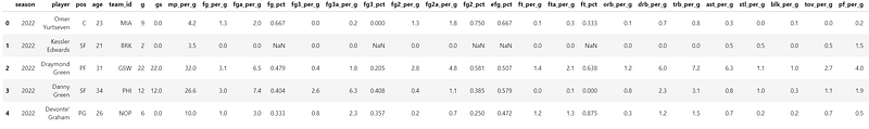
We will use dataset on NBA playoffs statistics. You can download it on Kaggle here to follow along.
The first little tip is to use ‘pd.set_options(‘display.max_columns’,None) to let you see all your dataframe columns.
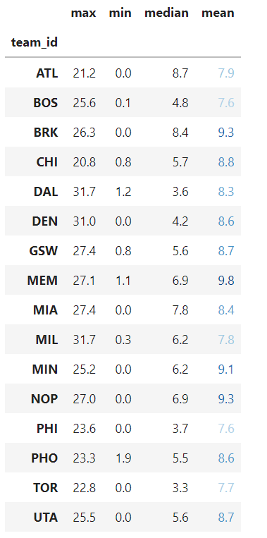
For our use case today, let’s focus on the points per game statistics for each team. We will use groupby.
The important attribute is .style, which will return an object of the class “styler,”. We will use it to apply different formatting and styling methods to our dataframe.
2. Control the formatting
You need to use the .format() method. It allows us to format many different things: adding currency, converting a value in percentage, and the DateTime column format among others. I put Pandas official links at the end of this post.
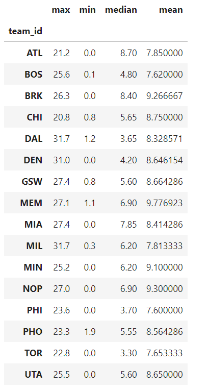
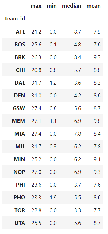
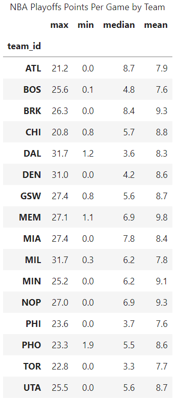
For example, the rounding for each column is not the same. Let’s say we want to keep 1 decimal:
line 4: we call the .style attribute to start applying formatting and styling
line 5: .format method where we specify for each column to have only one decimal.
To write it in a more pythonic way, we can use a dictionary comprehension:
Please feel free to use the previous syntax if it’s clearer to you.
One more interesting formatting option is the .set_caption() method. We can use it to add a title to our dataframe:
Line 10: set_caption() with the title you want.
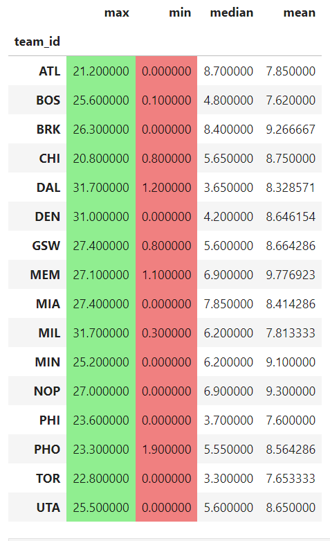
3. Highlighting max and min values
We will use the convenient highlighting_max and highlighting_min methods
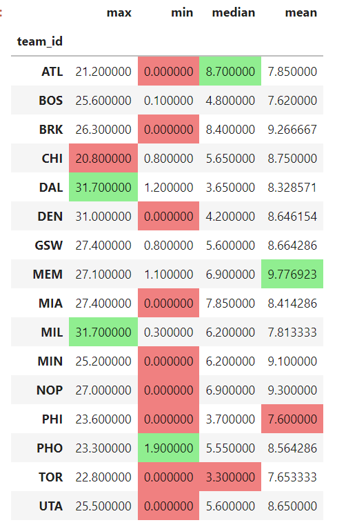
Please note that if you want to highlight by row, you need to specify axis=1
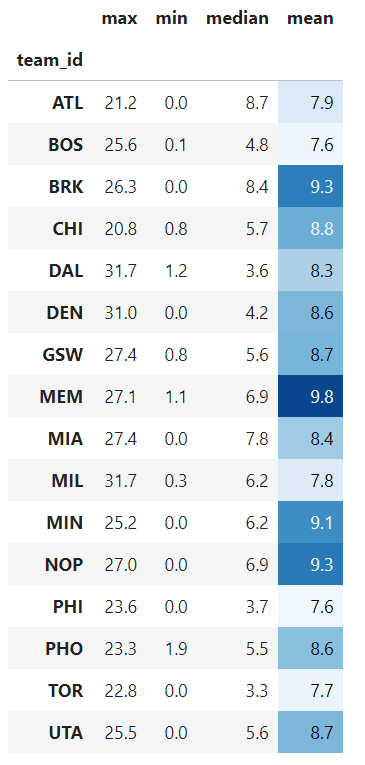
4. Apply gradient styles
They make it easier for viewers to comprehend how the table’s columns and rows relate to the numbers. Gradients can be used to show whether a value is big or small, positive or negative, or even good or bad.
Let’s say we apply a gradient background color only to the ‘mean’ column:
line 6: we use the background_gradient method: subset lets us choose to style only the mean column. The chosen colormap is Blues and we specify the minimum and maximum values so gradients are more visible.
We can also apply the gradients to the text with the text_gradient method:
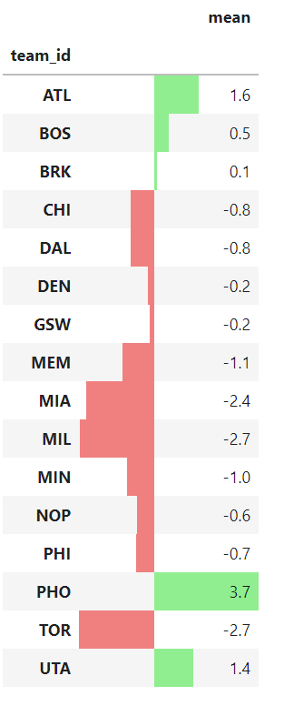
5. Embedded bars
Like in Excel, we can add color bars in the background to provide more visual information on the numbers.
We use the .bar method and apply it to a different column ‘obpm’ (which is the acronym for offensive box/plus minus =metric that estimates a player’s contribution to the team when that player is on the court)
6. Conclusion
In terms of styling, pandas provide a wide range of options. They are often unknown and/or underutilized. Feel free to try them out and explore the different possibilities. The goal is always the same: to inform our audience as effectively as we can.
I hope you enjoyed reading this post! Follow me on Medium for future posts. It motivates me to continue.
References:
Table Visualization — pandas 1.4.3 documentation (pydata.org)
Styling — pandas 1.1.5 documentation (pydata.org)
Style — pandas 1.4.3 documentation (pydata.org)
More content at PlainEnglish.io. Sign up for our free weekly newsletter. Follow us on Twitter, LinkedIn, and Discord.