
How to Use the Plotly Charting Library in React App
A charting library for data scientists that builds on top of D3 and stack.gl

Introduction
Plotly is a computing company headquartered in Montreal, Quebec, that develops online data analytics and visualization tools. It provides online graphing, analytics, and statistics tools for individuals and collaboration and scientific graphing libraries for Python, R, MATLAB, Perl, Julia, Arduino, and REST. Plotly tools can also be used to style interactive graphs with Jupyter notebook.
Plotly is also the product name. Plotly.js is a charting library that builds on top of D3 and stack.gl, which are modular WebGL components. It is a high-level, declarative charting library, and it ships with over 40 chart types, including 3D, statistical, scientific, financial, and SVG maps. Besides the JavaScript library, Plotly also powers plotly.py and plotly.R. Plotly charts are widely adopted by AI/data science community, such as MLflow, Point-E demo on Hugging Face.

Let’s take a look at how Plotly works.
Set Up Plotly.js in Create React App
We use Create React App as a base to explore plotly.js. The following command creates a React project:
% yarn create react-app react-plotly
% cd react-plotly
Set up plotly.js and the React wrapper, react-plotly.js:
% yarn add plotly.js react-plotly.js
They become part of dependencies in package.json:
"dependencies": {
  "plotly.js": "^2.17.0",
  "react-plotly.js": "^2.6.0"
}
The working environment is ready.
The Bar Chart
A bar chart presents categorical data with rectangular bars with heights or lengths proportional to the values they represent. The bars can be plotted vertically or horizontally. A vertical bar chart is sometimes called a column chart.
In Plotly, a series is called data, which is composed of an array of traces. Each trace object is composed of type, x, y, and other information.
xsets thexcoordinates, which are an array of the sequential progression of values. The default value is a sequence that starts from 0, with an increment of 1.ysets theycoordinates, which is an array of values at each point ofy.- The bar chart type is
'bar'.
Here is the modified src/App.js:
- At lines 3–7, it creates a layout object, with
title,width, andheight. - At lines 9–18, it creates a data array composed of two trace objects. Both traces are defined as a type of
'bar', along withyvalues. - At line 21, the bar chart is created.
Execute yarn start, and we see a bar chart in the vertical orientation.

We can change one of the bars to the horizontal orientation with this code:
const dataArray = [
  {
    type: 'bar',
    y: [1, 2, 1, 4, 3, 6],
    orientation: 'h',
  },
  {
    type: 'bar',
    y: [2, 7, 0, 4, 6, 2],
  },
];
Execute yarn start, and we see a bar chart with one bar in the horizontal orientation and the other in the vertical orientation.

The mixed orientations are for demonstration only. Likely, real use cases have all bars in the same orientation.
Set both bars to the horizontal orientation using the following code:
const dataArray = [
  {
    type: 'bar',
    y: [1, 2, 1, 4, 3, 6],
    orientation: 'h',
  },
  {
    type: 'bar',
    y: [2, 7, 0, 4, 6, 2],
    orientation: 'h',
  },
];
Execute yarn start, and we see a bar chart in the horizontal orientation.

The Scatter Chart
A line chart connects a series of data points using a line, and a scatter chart displays a collection of points. In Plotly, both line and scatter charts have the type of 'scatter'. It uses mode to determine the drawing mode:
'lines': It draws a line plot.'markers': It draws a scatter plot.'text': It displays a text.'none': It displays nothing.
The mode value is any combination of 'lines', 'markers', 'text', joined with a '+'. The combination order does not matter. It can also be defined as 'none'.
Here is the modified src/App.js:
- At lines 3–7, it creates a layout object, with
title,width, andheight. - At lines 9–20, it creates a data array composed of two trace objects. Both traces are defined as type of
'scatter', along withyvalues. The first trace setsmodeto'lines', and the second setsmodeto'markers'. - At line 23, the scatter chart is created.
Execute yarn start, and we see a scatter chart, where trace 0 is composed of connected lines and trace 1 is composed of scattered points.

Here is the modified src/App.js that uses combined modes.
- At lines 3–7, it creates a layout object, with
title,width, andheight. - At lines 9–28, it creates a data array composed of two trace objects.
– At lines 10–14, the first trace sets the mode to
'lines+markers'. – At lines 15–26, the second traces set the mode to'markers+lines'. In addition, it setsmarker.colorto'green',marker.sizeto 12,line.colorto'red', andline.widthto 3. - At line 31, the scatter chart is created.
Execute yarn start, and we see a scatter chart with two traces of 'markers+lines'. trace 1 customizes the marker’s color and size, along with the line’s color and thickness.

The following dataArray adds text to mode for both traces, along with an array of text values. Here’s the code:
const dataArray = [
  {
    type: 'scatter',
    y: [1, 2, 1, 4, 3, 6],
    mode: 'lines+markers+text',
    text: ['Line1-a', 'Line1-b', 'Line1-c', 'Line1-d', 'Line1-e', 'Line1-f'],
  },
  {
    type: 'scatter',
    y: [2, 7, 0, 4, 6, 2],
    mode: 'text+markers+lines',
    text: ['Line2-a', 'Line2-b', 'Line2-c', 'Line2-d', 'Line2-e', 'Line2-f'],
    marker: {
      color: 'green',
      size: 12,
    },
    line: {
      color: 'red',
      width: 3,
    },
  },
];
Execute yarn start, and we see a scatter chart with two traces of 'lines+markers+text'.

It works, except that there are some overlaps between markers and text.
We can shift the text positions to avoid overlaps:
const dataArray = [
  {
    type: 'scatter',
    y: [1, 2, 1, 4, 3, 6],
    mode: 'lines+markers+text',
    text: ['Line1-a', 'Line1-b', 'Line1-c', 'Line1-d', 'Line1-e', 'Line1-f'],
    textposition: 'top center',
  },
  {
    type: 'scatter',
    y: [2, 7, 0, 4, 6, 2],
    mode: 'text+markers+lines',
    text: ['Line2-a', 'Line2-b', 'Line2-c', 'Line2-d', 'Line2-e', 'Line2-f'],
    textposition: 'bottom center',
    marker: {
      color: 'green',
      size: 12,
    },
    line: {
      color: 'red',
      width: 3,
    },
  },
];
Then, the following chart does not have overlaps:

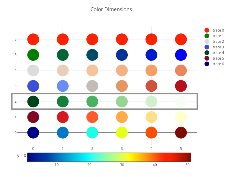
We have seen x and y dimensions in a Plotly chart, and there is another dimension, the color dimension, in scatter charts. In the following example, we create a chart with seven horizontal scatter traces with markers. These markers are used to explain how color dimension works.
Here is our target chart:
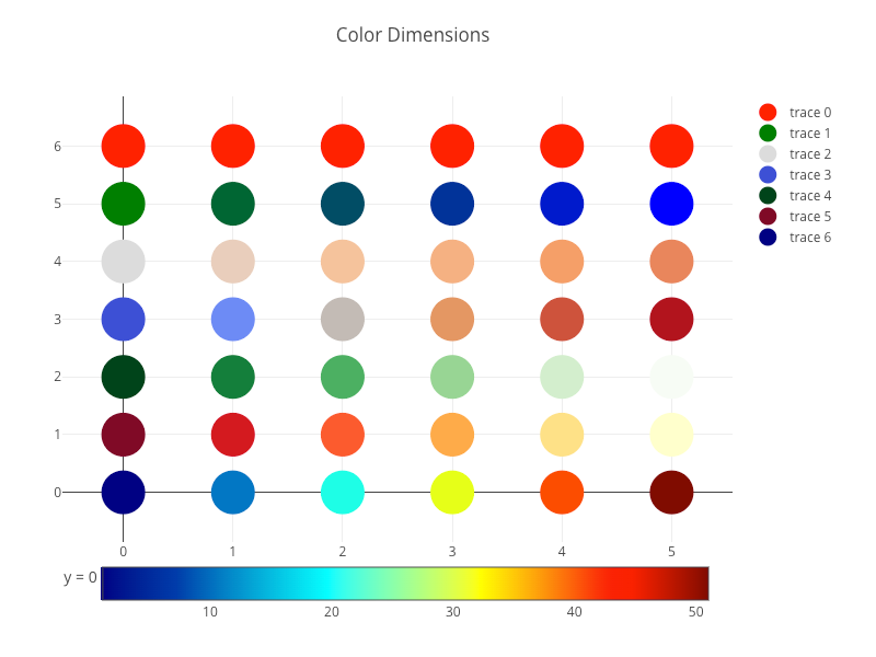
And here is the modified src/App.js:
- At lines 10–18,
trace 0definesyvalues to be[6, 6, 6, 6, 6, 6](line 12), andmarker.colorto be a simple color,'red'(line 15).

- At lines 19–28,
trace 1definesyvalues to be[5, 5, 5, 5, 5, 5](line 21), andmarker.colorscaleto be[[0, 'green'], [1, 'blue']](line 24).colorscaleis an array containing arrays mapping a normalized value to an rgb, rgba, hex, hsl, hsv, or named color string. At minimum, a mapping for the lowest (0) and highest (1) values are required.colorscalehas an effect only ifmarker.coloris set to a numerical array (line 25).
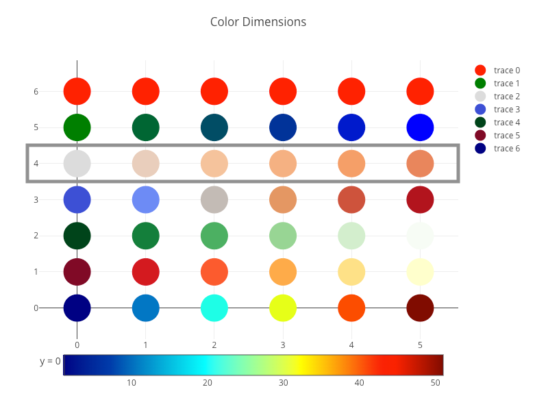
- At lines 29–39,
trace 2definesyvalues to be[4, 4, 4, 4, 4, 4](line 31). Sincemarker.colorscaleis not defined, the defaultcolorscaleis applied.marker.cmin(line 35) sets the lower bound of the color domain, andmarker.cmax(line 36) sets the upper bound of the color domain. Otherwise,marker.cminandmarker.cmaxwill be deducted frommarker.color(line 34).
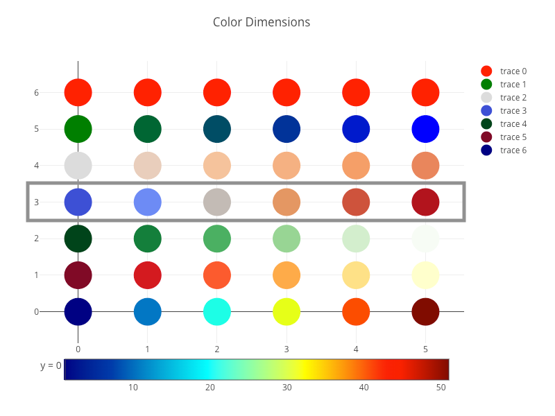
- At lines 40–49,
trace 3definesyvalues to be[3, 3, 3, 3, 3, 3](line 42).marker.cmid(line 46) sets the mid-point of the color domain by scalingmarker.cminand/ormarker.cmaxto be equidistant to this point.
- At lines 50–59,
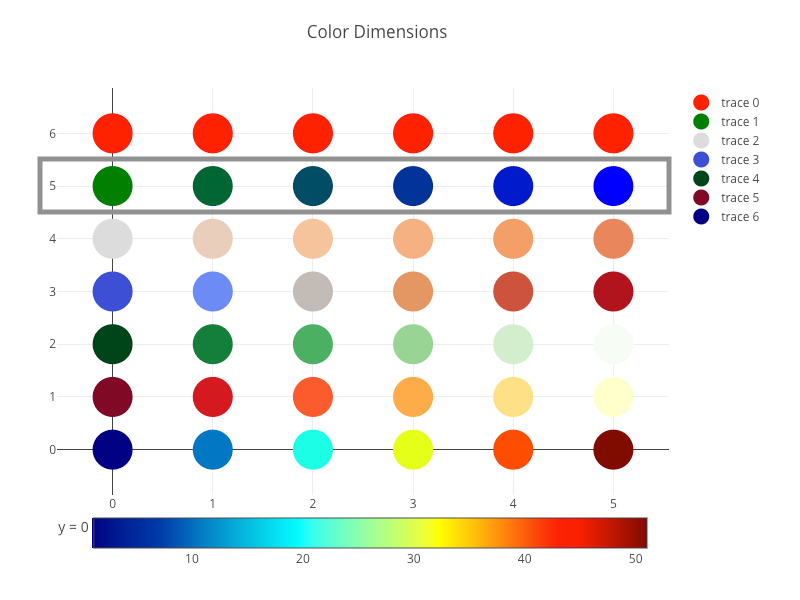
trace 4definesyvalues to be[2, 2, 2, 2, 2, 2](line 52). Besides definingcolorscale, we can use a predefined palette name from the list:'Blackbody','Bluered','Blues','Cividis','Earth','Electric','Greens','Greys','Hot','Jet','Picnic','Portland','Rainbow','RdBu','Reds','Viridis','YlGnBu', and'YlOrRd'. Fortrace 4,marker.colorscaleis set to'Greens'(line 56).
- At lines 60–69,
trace 5definesyvalues to be[1, 1, 1, 1, 1, 1](line 62), andmarker.colorscaleto be'YlOrRd'(yellow or red, line 66).
- At lines 70–85,
trace 6definesyvalues to be[0, 0, 0, 0, 0, 0](line 72), andmarker.colorscaleto be'Jet'(line 76).
- At lines 78–83 in
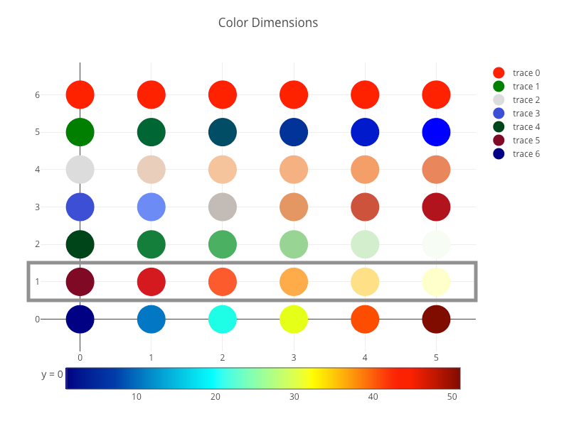
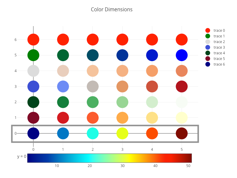
trace 6,colorbaris defined withtitle,orientation,x, andy.colorbaris set with a horizontal orientation (line 80) to avoid overlaying the legend.colorbar.xsets thexposition of the color bar, with a number between or equal to -2 and 3. The default value is 1.02.colorbar.ysets the y position of the color bar, with a number between or equal to -2 and 3. The default value is 0.5. Intrace 6,colorbar.xis set to 0.48 (line 81), andcolorbar.yis set to -0.2 (line 82). The location has been moved from the top (default for horizontal orientation) to the bottom, next totrace 6. It shows how the color dimension of scattered points matchescolorbar.

- At line 94, the scatter chart with seven color dimensions is created.
We have explained how color dimension works for a scatter chart. At line 80 of the code above, the orientation of colorbar is set to horizontal. You may wonder what would happen if it is set to vertical.
colorbar: {
  title: 'y = 0',
  orientation: 'v',
}
Here is the display that reflects the colorbar orientation change:
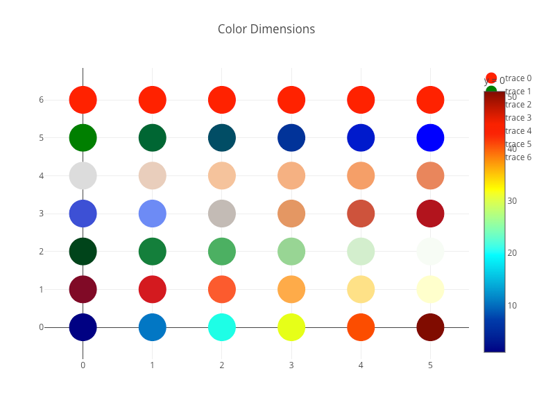
Apparently, colorbar overlaps the legend. Instead of making colorbar horizontal, we can change the legend to be horizontal.
Here is the modified src/App.js.
- At lines 7–9,
legendis set to horizontal. - At lines 81–83, the orientation of
colorbaris removed. The default value is vertical ('v').
Execute yarn start, and we see a scatter chart with colorbar displayed vertically and legend displayed horizontally.
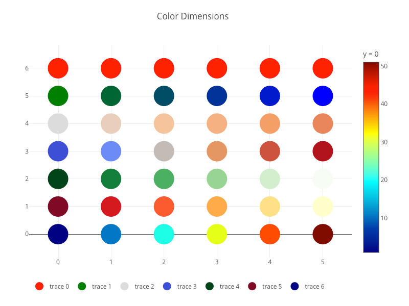
The above example shows that color dimension is vibrant and easy to use.
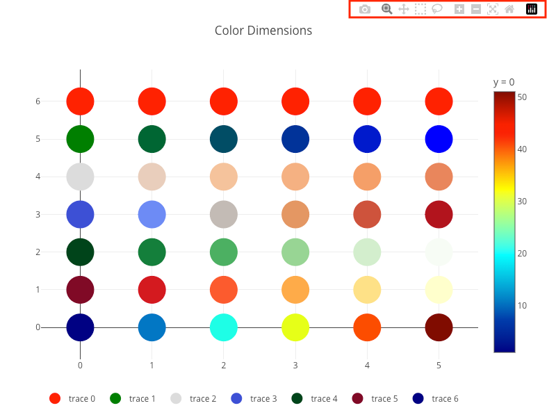
Configuration Options
When hovering on the upper right corner of a chart, modebar shows up with a list of buttons. From left to right, it is Download, Zoom, Pan, Box Select, Lasso Select, Zoom in, Zoom out, Autoscale, Reset axes, and Plotly Logo.
Download: It downloads the chart via the browser. By default, it downloads a PNG file of dimension700x450. Here is the example to configure it to download an SVG file named'custom_image', and of the dimension800x600.
const configObj = {
  toImageButtonOptions: {
    format: 'svg', // one of png, svg, jpeg, webp
    filename: 'custom_image',
    width: 800,
    height: 600,
    scale: 1, // multiply title/legend/axis/canvas sizes by this factor
  },
};Zoom: It changes from a long shot to a close-up or vice versa. Upon the mouse selection, the selected area fills the viewing area.Zoomis the default action.

After zooming, double-click to zoom back out.
Setting scrollZoom to true allows users to zoom in and out using the scroll wheel on the mouse.
const configObj = {
  scrollZoom: true,
};Pan: It allows moving the chart inside the container.

Box Select: It allows selecting part of the chart with a box.

Lasso Select: It allows selecting part of the chart with a free boundary.

Zoom in: It makes the image bigger and closer.

Zoom out: It makes the image smaller and farther.

Autoscale: It looks at all the points (data) in the plot and changes the layout to show all of them.Reset axes: It goes back to the layout details specified for the chart, even if that leaves some points out.Plotly Logo: The tooltip shows the Plotly version, and clicking it goes to https://plotly.com/.
Plotly configuration options are set as a prop in Plot.
<Plot layout={layoutObj} data={dataArray} config={configObj} />All available options are listed here, and the following are some examples.
- Turn off the width and height responsiveness:
const configObj = {
  responsive: false,
};- Make the chart static (no
modebarand no interactive actions):
const configObj = {
  staticPlot: true,
};- Make the
modebaralways visible:
const configObj = {
  displayModeBar: true,
};- Hide the Plotly Logo on the
modebar:
const configObj = {
  displaylogo: false,
};- Removing
modebarbuttons:
const configObj = {
  modeBarButtonsToRemove: ['pan', 'lasso'], // Pan and Lasso are removed
};- Adding optional
modebarbuttons:
const configObj = {
  modeBarButtonsToAdd: [
    'drawline',
    'drawopenpath',
    'drawclosedpath',
    'drawcircle',
    'drawrect',
    'eraseshape',
  ],
};
The full list of modebar buttons is listed here. In addition, Plotly allows customizing new buttons.
Modebar buttons provide many built-in options and capabilities, although Plotly charts lack accessibility.
Event Handler Props
In the previous section, we introduced Box Select and Lasso Select, These select parts of the chart. What is the use case for that?
The chart that listens to the select event can react to the user selection.
Here is the modified src/App.js:
- At line 10, it makes
Box selectas the default action ofmodebar. - At lines 98–101, it creates a config object, which makes the
modebaralways visible and hides the Plotly Logo on themodebar. - At lines 103–105, a select handler is created to log the
selectedinformation. - At line 109, the chart is created with props of
layout,data,config, andonSelected.
Execute yarn start, and we can use the default action, Box select, to select four scatter points.

On the Inspect console, selected information is displayed, which can be used to build applications.

Here is the props list for event handlers: onAfterExport, onAfterPlot, onAnimated, onAnimatingFrame, onAnimationInterrupted, onAutoSize, onBeforeExport, onBeforeHover, onButtonClicked, onClick, onClickAnnotation, onDeselect, onDoubleClick, onError, onFramework, onHover, onInitialized, onLegendClick, onLegendDoubleClick, onPurge, onRelayout, onRelayouting, onRestyle, onRedraw, onSelected, onSelecting, onSliderChange, onSliderEnd, onSliderStart, onSunburstClick, onTransitioning, onTransitionInterrupted, onUnhover, onUpdate, and onWebGlContextLost.
Conclusion
We have shown how plotly.js works for bar charts and scatter charts. In addition to the full chart capabilities, its color dimension is vibrant and easy to use. Its modebar buttons are excessive and powerful. However, it lacks accessibility.
Compared to Highcharts, Plotly’s statistical and scientific charts are widely adopted by AI/data science community. We will give examples in the following articles.
Thanks for reading.
Want to Connect?

If you are interested, check out my directory of web development articles.


