
Explainable S-Learner Uplift Model Using Python Package CausalML
Uplift model using meta-learner s-learner for heterogeneous ITE, ATE, model explainability, and feature importance

S-learner is a meta-learner uplift model that uses a single machine learning model to estimate the individual level causal treatment effect. In this tutorial, we will talk about how to use the python package causalML to build s-learner. We will cover:
- How to implement s-learner using the Python package CausalML?
- How to make individual treatment effect (ITE) and average treatment effect (ATE) estimation using s-learner?
- How to check s-learner feature importance?
- How to interpret an s-learner uplift model using SHAP?
Resources for this post:
- Video tutorial for this post on YouTube
- Click here for the Colab notebook.
- More video tutorials on Causal Inference
- More blog posts on Causal Inference
- If you are not a Medium member and want to support me as a writer to keep providing free content(😄 Buy me a cup of coffee ☕), join Medium membership through this link. You will get full access to posts on Medium for $5 per month, and I will receive a portion of it. Thank you for your support!
Let’s get started!
Step 1: Install and Import Libraries
In step 1, we will install and import the python libraries.
Firstly, let’s install causalml for synthetic dataset creation.
# Install package
!pip install causalml
After the installation is completed, we can import the libraries.
pandasandnumpyare imported for data processing.synthetic_datais imported for synthetic data creation.seabornis for visualization.LGBMRegressor,BaseSRegressor, andXGBRegressorare for the machine learning model training.
# Data processing
import pandas as pd
import numpy as np
# Create synthetic data
from causalml.dataset import synthetic_data# Visualization
import seaborn as sns# Machine learning model
from causalml.inference.meta import LRSRegressor, BaseSRegressor
from xgboost import XGBRegressorStep 2: Create Dataset
In step 2, we will create a synthetic dataset for the s-learner uplift model.
Firstly, a random seed is set to make the synthetic dataset reproducible.
Then, using the synthetic_data method from the causalml python package, we created a dataset with five features, one treatment variable, and one continuous outcome variable.
# Set a seed for reproducibility
np.random.seed(42)
# Create a synthetic dataset
y, X, treatment, ite, _, _ = synthetic_data(mode=1, n=1000, p=5, sigma=1.0)feature_names = ['X1', 'X2', 'X3', 'X4', 'X5']After that, using value_counts on the treatment variable, we can see that out of 1000 samples, 512 units received treatment and 488 did not receive treatment.
# Check treatment vs. control counts
pd.Series(treatment).value_counts()
Output:
1    512
0    488
dtype: int64
Finally, we get the true average treatment effect (ATE) by taking the mean of the true individual treatment effect (ITE). The true average treatment effect (ATE) is about 0.5.
# True ATE
ite.mean()
Output:
0.4982285515450249Step 3: S-Learner Average Treatment Effect (ATE)
In step 3, we will use the s-learner to estimate the average treatment effect (ATE).
The python causalML package provides two methods for building s-learner models.
LRSRegressoris a built-in ordinary least squares (OLS) s-learner model that comes with thecausalMLpackage.BaseSRegressoris a generalized method that can take in existing machine learning models from pakcages such assklearnandxgboost, and run s-learners with those models.
To estimate the average treatment effect (ATE) using LRSRegressor, we first initiate the LRSRegressor, then get the average treatment effect (ATE) and its upper bound and lower bound using the estimate_ate method.
# Use LRSRegressor
lr = LRSRegressor()
# Estimated ATE, upper bound, and lower bound
te, lb, ub = lr.estimate_ate(X, treatment, y)# Print out results
print('Average Treatment Effect (Linear Regression): {:.2f} ({:.2f}, {:.2f})'.format(te[0], lb[0], ub[0]))We can see that the estimated average treatment effect (ATE) is 0.65, which is 0.15 higher than the true average treatment effect (ATE).
Average Treatment Effect (Linear Regression): 0.65 (0.50, 0.80)To estimate the average treatment effect (ATE) using BaseSRegressor, we first initiate the BaseSRegressor, then get the average treatment effect (ATE) and its upper bound and lower bound using the estimate_ate method.
Besides passing in the covariates, the treatment variable, and the outcome variable, we need to specify return_ci=True to get the confidence interval for the estimated average treatment effect (ATE).
# Use XGBRegressor with BaseSRegressor
xgb = BaseSRegressor(XGBRegressor(random_state=42))
# Estimated ATE, upper bound, and lower bound
te, lb, ub = xgb.estimate_ate(X, treatment, y, return_ci=True)# Print out results
print('Average Treatment Effect (Linear Regression): {:.2f} ({:.2f}, {:.2f})'.format(te[0], lb[0], ub[0]))We can see that the estimated average treatment effect (ATE) is 0.47, which is 0.03 lower than the true average treatment effect (ATE).
The results show that using the BaseSRegressor in combination with XGBoost produced a much more accurate estimation for the average treatment effect (ATE).
Average Treatment Effect (Linear Regression): 0.47 (0.37, 0.57)Step 4: S-Learner Individual Treatment Effect (ITE)
In step 4, we will use the s-learner to estimate the individual treatment effect (ITE).
Since the s-learner model of XGBRegressor with BaseSRegressor produced better estimation, we will continue with this model for the individual treatment effect (ITE).
The method fit_predict produces the estimated individual treatment effect (ITE).
# ITE
xgb_ite = xgb.fit_predict(X, treatment, y)
# Take a look at the data
print('\nThe first five estimated ITEs are:\n', np.matrix(xgb_ite[:5]))From the first five results, we can see that the treatment has a positive impact on some individuals and a negative impact on some other individuals.
The first five estimated ITEs are:
 [[ 0.53507471]
 [-0.03358769]
 [-0.04331005]
 [ 0.20249051]
 [ 0.53742391]]
If the confidence interval for the individual treatment effect (ITE) is needed, we can use bootstrap by specifying the bootstrap number, bootstrap size, and setting return_ci=True.
# ITE with confidence interval
xgb_ite, xgb_ite_lb, xgb_ite_ub = xgb.fit_predict(X=X, treatment=treatment, y=y, return_ci=True,
                               n_bootstraps=100, bootstrap_size=500)
# Take a look at the data
print('\nThe first five estimated ITEs are:\n', np.matrix(xgb_ite[:5]))
print('\nThe first five estimated ITE lower bound are:\n', np.matrix(xgb_ite_lb[:5]))
print('\nThe first five estimated ITE upper bound are:\n', np.matrix(xgb_ite_ub[:5]))The output gives us both the estimated individual treatment effect (ITE) and the estimated upper and lower bound for each individual.
The first five estimated ITEs are:
 [[ 0.53507471]
 [-0.03358769]
 [-0.04331005]
 [ 0.20249051]
 [ 0.53742391]]
The first five estimated ITE lower bound are:
[[ 0.08227151]
[-0.60897052]
[-0.41699027]
[-0.15284285]
[ 0.12823942]]The first five estimated ITE upper bound are:
[[0.9885146 ]
[0.50681158]
[0.85921164]
[0.83486686]
[0.98535124]]We can take the mean of the estimated individual treatment effect (ITE) to get the average treatment effect (ATE). We can see that the average treatment effect (ATE) value of 0.47 is the same as what we estimated in step 3 using the estimate_ate method.
# Estimate ATE
xgb_ite.mean()
Output:
0.4727874168455601Step 5: S-Learner Model Feature Importance
In step 5, we will check the s-learner feature importance.
The python causalML package provides two methods for calculating feature importance.
autoworks on a tree-based estimator. It uses the estimator's default feature importance. If no tree-based estimator is provided, it falls back to theLGBMRegressorandgainas the importance type.permutationworks on any estimator. It permutes a feature column and calculates the decrease in accuracy. The feature importance is ordered based on the magnitude of the decrease in accuracy. When the sample size is large, downsampling is suggested.
Both methods are based on a machine learning model, where the dependent variable is the individual treatment effect (ITE) and the independent variables are the features of the model.
get_importanceis the function to get the feature importance values.Xtakes in the feature matrix.tautakes in the individual treatment effect (ITE).normalize=Truenormalizes the importance value by the sum of importance. It only works formethod='auto'.features=feature_namesprints out the feature names in the outputs.methodspecifies whether to useautoorpermutationfor the feature importance calculation.
# Feature importance using auto
xgb.get_importance(X=X, tau=xgb_ite, normalize=True, method='auto', features=feature_names)
From the method='auto' output, we can see that X1 is the most important feature, X5 is the least important feature, and X2, X3, and X4 importance values are similar.
All the importance values add up to 1 because we specified normalize=True.
{1: X1    0.489546
 X3    0.167439
 X4    0.159123
 X2    0.135098
 X5    0.048795
 dtype: float64}
We can also visualize the feature importance using the plot_importance function.
# Visualization
xgb.plot_importance(X=X, tau=xgb_ite, normalize=True, method='auto', features=feature_names)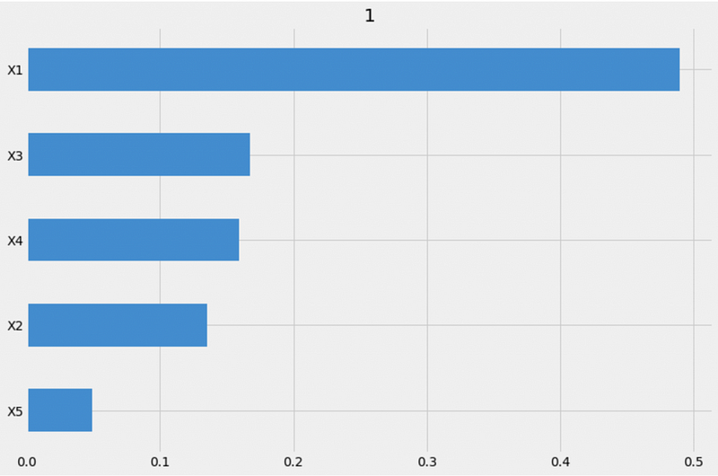
When calculating the feature importance using the permutation method, we need to add a random_state number to make the results reproducible.
# Feature importance using permutation
xgb.get_importance(X=X, tau=xgb_ite, method='permutation', features=feature_names, random_state=42)
From the method='permutation' output, we can see that X1 is the most importance feature, X5 is the least important feature, and X2, X3, and X4 importance values are similar. This is consistent with the auto method results.
However, the feature importance order for X3 and X4 are different. The auto method shows that X3 is the second most important feature while the permutation method shows X4 as the second most important feature.
{1: X1    0.900729
 X4    0.428106
 X3    0.312299
 X2    0.238978
 X5    0.103642
 dtype: float64}
We can also visualize the feature importance using the plot_importance function.
# Visualization
xgb.plot_importance(X=X, tau=xgb_ite, method='permutation', features=feature_names, random_state=42)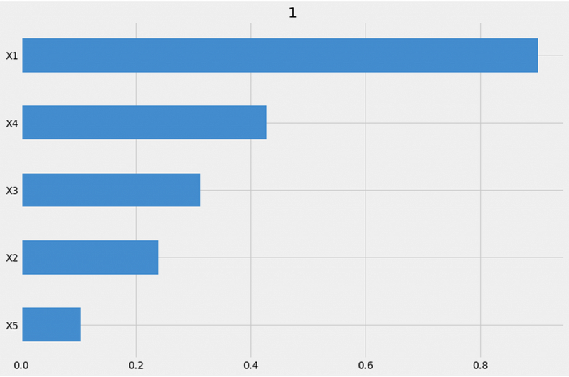
Step 6: S-Learner Model Interpretation
In step 6, we will interpret the s-learner model using SHAP (SHapley Additive exPlanations).
The sharpley values are calculated based on a machine learning model, where the dependent variable is the individual treatment effect (ITE) and the independent variables are the features of the model.
plot_shap_valuesis the function to visualize SHAP values.Xtakes in the feature matrix.tautakes in the individual treatment effect (ITE).features=feature_namesprints out the feature names in the outputs.
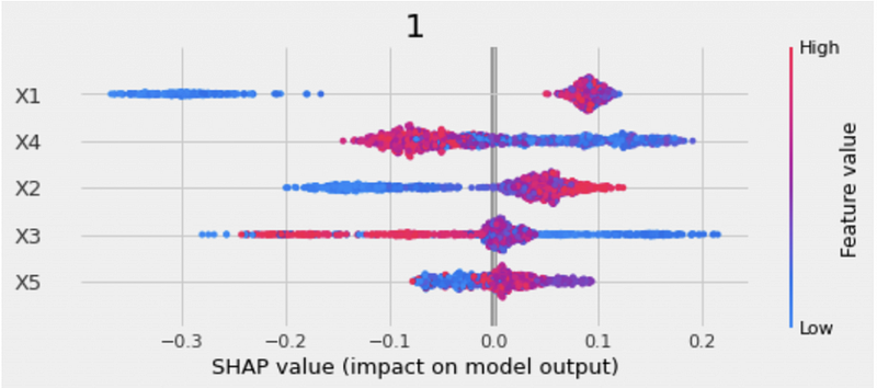
# Plot shap values
xgb.plot_shap_values(X=X, tau=xgb_ite, features=feature_names)
The SHAP plot includes both the feature importance and the feature impacts.
- The y-axis is the list of features ordered from the most important to the least important.
- The x-axis is the SHAP value, representing how each feature impacts the model output.
- The color of the dots represents the feature values. Blue indicates low values, and red indicates high values.
- The overlapping dots are jittered, which helps us to see the distribution of each feature.
For example, from the SHAP plot we can see that X1 is the most important feature. High X1 values affect the predictions in a positive direction and low X1 values affect the predictions in a negative direction.
The SHAP dependence plot shows the features’ marginal impact on model predictions.
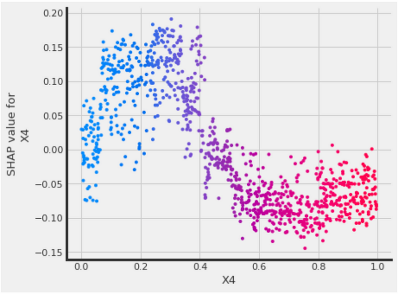
The python causalML has a function called plot_shap_dependence.
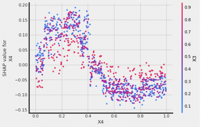
treatment_grouptakes in the treatment group value. Our dataset has 0 for the control group and 1 for the treatment group, so we settreatment_group=1.feature_idxis the feature index for the SHAP dependence plot. Since the index starts with 0,feature_idx=3indicates that we would like to plot the SHAP dependence forX4.Xis the feature matrix.tauis the individual treatment effect (ITE).interaction_idxis the feature index for the color. Settinginteraction_idx=3means that the color is based on the feature value forX4.features=feature_namesprints out the feature names in the outputs.
# SHAP dependence plot
xgb.plot_shap_dependence(treatment_group=1,
                         feature_idx=3,
                         X=X,
                         tau=xgb_ite,
                         interaction_idx=3,
                         features=feature_names)
The plot shows that higher X4 values correspond to lower SHAP values, and lower X4 values correspond to higher SHAP values.
We can also set interaction_idx='auto' to pick the strongest interaction feature automatically.
# interaction_idx set to 'auto' (searches for feature with greatest approximate interaction)
xgb.plot_shap_dependence(treatment_group=1,
                         feature_idx=3,
                         X=X,
                         tau=xgb_ite,
                         interaction_idx='auto',
                         features=feature_names)
We can see that X3 is picked as the color scheme automatically for the feature X4.
If you prefer building an S-learner manually, please check out the tutorial S Learner Uplift Model for Individual Treatment Effect and Customer Segmentation in Python.
More tutorials are available on GrabNGoInfo YouTube Channel and GrabNGoInfo.com.
Recommended Tutorials
- GrabNGoInfo Machine Learning Tutorials Inventory
- S Learner Uplift Model for Individual Treatment Effect and Customer Segmentation in Python
- Explainable T-learner Deep Learning Uplift Model Using Python Package CausalML
- ATE vs CATE vs ATT vs ATC for Causal Inference
- Time Series Causal Impact Analysis in Python
- Time Series Causal Impact Analysis in R
- Multivariate Time Series Forecasting with Seasonality and Holiday Effect Using Prophet in Python
- 3 Ways for Multiple Time Series Forecasting Using Prophet in Python
- Time Series Anomaly Detection Using Prophet in Python
- Four Oversampling And Under-Sampling Methods For Imbalanced Classification Using Python
- Hyperparameter Tuning For XGBoost
- Autoencoder For Anomaly Detection Using Tensorflow Keras
- Databricks Mount To AWS S3 And Import Data
- One-Class SVM For Anomaly Detection
- Sentiment Analysis Without Modeling: TextBlob vs. VADER vs. Flair
- Recommendation System: User-Based Collaborative Filtering
- How to detect outliers | Data Science Interview Questions and Answers
- Causal Inference One-to-one Matching on Confounders Using R for Python Users
- Gaussian Mixture Model (GMM) for Anomaly Detection
- Time Series Anomaly Detection Using Prophet in Python
- How to Use R with Google Colab Notebook
References
- Lo, V. S. Y. (2002); The True Lift Model, ACM SIGKDD Explorations Newsletter, Vol. 4, №2, 78–86, available at http://citeseerx.ist.psu.edu/viewdoc/download;jsessionid=4FD247B4987CBF2E29186DACE0D40C3D?doi=10.1.1.99.7064&rep=rep1&type=pdf
- CausalML documentation


