
The Ultimate Guide to Screen Resolution
During my work as a UX/UI Designer I saw many people struggling to understand why we set the art-boards to a pixel size that is significantly different than the actual number of pixels on the device’s screen resolution.
This post will try to explain you why.
But before we dive in to understand the relationship between these the device screen resolution and the logical resolution, we should start from the hardware properties of the device that we use everyday.
Hardware specifications
I use an iPhone 13. Screen size: 6,1" Screen resolution: 1170 x 2532 pixels PPI: 460
Now, life was very simple some years ago, so when we talked about pixels we could imagine a single black square with a 1 x 1 dimension. Easy, fast, makes sense.
This is how things still work when we talk about the physical screen resolution. In my case: the horizontal side of the screen is made up by 1170 pixels and the vertical side is composed by 2532 pixels. Multiplying them we have a total of 2.962.440 pixels inside the display. This represent the total amount of pixels in 6,1".
But in the market there are tons of devices with different display sizes. In order to have a uniformly applicable method of comparison, PPI was created.
PPI (pixel per inch) indicate the number of pixels present in an inch.
It doesn’t relate to the total amount of pixels inside of the screen. This allows us for example to compare the screen resolution of a large monitor of 24" with the display of a smartphone of 3.5" in the fastest way possible.
The revolution of High-Density Screen
It’s 2010 and Apple announces its latest device. The iPhone 4 with his innovative retina High-Density Screen. From now on, the world of screen resolutions changes drastically.
Why? It has to do with the fact that, in high-density screen
a pixel, is no longer a pixel.
In fact, to avoid having too many different sizes on different resolution screens, Apple introduced the Logical Resolution.
A system based on a new unit, the point. This is an abstract unit and makes sense only in Apple coding softwares. Being abstract units, at a certain moment points will be rendered. This process is known as rasterization. Point coordinates are multiplied by scale factor to get pixel coordinates. Higher scale factors result in higher level of detail.
Imagine this point as a new square, made up of pixels. There are 3 kinds of scale factor:
@x1 — 1x1 pixel side for a total of 1 pixel @x2 — 2x2 pixels side for a total of 4 pixels @x3 — 3x3 pixels side for a total of 9 pixels
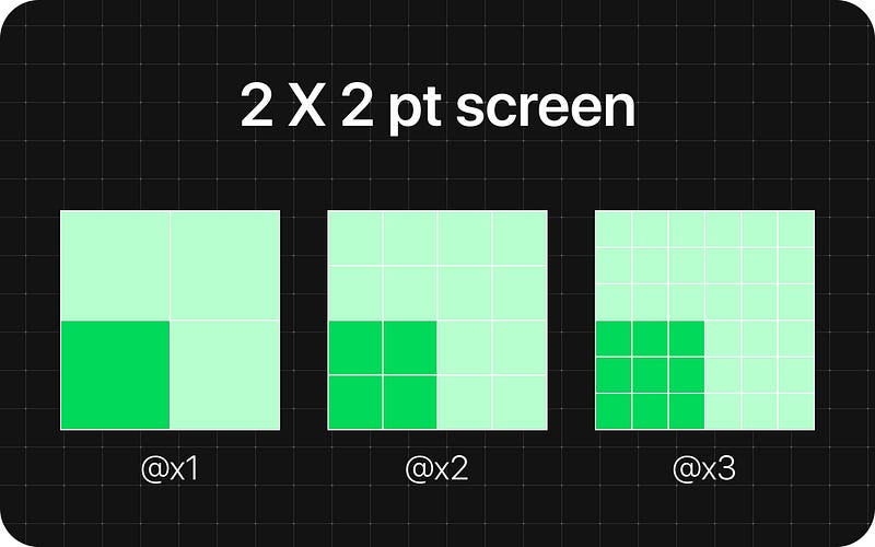
Each device has is own scale factor but all start from the 1x1 point as baseline.
eg. iPhone 11 Logical Resolution = 414 x 896 pixels Scale Factor = x2 Screen resolution = 828 x 1792 pixels
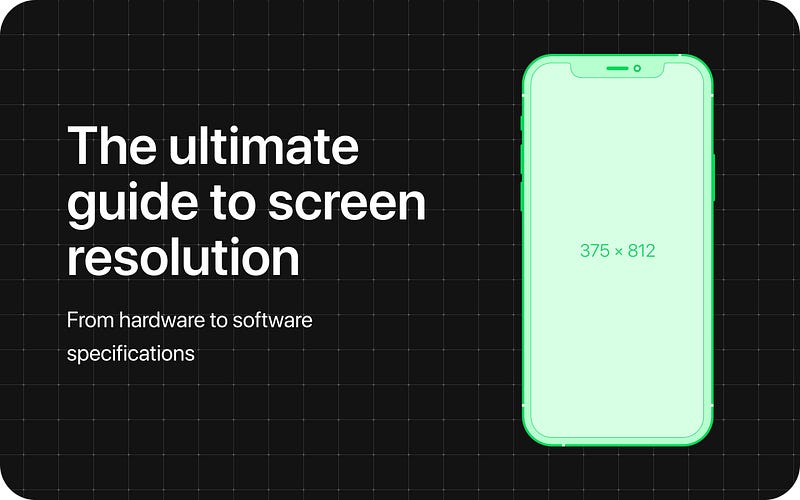
iPhone 11 Pro Logical Resolution = 375 x 812 pixels Scale Factor = x3 Screen Resolution = 1125 x 2436 pixels
If you only watch the logical resolution, it seems like the iPhone 11 has a better resolution of the iPhone 11 pro, but after the rasterization you can clearly see that the amount of pixels of the iPhone 11 Pro is higher.
Why Apple created it?
Let’s take for example the new iPhone 14 Pro, whose device screen resolution is 1290 × 2796 px. This can be a resolution for a desktop screen, but displayed on a mobile device. If Apple hadn’t created the logical resolution, the desktop website would appear on the mobile device as on a desktop monitor with the impossibility of creating responsive websites.
How this affect your design?
As we said, final screen resolution can be a x2 or x3 of the logical resolution, but designers should always set their design frame to reflect the logical resolution when designing for iOS.
There are 2 main reasons because you should do this: 1) Developers has to input 1x numbers when they develop a design. Otherwhise you’ll be giving them a 2x/3x sizing if you manually scale the default Figma frame preset to reflect the real screen resolution. 2) Designing with the logical resolution allows you to work with lighter files and this results in better performance. When you work on files with thousands of interfaces, the difference is huge.
But what about assets?
As we said, iOS final screen resolution can be a x2, x3 or even higher of the logical resolution. If we design for a x1, images in the final product will be blurry and low quality.
So what do we have to do?
SVG/JSON: for vector objects like icons, shapes, paths, and things like that. iOS coding software will automatically scale them for each resolution. Final device resolution JPEG/PNG: for rastered image formats. Developers can upload a variant of an image for each scale factor, so the designer has to export images for each of them. If you upload the same image for all 3 formats, the image would be blurry on screens with a higher scale factor. This is because, to cover the same physical size, the image would need more pixels, not having them, the software will make a stretch of those present which will therefore lose quality.
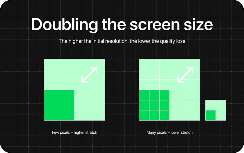
Actually Figma downsizes images with a width or height larger than 4096 pixels. This scales the image’s original dimensions proportionally, so the longest edge is less than 4096 pixels. Considering that the iPhone 13 pro Max has a resolution of 1284 x 2778, this means you will never have problems with images if you start from an higher quality.
To summarize, ever since retina displays were introduced you now design for the 1x logical resolution and export assets as SVG or with 2x or 3x the size so they’ll look perfect in each device.
What about Android?
Google developed their own abstract unit called Density-independent pixels (known as dp or dip). The name is explanatory.
A density-independent pixel is the size of an element in pixels on the screen that is independent of the actual screen resolution’s pixel density.
These units are relative to a 160 dpi screen, so one dp is one pixel on a 160 dpi screen. The ratio of dp-to-pixel will change with the screen density, but not necessarily in direct proportion. Note: The compiler accepts both “dip” and “dp”, though “dp” is more consistent with “sp”.
Android also uses the term scalable pixels (sp) to serve the same function as density-independent pixels, but instead for fonts. 1 sp is technically equal to 1dp.
You can read more about on Material guidelines.
Conclusion
You always have to keep in mind the difference between physical and logical pixels. It is quite easier for designers because the whole transformation happens in the development software, but you need to be careful when you work at your graphic outputs.
That’s all for today. Hope it was helpful ✌ If you liked the article, clap and sharing are appreciated 😎


