
Working With Different Pixel Densities in Android
Besides having different screen sizes (handsets, tablets, TVs, and so on) on Android, there are also different pixel size features. That is, while one device has 160 pixels per square inch, another device fits 480 pixels in the same space. We use the pixel density keyword for this kind of case. Pixel density is a term independent of screen size. To give an example through an image to better understand, in case we ignore dependence such as pixel density, the image quality or image size may deteriorate.
Today, I would like to talk to you about different screen pixel densities and resolution-independent units of measurements.
Before that, let’s talk about a few concepts in order to understand the basics of multiple screens.
Inch
An inch is a unit of length measuring equals one-twelfth of a foot (2.54 cm). The symbol is in or ″.
Screen Size
The size of a screen is usually described by the length of its diagonal, which is the distance between opposite corners, usually in inches.
Pixel (Picture X Element)
A pixel(px) is the smallest portion that makes up an image on a computer screen. We can see the pixel when we zoomed into an image.
Screen Resolution
The screen resolution is the number of pixels a screen can show horizontally and vertically. For instance, the resolution of a screen that displays 1080 pixels vertically, and 1920 pixels horizontally is known as Full HD. HD display has 1920*1080 = 2,083,600 pixels totally.
The higher the number of pixels, the more detailed the image quality. But this is not the only factor. There is also pixel density. In the case of monitors are different screen sizes and the same screen resolution, the smaller monitor has a higher number of pixels per inch than the larger screen. And of course, that means better display quality.
Density-independent Pixels
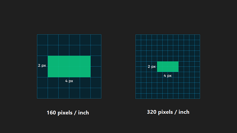
Let’s imagine a designer creating a button whose width is 4 px and height is 2 px. In the different screens with 160 pixels and 320 pixels per inch, the button will be displayed differently like below.
If we specify our distances/sizes based on pixels, we would have to arrange them for all different devices.
Android solved this problem by introducing the Density-independent pixel (abbreviated dp or dip) keyword. DP units keep things roughly the same physical size on every Android device.
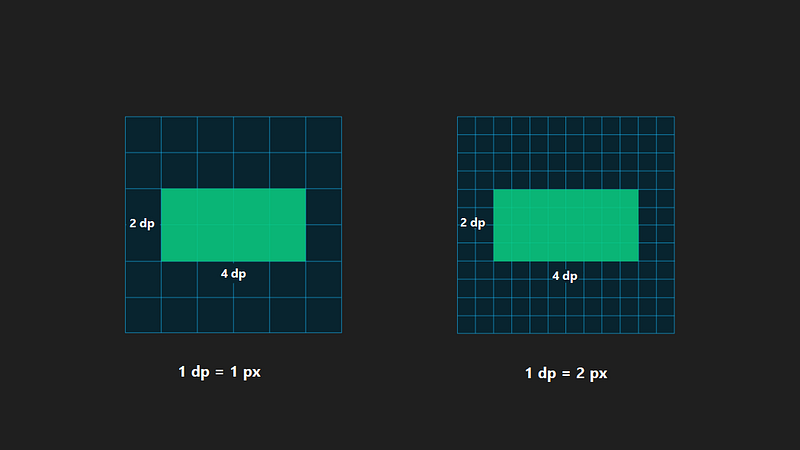
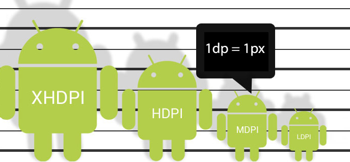
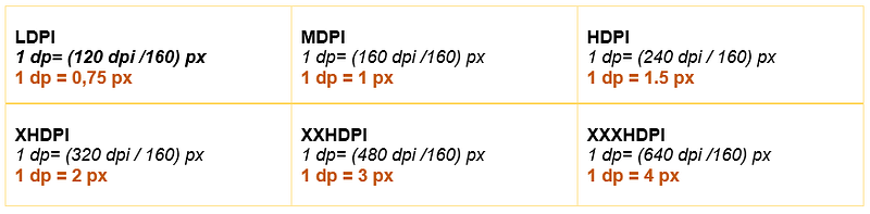
To protect the visible size of UI design on different screens that have different densities, we need to design our UI with Density-independent pixels. This measurement unit is independent of the device screen. It scales as per device screen density. It is used to define layout and Views dimension. 1 dp is equal 1 px in baseline density(160 pixels per inch).
👉 1 dp= (dpi of your screen/160) px
Scale-independent Pixels
This measurement unit(sp) is used for TextView size. Compare to dp, sp scales as per device density and user setting preferences in the device.
Screen Density with Details
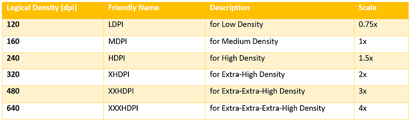
To deal with these diverse devices with different screen resolutions, Android came up with 6 buckets to group the devices of different screen resolutions.
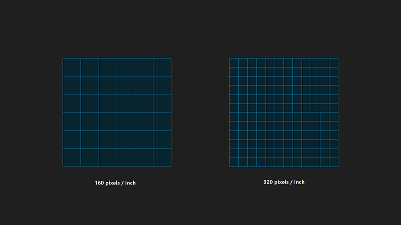
Screen Density is measured in Dots Per Inch(dpi). One dot represents one pixel. The term specifies pixel number in an inch.
If we come back to the formula above, we can calculate the scale factor in this way.
Let’s create a View that is 100 dp height and see the behavior on devices that are with different screen resolutions.
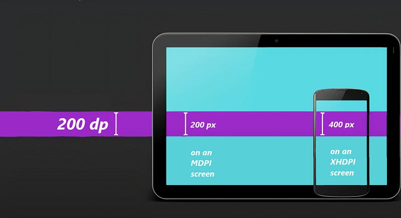
As we see in the image above, we were able to preserve the size because we set with the dp unit.
Tips & Tricks
👾 While we design our app, we need to be aware that a human fingertip is roughly 50 dp wide.
👾 We should avoid using pixel instead of dp units while we design our UI.
👾 Create PNG graphic assets for each density to avoid automatic scaling.
That’s enough today. Good Bye 🙋
https://developer.android.com/training/multiscreen/screendensities