
Delightful and frustrating UX in video games
Did you know that 40.75% of the world’s population is a gamer? That’s a whole lot of user experiences which need to be designed, and why gaming has become a huge industry for UX designers to work in.
While I’m not working in the gaming industry myself, I’ve spent a lot of hours enjoying a number of games in the last two years. As a UX designer, I couldn’t help but recognise common UX patterns, leading to some delightful experiences, and some frustrating ones which had an impact on the overall enjoyment of playing the game.
A lot of this article will discuss things like menu screen design, information display and HUD (the method by which information is visually relayed to the player as part of a game’s user interface. ) If you want to find out more about UX design and how it applies to gaming design, or the difference between the two, you can read about it here.
I appreciate the challenges that UX and UI designers working on these games face and I have every admiration for their work.
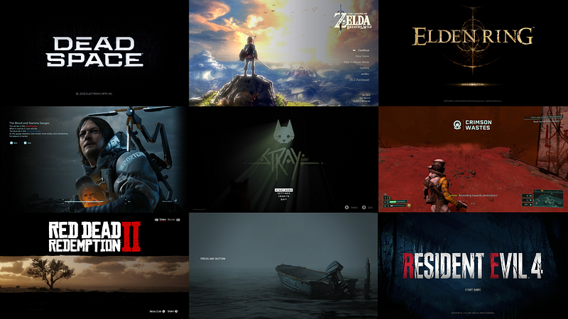
I should also point out, I completely missed the PS3/Xbox 360 era, and most of the PS4 era as well, so most of the games mentioned here are recent releases of the past 2 years, except for one or two older ones and remakes. I’m sure there are plenty of older games which are worth mentioning that I’ve left out here, feel free to mention them in the comments.
Frustrating user experience #1—Death Stranding: Overwhelming display of information
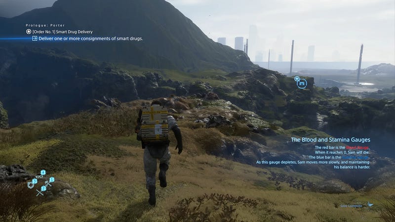
Death Stranding is a unique game and I loved playing through and experiencing this story. What sounds like an ordinary concept of “delivery man in a post apocalyptic world” is actually a fascinating story which made me keep playing until the end to find out what happens and what the twists are, of which there were plenty.
Getting started with it was hard to say the least, and it is in part because of how much information it bombards you with. The biggest challenge I found as I played through was the menu design. The screen below is an example of the menu in which you select your next mission, or order, to complete.
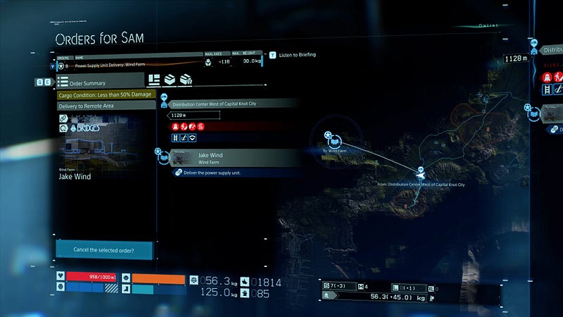
Even as someone who played through this game already, the above screen is overwhelming. What is selected and what is not? What are the colourful bars at the bottom showing? I had to really take the time to understand what is going on here and what I’m supposed to be doing with it.
While I thought this to be a brilliantly imaginative game, the confusing and overwhelming UX and UI makes it a frustrating experience at times. There are a lot of aspects to this game, including a social concept which can change the environment as you play through. So the information has to be presented to you in a way that is digestible and understandable, which I found was not always the case.
Frustrating user experience #2— Legend of Zelda Breath of the Wild: Too many options making it hard to navigate through the menu
I haven’t played Tears of the Kingdom yet, but according to this article, the problem of long menus remains.
At first glance in the menu above, it doesn’t appear as cluttered and confusing as that of the previous example or some others to come; but the issue is when you have gathered a lot of options of say different food types, you have three or four screens of this type and have to scroll through each one every time you want to get to the next option.
The gameplay does pause when this menu is open, but I still found myself spending a lot of time scrolling through the menu options to get to what I needed; it would be helpful if you could at least arrange the menu items in a way that the one you use the most is accessible first (I am not aware that this option exists in this game.)
Frustrating user experience #3—Gran Turismo 7: Inconsistent menu interactions
I noticed a peculiar behaviour in the menu of Gran Turismo 7. The horizontal strip at the very top appears on most screens; but you can only select half of them.
The menu book, credits and the car are selectable with the cursor but the collector’s level, daily workout and date and time items are not selectable. (I’m still not sure what “daily workout” actually does or how it is relevant in the game.)
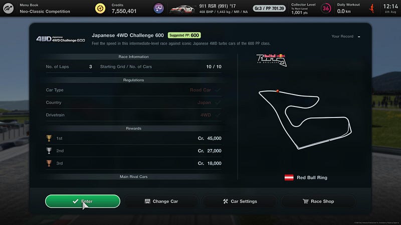
However, in certain menus like the one above where you are about to enter a race, you cannot access any items at all from this horizontal bar. This type of inconsistency is frustrating and feels unintuitive, and is probably the result of the circuit and race info being a pop-up window in the foreground with the rest of the screen being inaccessible in the background. If that is the case then it should be faded out or blurred, because I kept wanting to change my car from the top options rather than the “change car” button provided in the window, out of habit.
Also, a cursor on a game controller is really annoying — the game is not even supported on PC (to my knowledge they don’t plan to), so I cannot think of a good reason as to why a cursor needs to be there.
Frustrating user experience #4—Resident Evil 4 (2023 remake): Forcefully pausing gameplay when picking up an item
A lot of games are guilty of this tactic, and the remake of Resident Evil 4 is the most recent game I have played which does this.
Getting the user up to speed quickly about the controls and essential items is important; however taking them out of the action to notify about an item they just picked up (and one that they purposefully picked up) kind of breaks the intensity and concentration.
And yes, in this game they do this when you pick up a significant item to what you’re currently doing; it could also just display this on the game screen without pausing the action.
No one wants their gameplay constantly interrupted to read a paragraph about an item which they’ll forget anyway. Although there aren’t long descriptions featured in this particular example, lots of games tend to do this.
A better alternative is to gently notify without disrupting the gameplay and provide a database, which I can go to in the menu and read up on if I wish to.
Frustrating user experience #5—Elden Ring: Lack of contrast in menu screens
I previously wrote an entire article about the UX of Elden Ring. It has to be mentioned here again because while I love this game and rate it as one of my all-time favourites, the UI design of the menu is something that was a big stumbling block to the experience of getting into this game.
From the low contrast of the font size and colour, to information which is difficult to scan and understand at a glance, to the bottom controls being unreadable, all this makes Elden Ring difficult to understand especially for new players.
Frustrating experience #6—Cyberpunk 2077: Incoherent menu screens
This is one game on the list which I gave up on and didn’t finish. While I can see from a story and action perspective why it is a great game to play, there were so many frustrating elements in one game which I couldn’t get past that made the experience of playing it not as fun as it should have been.
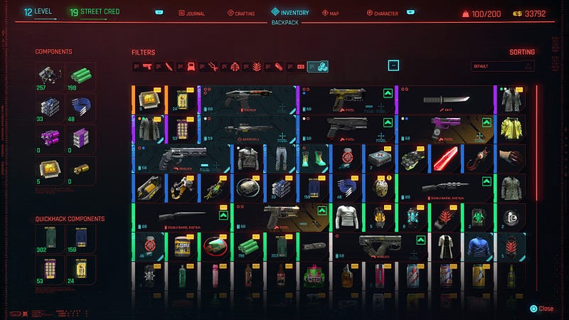
It suffers from too many of the UI design patterns and decisions which I’ve already mentioned on this list, all at once. This includes information overload on most of the menu screens and options, low contrast colours, small text and icons which are hard to read.
For example, can you see at a glance the pop up on this screen for the selected item? I had to look careful to even spot it.
Another example is using red text on a red background; or just having too much happening and showing at the same time, like in the screen below.
I can appreciate the aesthetic they were going for with this UI, but all together there is too much happening here.
Delightful user experiences
Now that I’ve mentioned a long list of frustrations, here are games which I found to have enjoyable UX, in addition to being outstanding games to play.
Delightful user experience #1—Red Dead Redemption 2: Minimal, easy-to-use menu
Red Dead Redemption 2 was released in 2018 and is still one of the best games out there. Many aspects come together to make this a favourite, including a story mode and an online mode, amazing looking graphics, immersive gameplay and incredible story-telling. You can find entire threads online where people discuss being brought to tears by this story.
I would add good UX to that list because I really came to appreciate the menu design and flows in this game. It’s not overwhelming and manages to be informative. It is not bloated with unnecessary information and does well with the master-and-detail pattern, or information on demand, rather than spamming you with as much as possible in one screen.
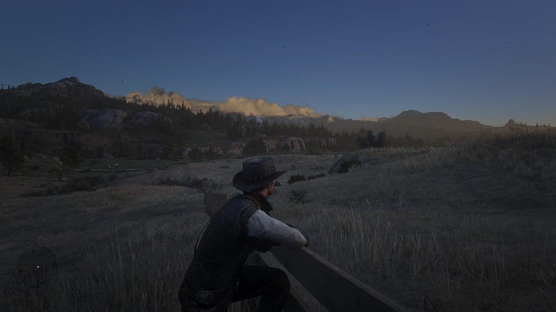
I also like how the information on the main gameplay screen is kept minimal, which really helps to immerse the player in the world they’ve created.
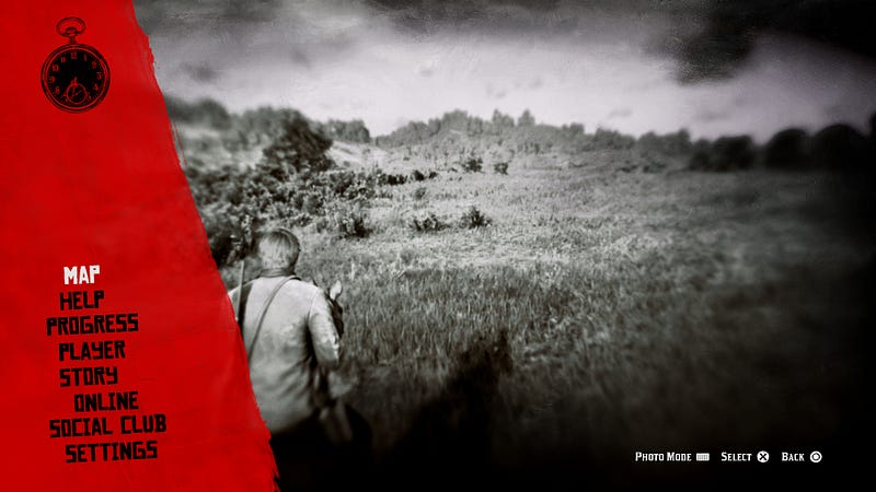
My only gripe would be the naming of the options displayed in the main menu, as well as the order in which they appear.
For example, the “Help” option can be further down the list, and at first glance I’m not sure what the difference is between “progress” and “story”; upon inspection “progress” is the progress you’ve made in the game which is kind of obvious, and story breaks down the chapters.
Delightful user experience #2—Returnal: New information is stored in database with a logical information architecture
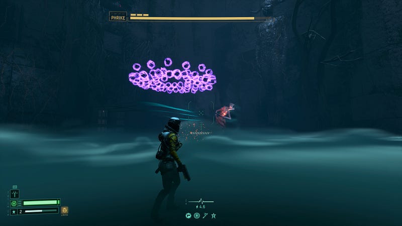
In my humble opinion, this game is a gem and I don’t know why more people aren’t obsessed with it, although I was a little late to the party and played it about a year after it was released.
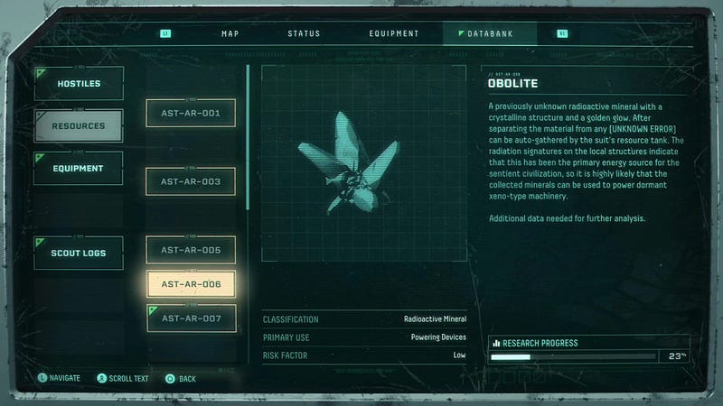
Whenever you come across a new type of creature or item in Returnal, the game doesn’t stop you in your tracks to tell you about it — instead, a small and inobtrusive information display tells you that it has been added to the database, where you can access it at any time.
I found myself appreciating the design and information architecture of the menu, as it wasn’t overwhelming and items were categorised in a logical manner, making it easier to navigate. In comparison to the Death Stranding menu, this screen is way more digestible and readable.
Delightful user experience #3—Stray: Beautiful, minimal UI to compliment the rest of the style of the game
A game in which you play as a cat — something that we all wanted without even knowing it (or maybe we did?)
I loved every minute of this game, from how well they captured the cat’s behaviour and movement, to how well-executed the whole concept is.
The UI is also in line with this, being minimal, unobtrusive and even making it easy to scan by highlighting key words in dialogues to provide clues. And the other characters you interact with are robots with iMac-shaped heads and screens as faces. What is not to love about this!
Delightful UX #4—Dead Space (2023 remake): Themed UI without sacrificing the UX
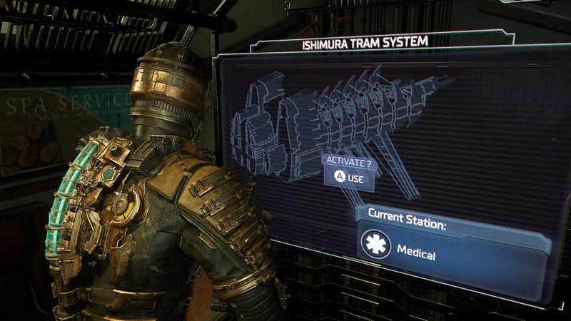
I learnt something new while looking into the UI design of Dead Space. I knew how to describe the approach without knowing the term for it — diegetic design.
Diagetic is UI made to look like it is entirely part of the game’s narrative. This means that something like an “open door” prompt is also part of the character’s word. Things like save menus or the inventory store are physical stations you have to come across in the game to be able to access them, and then they open as holographic screens, creating a rather nice immersive touch.
Of particular note is also how it has struck the right balance between the hologram-style UI of the menu screen, and not going overboard on how much information it displays to result in making it unreadable (again, compare this to Death Stranding and you’ll remark the difference.)
The result of the design of the UI and the interactions is to create an enjoyable, immersive experience which can also be terrifying at times, being of the survival horror genre. You can read more about it in this article.
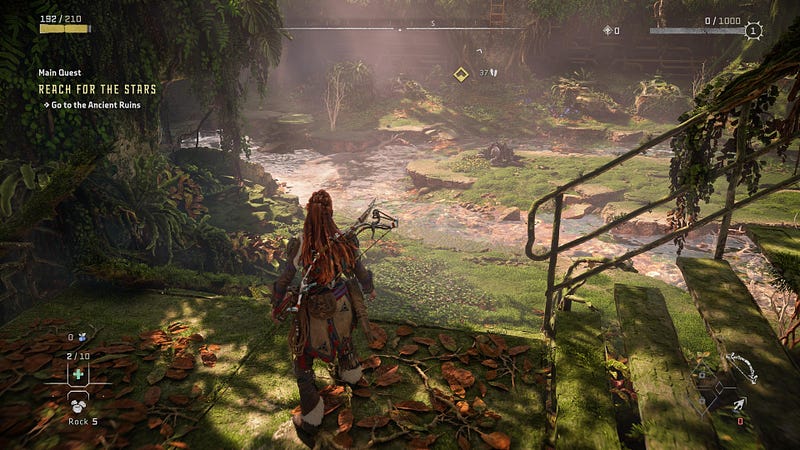
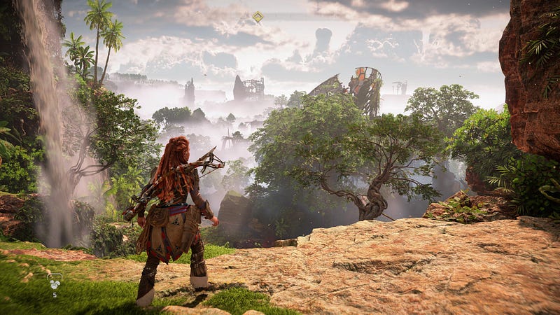
Delightful UX #5—Horizon Forbidden West: Customisation and accessibility settings
This game has arguably the most visually breathtaking graphics of all the ones mentioned here. The environment is incredibly lush and full of colour, the gameplay is really fun and the narrative strong enough to captivate until the end.
One thing that some players have a problem with is that the game tends to hold the player’s hand throughout with constant on-screen prompts, hints and not-so-subtle nudges from the main character herself, so you’re never left to explore and figure things out for yourself like in Elden Ring.
The reason I put this on the delightful list is because it offers a lot of customisation according to your preferred playing style — you can choose whether or not your screen is simple and distraction-free or if you want to see hints and get help along the way.
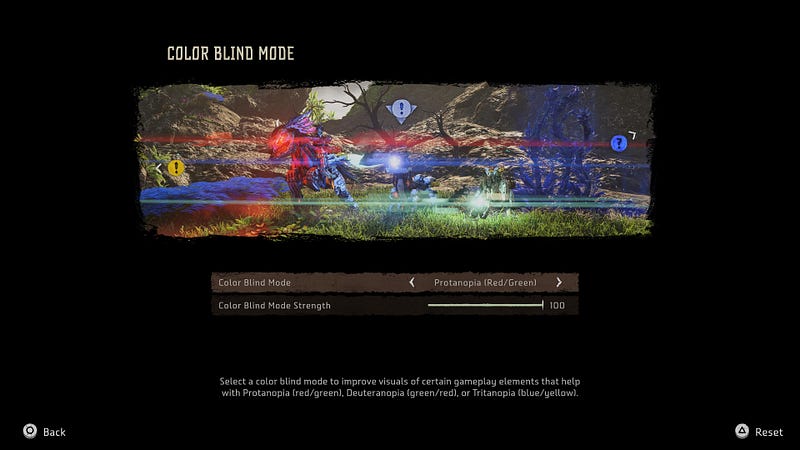
It also has many accessibility features which we are starting to see becoming a standard in newly-released games. This means that more players can have a great experience and enjoy the game.
Delightful UX #6
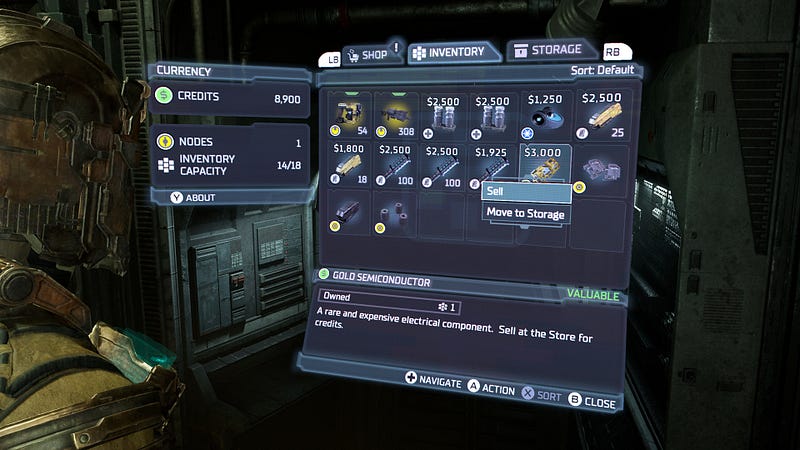
Resident Evil 4 (2023 remake): Inventory organisation
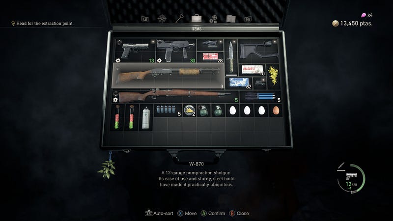
Although I already listed Resident Evil 4 as a frustrating experience, there are some good ideas here and I really like the inventory menu, which is also really easy to access and it pauses the gameplay when you open it — unlike in Elden Ring where the battle is still going on while you’re trying to replenish your health or find a different weapon.
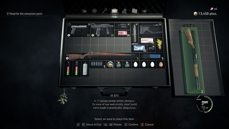
The inventory menu in Resident Evil 4 is presented as a case, with a grid, in which you can organise your items as you wish. Each item takes up a certain number of blocks. My OCD is very satisfied with this layout exercise. It also takes up a good portion of the screen and I can see which item is which, unlike previous examples where it was hard to see what was what and everything was really cramped.
Did I leave out any obvious examples? Let me know in the comments if there are other games with UX which you loved, or hated.


