Designing Effective Diegetic UI: Lessons Learned from Dead Space’s Success and The Callisto Protocol’s Failure
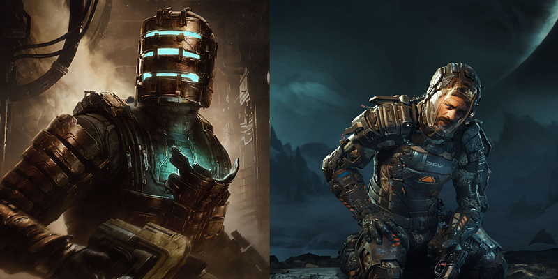
After replaying The Callisto Protocol (will refer to it as TCP) following the Dead Space Remake, I began to question why I wasn’t as impressed or immersed in the Black Iron Prison setting, unlike the Ishimura. Upon closer examination, I noticed gaps and significant errors in The Callisto Protocol’s user interface that constantly pulled me out of the game’s world. The decisions made to sustain this negatively impacted the user experience.
What made Dead Space’s Diegetic UI an absolute triumph ?
Diegetic by design and implementation
For the designers who have been a huge fan of Dead Space’s user interface, the quote “Diegetic by design and implementation” would be something you would be quite fond of. The development team of the first Dead Space game considered the space vessel Ishimura, where the game is set, as a character, and its voice was conveyed through the user interface (UI). At a GDC 2013 panel, developer Dino Ignacio, Visceral Games’ lead UI designer, explained Dead Space’s design philosophy and chronicled its evolution throughout the series where he said, “ We were not just diegetic by design, we were diegetic by implementation “.
“If Ishimura is a character, the UI became its voice”
Some of the earlier rules which were established by the designers of Dead Space which could be seen in action all through the game,
- All elements which did not belong to Isaac were put behind him
- All important UI elements needed to be 1.5m above the ground
- A strict colour coding language to communicate information clearly
My thoughts on how to create an effective diegetic UI by utilising my observation from Dead Space:
CONSISTENCY
Dead Space demonstrates a remarkable level of consistency throughout its gameplay experience. By treating Ishimura as a character, every object within the game world is consistently designed to align with this concept. However, The Callisto Protocol falls short in this aspect. It suffers from numerous visual disconnections, resulting in a significant lack of consistency that disrupts the overall immersion.
Door Indicators
Door hologram exists as a real world element for Isaac and doubles as a UI element for the player in Dead Space, compare that to The Callisto Protocol the holograms just showcasing the contextual button which are projected over certain doors breaks the bond of consistency and it’s just merely placed over the top of particular door or objects without any meaningful use case.
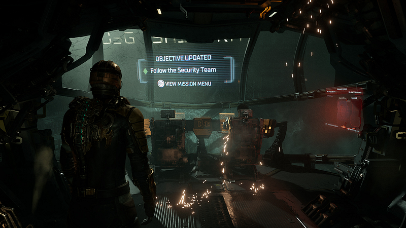
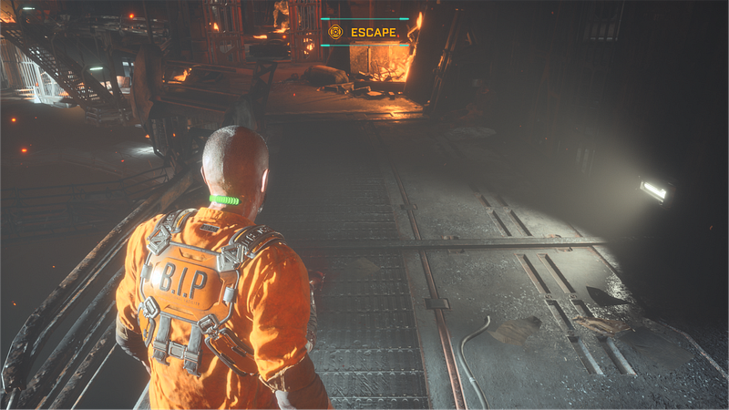
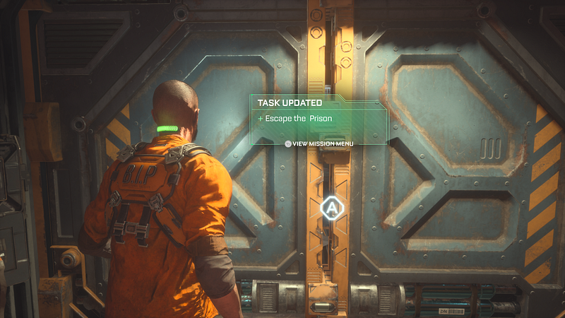
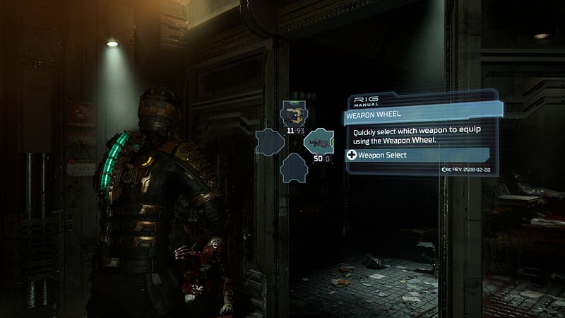
Mission Objectives
Mission objectives showcased in Dead Space comes through the RIG Manual, wheres in The Callisto Protocol, the objective is showcased non-diegetically. Personally, I would have liked to see a sense of consistency through the game on how Jacob’s holographic visor works and giving it more importance to serve multiple purposes.
CLARITY
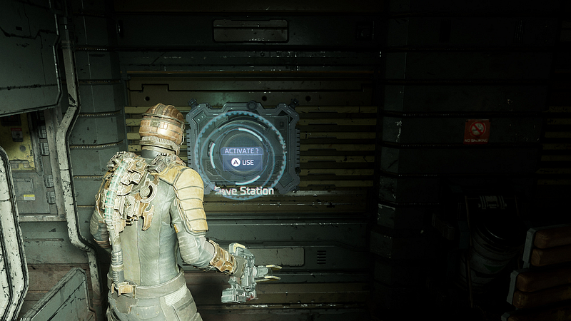
Although Dead Space showcases everything in a diegetic format, the information. which the players would need and access are always perfectly clear. The design and the philosophy which were created during the production of the interface can be said that it has been followed through every step of the way.
To explain this in further detail, it’s better if we compare the “C.O.R.E” Device in The Callisto Protocol and the RIG from Dead Space
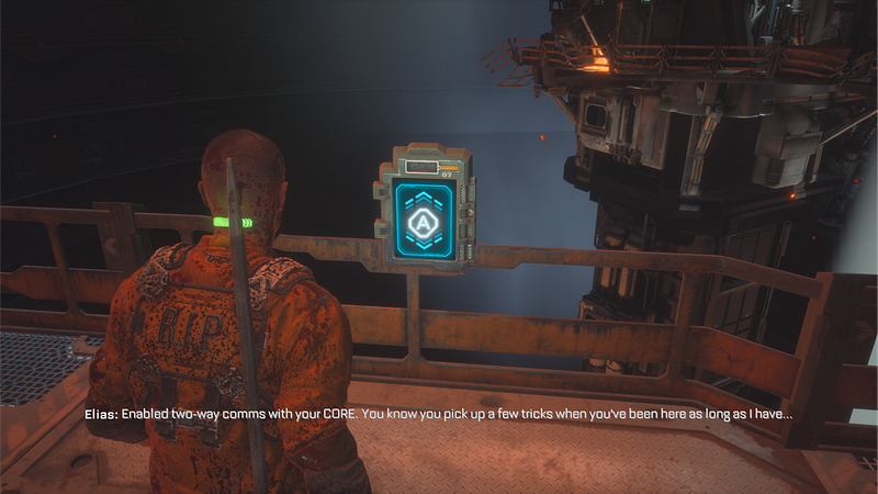
The Cranial Optical Recording Engine or “C.O.R.E” Device is a neck implant that is embedded in the necks of all Black Iron inmates and Security personnel in The Callisto Protocol which acts quite similar to the RIG (Resource Integration Gear) from Dead Space.
The RIG is used in almost every aspect to convey and display information to Isaac and the player thereby making it more consistent and a powerful interface the player can depend on, comparing this to the C.O.R.E,
Grip Indicator (HUD)
One of the most crucial information where the gameplay is directly integrated would be the Grip indicator which is placed on Jacob’s back. GRIP acts similarly to the Stasis meter for Isaac. If you look at Isaac’s stasis meter the status of the meter is very clear, the amount left to be used or the amount which is getting refilled through a Stasis pack whereas I certainly struggled to notice the status of the GRIP meter several times during the course of my play through.
Tutorials
Tutorials play a crucial role in effectively conveying game mechanics, encompassing more than just the user interface. Dead Space successfully achieves this by utilising Isaac’s RIG to provide clear explanations for all essential tutorials. In contrast, The Callisto Protocol employs various approaches to deliver tutorials. Some mechanics are taught through in-game actions, while others are presented through dedicated tutorial screens, and sometimes a combination of both.
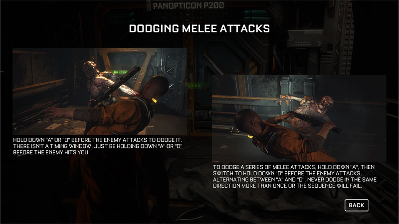
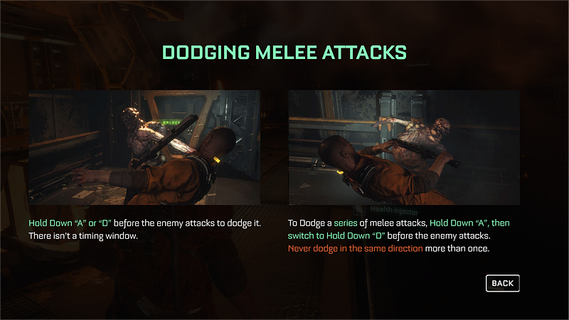
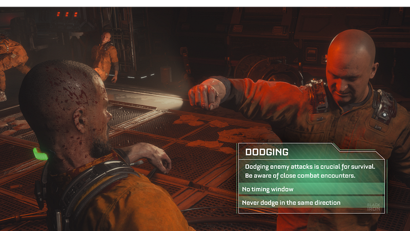
While recognising that this approach is a deliberate choice by the developers, it must be acknowledged that the tutorials presented in The Callisto Protocol are not always clear and easily comprehensible. One particularly frustrating aspect I noticed was the presentation of information in all capital letters without proper visual hierarchy. Ideally, I would have preferred a similar approach to Dead Space, where this aspect of the game world was handled with more effective communication. However, I understand that the mechanics might have required a different method of conveying information.
USABILITY & ACCESSIBILITY
Dead Space excels in providing a user-friendly and accessible experience by incorporating all of its features seamlessly within a diegetic user interface (UI), without compromising on usability. However, in contrast, The Callisto Protocol’s diegetic design choices negatively impact several features, leading to a lackluster user experience.
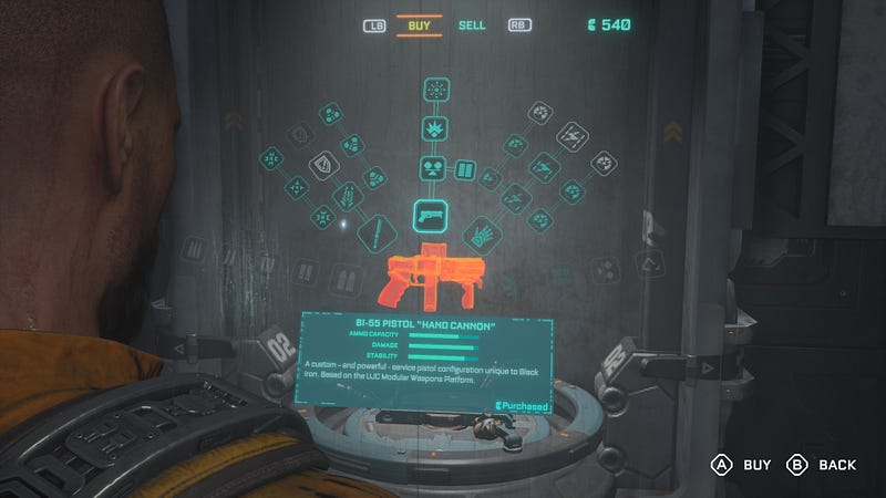
Upgrading and Crafting Weapons
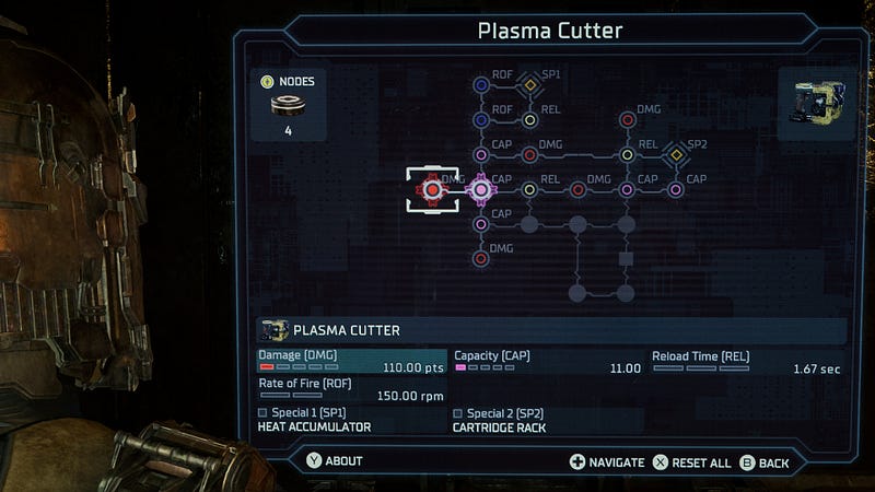
Upgrading and crafting weapons are crucial for survival in The Callisto Protocol. Throughout your journey, this feature is expected to be frequently utilised. However, in terms of usability and interaction, Dead Space excels in comparison. In Dead Space, Isaac can access a terminal to upgrade his weapons. The player is presented with a user-friendly upgrade tree, allowing for easy selection and immediate application of chosen upgrades to their weapon.
On the other hand, in The Callisto Protocol, Jacob encounters a similar terminal for accessing weapon upgrades. Upon scrolling through the upgrade options and selecting a desired upgrade, the player is required to insert their weapon into the terminal. Subsequently, they must endure an unskippable cutscene that showcases the upgrade process. This repetitive and time-consuming procedure often leads to frustration among players. It personally made me consider forgoing weapon upgrades entirely just to skip the entire process.
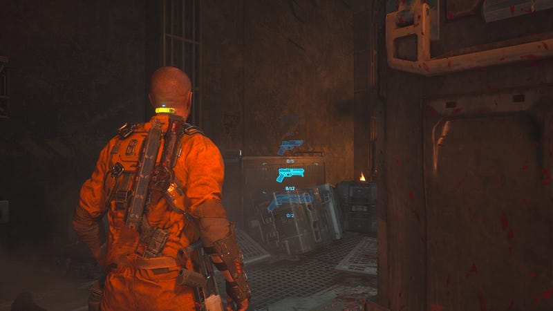
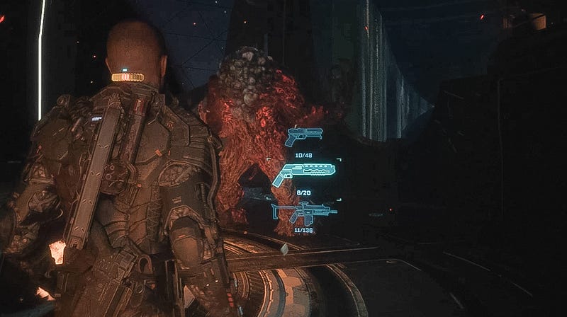
Weapon Wheel
In Dead Space, the weapon wheel utilizes a standard and widely used design found in most modern shooters. Players are given the option to choose the weapons they want available on the wheel, allowing for easy swapping between them.
However, in The Callisto Protocol, a similar approach is taken, but the weapon wheel is presented in a vertical orientation. This means that players must toggle through multiple weapons to reach their desired choice. This design decision can be extremely frustrating, particularly in intense battles. Adding to the frustration, attempting to perform a dodge during combat can inadvertently cancel the weapon change, resulting in the player being back at square one.
In conclusion, those are a few of my personal observations on the matter. While I do understand that developers have their reasons for the design choices they make, I can’t shake the feeling that The Callisto Protocol had a great deal of potential for improvement and growth. When comparing it to the outstanding execution of similar games like Dead Space, there are valuable lessons to be learned.