
DeFi Design Tips Vol. 10
An ongoing series in which I record UX/UI improvements I have noticed in DeFi. This is my own competitive analysis, as I collect things I find interesting, useful, or delightful. As a DeFi designer myself, I want a bunch of ideas to test.
Read the others here: Vol. 1, Vol. 2, Vol. 3, Vol. 4, Vol. 5, Vol.6, Vol.7, Vol. 8, Vol.9

1. Zappers for everything! Show compatible tokens currently in the user’s wallet.
ref. Yearn
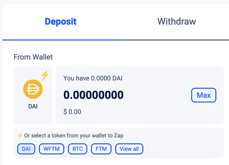
I’m a big fan of zappers for the same reason I’m a fan of auto-compounders and strategy automators. They both reduce the number of steps involved, simplifying the user flow dramatically.
If you want to do some yield farming, then at best, the user flow is going to be:
- swap 49% of token1 to token 2
- add equal amounts of both to a liquidity pool
- go to a different page and stake the LP tokens
- periodically harvest rewards
- sell the farm tokens for something better
At worst, you’ll have to do a number of swaps first, then repeat steps 3+4 over and over again (stake your Eth on Lido, then take your wStEth and add to Curve, then take your crvEth and stake on Convex, then take your CvxCrvEth and use that as collateral in…).
Zappers speed up the first part of the flow so you don’t have to have equal amounts of both tokens.
The nice thing on Yearn’s UI is that you don’t have to have any of the underlying tokens! You can zap in from many options. They also make this feature even easier by giving you quick links to the tokens currently in your wallet.
2. Say something about the networks in your multi-chain app.
ref. Idle.finance
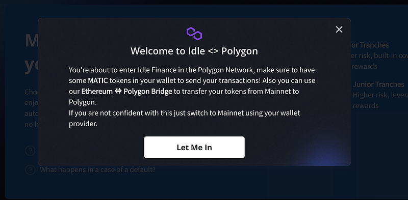
I wrote in volume six, “As the number of EVMs continues to grow, users are confronted by increasingly long and bewildering lists of networks… If you connect to a multi chain app, wouldn’t it be nice to know how Optimism differs from Fantom, or why you should care about Boba or Cronos?”
Multi-chain apps take it for granted that every user is a blockchain expert. It would be great if they had some basic info on what each network actually is, why you might want to use it, and a link to a bridge and an rpc. Idle Finance don’t quite do all of this, but they do sorta explain “hey, you’re on a new network here”.
3. Show safety/complexity in an easy way
ref. Vesper
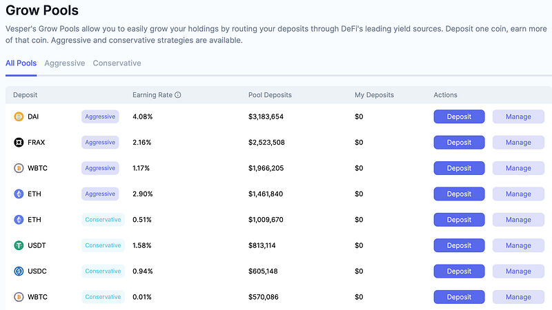
Vesper uses “conservative” and “aggressive” tags to describe each strategy. I think this is a really clear simple way to communicate risk.
I’ve seen some automators give scores out of ten, or describe the complexity as low/medium/high, but I quite like Vesper’s choice here.
4. Rethink modals and their placement
ref. Sushiswap
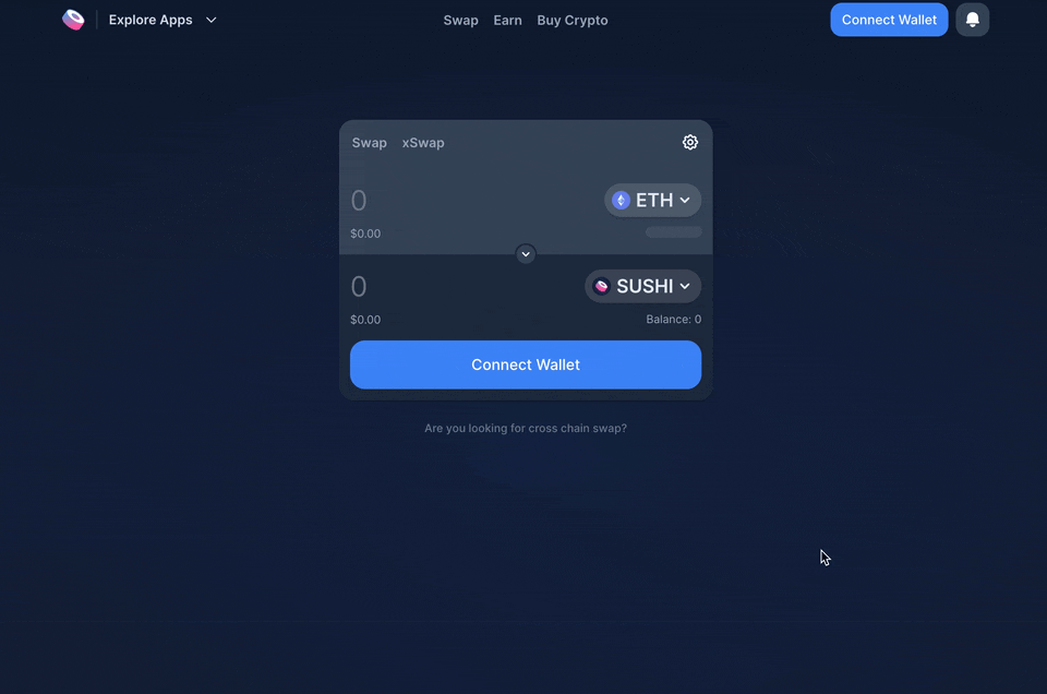
I sometimes think of web3 design as “peak modal”.
Modals are windows that pop up and usually disable/blur the rest of the screen, so that you have to concentrate fully on the window in focus.
DeFi apps use them for everything — connect, confirm, success, and error messages.
They work perfectly fine, but sometimes it’s like we just accepted this without ever asking if there could be a better option. Modals are quite aggressive. They’re literally used to disrupt the user’s flow when important info needs their full attention. They introduce friction by design.
Sushi’s new UI has a pattern I’ve not seen before. When you go to connect wallet, you get a subtle popup directly below where you clicked. It’s almost like a dropdown. It’s not very disruptive, and is very easy to mouse over and select the option you want. Cool to see them try something new.
👋 About Me
I am a product designer and UX consultant specialising in web3. I enjoy scaling and leading design teams, and helping web3 companies at all stages of their development.
If you’re after some more insights, you might want to check my competitive analysis on DEXes, my case study for a project I did with Element Finance, or my series on DeFi Design Tips.
Other volumes here: Vol. 1, Vol. 2, Vol. 3, Vol. 4, Vol. 5, Vol.6, Vol.7, Vol.8, Vol.9.
https://twitter.com/JonCrabb https://www.linkedin.com/in/jon-crabb/