
DeFi Design Tips Vol. 8 — How to Connect Wallets
A Connecting Wallets Special Edition
An ongoing series in which I record UX/UI improvements I have noticed in DeFi. This is my own competitive analysis, as I collect things I find interesting, useful, or delightful. As a DeFi designer myself, I want a bunch of ideas to test.
Read the others here: Vol. 1, Vol. 2, Vol. 3, Vol. 4, Vol. 5, Vol.6, Vol.7

If you want to try a decentralised application (dApp), the first thing you ever do is connect your wallet.
This is the thing that takes you from the relatively familiar world of Chrome and cookies to the strange land of Metamask and signatures. One minute you’re loading a webpage, the next minute you’re choosing from a panoply of wallets and authorising random transactions. It’s possible, nay probable, that you’ll also be confronted by an image of Pepe the frog and/or a unicorn. If you’re not already familiar with this world, you may feel lost before you even begin. As the poet wrote…
I, a stranger and afraid In a world I never made.
As this world is relatively new, there are no standards for entering it, and the connection flow usually caters for experienced users who want as much control as possible.
Here is an example of the connect screen from Zapper, with commentary from ChainLinkGod:
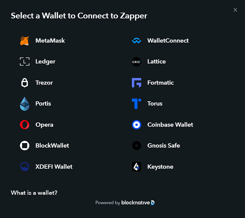
I mean just look at this wallet connect page, WTF is this, imagine you’re a completely new user, just thrown in the deep end “good luck”
1Inch is even worse, because they make you choose network first. They literally just add an extra step to confuse you:
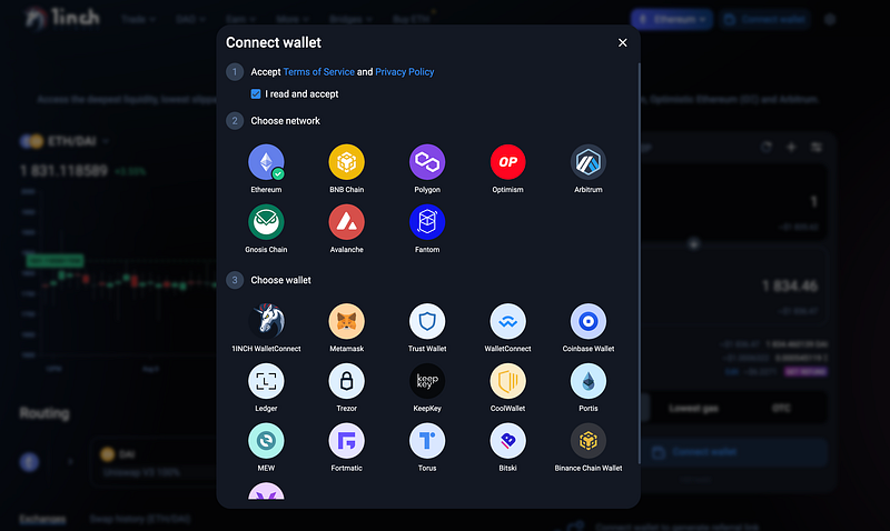
The curse of too many options
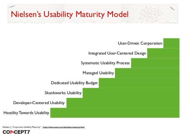
I like Nielsen’s Usability Maturity Model because it’s a good way of judging your project’s overall approach to UX. A lot of web3 apps are somewhere around the “developer-centred usability” step. The tendency is to give as much control as possible, even if that creates information overload for the less experienced. There’s nothing wrong with catering for the experts, but as the industry progresses, this flexibility should be in the form of hidden shortcuts, not overwhelming customisability.
I’ve been doing a lot of research on the connect flow recently and I’ve found a few different options for improving it. As with everything, this needs extensive user testing, but in the interest of open-sourcing my findings, this is what I’ve discovered so far.
This article is a bit different from my other tips because it’s less of a “do this, don’t do this” piece, and more of a “here’s the situation, and here are some things that might make it better” piece.
There are basically three types of Connect Wallet screen
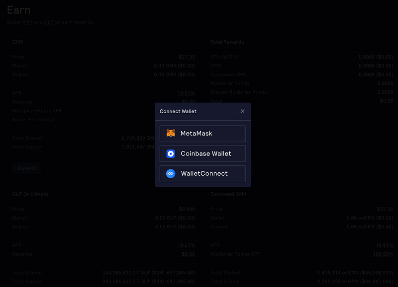
1. The “We did this as an afterthought, pick a wallet” option
You get a choice of a few wallets, and that’s it. No text, no links, no nothing. To be honest, I actually prefer this kind of minimalism if the alternative is Zapper. It looks a bit stark, but at least it’s easy to scan.
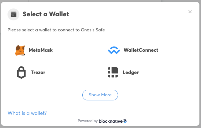
2. “Powered by Blocknative”, a bit of explanatory text
You see this one a lot. There’s usually a title, a choice of wallets with big icons, and a “what is a wallet?” link. Fine. Except some projects overdo it and add every single wallet they can think of.
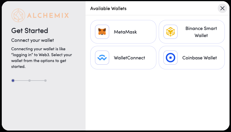
3. “Get Started” three-step process
This is becoming a bit more popular. Probably the best out the box option.
Now that we know the standards, here are some variations I’ve seen.
1. Moving MetaMask icon in the connect modal
ref. Gem

I like how playful this is. It’s not a huge leap forward for the UX, but the moving fox is fun.
2. Make “What is a Wallet” the primary focus
ref. Velodrome
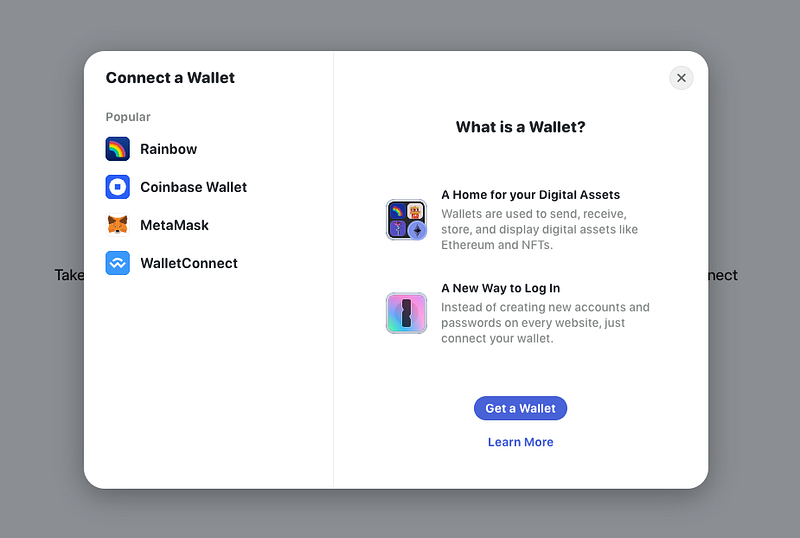
Rainbow Kit take the stepper modal and invert it, so that “What is a Wallet?” actually become the primary focus, and the wallet CTAs are relegated to the left-hand side.
Not convinced. I like the idea, but surely the wallets themselves should take priority? I don’t think this really helps you log in. It looks like “Get a Wallet” is the only CTA on the page.
3. Provide as much feedback as possible within the connect modal
ref. Enzyme
One of the biggest issues with web3 UX is the lack of feedback. I’ve watched users try DeFi apps and one of the first things you notice is people looking confused or concerned about whether anything is happening. Because most web3 interactions are actually transactions of some kind, there is often a short delay while they go through. The user should be reassured at every stage that something is happening.
Enzyme add some nice feedback to their connect flow that I’ve not seen anywhere else. There is a little micro-animation while you’re connecting, and you can also manage the connection from the same modal. So if you connect to the wrong network, you can do it there and then, instead of closing this screen and having a different one pop up.
4. Use chips/tags to highlight important info. Hide less popular options behind a show more button.
ref. OpenSea
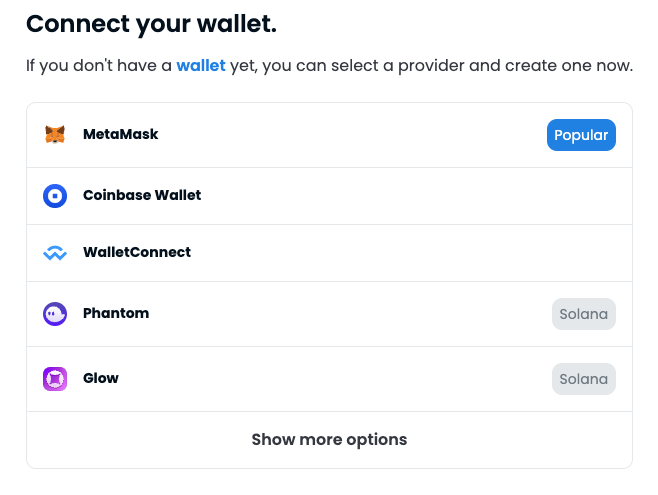
The list of wallets can potentially grow even longer if the app is multi-chain. OpenSea make nice use of chips to highlight the Solana options, and draw attention to the obvious choice Metamask. I don’t have the data but I’m guessing MetaMask is by far the most popular choice.
5. Use Tabs to organise multiple networks
ref. Rarible
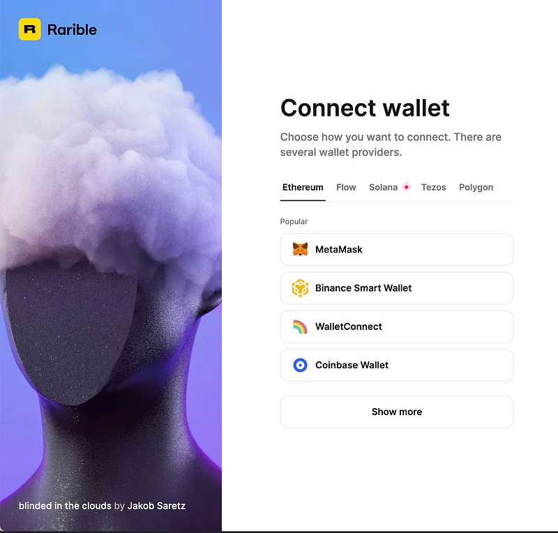
Rarible combines the ideas presented above with some simple tab navigation for the different networks.
This is a pretty nice interface. You get a small number of options (Miller’s Law), the top one is tagged “popular”, the rest are hidden behind a show more button. The other networks are kept behind tabs.
The other thing to notice on this is, is that it’s not actually a modal at all. This is integrated into the main page, and the image on the left changes periodically to show off different NFTs available on the platform. It’s a very well-integrated flow and probably one of the best that I’ve seen.
6. If all else fails: Keep it Simple!
ref. Lens Frens
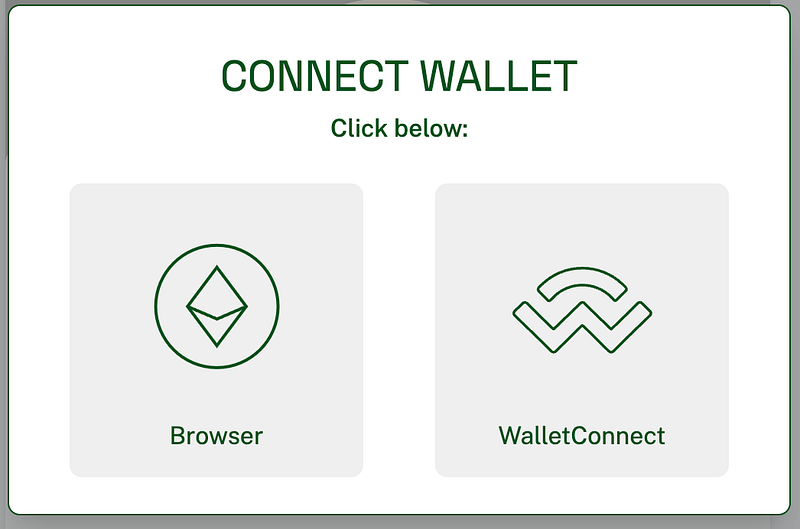
Maybe the ultimate option.
This gives you just two giant buttons. If you click browser it will load your browser’s default web3 wallet. If you click wallet connect, it will take you into the mobile connect flow and you can scan the QR code, or open the link in your mobile wallet of choice.
This is a very elegant solution to the wall of icons you normally see.
It’s simple, the UI is on-brand, the buttons are big and clickable.
Do you really need anything else?
BONUS: I have early access to DALL•E 2, so here are some other images I generated to illustrate this article:


👋 About Me
I am a product designer and UX consultant specialising in web3. I enjoy scaling and leading design teams, and helping web3 companies at all stages of their development.
If you’re after some more insights, you might want to check my competitive analysis on DEXes, my case study for a project I did with Element Finance, or my series on DeFi Design Tips.
https://twitter.com/JonCrabb https://www.linkedin.com/in/jon-crabb/