avatarRenee LIN

Free AI web copilot to create summaries, insights and extended knowledge, download it at here

2265

Abstract

rst person to do so. Check this short BBC video: <a href="https://www.youtube.com/watch?v=jbkSRLYSojo">Hans Rosling’s 200 Countries, 200 Years, 4 Minutes — The Joy of Stats</a> or a longer TED talk here: <a href="youtube.com/watch?v=hVimVzgtD6w">The best stats you’ve ever seen.</a></p><figure id="ddbd"><img src="https://cdn-images-1.readmedium.com/v2/resize:fit:800/0*XplsR4PVKWZWbFAU.gif"><figcaption><a href="https://www.analyticsvidhya.com/blog/2017/07/beginner-guide-build-data-visualisations-web-d3-js/">https://www.analyticsvidhya.com/blog/2017/07/beginner-guide-build-data-visualisations-web-d3-js/</a></figcaption></figure><p id="f5b2"><b>(3) Map for spacial dimension</b></p><p id="a1f8">Have to mention <a href="https://www.ph.ucla.edu/epi/snow/mapsbroadstreet.html">John Snow’s visualization</a> of the 1854 cholera outbreak in England. He is viewed by many as a pioneer in disease mapping. And thanks to Google Maps we are so familiar with this kind of visuals now.</p><figure id="8aa0"><img src="https://cdn-images-1.readmedium.com/v2/resize:fit:800/1*Ap0GqVWVFvQ1JGe3hi0iEw.png"><figcaption><a href="https://www.ph.ucla.edu/epi/snow/mapsbroadstreet.html">https://www.ph.ucla.edu/epi/snow/mapsbroadstreet.html</a></figcaption></figure><p id="c485"><b>(4) 3D graphs for an extra dimension</b></p><p id="5d6b">I love how React and MapBox can be used to create 3D webpages much easier. Check <a href="https://deck.gl/showcase">this page</a> for the showcases.</p><figure id="f4c2"><img src="https://cdn-images-1.readmedium.com/v2/resize:fit:800/1*zQ_s3F-sNUNa1lrwnO-3qw.png"><figcaption><a href="https://fairinternetreport.com/research/internet-speed-map-single-day">https://fairinternetreport.com/research/internet-speed-map-single-day</a></figcaption></figure><figure id="4110"><img src="https://cdn-images-1.readmedium.com/v2/resize:fit:800/1*rcA6z2muepPdFg7v00E5Cw.png"><figcaption><a href="https://avs.auto/demo/index.html">https://avs.auto/demo/index.html</a></figcaption></figure><h1 id="a902">2. Analysing and compressing before bringing out the visuals</h1><p id="ed59">We can’t visualize everything, otherwise it won’t help. It’s crucial to pick the most meaningful dimensions for visualization, which is where data analysis comes into play. Th

Options

rough careful analysis, we can sift through the myriad dimensions and select those that truly matter for our visualization. This topic alone is worth many posts, which is what <a href="https://medium.com/pathway-to-data-analysis">this Medium channel</a> trying to do.</p><h1 id="e60e">3. Aesthetics matters</h1><p id="a58a">Aesthetics is key in data visualization, much like in web design where such elements are heavily valued. Data visualization borrows these elements generously. I have written a series of posts on beautifying PowerBI reports, which consider below elements like this one: <a href="https://readmedium.com/beautify-the-powerbi-reports-layout-and-navigation-9940bf15f2c6">Beautify the PowerBI Reports — Layout and Navigation</a></p><ul><li><b>The layout, spacing</b></li></ul><p id="aceb">The layout, which encompasses how elements are arranged and spaced, sets the stage for how easily the data can be digested. Spacing, by ensuring that elements are neither too cramped nor too scattered, maintains a visual balance that’s inviting to the eye.</p><ul><li><b>Colour and contrast</b></li></ul><p id="fb87">Colour is more than just a decorative element; it can be used to differentiate categories, indicate quantities, or highlight specific data points. Contrast, on the other hand, ensures that the visuals are clear and discernible, preventing any strain on the eyes.</p><ul><li><b>The font, size, shape</b></li></ul><p id="9ed0">The choice of font, its size, and shape also contribute significantly to the readability and overall appeal of the visualization.</p><p id="0187">Every aesthetic element, from the colours to the fonts, works in harmony to create a visual that’s not only pleasing to the eye but also effectively communicates the complexity of the data intuitively. When a pretty visual meets solid analysis and tells a clear idea, that’s when you’ve got the magic mix of science and art.</p><p id="531c">If you found this post helpful, please consider clapping for it or following <a href="https://medium.com/pathway-to-data-analysis">this publication</a>. Your support could help it grow, attract more contributors, and foster a rich dialogue on data analysis topics. Thank you for your appreciation and support.</p></article></body>

Data Visualization: The Art of Expressing Multi-Dimensional Relationships

Data visualization has been around for a while, popping up in maps way back before 1644. It’s all about seeing different sides of the same story at a single glance. The trick is to show how these different sides relate to each other, which gets tricky when you try to cram a bunch of dimensions into a 2D space. Putting more than three dimensions on one graph is tough, but there’s a workaround like having another graph next to it to tell the story together. But here’s a head-scratcher: we humans start to get lost when there are more than four dimensions to analyze at once. So, the visuals have got to hit the sweet spot — being meaningful (with related dimensions) and not overpacked. A neat, focused, and eye-pleasing graph can say a lot more than a bunch of words thrown together. I’d like to share my thoughts about:

  1. Incorporating more dimensions within a 2D space
  2. Analysing and compressing before bringing out the visuals
  3. Aesthetics matters

1. Incorporating more dimensions

(1) Utilising colours, sizes, shapes

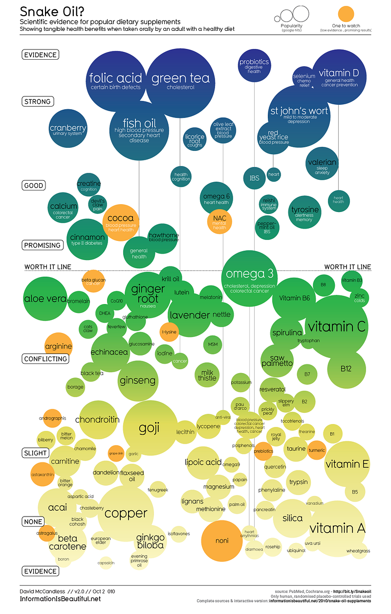
Check this graph created by David McCandless far back in 2010. It shows scientific evidence for popular nutritional supplements. In this graph, the y-axis stands for levels of evidence, colours reflect evidence as well as identify special data points, and size tells popularity.

His TED talk — The beauty of data visualization is also worth watching.

https://informationisbeautiful.net/visualizations/snake-oil-scientific-evidence-for-nutritional-supplements-vizsweet/

(2) Using animation to include the time dimension

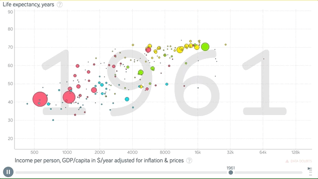
Using the movements to present the time dimension is common nowadays. It enables another dimension. I believe Hans Rosling is the first person to do so. Check this short BBC video: Hans Rosling’s 200 Countries, 200 Years, 4 Minutes — The Joy of Stats or a longer TED talk here: The best stats you’ve ever seen.

https://www.analyticsvidhya.com/blog/2017/07/beginner-guide-build-data-visualisations-web-d3-js/

(3) Map for spacial dimension

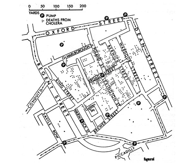
Have to mention John Snow’s visualization of the 1854 cholera outbreak in England. He is viewed by many as a pioneer in disease mapping. And thanks to Google Maps we are so familiar with this kind of visuals now.

https://www.ph.ucla.edu/epi/snow/mapsbroadstreet.html

(4) 3D graphs for an extra dimension

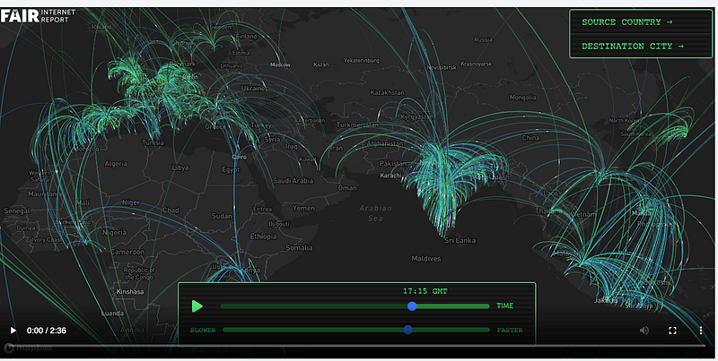
I love how React and MapBox can be used to create 3D webpages much easier. Check this page for the showcases.

https://fairinternetreport.com/research/internet-speed-map-single-day
https://avs.auto/demo/index.html

2. Analysing and compressing before bringing out the visuals

We can’t visualize everything, otherwise it won’t help. It’s crucial to pick the most meaningful dimensions for visualization, which is where data analysis comes into play. Through careful analysis, we can sift through the myriad dimensions and select those that truly matter for our visualization. This topic alone is worth many posts, which is what this Medium channel trying to do.

3. Aesthetics matters

Aesthetics is key in data visualization, much like in web design where such elements are heavily valued. Data visualization borrows these elements generously. I have written a series of posts on beautifying PowerBI reports, which consider below elements like this one: Beautify the PowerBI Reports — Layout and Navigation

  • The layout, spacing

The layout, which encompasses how elements are arranged and spaced, sets the stage for how easily the data can be digested. Spacing, by ensuring that elements are neither too cramped nor too scattered, maintains a visual balance that’s inviting to the eye.

  • Colour and contrast

Colour is more than just a decorative element; it can be used to differentiate categories, indicate quantities, or highlight specific data points. Contrast, on the other hand, ensures that the visuals are clear and discernible, preventing any strain on the eyes.

  • The font, size, shape

The choice of font, its size, and shape also contribute significantly to the readability and overall appeal of the visualization.

Every aesthetic element, from the colours to the fonts, works in harmony to create a visual that’s not only pleasing to the eye but also effectively communicates the complexity of the data intuitively. When a pretty visual meets solid analysis and tells a clear idea, that’s when you’ve got the magic mix of science and art.

If you found this post helpful, please consider clapping for it or following this publication. Your support could help it grow, attract more contributors, and foster a rich dialogue on data analysis topics. Thank you for your appreciation and support.

Data Visualization
Data Analysis
Data Science
Graphic Design
Visualization
Recommended from ReadMedium