Free AI web copilot to create summaries, insights and extended knowledge, download it at here
2707
Abstract
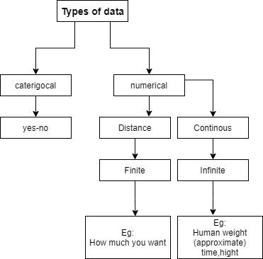
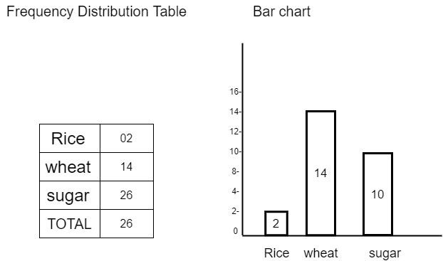
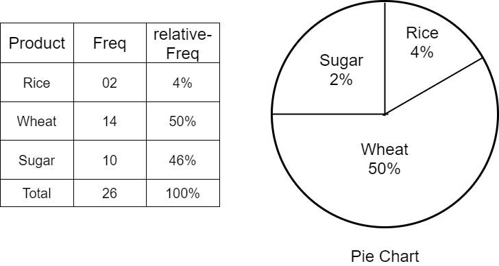
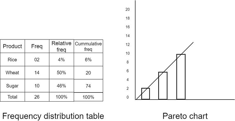
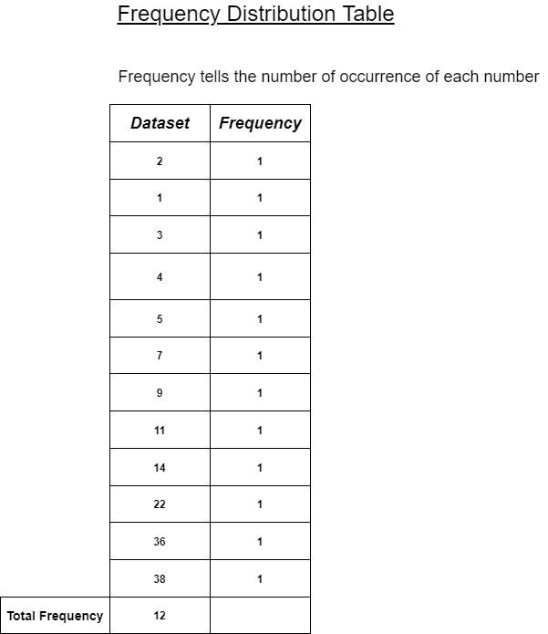
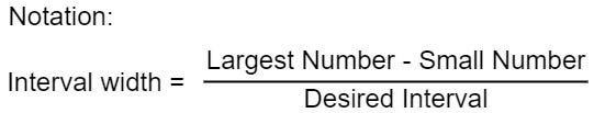
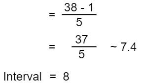
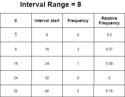
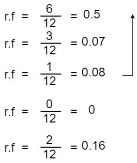
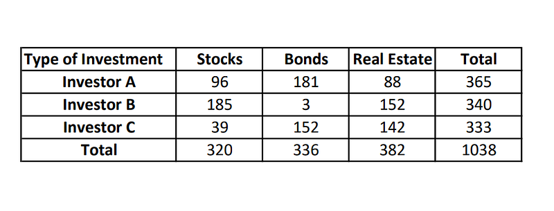
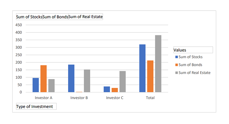
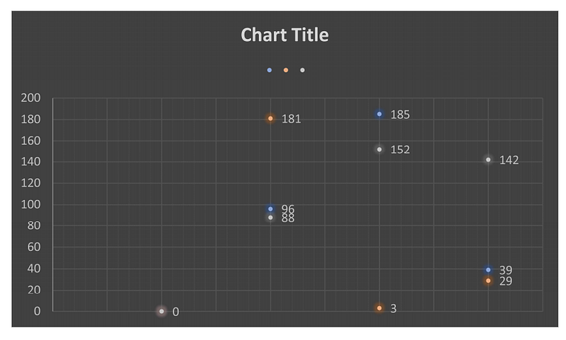
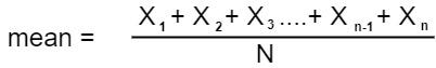
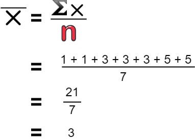
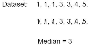
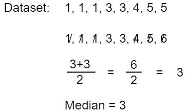
desired intervals.</p><figure id="e9a8"><img src="https://cdn-images-1.readmedium.com/v2/resize:fit:800/1*IO0pZtzVIyqqTgiklWVu2Q.jpeg"><figcaption></figcaption></figure><p id="e564">In my case, the largest number from the dataset is 38 and the smallest number from my dataset is 1</p><figure id="5c00"><img src="https://cdn-images-1.readmedium.com/v2/resize:fit:800/1*0xNMO7gMuKDZg-LYDNiWPA.jpeg"><figcaption></figcaption></figure><p id="b8ae">By subtracting the largest number and the smallest number I got 37 and dividing by the number of the desired intervals I got 7.4 which will be taken as 8</p><ul><li>Relative Frequency can be calculated by</li></ul><figure id="c107"><img src="https://cdn-images-1.readmedium.com/v2/resize:fit:800/1*BDlIhHXUfB2_6R3GuPf5xA.jpeg"><figcaption></figcaption></figure><figure id="db6a"><img src="https://cdn-images-1.readmedium.com/v2/resize:fit:800/1*2zXBHIbCJNFqFvv8pPh9PQ.jpeg"><figcaption></figcaption></figure><figure id="f229"><img src="https://cdn-images-1.readmedium.com/v2/resize:fit:800/1*jieCpY9lGm4tg12Vo_KaqA.jpeg"><figcaption></figcaption></figure><h2 id="1e27">Categorical Variables Visualization:</h2><p id="85d6">The visualization of the categorical variables follows</p><ol><li><b>Cross Tables</b></li><li><b>Scatter plots</b></li></ol><h2 id="76fe">Cross Tables :</h2><p id="6ea1">This table uses a side-by-side bar chart.</p><figure id="fac9"><img src="https://cdn-images-1.readmedium.com/v2/resize:fit:800/1*g1QtE9XPnuxveKv9Uo-q-w.png"><figcaption></figcaption></figure><figure id="30fa"><img src="https://cdn-images-1.readmedium.com/v2/resize:fit:800/1*gYZ6iIs407in_bgoRkozqg.jpeg"><figcaption></figcaption></figure><h2 id="180a">Scatter plots:</h2><p id="0749">mostly the visualization of the scatter plots is widely used to represent two numerical variables.</p><figure id="8375"><img src="https://cdn-images-1.readmedium.com/v2/resize:fit:800/1*E8djFVlKy4auSnD2vCJ7BA.png"><figcaption></figcaption></figure><h2 id="4649">Measures Of Central Tendency :</h2><ol><li>Mean</li><li>Median</li><li>Mode</li></ol><p id="3a42"><b>Mean:- </b>It is used to calculate an average value which is denoted by <b>μ</b> for the population mean and <b>x̄ (x bar) </b>for the sample mean.</p><figure id="f80a"><img src="https://cdn-images-1.readmedium.com/v2/resize:fit:800/1*mg4xYRrDDVd0GfWPv2pZcg.jpeg"><figcaption></figcaption></figure><ul><li>Adding all components and dividing by the number of components.</li></ul><p id="74a5"><b>Dataset:</b> 1, 1, 1, 3, 3, 3, 5, 5</p><figure id="8a7f"><img src="https://cdn-images-1.readmedium.com/v2/resize:fit:800/1*vcgyTLe_PKQ8_1nQQUSAMg.jpeg"><figcaption></figcaption></figure><p id="9c4f"><b>Median:-</b>To find the m
Options
ean arrange all the values in order and find the middle value.</p><figure id="f2a1"><img src="https://cdn-images-1.readmedium.com/v2/resize:fit:800/1*cGAIBLSDiIRP-5Nmfd5kUg.jpeg"><figcaption></figcaption></figure><p id="64f5"><b>When median has two values?</b></p><p id="01fa">To find median for two value</p><figure id="5434"><img src="https://cdn-images-1.readmedium.com/v2/resize:fit:800/1*0xzemrenHrBhl_POz8YKag.jpeg"><figcaption></figcaption></figure><p id="bd6e"><b>Mode:- </b>mode is defined as “most frequently occurring value” or <i>counting the</i> <i>most repeated value</i>. In other words,<b> </b>we can easily find out the mode value by a value that has multiple occurrences.</p><ul><li>Example:- Dataset: <b>4</b>, 1, 5, 2, 1, 2, <b>4, 4</b>, 5, 5, <b>4</b></li><li>From the above dataset, 4 is the mode because it occurs frequently.</li></ul><p id="518e"><b><i>Bi-modal</i>: </b>If the mode has two mode values.</p><p id="d3f2"><b><i>Multi-modal: </i></b>multi-modal occurs when the dataset contains more than one mode is called multi-modal. It is the same as bi-modal.</p><ul><li>Dataset: <b>4, 4, 4, 4</b>, 3, 2, 6, <i>5, 5,</i> 8, <i>5,</i> 7, <b>4,</b> <i>5, 5</i></li><li>From the above, we have two repeated values so it refers to multimodal.</li></ul><div id="31ee"><pre><span class="hljs-attribute">Thank you</span></pre></div><h2 id="cd14">Read more articles:</h2><div id="84aa" class="link-block">
<a href="https://saran-23.medium.com/day-7-concept-of-combinatorics-you-need-to-know-for-data-science-23e517d44053">
<div>
<div>
<h2>How Combinatorics used in data science</h2>
<div><h3>Read about the basics of Combinatorics for free in just 3 minutes</h3></div>
<div><p>saran-23.medium.com</p></div>
</div>
<div>
<div style="background-image: url(https://miro.readmedium.com/v2/resize:fit:320/1*0KhRSNaC-8vPLLf1ZecRxA.png)"></div>
</div>
</div>
</a>
</div><div id="f157" class="link-block">
<a href="https://saran-23.medium.com/day-5-concept-of-machine-learning-in-data-science-7e58378fbf90">
<div>
<div>
<h2>The Concept of Machine learning in data science</h2>
<div><h3>read about machine learning for free in just 3 minutes</h3></div>
<div><p>saran-23.medium.com</p></div>
</div>
<div>
<div style="background-image: url(https://miro.readmedium.com/v2/resize:fit:320/0*62rSHF3QKuWrVCBu)"></div>
</div>
</div>
</a>
</div></article></body>