
Creating a Sales by Product Segment KPI with a Donut chart in Power BI
Creating a Sales by Product Segment KPI with a Donut Chart in Power BI is a powerful way to visualize and track the performance of different product segments within your business. This KPI can help you quickly identify which segments are performing well and which need attention. In this article, we’ll guide you through the process of setting up this KPI in Power BI, using a donut chart to make your data pop.
Why a Donut Chart for KPIs?
- Visual Appeal: Donut charts offer a clean and simple way to display data, making it easy to understand at a glance.
- Comparison: They allow for easy comparison between different segments, helping you spot trends and outliers quickly.
- Customization: Power BI’s flexibility lets you customize your donut chart to match your specific needs and preferences.
What You’ll Learn:
- Data Preparation: How to organize and format your data for optimal use in Power BI.
- Creating the KPI: Step-by-step instructions on setting up a Sales by Product Segment KPI.
- Designing the Donut Chart: Tips and tricks for creating a visually appealing and informative donut chart.
- Analyzing Results: How to interpret the KPI and use the insights to drive business decisions.
By the end of this guide, you’ll have a stunning donut chart in Power BI that effectively communicates the performance of your product segments.
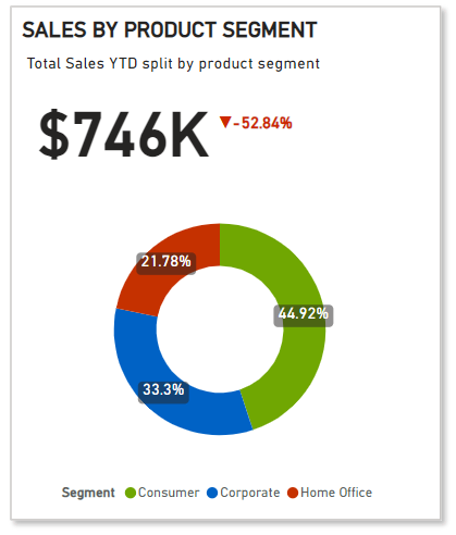
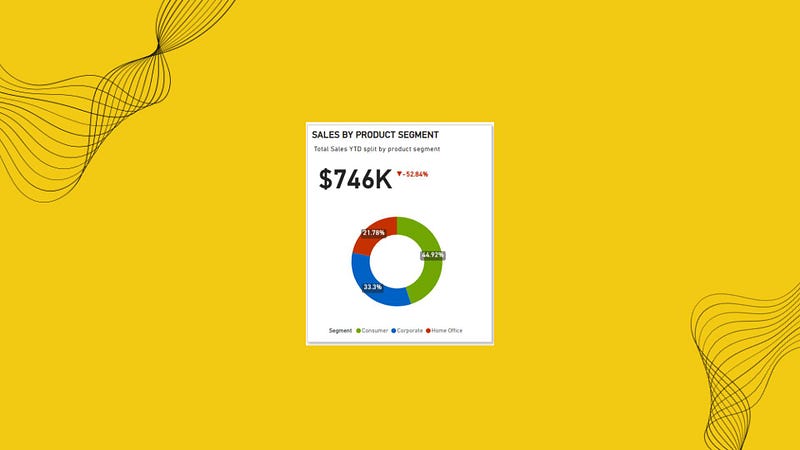
This is how our end result is going to look like:
Building the KPI
We will go through these steps:
- Creating the DAX Functions
- Creating the Base for the KPI
- Creating the Text Boxes
- Creating the YTD Sales KPI card
- Adding Donut Chart to the KPI
- Creating the YoY Sales Percentage trend indicator
Happy learning!
Creating the DAX Functions:
YTD Sales KPI = TOTALYTD(SUM(Table1[Sales]), Table1[Order Date])
The DAX formula calculates the Year-to-Date (YTD) profit for the Table1 dataset. It calculates the cumulative profit from the beginning of the year to the current date based on the Table1[Order Date] column.
PYTD Sales KPI = CALCULATE(SUM(Table1[Sales]), SAMEPERIODLASTYEAR(Table1[Order Date]))
CALCULATE
The CALCULATE function evaluates an expression in a modified filter context. Essentially, it allows you to change the context in which data is evaluated.
Syntax:
CALCULATE(<expression>, <filter1>, <filter2>, ...)SAMEPERIODLASTYEAR
The SAMEPERIODLASTYEAR function is a time intelligence function that returns a table with the same period in the previous year. It’s useful for year-over-year comparisons.
Syntax:
SAMEPERIODLASTYEAR(<dates>)YoY Sales KPI = ([YTD Sales KPI] — [PYTD Sales KPI])/[PYTD Sales KPI]

Sales Colour KPI = IF([YoY Sales KPI]>0,”Green”,”Red”)

It assigns Sales Colour KPI Green or Red depending on the value of YoY Sales KPI greater or less than zero respectively.
Sales Indicator PP KPI = var positive_icon = “▲”
var negative_icon = “▼”
var result = IF([YoY Sales KPI]>0, positive_icon, negative_icon)
return result

This DAX formula creates a KPI indicator based on the Year-over-Year (YoY) Sales KPI value:
Variables:
positive_icon= "▲"negative_icon= "▼"
Logic:
- If
[YoY Sales KPI]> 0, usepositive_icon. - Otherwise, use
negative_icon.
Return:
- The appropriate icon (▲ or ▼) based on the sales KPI.
All these are basic DAX functions which is always good to know, refer the below article to understand them, it’s under 3 min read.
Creating the Base for the KPI:
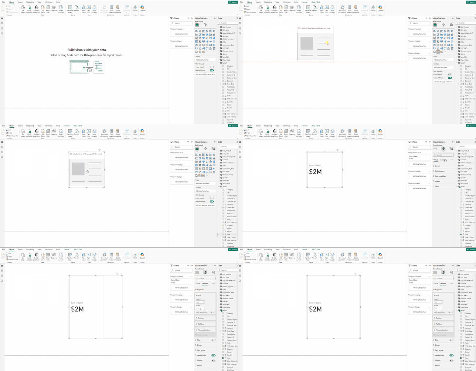
- Add a Card(new) visual and put Sales in it.
- In the Format visual → General →Properties set Height to 494 and Width to 419.
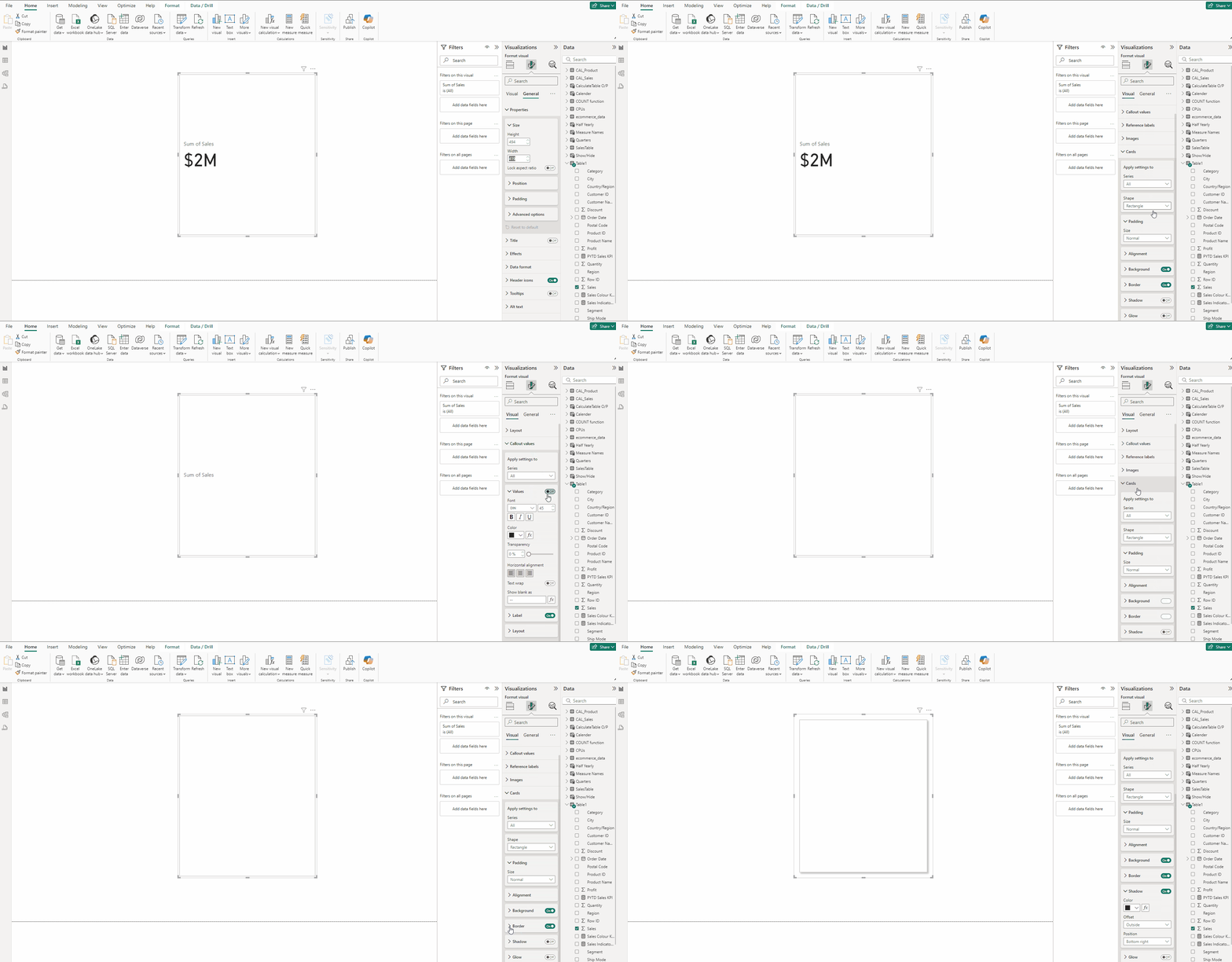
- In Format visual →Visual →Callout values and turn off Values and Label.
- In Cards turn on Shadow.
Creating the Text Boxes:
- In the Insert tab select Text box.
- Type SALES BY PRODUCT SEGMENT.
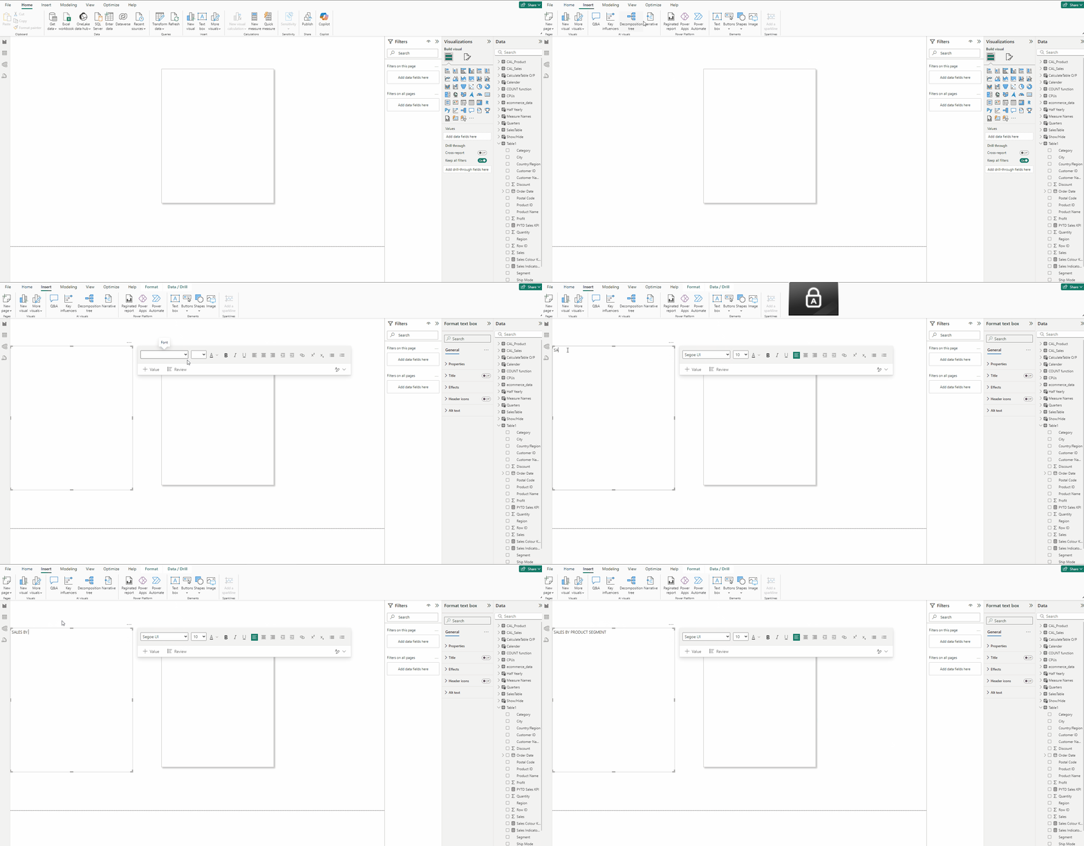
- Set Font to DIN and size 16 and Bold the font.
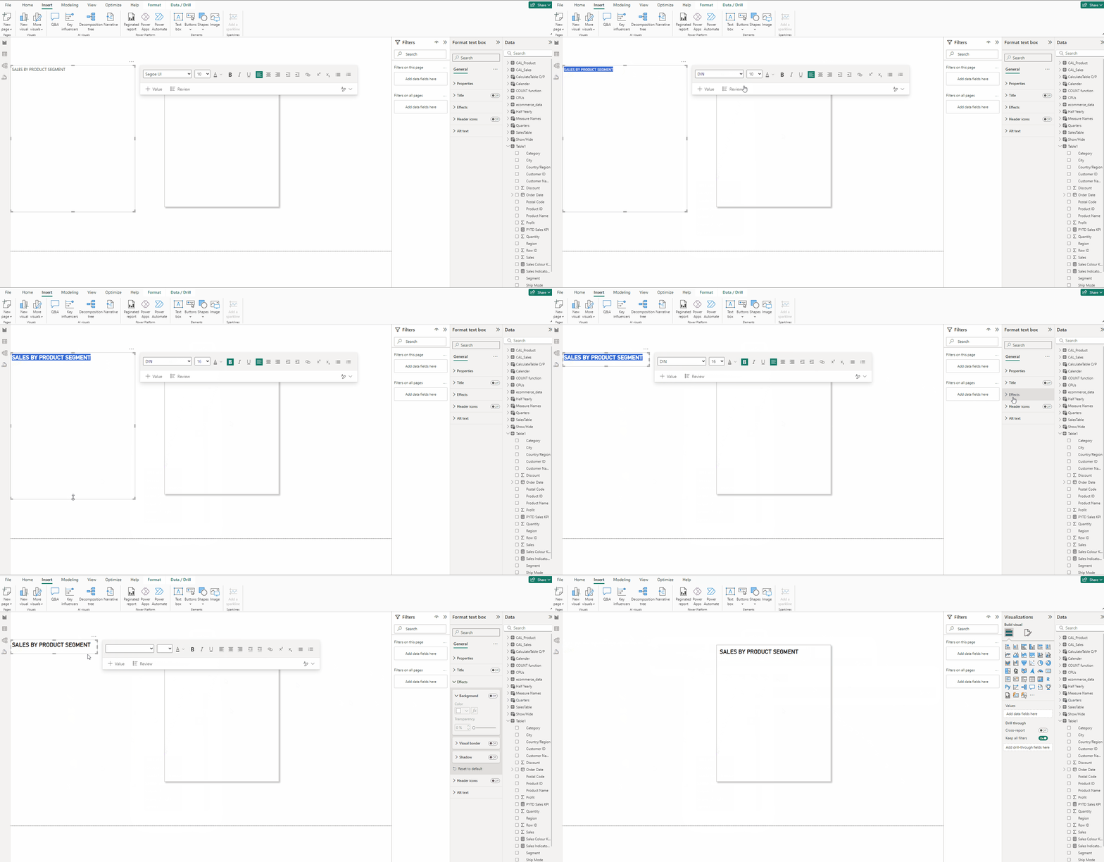
- In the Format visual → General →Effects turn off Background.
- Place it on top of the KPI Base created in the previous step.
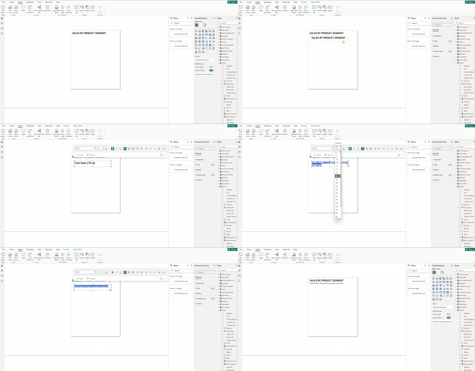
- Copy the SALES YTD text box
- Type “Total Sales YTD split by product segment” and set size to 12.
- Remove the Bold the font setting and place the box below the previous text box.
Creating the YTD Sales KPI card:
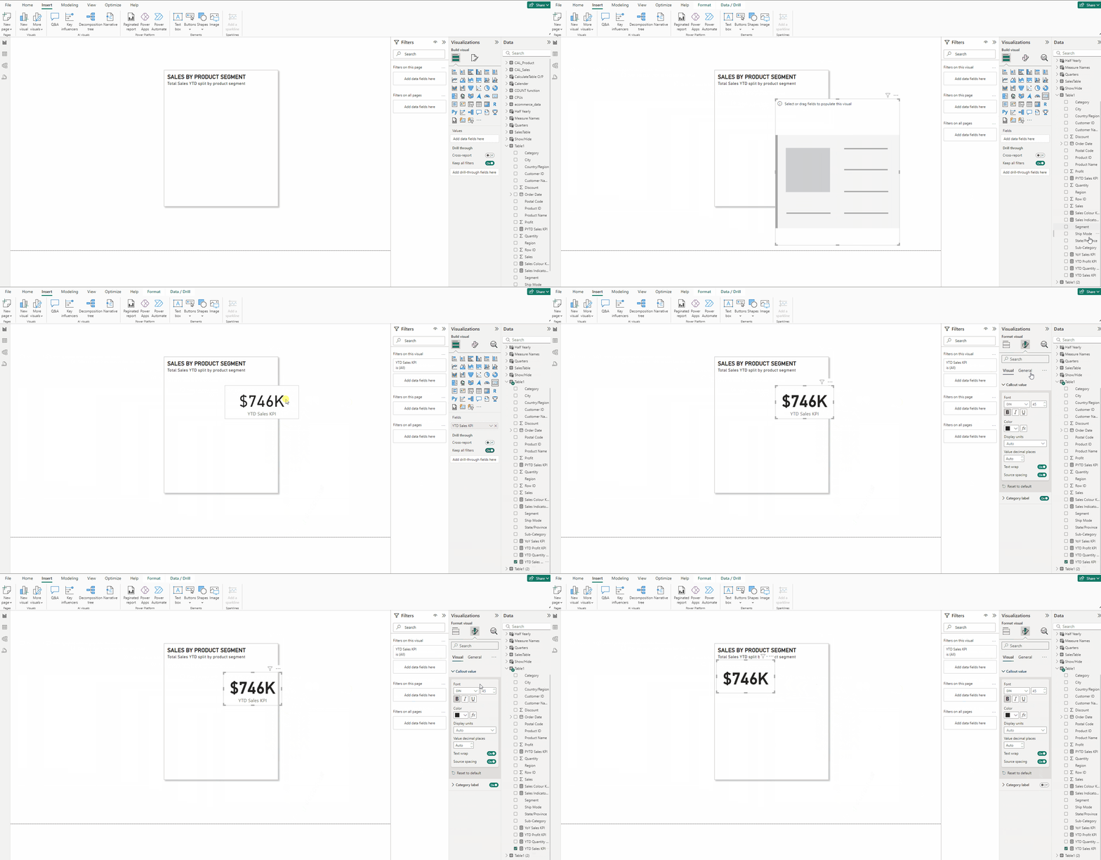
- Add a Card visual and put YTD Sales KPI to it.
- Set Font to DIN and Bold the font.
- In the Format visual → General →Effects turn off Background.
- Turn off Category label.
Adding Donut Chart to the KPI:
- Add a Donut chart and put Segment in Legend and YTD Sales KPI in Values.
- In the Format visual → General →Properties set Height to 301 and Width to 363.
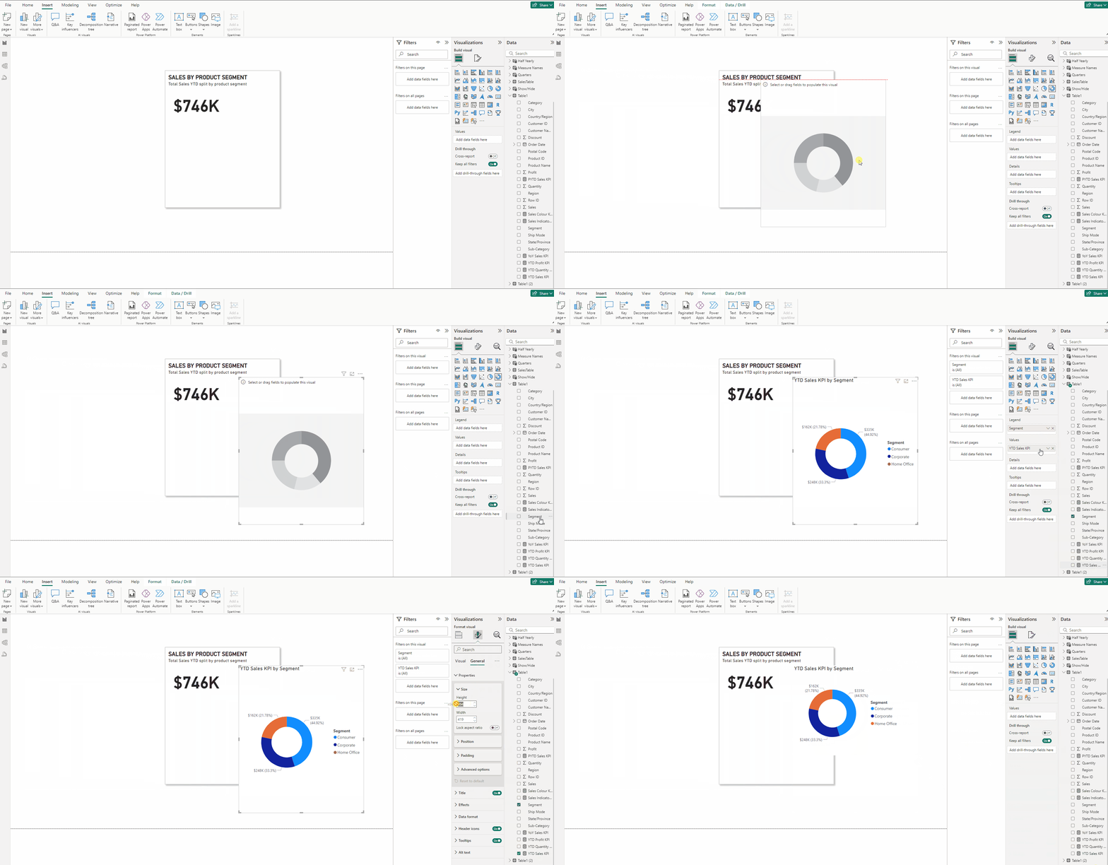
- Expand Legend and for Position set Bottom center.
- In Legend → Text set font to DIN.
- Expand Detail labels set Position to Inside and Label contents to Percent of total.
- In the Format visual → General →Effects turn off Background.
- In the Format visual → General turn off Title.
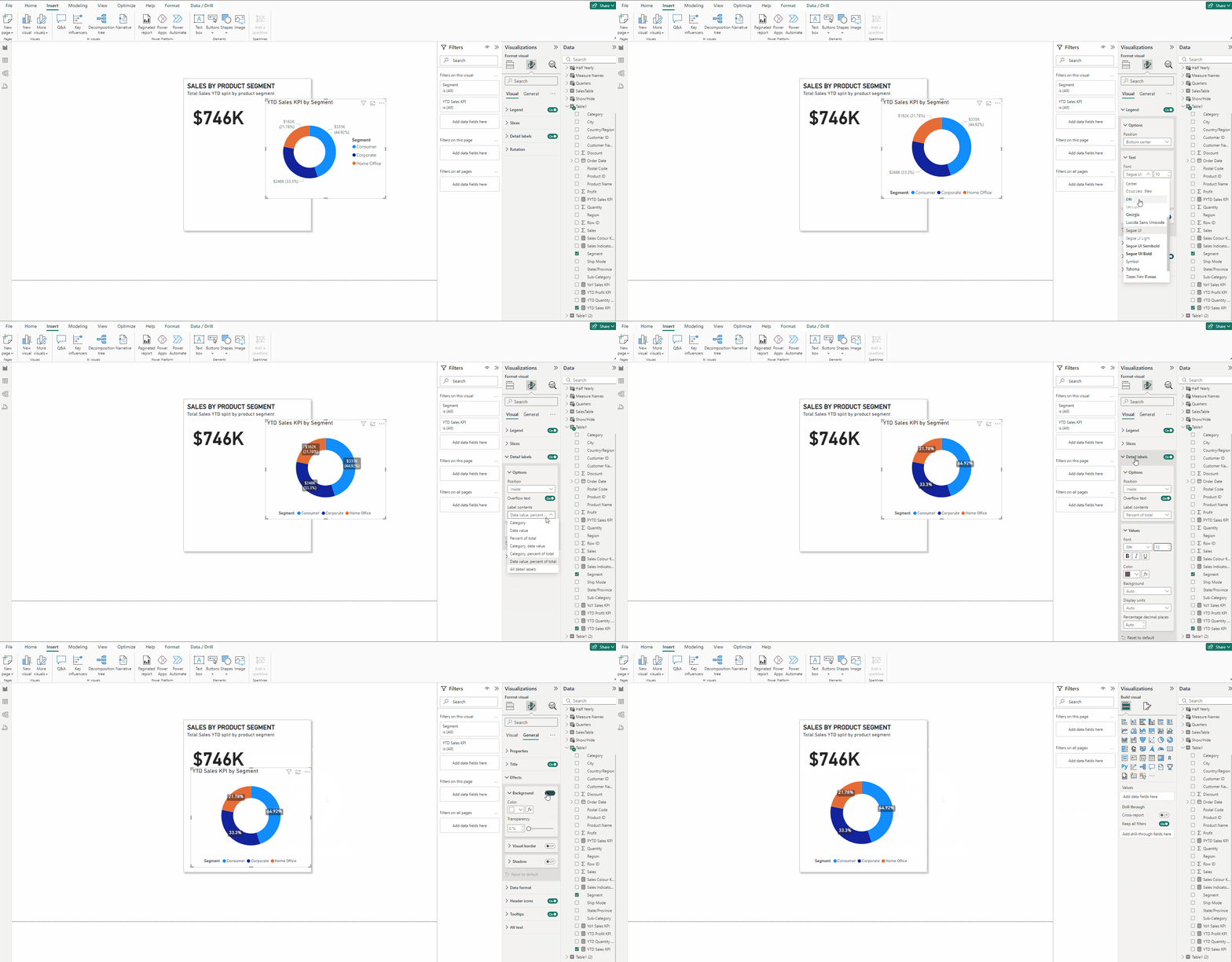
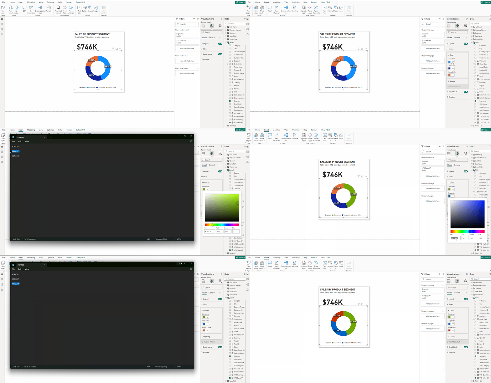
- Expand Slices and use the below color scheme:
Consumers: #70A702
Corporate: #0062C5
Home Office: #C53100
Creating the YoY Sales Percentage trend indicator:
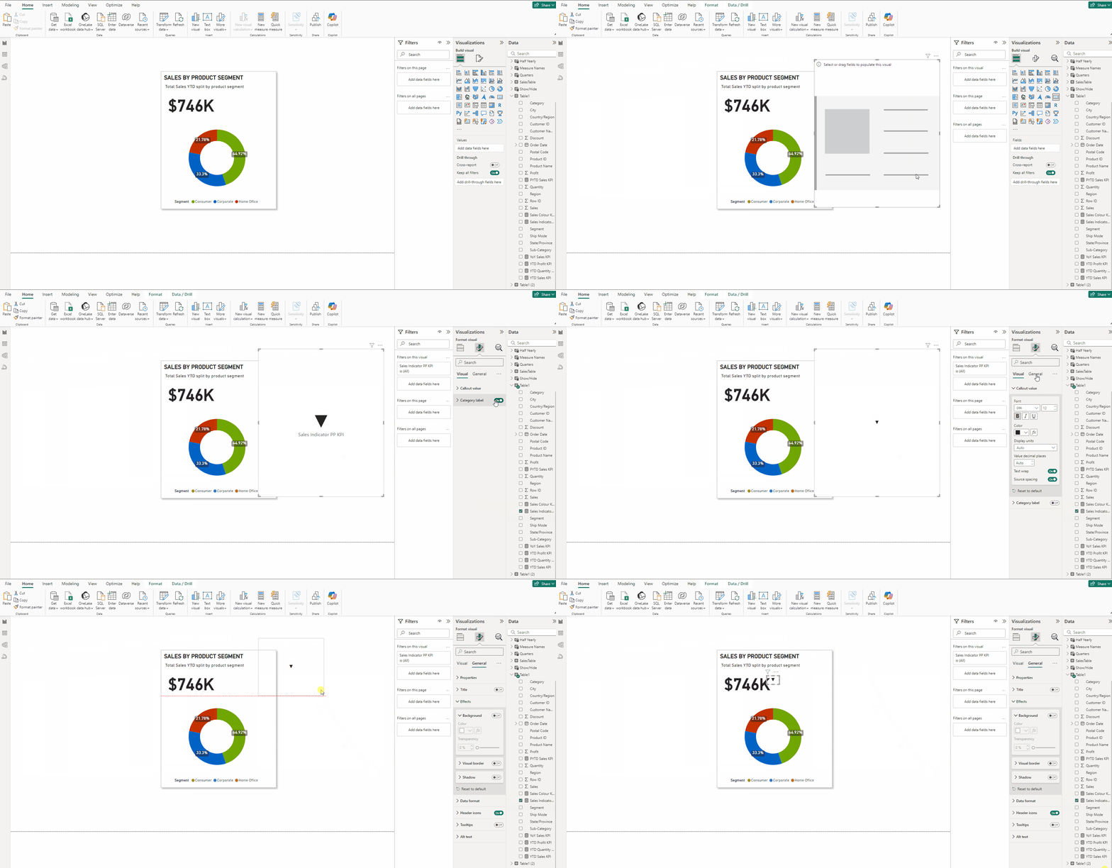
- Add a Card(new) visual and put Sales Indicator PP KPI in it.
- Turn off Category label.
- Set size to 12 and Bold the font.
- In the Format visual → General →Effects turn off Background.
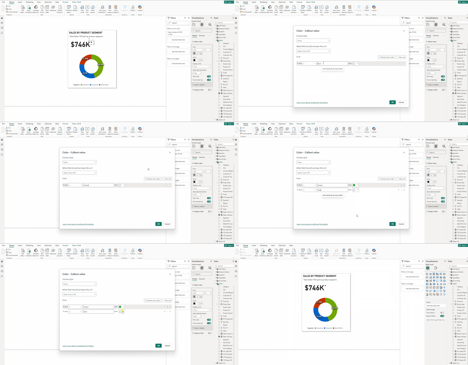
- In Format visual → Callout values in the Color section press fx.
- Keep Format Style → Rules and in field select Sales Colour KPI.
- Type Green select #01C521 for color and for Red select #CD2900, press OK.
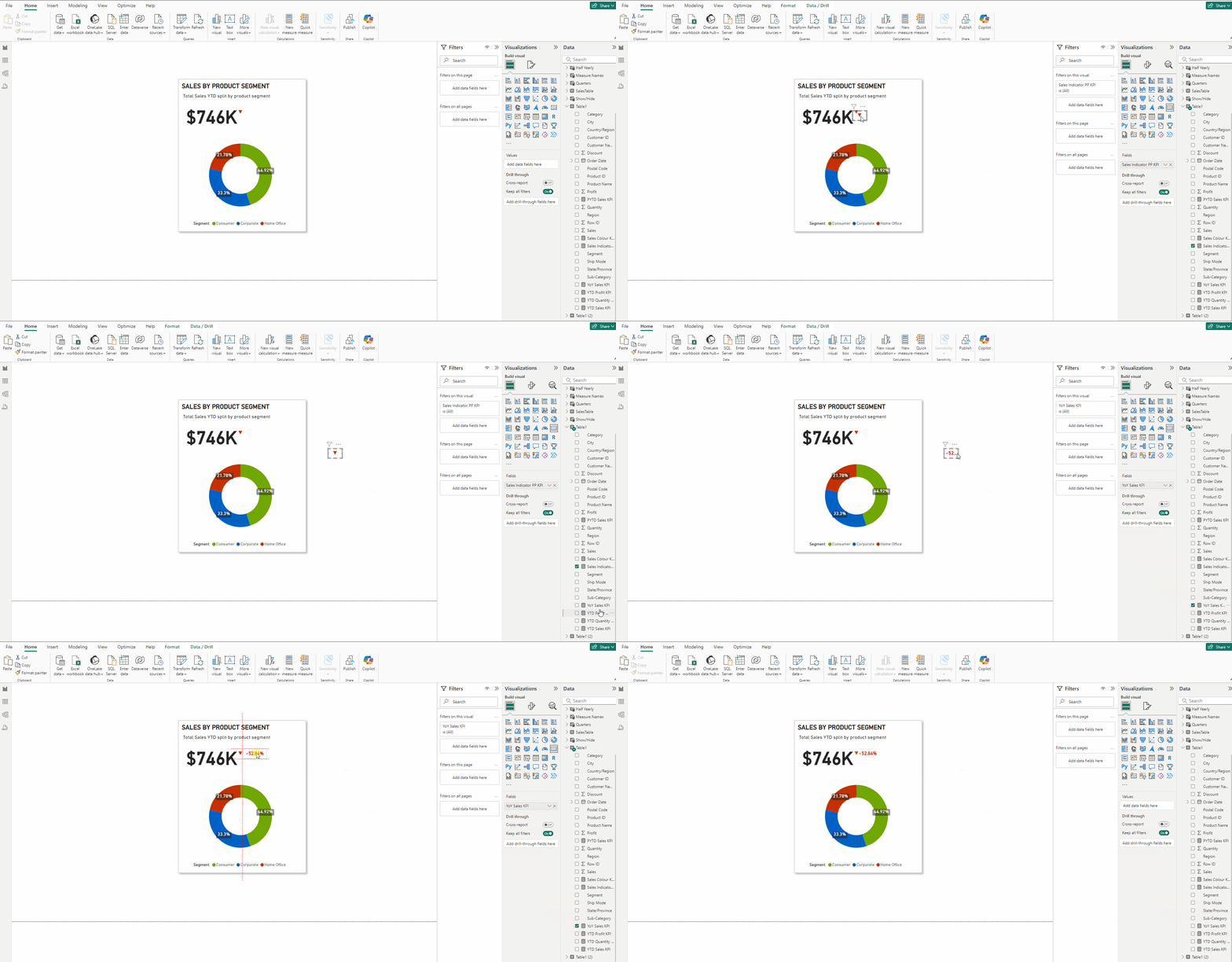
- Copy the Sales Indicator PP KPI card.
- Put YoY Sales KPI in it.
- Place it next to the sales indicator.
Check out this article to learn more about KPIs with “Conditional Formatting as we did above for YoY Sales”.
Finally we have our KPI.
Download the data for the KPI from this link.
Download the PBIX file from this link.
Thank you for your attention!
Follow me or subscribe to get all my Power BI articles!
Don’t forget to subscribe to
👉 Power BI Publication
👉 Power BI Newsletter
and join our Power BI community: