
Creating a Dashboard for a Quick Commerce Company from scratch in Power BI
In today’s fast-paced business environment, quick commerce companies need robust and dynamic tools to visualize their data effectively. Power BI, a powerful business intelligence tool, offers the perfect solution for creating interactive and insightful dashboards. This article will guide you through the process of building a comprehensive dashboard for a quick commerce company from scratch using Power BI.
Key Highlights:
Data Source Integration:
- Connect to various data sources such as Excel, CSV files, and cloud services like Azure.
Data Modeling:
- Establish relationships between different tables.
- Use DAX (Data Analysis Expressions) for creating custom calculations and measures.
Visualization Techniques:
- Create a variety of visualizations including charts, tables, and maps.
- Customize visuals to match the company’s branding and reporting needs.
Interactive Features:
- Implement slicers and filters to allow users to interact with the data.
Dashboard Design:
- Design an intuitive layout that highlights key performance indicators (KPIs).
- Ensure the dashboard is user-friendly and accessible on multiple devices.
By following these steps, you will be able to create a powerful and interactive dashboard that provides valuable insights and supports data-driven decision-making for your quick commerce company.
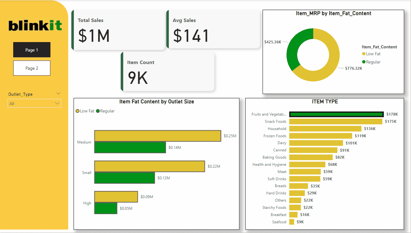
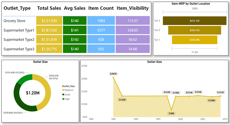
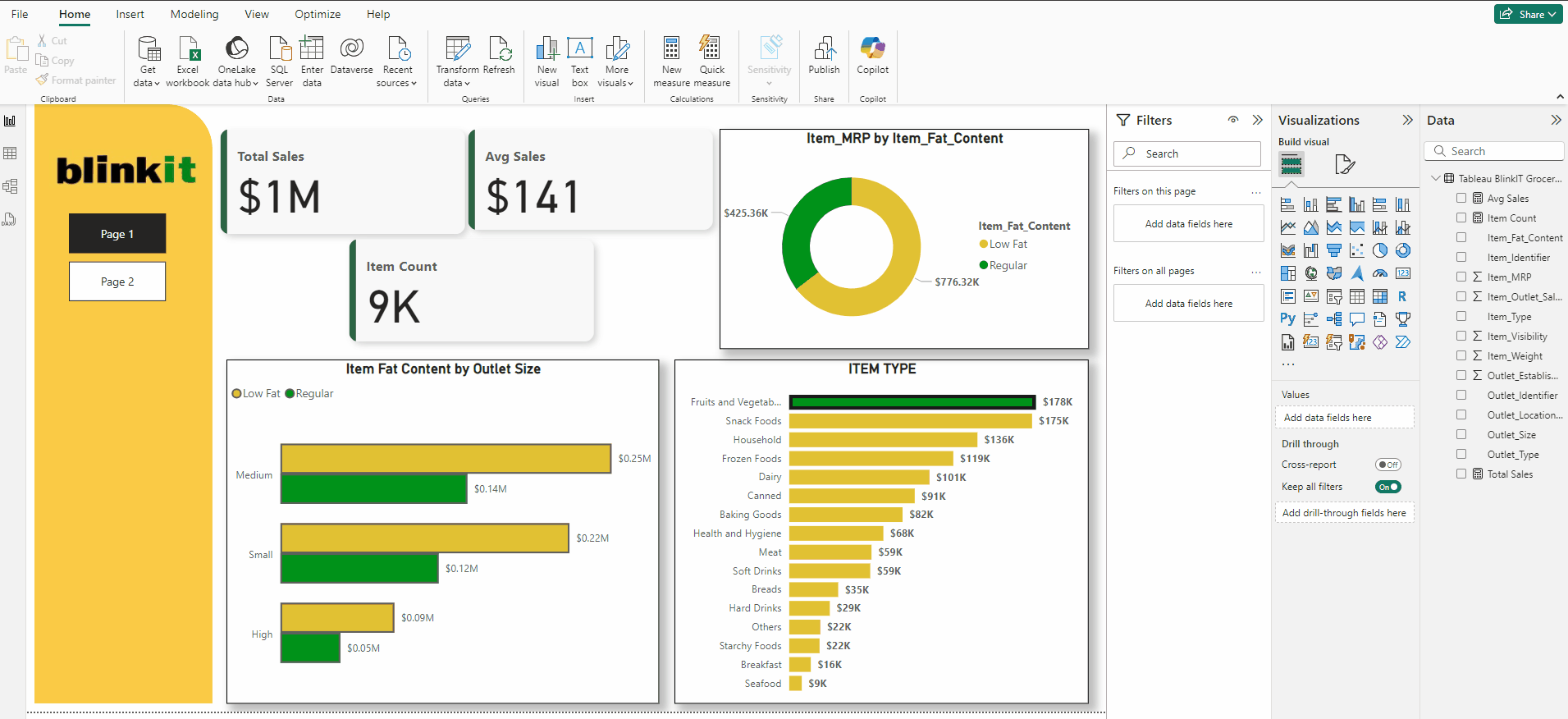
Below is the dashboard we will be creating:
Building the Dashboard
We will go through these steps:
- Creating the ITEM TYPE Bar chart
- Creating the Donut chart
- Creating the Funnel
- Creating the Outlet Size by Price Donut
- Creating the Table
- Creating the Area Chart
- Creating the KPI Card
- Creating Outlet Size Bar Chart
- Creating the side Visual
- Arranging the visuals
- Adding Page Navigator Buttons
- Adding Filter Interactions
- Adding External Filters
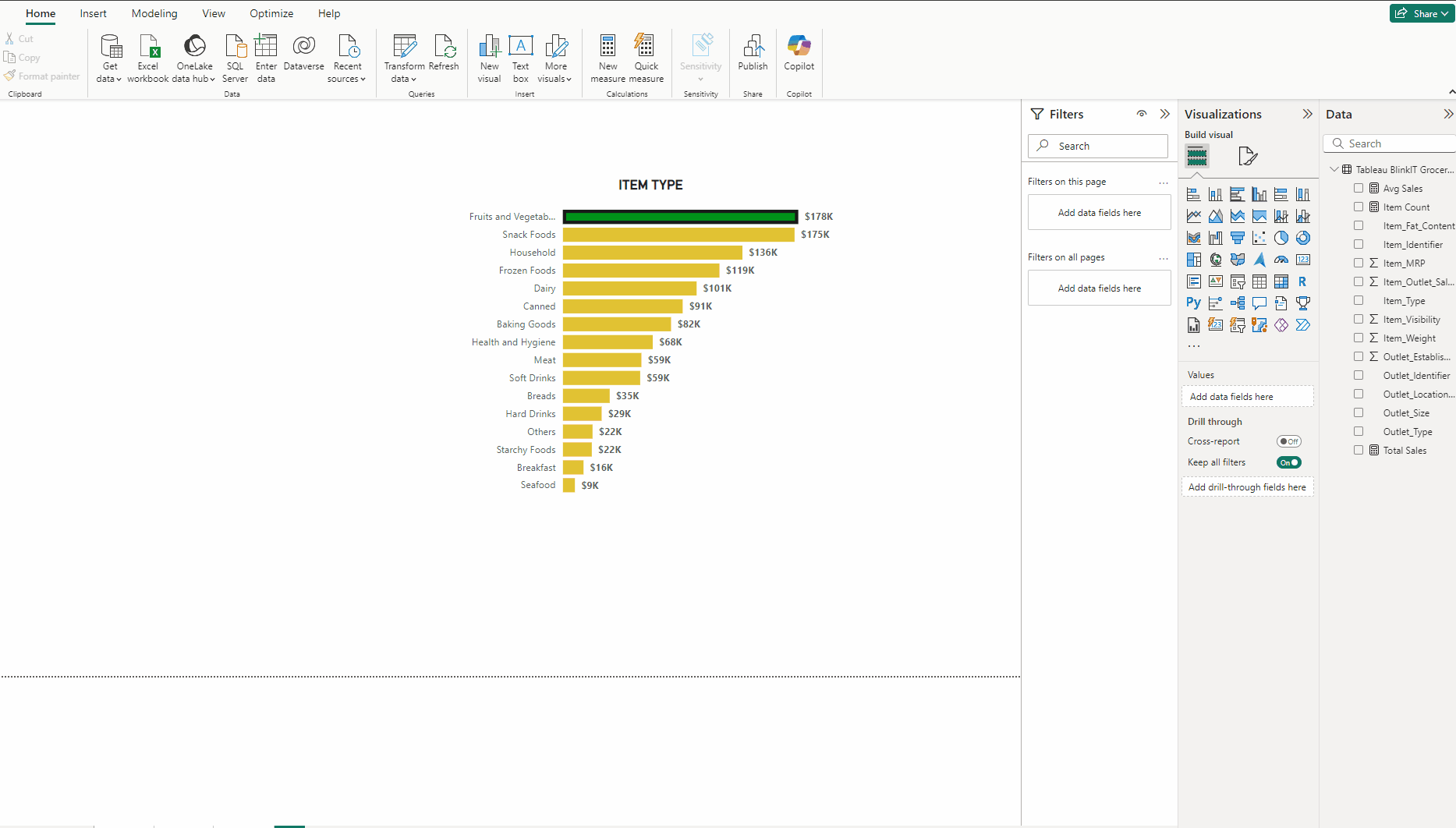
Creating the ITEM TYPE Bar chart:
- Add a Clustered bar chart.
- Put Item_Type in Y-axis and Item_MRP in X-axis.
- In Format visual → Visual expand Y-axis and turn off Title, expand X-axis and turn off both Title and Values.
- Expand Bars and for Color use #E1C233, select Fruits and Vegetables from Categories and use #009319.
- Turn on Border use #1A1A1A and Width to 4px.
- Turn on Data labels and in Value Bold the font.
- In Format visual → General → Title type ITEM TYPE, Bold the Font and Horizontal alignment to Center.
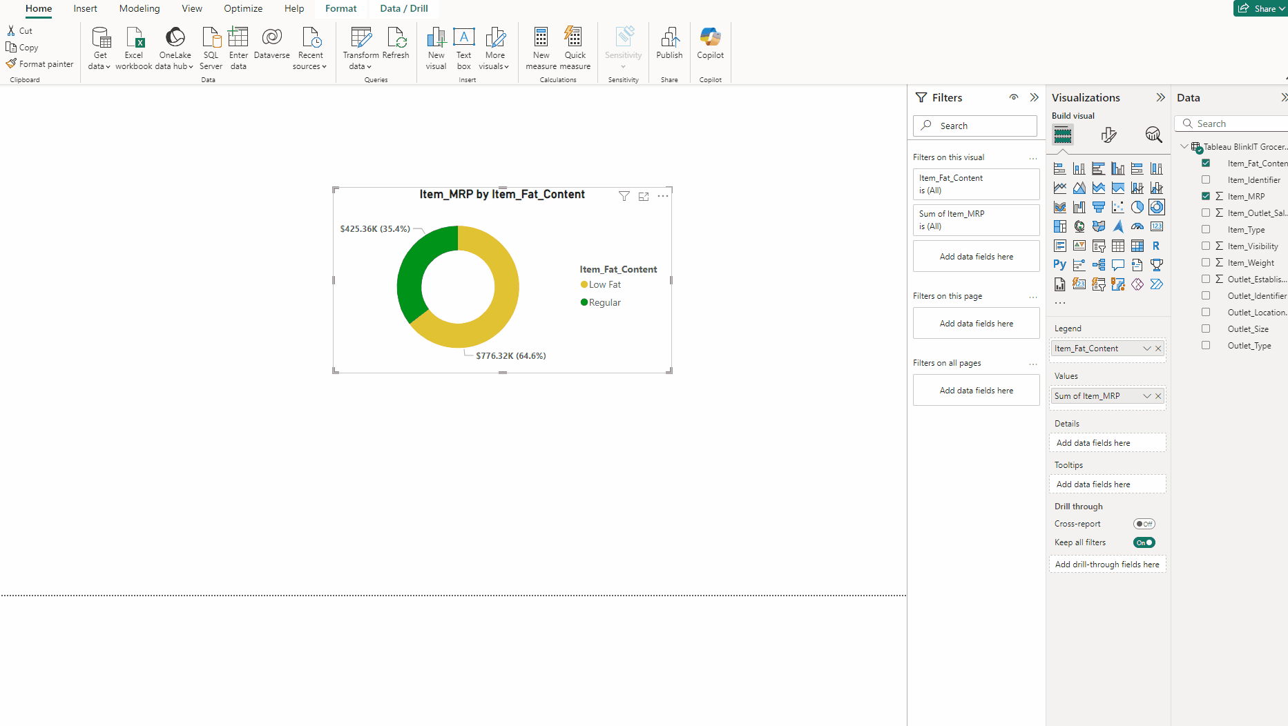
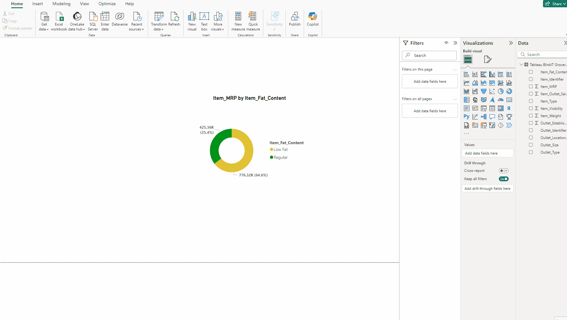
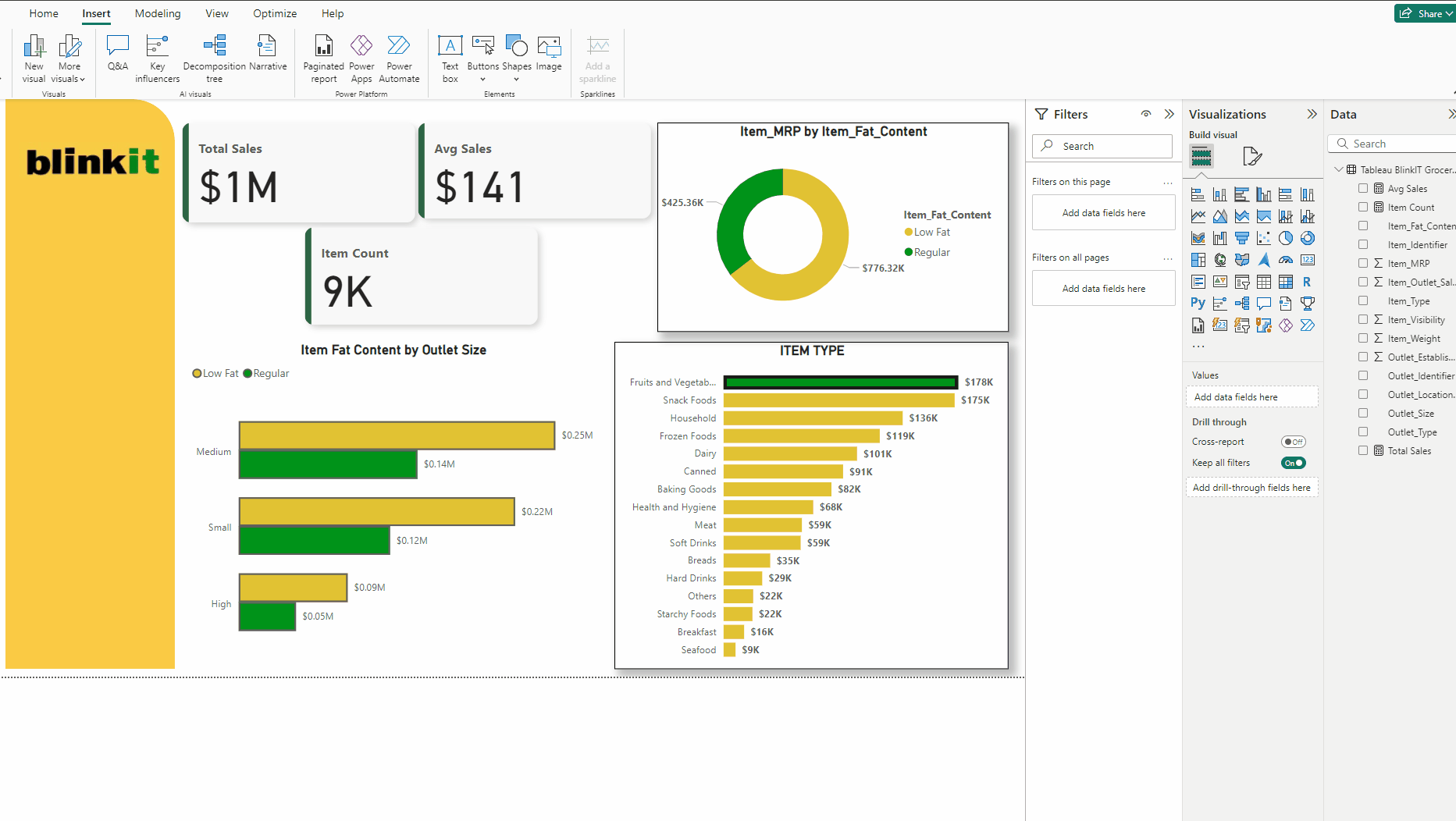
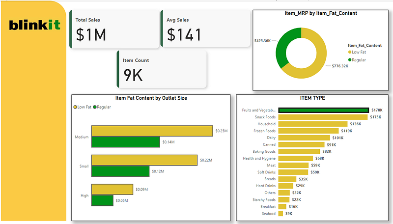
Creating the Donut chart:
- Add a Donut chart.
- Put Item_Fat_Content in Legend and Item_MRP in Values.
- In Format visual → Visual →Slices, Low Fat #E1C233 and Regular #009319.
- Turn on Detail labels and Bold font in Values.
- Rewrite the title, Bold the Font and Horizontal alignment to Center.
- Turn on Detail labels →Label contents select Data value.
Creating the Funnel:
- Add a Funnel.
- Put Outlet_Location_Type in Category and Item_MRP in Values.
- Expand Colors press fx.
- Choose Format style → Gradient, Min color #D9B300 and Max color #6D5A00.
- Adjust the title like in before charts.
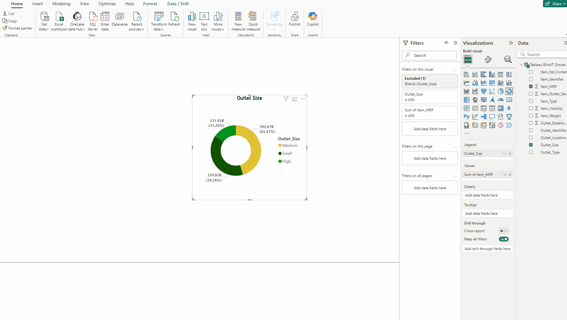
Creating the Outlet Size by Price Donut:
- Copy the previous Donut chart.
- Put Outlet_Size in Legend and Item_MRP in Values.
- Exclude the Blank.
- In Slices, Medium #E1C233, Small #105300 and High #009319.
- Adjust the title accordingly.
- In Slices → Spacing set Inner raduis 70%.
- Add a Card and put Item_MRP to it, set currency and 2 decimal points.
- Turn off label, set size 20, bold the font and turn off Background.
Creating the Table:
First we create some DAX functions:
Total Sales = SUM(‘Tableau BlinkIT Grocery Project’[Item_MRP])

Avg Sales = AVERAGE(‘Tableau BlinkIT Grocery Project’[Item_MRP])

Item Count = COUNT(‘Tableau BlinkIT Grocery Project’[Item_Type])

- Add a Table.
- Add Outlet_Type, Total Sales, Avg Sales, Item Count and Item_Visibilty in Columns.
- Turn off label, set size 20, bold the font and turn off Background.
- Rename Sum Of Item_Visibity.
- In Style presets select Minimal.
- In Grid set Color white and Width 5 for both Horizontal and Vertical.
- Expand Options and and use 10 for Row padding.
- For Values set size to 15, in Column headers set Font Bold, size 20 and Horizontal alignment Center.
- Turn off Totals.
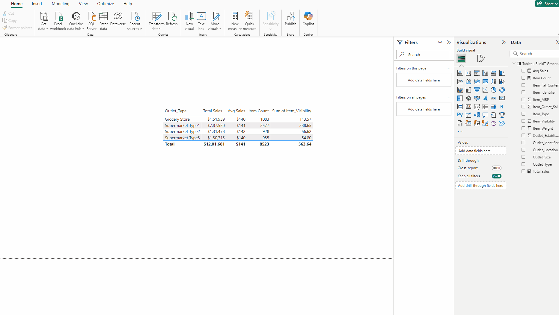
- In Specific column select Total Sales, Text color white, Background color #E1C233, Alignment Center.
- For Avg Sales color #197F00, rest same as Total Sales.
- For Item count color #70BBFF and for Item_Visibilty color #AC95DA.
Creating the Area Chart:
- Add an Area chart.
- Add Outlet_Establishment_Year in X-axis and Total Sales in Y-axis.
- For both X and Y axis turn off Title.
- Turn on Markers.
- Turn on Data labels, turn on Background and in Value Bold the Font.
- In Lines → Color use #E1C233 and for Width use 4 px.
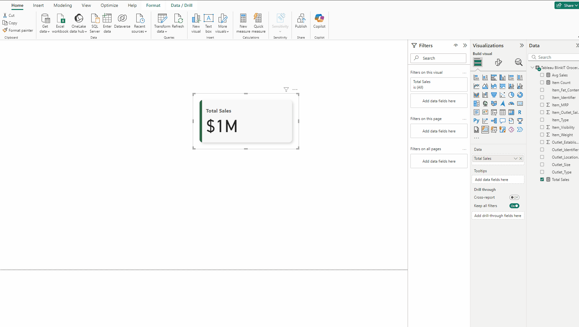
Creating the KPI Card:
- Add a Card(new) and put Total Sales to it.
- in Format visual → Cards → Shape use Rounded Rectangle and set Rounded Corners to 10 px, then in Padding set Size to Wide.
- In Cards expand Background and in Color use #F8F8F8, then turn off Border.
- Turn on Glow, for Position set it to Bottom right and set Color to #666666.
- Next up turn on Accent bar set its Color to #2D6545 and Width to 8 px.
- Next in Format visual → Callout values expand Label, Bold the font.
- Make two more copies of KPI and add Avg Sales and Item Count to them.
Creating Outlet Size Bar Chart:
- Copy the ITEM TYPE Bar chart.
- Put Outlet_Size in Y-axis and Item_Fat_Content in Legend.
- Exclude the Blank from the chart by right click and Exclude on the bar.
- In Bars use #E1C233 for Low Fat and use #009319 for Regular.
- For Series : All turn on Border and set Width 2 px.
- Adjust the title accordingly.
Creating the side Visual:
- In Insert tab → Shapes add Rounded tab, top right.
- In Style for Color use #FBCA44 and turn off Border.
- Add an Image and in Style → Scaling use Fit.
Arranging the visuals:
Follow the below steps for all the visuals
- Select the chart
- Head to Format visual → General.
- Turn on Visual border and Shadow.
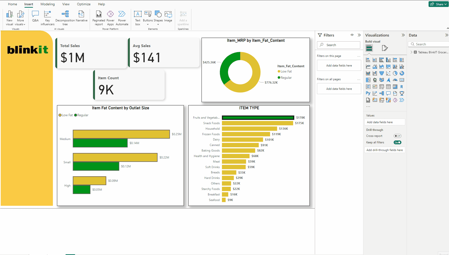
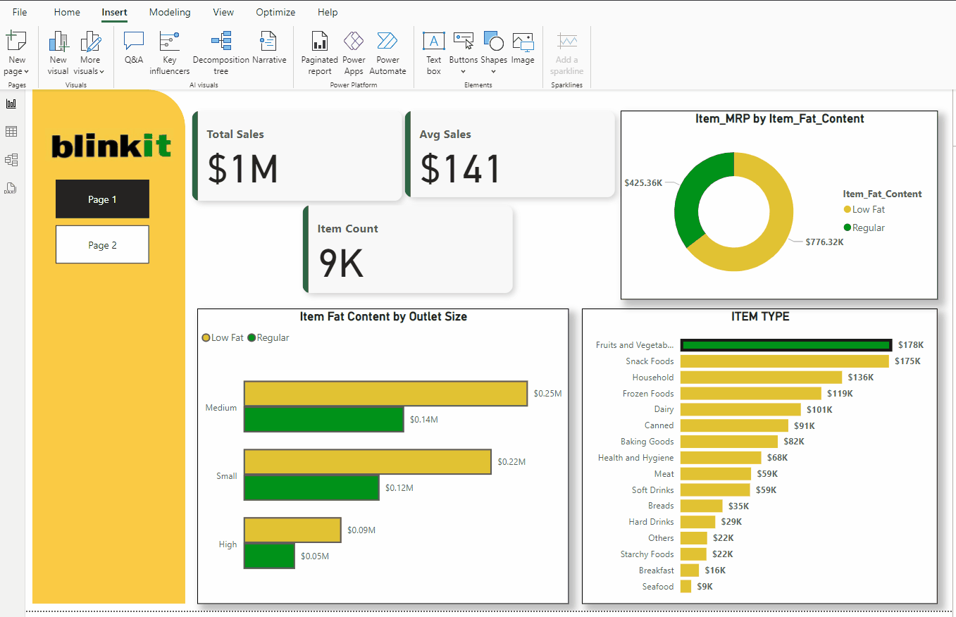
This is how I have arrange my charts in two pages:
You can arrange the charts as shown above or follow your own format.
Adding Page Navigator Buttons:
To quickly move between pages we will add Page navigator buttons to both the pages.
- In Insert tab → Buttons → Navigator add Page navigator.
- Add them to both of the pages.
- Now use Ctrl and left mouse button to move between pages.
Adding Filter Interactions:
Normally if you press on any chart then the filtering of other chart is not what it should be like below:
It filters data, but all the other data is also shown which is not what it should do, it should not display the filtered visuals. For which follow the below steps:
- Select the chart which you want to filter.
- With chart selected head to Format tab and click on Edit interactions.
- Then for all other charts select the below Filter icon.
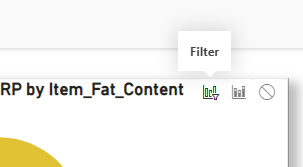
- Now you can choose the chart elements in one chart to overall display the filtered charts.

Adding External Filters:
- Add a Slicer, put Outlet_Type to it.
- In Slicer settings choose Dropdown.
- Now in Format visual → General change Background Color to #FBCA44.
- Now control the charts through external filters.
Finally we have created the Dashboard which is very insightful.
Download the data for the dashboard here.
Download the PBIX file of the dashboard from here.
Thank you for your attention!
Follow me or subscribe to get all my Power BI articles!
Don’t forget to subscribe to
👉 Power BI Publication
👉 Power BI Newsletter
and join our Power BI community:


